
Forum updates: new layout and image upload
p.6 #1Forum updates: new layout and image upload
OregonSun wrote:
Been out taking photos for the last 5 days with no internet service. Definitely not a fan of the latest design changes for mobile.
When viewing a Board, Topics now take up too many lines with extraneous info (pages, posts, views, etc.). Having to scroll more to access the same important info (title, author, link to last post) is a degraded experience IMO.
Same opinion of the similar changes to posts in a thread. Do we really need to see all the member info on every post? You could make it expandable and collapsed by default if you really think people want...Show more →
Ah thanks for letting me know about the inbox icon. Ok I missed that.
I will send you a screenshot by dm.
My complaints are mostly about mobile experience on phones. I feel like the information density is a lot lower when the screen space is small.
Thanks.
Been out taking photos for the last 5 days with no internet service. Definitely not a fan of the latest design changes for mobile.
When viewing a Board, Topics now take up too many lines with extraneous info (pages, posts, views, etc.). Having to scroll more to access the same important info (title, author, link to last post) is a degraded experience IMO.
Same opinion of the similar changes to posts in a thread. Do we really need to see all the member info on every post? You could make it expandable and collapsed by default if you really think people want...Show more →
Ah thanks for letting me know about the inbox icon. Ok I missed that.
I will send you a screenshot by dm.
My complaints are mostly about mobile experience on phones. I feel like the information density is a lot lower when the screen space is small.
Thanks.
Nov 11, 2026 at 08:59 PM
p.6 #2Forum updates: new layout and image upload
Fred, thank you 1000X for the drag and drop photo upload feature!
Nov 12, 2026 at 12:22 PM
p.6 #3Forum updates: new layout and image upload
jeffbuzz wrote:
Fred, thank you 1000X for the drag and drop photo upload feature!
I'm glad you like it!
New image frames layout coming up!
Fred, thank you 1000X for the drag and drop photo upload feature!
I'm glad you like it!
New image frames layout coming up!
Nov 12, 2026 at 12:52 PM
p.6 #4Forum updates: new layout and image upload
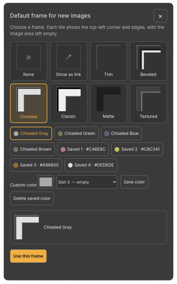
The brand-new Image Upload Frame Options feature is officially live! (Requires Upload & Sell).
Here's what you can do now when uploading images to your forum post:
⦿ Preview frames before applying them.
⦿ Customize colors for different frame designs to match your style.
⦿ Save your custom color palettes directly to your profile.
Head over and try it out today! PS: works on mobile as well.
Here's what you can do now when uploading images to your forum post:
⦿ Preview frames before applying them.
⦿ Customize colors for different frame designs to match your style.
⦿ Save your custom color palettes directly to your profile.
Head over and try it out today! PS: works on mobile as well.
Nov 12, 2026 at 02:42 PM
p.6 #5Forum updates: new layout and image upload
Fred Miranda wrote:
When viewing a Board, Topics now take up too many lines with extraneous info (pages, posts, views, etc.). Having to scroll more to access the same important info (title, author, link to last post) is a degraded experience IMO.
Same opinion of the similar changes to posts in a thread. Do we really need to see all the member info on every post? You could make it expandable and collapsed by default if you really think people want access to that on their phones. Number of likes is displayed twice per post. The buttons at the bottom of a post now consume up to 3 lines and are a odd mix of post (reply, quote) and poster (top 15, www, hide me, etc.) related actions.
Again, all this clutter is burying the most important info (author, images, text, post date) and obscuring the back and forth of the thread discussion.
Desktop site is looking good, but the mobile experience needs some streamlining.Thanks for the detailed feedback, I really appreciate it.
I agree with most of it, and I'm still working on the mobile layout. I've already made some changes: shorter topic rows on the board, a more compact poster info area on each post (tap Details for the rest), and fewer buttons per post. Please check it out and let me know what you think. If it still looks the same, reload the page first. More tweaks are coming.
Latest changes are much better. Glad my feedback was useful!
OregonSun wrote
Been out taking photos for the last 5 days with no internet service. Definitely not a fan of the latest design changes for mobile.When viewing a Board, Topics now take up too many lines with extraneous info (pages, posts, views, etc.). Having to scroll more to access the same important info (title, author, link to last post) is a degraded experience IMO.
Same opinion of the similar changes to posts in a thread. Do we really need to see all the member info on every post? You could make it expandable and collapsed by default if you really think people want access to that on their phones. Number of likes is displayed twice per post. The buttons at the bottom of a post now consume up to 3 lines and are a odd mix of post (reply, quote) and poster (top 15, www, hide me, etc.) related actions.
Again, all this clutter is burying the most important info (author, images, text, post date) and obscuring the back and forth of the thread discussion.
Desktop site is looking good, but the mobile experience needs some streamlining.
I agree with most of it, and I'm still working on the mobile layout. I've already made some changes: shorter topic rows on the board, a more compact poster info area on each post (tap Details for the rest), and fewer buttons per post. Please check it out and let me know what you think. If it still looks the same, reload the page first. More tweaks are coming.
Latest changes are much better. Glad my feedback was useful!
Nov 12, 2026 at 04:53 PM
p.6 #6Forum updates: new layout and image upload
OregonSun wrote:
When viewing a Board, Topics now take up too many lines with extraneous info (pages, posts, views, etc.). Having to scroll more to access the same important info (title, author, link to last post) is a degraded experience IMO.
Same opinion of the similar changes to posts in a thread. Do we really need to see all the member info on every post? You could make it expandable and collapsed by default if you really think people want access to that on their phones. Number of likes is displayed twice per post. The buttons at the bottom of a post now consume up to 3 lines and are a odd mix of post (reply, quote) and poster (top 15, www, hide me, etc.) related actions.
Again, all this clutter is burying the most important info (author, images, text, post date) and obscuring the back and forth of the thread discussion.
Desktop site is looking good, but the mobile experience needs some streamlining.Thanks for the detailed feedback, I really appreciate it.
I agree with most of it, and I'm still working on the mobile layout. I've already made some changes: shorter topic rows on the board, a more compact poster info area on each post (tap Details for the rest), and fewer buttons per post. Please check it out and let me know what you think. If it still looks the same, reload the page first. More tweaks are coming.Latest changes are much better. Glad my feedback was useful!
Please let me know if you spot anything that could be improved...I really appreciate your insight.
Fred Miranda wrote
OregonSun wrote
Been out taking photos for the last 5 days with no internet service. Definitely not a fan of the latest design changes for mobile.When viewing a Board, Topics now take up too many lines with extraneous info (pages, posts, views, etc.). Having to scroll more to access the same important info (title, author, link to last post) is a degraded experience IMO.
Same opinion of the similar changes to posts in a thread. Do we really need to see all the member info on every post? You could make it expandable and collapsed by default if you really think people want access to that on their phones. Number of likes is displayed twice per post. The buttons at the bottom of a post now consume up to 3 lines and are a odd mix of post (reply, quote) and poster (top 15, www, hide me, etc.) related actions.
Again, all this clutter is burying the most important info (author, images, text, post date) and obscuring the back and forth of the thread discussion.
Desktop site is looking good, but the mobile experience needs some streamlining.
I agree with most of it, and I'm still working on the mobile layout. I've already made some changes: shorter topic rows on the board, a more compact poster info area on each post (tap Details for the rest), and fewer buttons per post. Please check it out and let me know what you think. If it still looks the same, reload the page first. More tweaks are coming.
Please let me know if you spot anything that could be improved...I really appreciate your insight.
Nov 12, 2026 at 06:36 PM

p.6 #7Forum updates: new layout and image upload
Hi Fred...
I really like the new features you've introduced. One issue that has changed since the updates began rolling out are the link titles under each of the Gear Talk, Buy & Sell and Image Boards. In the past, if I clicked on one of the titles under each of those headings, it would become a different color when I went back so that I could tell which links I had visited. It also had a right-pointing arrow that if I clicked it, it would take me to the very end of a multi-page post. Maybe I'm overlooking something, but those features would be helpful.
Tom
I really like the new features you've introduced. One issue that has changed since the updates began rolling out are the link titles under each of the Gear Talk, Buy & Sell and Image Boards. In the past, if I clicked on one of the titles under each of those headings, it would become a different color when I went back so that I could tell which links I had visited. It also had a right-pointing arrow that if I clicked it, it would take me to the very end of a multi-page post. Maybe I'm overlooking something, but those features would be helpful.
Tom
Nov 12, 2026 at 07:37 PM
p.6 #8Forum updates: new layout and image upload
Thanks for the updates.
One feature request that other forums have: When you click on a thread, can it take you to the first unread post in the thread since your last view of the thread? Other forums have this. It is kind of annoying to click on a multi-page thread by going to the end, then going back posts or even pages until you find the last post you viewed previously and the start of new content. My apologies if this is already present and I missed it.
One feature request that other forums have: When you click on a thread, can it take you to the first unread post in the thread since your last view of the thread? Other forums have this. It is kind of annoying to click on a multi-page thread by going to the end, then going back posts or even pages until you find the last post you viewed previously and the start of new content. My apologies if this is already present and I missed it.
Nov 12, 2026 at 10:55 PM
p.6 #9Forum updates: new layout and image upload
Overall, the changes are looking good. I do still think the mobile site is too cluttered in some areas (though overall it's better now in most areas). I don't know if anyone else is like this, but I bookmark the site on 'my posts' so I can initially see if someone has replied to a thread I'm active in, and that list on mobile is far more cluttered than it used to be, and it makes it a little hard to follow where things are - some fonts blend together between the link to the forum name, the poster name on the latest, and such - and the Last Post button varies on which line its on based on title length, which I don't recall happening on the previous design.
On mobile the actual posts look good, though the 'multi-quote' and 'like' links appearing immediately in-line with the last sentence of a post looks a little off - perhaps that should always be on a new line below the post text. The main post listing for each forum looks generally good - though there's something maybe slightly off with the font sizes - not sure, though this isn't something that needs any sort of attention - just a personal preference thing.
I appreciate the work you're doing bringing the forums up to date - I know stuff like this is a long process, and a lot of work! Thanks!
On mobile the actual posts look good, though the 'multi-quote' and 'like' links appearing immediately in-line with the last sentence of a post looks a little off - perhaps that should always be on a new line below the post text. The main post listing for each forum looks generally good - though there's something maybe slightly off with the font sizes - not sure, though this isn't something that needs any sort of attention - just a personal preference thing.
I appreciate the work you're doing bringing the forums up to date - I know stuff like this is a long process, and a lot of work! Thanks!
Nov 13, 2026 at 07:29 AM
p.6 #10Forum updates: new layout and image upload
This color combination is more difficult to read than before. Will there be some an option to choose a different color scheme in the future? Not sure I'm asking the right question…
Nov 13, 2026 at 09:28 AM
|
p.6 #11Forum updates: new layout and image upload
Tom In Arizona wrote:
Hi Fred...
I really like the new features you've introduced. One issue that has changed since the updates began rolling out are the link titles under each of the Gear Talk, Buy & Sell and Image Boards. In the past, if I clicked on one of the titles under each of those headings, it would become a different color when I went back so that I could tell which links I had visited. It also had a right-pointing arrow that if I clicked it, it would take me to the very end of a multi-page post. Maybe I'm overlooking...Show more →
All great ideas and implemented Tom! Thanks for the feedback.
Hi Fred...
I really like the new features you've introduced. One issue that has changed since the updates began rolling out are the link titles under each of the Gear Talk, Buy & Sell and Image Boards. In the past, if I clicked on one of the titles under each of those headings, it would become a different color when I went back so that I could tell which links I had visited. It also had a right-pointing arrow that if I clicked it, it would take me to the very end of a multi-page post. Maybe I'm overlooking...Show more →
All great ideas and implemented Tom! Thanks for the feedback.
Nov 13, 2026 at 12:35 PM
p.6 #12Forum updates: new layout and image upload
TGPhotography wrote:
Thanks for the updates.
One feature request that other forums have: When you click on a thread, can it take you to the first unread post in the thread since your last view of the thread? Other forums have this. It is kind of annoying to click on a multi-page thread by going to the end, then going back posts or even pages until you find the last post you viewed previously and the start of new content. My apologies if this is already present and I missed it.
Awesome idea that would simply our lives. Implemented. Thank you for the suggestion!
Thanks for the updates.
One feature request that other forums have: When you click on a thread, can it take you to the first unread post in the thread since your last view of the thread? Other forums have this. It is kind of annoying to click on a multi-page thread by going to the end, then going back posts or even pages until you find the last post you viewed previously and the start of new content. My apologies if this is already present and I missed it.
Awesome idea that would simply our lives. Implemented. Thank you for the suggestion!
Nov 13, 2026 at 12:36 PM
p.6 #13Forum updates: new layout and image upload
Surfnsun wrote:
This color combination is more difficult to read than before. Will there be some an option to choose a different color scheme in the future? Not sure I'm asking the right question…
A light mode for the forum is planned. Currently we've kept the same color scheme as before the changes.
This color combination is more difficult to read than before. Will there be some an option to choose a different color scheme in the future? Not sure I'm asking the right question…
A light mode for the forum is planned. Currently we've kept the same color scheme as before the changes.
Nov 13, 2026 at 12:38 PM
p.6 #14Forum updates: new layout and image upload
Jman13 wrote:
Overall, the changes are looking good. I do still think the mobile site is too cluttered in some areas (though overall it's better now in most areas). I don't know if anyone else is like this, but I bookmark the site on 'my posts' so I can initially see if someone has replied to a thread I'm active in, and that list on mobile is far more cluttered than it used to be, and it makes it a little hard to follow where things are - some fonts blend together between the link to the forum name, the poster name...Show more →
Thanks for the thoughtful feedback...those were good points. I’ve made two mobile adjustments based on your suggestions:
"My posts" now has a clearer distinction between the thread title, forum name, and latest reply information. The "Last post" button also stays in a consistent position at the lower right instead of moving with the title.
Like and Multi-quote now appear on a separate line below the post text.
I've made these changes and you can check by refreshing your usual "My posts" bookmark on your phone, then opening a thread to check the action links below a post. No special preview link is needed.
Please let me know whether this feels easier to scan, especially on threads with longer titles. Thanks again for helping improve it!
Overall, the changes are looking good. I do still think the mobile site is too cluttered in some areas (though overall it's better now in most areas). I don't know if anyone else is like this, but I bookmark the site on 'my posts' so I can initially see if someone has replied to a thread I'm active in, and that list on mobile is far more cluttered than it used to be, and it makes it a little hard to follow where things are - some fonts blend together between the link to the forum name, the poster name...Show more →
Thanks for the thoughtful feedback...those were good points. I’ve made two mobile adjustments based on your suggestions:
"My posts" now has a clearer distinction between the thread title, forum name, and latest reply information. The "Last post" button also stays in a consistent position at the lower right instead of moving with the title.
Like and Multi-quote now appear on a separate line below the post text.
I've made these changes and you can check by refreshing your usual "My posts" bookmark on your phone, then opening a thread to check the action links below a post. No special preview link is needed.
Please let me know whether this feels easier to scan, especially on threads with longer titles. Thanks again for helping improve it!
Nov 13, 2026 at 12:48 PM
p.6 #15Forum updates: new layout and image upload
Thanks for the quick reply, Fred. However, I'm not seeing any change when I click on one of the links from the home page in one of those sections and I don't see the right-pointing arrow. I've logged out and logged back in, closed my browser and reopened, but no change. Maybe it takes time for your update to propagate.
Tom
Tom
Nov 13, 2026 at 01:03 PM
p.6 #16Forum updates: new layout and image upload
Tom In Arizona wrote:
Thanks for the quick reply, Fred. However, I'm not seeing any change when I click on one of the links from the home page in one of those sections and I don't see the right-pointing arrow. I've logged out and logged back in, closed my browser and reopened, but no change. Maybe it takes time for your update to propagate.
Tom
I misunderstood, you meant the homepage? I made the changes to the Board pages so far.
Thanks for the quick reply, Fred. However, I'm not seeing any change when I click on one of the links from the home page in one of those sections and I don't see the right-pointing arrow. I've logged out and logged back in, closed my browser and reopened, but no change. Maybe it takes time for your update to propagate.
Tom
I misunderstood, you meant the homepage? I made the changes to the Board pages so far.
Nov 13, 2026 at 01:17 PM
p.6 #17Forum updates: new layout and image upload
Fred Miranda wrote:
On mobile the actual posts look good, though the 'multi-quote' and 'like' links appearing immediately in-line with the last sentence of a post looks a little off - perhaps that should always be on a new line below the post text. The main post listing for each forum looks generally good - though there's something maybe slightly off with the font sizes - not sure, though this isn't something that needs any sort of attention - just a personal preference thing.
I appreciate the work you're doing bringing the forums up to date - I know stuff like this is a long process, and a lot of work! Thanks!Thanks for the thoughtful feedback...those were good points. I’ve made two mobile adjustments based on your suggestions:
"My posts" now has a clearer distinction between the thread title, forum name, and latest reply information. The "Last post" button also stays in a consistent position at the lower right instead of moving with the title.
Like and Multi-quote now appear on a separate line below the post text.
I've made these changes and you can check by refreshing your usual "My posts" bookmark on your phone, then opening a thread to check the action links below a post. No special preview link is...Show more →
Thanks for the quick update! Yeah, everything looks better here, and most importantly, more consistent and therefore much easier to read. Still getting used to the color change on 'read' threads, but that's an adjustment thing not something that needs to be changed...it makes it easier to delineate, it's just something that is different than what I'm used to after 21 years on the forum (my god...my FM Membership can drink now).
Jman13 wrote
Overall, the changes are looking good. I do still think the mobile site is too cluttered in some areas (though overall it's better now in most areas). I don't know if anyone else is like this, but I bookmark the site on 'my posts' so I can initially see if someone has replied to a thread I'm active in, and that list on mobile is far more cluttered than it used to be, and it makes it a little hard to follow where things are - some fonts blend together between the link to the forum name, the poster name on the latest, and such - and the Last Post button varies on which line its on based on title length, which I don't recall happening on the previous design.On mobile the actual posts look good, though the 'multi-quote' and 'like' links appearing immediately in-line with the last sentence of a post looks a little off - perhaps that should always be on a new line below the post text. The main post listing for each forum looks generally good - though there's something maybe slightly off with the font sizes - not sure, though this isn't something that needs any sort of attention - just a personal preference thing.
I appreciate the work you're doing bringing the forums up to date - I know stuff like this is a long process, and a lot of work! Thanks!
"My posts" now has a clearer distinction between the thread title, forum name, and latest reply information. The "Last post" button also stays in a consistent position at the lower right instead of moving with the title.
Like and Multi-quote now appear on a separate line below the post text.
I've made these changes and you can check by refreshing your usual "My posts" bookmark on your phone, then opening a thread to check the action links below a post. No special preview link is...Show more →
Thanks for the quick update! Yeah, everything looks better here, and most importantly, more consistent and therefore much easier to read. Still getting used to the color change on 'read' threads, but that's an adjustment thing not something that needs to be changed...it makes it easier to delineate, it's just something that is different than what I'm used to after 21 years on the forum (my god...my FM Membership can drink now).
Nov 13, 2026 at 01:40 PM
p.6 #18Forum updates: new layout and image upload
Jman13 wrote:
On mobile the actual posts look good, though the 'multi-quote' and 'like' links appearing immediately in-line with the last sentence of a post looks a little off - perhaps that should always be on a new line below the post text. The main post listing for each forum looks generally good - though there's something maybe slightly off with the font sizes - not sure, though this isn't something that needs any sort of attention - just a personal preference thing.
I appreciate the work you're doing bringing the forums up to date - I know stuff like this is a long process, and a lot of work! Thanks!Thanks for the thoughtful feedback...those were good points. I’ve made two mobile adjustments based on your suggestions:
"My posts" now has a clearer distinction between the thread title, forum name, and latest reply information. The "Last post" button also stays in a consistent position at the lower right instead of moving with the title.
Like and Multi-quote now appear on a separate line below the post text.
I've made these changes and you can check by refreshing your usual "My posts" bookmark on your phone, then opening a thread to check the action links below a post. No special preview link is needed.
Please let me know whether this feels easier to scan, especially on threads with longer titles. Thanks again for helping improve it!Thanks for the quick update! Yeah, everything looks better here, and most importantly, more consistent and therefore much easier to read. Still getting used to the color change on 'read' threads, but that's an adjustment thing not something that needs to be changed...it makes it easier to delineate, it's just something that is different than what I'm used to after 21 years on the forum (my god...my FM Membership can drink now).
I'm so glad! ...Still getting used to the color change on 'read' threads... That's actually how it behaved before the layout change. When you read a thread, the link turns gray, and if someone replies, it changes back to its original color. It's just a visual cue to show whether a thread has new replies since you last read it.
Fred Miranda wrote
Jman13 wrote
Overall, the changes are looking good. I do still think the mobile site is too cluttered in some areas (though overall it's better now in most areas). I don't know if anyone else is like this, but I bookmark the site on 'my posts' so I can initially see if someone has replied to a thread I'm active in, and that list on mobile is far more cluttered than it used to be, and it makes it a little hard to follow where things are - some fonts blend together between the link to the forum name, the poster name on the latest, and such - and the Last Post button varies on which line its on based on title length, which I don't recall happening on the previous design.On mobile the actual posts look good, though the 'multi-quote' and 'like' links appearing immediately in-line with the last sentence of a post looks a little off - perhaps that should always be on a new line below the post text. The main post listing for each forum looks generally good - though there's something maybe slightly off with the font sizes - not sure, though this isn't something that needs any sort of attention - just a personal preference thing.
I appreciate the work you're doing bringing the forums up to date - I know stuff like this is a long process, and a lot of work! Thanks!
"My posts" now has a clearer distinction between the thread title, forum name, and latest reply information. The "Last post" button also stays in a consistent position at the lower right instead of moving with the title.
Like and Multi-quote now appear on a separate line below the post text.
I've made these changes and you can check by refreshing your usual "My posts" bookmark on your phone, then opening a thread to check the action links below a post. No special preview link is needed.
Please let me know whether this feels easier to scan, especially on threads with longer titles. Thanks again for helping improve it!
I'm so glad! ...Still getting used to the color change on 'read' threads... That's actually how it behaved before the layout change. When you read a thread, the link turns gray, and if someone replies, it changes back to its original color. It's just a visual cue to show whether a thread has new replies since you last read it.
Nov 13, 2026 at 01:44 PM
p.6 #19Forum updates: new layout and image upload
Fred Miranda wrote:
A light mode for the forum is planned. Currently we've kept the same color scheme as before the changes.
That'll be cool...if you have the time (low priority), I also wouldn't mind an additional darker scheme as well - sort of the same as this default, but a darker base.
Surfnsun wrote
This color combination is more difficult to read than before. Will there be some an option to choose a different color scheme in the future? Not sure I'm asking the right question…That'll be cool...if you have the time (low priority), I also wouldn't mind an additional darker scheme as well - sort of the same as this default, but a darker base.
Nov 13, 2026 at 01:45 PM
p.6 #20Forum updates: new layout and image upload
Fred Miranda wrote:
On mobile the actual posts look good, though the 'multi-quote' and 'like' links appearing immediately in-line with the last sentence of a post looks a little off - perhaps that should always be on a new line below the post text. The main post listing for each forum looks generally good - though there's something maybe slightly off with the font sizes - not sure, though this isn't something that needs any sort of attention - just a personal preference thing.
I appreciate the work you're doing bringing the forums up to date - I know stuff like this is a long process, and a lot of work! Thanks!Thanks for the thoughtful feedback...those were good points. I’ve made two mobile adjustments based on your suggestions:
"My posts" now has a clearer distinction between the thread title, forum name, and latest reply information. The "Last post" button also stays in a consistent position at the lower right instead of moving with the title.
Like and Multi-quote now appear on a separate line below the post text.
I've made these changes and you can check by refreshing your usual "My posts" bookmark on your phone, then opening a thread to check the action links below a post. No special preview link is needed.
Please let me know whether this feels easier to scan, especially on threads with longer titles. Thanks again for helping improve it!Thanks for the quick update! Yeah, everything looks better here, and most importantly, more consistent and therefore much easier to read. Still getting used to the color change on 'read' threads, but that's an adjustment thing not something that needs to be changed...it makes it easier to delineate, it's just something that is different than what I'm used to after 21 years on the forum (my god...my FM Membership can drink now).I'm so glad! That's actually how it behaved before the layout change. When you read a thread, the link turns gray, and if someone replies, it changes back to its original color. It's just a visual cue to show whether a thread has new replies since you last read it.
Huh...maybe it's the color change in combination with some of the subtle font changes - it seems more stark a difference now than it did before. Again, not a complaint, just something that feels different.
Jman13 wrote
Fred Miranda wrote
Jman13 wrote
Overall, the changes are looking good. I do still think the mobile site is too cluttered in some areas (though overall it's better now in most areas). I don't know if anyone else is like this, but I bookmark the site on 'my posts' so I can initially see if someone has replied to a thread I'm active in, and that list on mobile is far more cluttered than it used to be, and it makes it a little hard to follow where things are - some fonts blend together between the link to the forum name, the poster name on the latest, and such - and the Last Post button varies on which line its on based on title length, which I don't recall happening on the previous design.On mobile the actual posts look good, though the 'multi-quote' and 'like' links appearing immediately in-line with the last sentence of a post looks a little off - perhaps that should always be on a new line below the post text. The main post listing for each forum looks generally good - though there's something maybe slightly off with the font sizes - not sure, though this isn't something that needs any sort of attention - just a personal preference thing.
I appreciate the work you're doing bringing the forums up to date - I know stuff like this is a long process, and a lot of work! Thanks!
"My posts" now has a clearer distinction between the thread title, forum name, and latest reply information. The "Last post" button also stays in a consistent position at the lower right instead of moving with the title.
Like and Multi-quote now appear on a separate line below the post text.
I've made these changes and you can check by refreshing your usual "My posts" bookmark on your phone, then opening a thread to check the action links below a post. No special preview link is needed.
Please let me know whether this feels easier to scan, especially on threads with longer titles. Thanks again for helping improve it!
Earlier quote
...Still getting used to the color change on 'read' threads...Huh...maybe it's the color change in combination with some of the subtle font changes - it seems more stark a difference now than it did before. Again, not a complaint, just something that feels different.
Nov 13, 2026 at 01:48 PM