
Forum updates: new layout and image upload

p.2 #1Forum updates: new layout and image upload
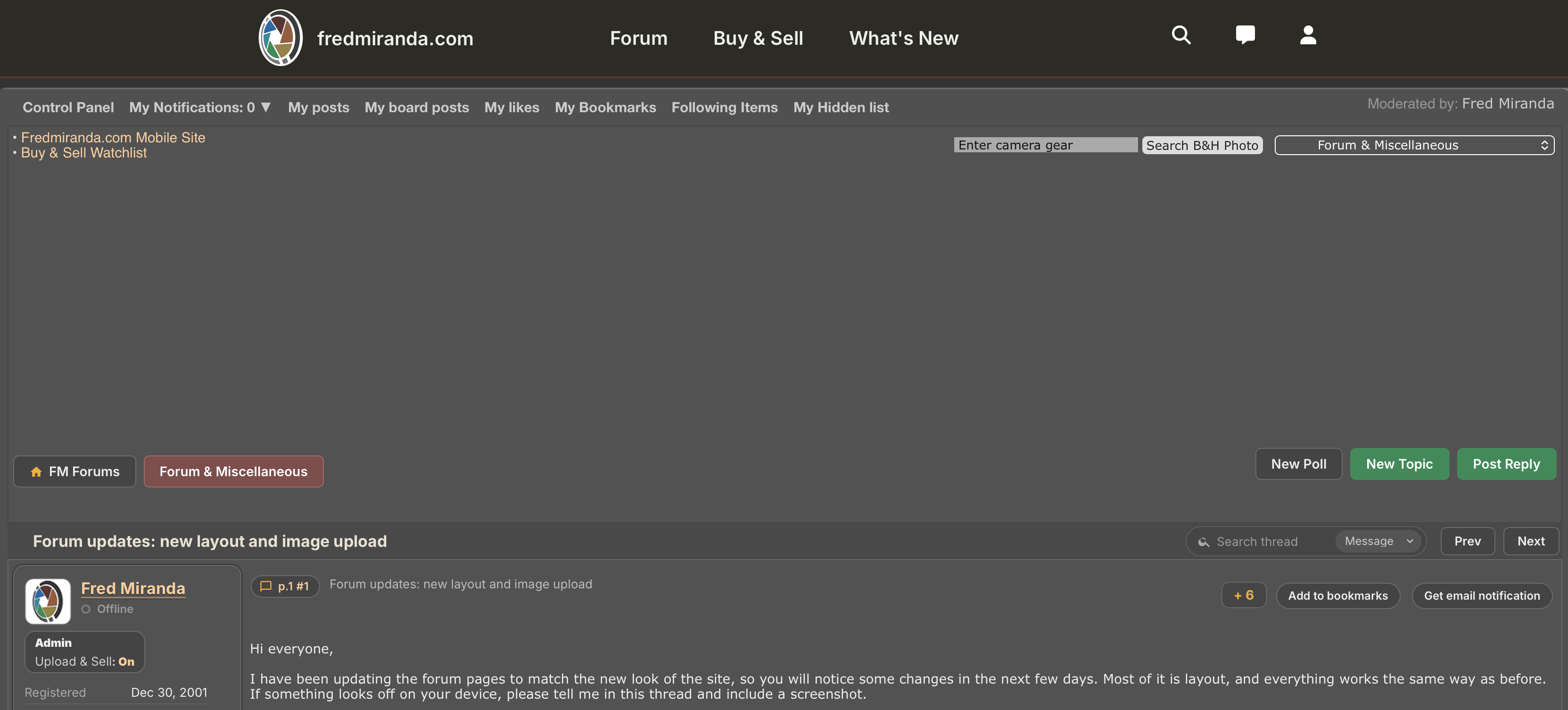
Fred... Might need to check this out, which is what I see today when viewing any post, in any board, including this one. Not sure if the ad went away and the space still used, or if there is just a lot of unused space up there...
Nov 03, 2026 at 11:45 AM
p.2 #2Forum updates: new layout and image upload
RWNPhoto wrote:
Fred... Might need to check this out, which is what I see today when viewing any post, in any board, including this one. Not sure if the ad went away and the space still used, or if there is just a lot of unused space up there...
Thank you for reporting this. It should be fixed now.
Fred... Might need to check this out, which is what I see today when viewing any post, in any board, including this one. Not sure if the ad went away and the space still used, or if there is just a lot of unused space up there...
Thank you for reporting this. It should be fixed now.
Nov 03, 2026 at 12:13 PM
p.2 #3Forum updates: new layout and image upload
I've been working on the newer Control Panel for a while and I'm confident it's pretty much bug free. Please check it and report any issues: https://www.fredmiranda.com/forum/controlpanel.php
Thank you! 😅
Thank you! 😅
Nov 03, 2026 at 01:44 PM
p.2 #4Forum updates: new layout and image upload
Fred Miranda wrote:
Hi Tony,
Thanks for reporting this. I wasn't able to reproduce the issue on my end, but I have updated the code with a potential fix.
Could you please test it out and let me know if it resolves the issue for you?
Thanks Fred, looks like that fixed it.
Tony
Hi Tony,
Thanks for reporting this. I wasn't able to reproduce the issue on my end, but I have updated the code with a potential fix.
Could you please test it out and let me know if it resolves the issue for you?
Thanks Fred, looks like that fixed it.
Tony
Nov 03, 2026 at 02:01 PM
p.2 #5Forum updates: new layout and image upload
I like the bolder font face, the slightly darker background, the alternating backgrounds from post to post. I and my old eyes thank you!
Nov 03, 2026 at 05:09 PM
p.2 #6Forum updates: new layout and image upload
Your modernization updates look great and improve functionality.
My only complaint is the garishness of the green and brighter orange colors you're using compared to the rest of the site. My eye is pulled away from the photos and text, which IMO should be the focus of the site.
Maybe try a more muted color scheme based on some of the colors in your logo.
My only complaint is the garishness of the green and brighter orange colors you're using compared to the rest of the site. My eye is pulled away from the photos and text, which IMO should be the focus of the site.
Maybe try a more muted color scheme based on some of the colors in your logo.
Nov 04, 2026 at 07:35 PM
p.2 #7Forum updates: new layout and image upload
The good: I like the new UI elements and the overall look of the site but as OregonSun mentioned maybe some colors could be muted a little
The bad: on my iPad the user panel, buttons etc takes up to much space compared to the text or title. If I switch to landscape everything looks better but I don’t think I should need to do that with an 11 inch screen.
Two examples below.
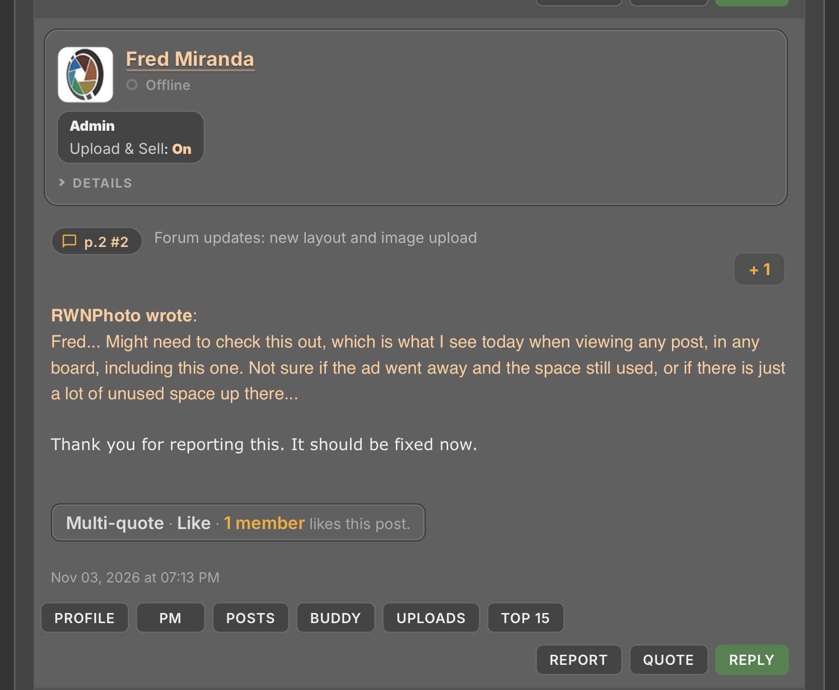
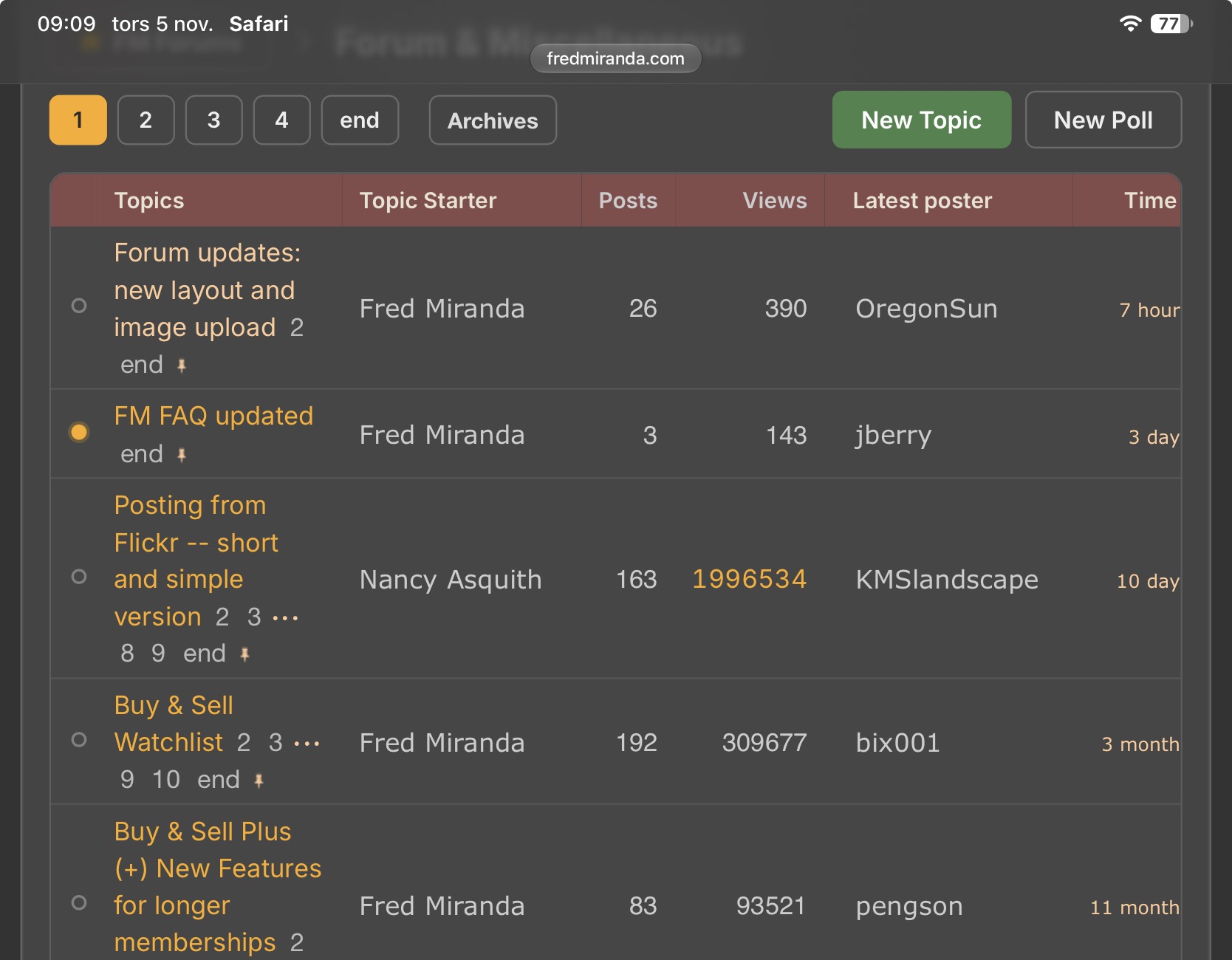
The bad: on my iPad the user panel, buttons etc takes up to much space compared to the text or title. If I switch to landscape everything looks better but I don’t think I should need to do that with an 11 inch screen.
Two examples below.
Nov 05, 2026 at 02:16 AM
p.2 #8Forum updates: new layout and image upload
Fred Miranda wrote:
I've been working on the newer Control Panel for a while and I'm confident it's pretty much bug free. Please check it and report any issues: https://www.fredmiranda.com/forum/controlpanel.php
Thank you! 😅
There’s some kind of bug to do with time zones.
I’m currently at UTC+11 (summer time) but your Control Panel showed one hour behind (UTC+10). So I clicked on the "match device time” and nothing happened. Then I went into Edit Profile and it showed the correct GMT + 11. I clicked on the “match device time” there, with it still showing GMT + 11, and saved the edit. Back at the control panel the time was now correct.
Then I refreshed the forum window I’d had open all along and the post times jumped forward an hour as expected.
Safari 27.2 on macOS 27.2.
I've been working on the newer Control Panel for a while and I'm confident it's pretty much bug free. Please check it and report any issues: https://www.fredmiranda.com/forum/controlpanel.php
Thank you! 😅
There’s some kind of bug to do with time zones.
I’m currently at UTC+11 (summer time) but your Control Panel showed one hour behind (UTC+10). So I clicked on the "match device time” and nothing happened. Then I went into Edit Profile and it showed the correct GMT + 11. I clicked on the “match device time” there, with it still showing GMT + 11, and saved the edit. Back at the control panel the time was now correct.
Then I refreshed the forum window I’d had open all along and the post times jumped forward an hour as expected.
Safari 27.2 on macOS 27.2.
Nov 05, 2026 at 03:28 AM
p.2 #9Forum updates: new layout and image upload
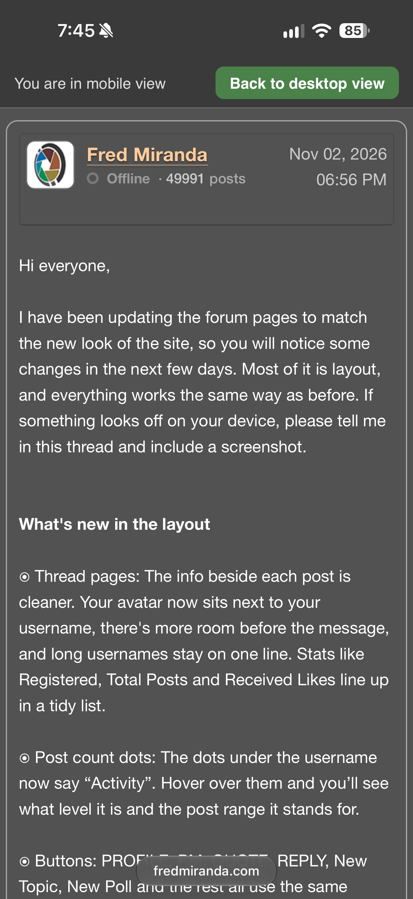
One issue I’m having on mobile is there is a persistent banner at the top that constantly says “you are in mobile view” with a giant “back to desktop view” button. This is quite unnecessary and distracting.
Nov 05, 2026 at 06:48 AM
p.2 #10Forum updates: new layout and image upload
Since today, some of the advertisements lead to a disruption of postings where all text is appearing only in a fairly small column on the right side of the screen. This continues for a few posts in a row. After a few of them, it turns back to normal posts with all written in the screen size lines. Clearly the interruption with the layout derives from some advertisements especially when they show up on the left of the screen and not underneath a post. Currently shown in recent posts in the Alt Forum where I observed it.
Nov 05, 2026 at 07:11 AM
|
p.2 #11Forum updates: new layout and image upload
retrofocus wrote:
Since today, some of the advertisements lead to a disruption of postings where all text is appearing only in a fairly small column on the right side of the screen. This continues for a few posts in a row. After a few of them, it turns back to normal posts with all written in the screen size lines. Clearly the interruption with the layout derives from some advertisements especially when they show up on the left of the screen and not underneath a post. Currently shown in recent posts in the Alt Forum where I observed it.
I am seeing the same thing.
Since today, some of the advertisements lead to a disruption of postings where all text is appearing only in a fairly small column on the right side of the screen. This continues for a few posts in a row. After a few of them, it turns back to normal posts with all written in the screen size lines. Clearly the interruption with the layout derives from some advertisements especially when they show up on the left of the screen and not underneath a post. Currently shown in recent posts in the Alt Forum where I observed it.
I am seeing the same thing.
Nov 05, 2026 at 07:30 AM
p.2 #12Forum updates: new layout and image upload
New for me today is the large number of pop-up advertisements which are taking over each pages. Is that the new norm?
Nov 05, 2026 at 08:17 AM
p.2 #13Forum updates: new layout and image upload
Al Trujillo wrote:
New for me today is the large number of pop-up advertisements which are taking over each pages. Is that the new norm?
Yes I find it annoying, too.
New for me today is the large number of pop-up advertisements which are taking over each pages. Is that the new norm?
Yes I find it annoying, too.
Nov 05, 2026 at 08:35 AM
p.2 #14Forum updates: new layout and image upload
The Mark Board Read button on the bottom of each forum is giving an URL not found error. I’d love to see a global Mark Site Read button as well if possible 
Nov 05, 2026 at 09:33 AM
p.2 #15Forum updates: new layout and image upload
Thanks everyone for the reports. Here is where things stand..
Ads: Google decides where its automatic ads go, and they were landing inside posts and breaking the layout. That's fixed. I also reduced how many automatic ads can appear and increased the space between them. Those changes can take a little while to show up. If you still see a pop-up ad, please post a screenshot and tell me what device you're using.
Mark board as read: the "URL not found" error is fixed.
Time zone: "Match your device" was saving the new time zone, but the page kept showing the old one until the next visit. It now updates right away.
Mobile banner: phones no longer show the "You are in mobile view" bar. There's still a Desktop view link at the bottom of the page.
iPad: when the member panel sits above the post, it's now a compact row, so it takes up less space.
Colors: thanks for the feedback on the green and orange. I’m looking at softer versions.
Ads: Google decides where its automatic ads go, and they were landing inside posts and breaking the layout. That's fixed. I also reduced how many automatic ads can appear and increased the space between them. Those changes can take a little while to show up. If you still see a pop-up ad, please post a screenshot and tell me what device you're using.
Mark board as read: the "URL not found" error is fixed.
Time zone: "Match your device" was saving the new time zone, but the page kept showing the old one until the next visit. It now updates right away.
Mobile banner: phones no longer show the "You are in mobile view" bar. There's still a Desktop view link at the bottom of the page.
iPad: when the member panel sits above the post, it's now a compact row, so it takes up less space.
Colors: thanks for the feedback on the green and orange. I’m looking at softer versions.
Nov 05, 2026 at 09:35 AM
p.2 #16Forum updates: new layout and image upload
The site updates look fantastic. Thank you!
Nov 05, 2026 at 09:59 AM
p.2 #17Forum updates: new layout and image upload
Thanks Fred! Looking good!
Nov 05, 2026 at 10:36 AM
p.2 #18Forum updates: new layout and image upload
jeffbuzz wrote:
The site updates look fantastic. Thank you!
Thank you Jeff!
----
BTW: I've brought back our Classic FM smilies! If you're feeling nostalgic, just click on the "Classic FM smilies".
The site updates look fantastic. Thank you!
Thank you Jeff!
----
BTW: I've brought back our Classic FM smilies! If you're feeling nostalgic, just click on the "Classic FM smilies".
Nov 05, 2026 at 10:37 AM
p.2 #19Forum updates: new layout and image upload
Getting better every day, great work.
Nov 05, 2026 at 10:49 AM
p.2 #20Forum updates: new layout and image upload
OregonSun wrote:
Your modernization updates look great and improve functionality.
My only complaint is the garishness of the green and brighter orange colors you're using compared to the rest of the site. My eye is pulled away from the photos and text, which IMO should be the focus of the site.
Maybe try a more muted color scheme based on some of the colors in your logo.
I'm sensitive to this, so your feedback matters to me. I have toned down the yellow buttons in the page number pagination and removed the green "Reply" button from every individual post on the topic view page.
Your modernization updates look great and improve functionality.
My only complaint is the garishness of the green and brighter orange colors you're using compared to the rest of the site. My eye is pulled away from the photos and text, which IMO should be the focus of the site.
Maybe try a more muted color scheme based on some of the colors in your logo.
I'm sensitive to this, so your feedback matters to me. I have toned down the yellow buttons in the page number pagination and removed the green "Reply" button from every individual post on the topic view page.
Nov 05, 2026 at 11:13 AM