
Forum updates: new layout and image upload
p.1 #1Forum updates: new layout and image upload
Hi everyone,
This layout update has been a very delicate process, because we are all so used to the look and feel of the site after many years. When something shifts, we notice it right away (trust me, I do!), and we all know where everything sits. While some pages look quite different now, I tried to keep the main forum, board and topic pages as close to the original look and feel as possible, even with new code running underneath everywhere.
It's been a slow process of testing, so please keep the feedback coming. If you spot anything off, or run into a page still showing the older design, let me know here and include a screenshot if you can. I will get it fixed as soon as I can.
New homepage and Dashboard
⦿ Homepage: A cleaner design with winning member photos, the current assignments and the latest news. News stories now keep their formatting and links, and you can read more right on the page.
⦿ Dashboard: The old Control Panel is now the Dashboard. You can see your unread PMs, notifications, latest posts and account status at a glance. Click your icon at the top of the site to get there.
Reading the forum
⦿ New posts line: When you return to a thread, a “New Posts” line shows exactly where you left off.
⦿ New post icons: The board icons were redrawn and are more accurate. A thread now shows as new until you've read to the end, and it works across your devices. There's also a “Mark board as read” button.
⦿ Thread pages: The info beside each post is cleaner and takes less room, and the buttons all share the same modern style. Hover over the dots under a username to see what the “Activity” level means.
⦿ Likes: Hover over the likes on a post to see who liked it.
⦿ Buy & Sell: The listings and filters have been redone, and the icons now match the filter bar.
⦿ Phones: Thread pages and Buy & Sell filters are much easier to use on small screens. You can switch between mobile and desktop views at any time.
Writing your message
⦿ Live preview: As you type, your post appears right under the message box, exactly as it will look in the thread. Bold text, quotes, links and smilies all show up, so you can catch mistakes before you send it.
⦿ Formatting buttons: Select your text and click a button. There's now strikethrough and heading sizes, and the buttons light up to show what's active. No need to remember any codes.
⦿ Smilies: Modern emoji are available in every message box. The classic FM smilies are back too, one click away, for those who miss them after more than 20 years.
⦿ Light or dark background: One button switches the writing area between dark and light. It only changes how the box looks while you type.
Image upload is much better
This was long overdue. Now there's one box: drag your pictures into it, or click “choose images” and select several at once. You can set the frame and EXIF option once for all of them, and any problem with a file shows up right away, not after a failed upload.
The limits are the same as before: about 5 MB per image, 8 images per post, and 12 for higher levels.
Private messages
⦿ New look: The PM pages have been completely revamped.
⦿ PM alert: The message icon at the top of the site turns gold and shows how many unread PMs you have.
⦿ Watchlist: Automated watchlist PMs are easier to read. The subject shows your keyword, and the message shows just the thread title.
Polls and profiles
⦿ Polls: The New Poll form and the vote and results card were rebuilt, and you can now edit a poll after creating it.
⦿ Profiles: The profile page has a new layout showing feedback and each member's public information.
Thanks for your patience while I worked through all of this, and for the reports that helped me fix things along the way. Let me know what you think. 😊
Fred
This layout update has been a very delicate process, because we are all so used to the look and feel of the site after many years. When something shifts, we notice it right away (trust me, I do!), and we all know where everything sits. While some pages look quite different now, I tried to keep the main forum, board and topic pages as close to the original look and feel as possible, even with new code running underneath everywhere.
It's been a slow process of testing, so please keep the feedback coming. If you spot anything off, or run into a page still showing the older design, let me know here and include a screenshot if you can. I will get it fixed as soon as I can.
New homepage and Dashboard
⦿ Homepage: A cleaner design with winning member photos, the current assignments and the latest news. News stories now keep their formatting and links, and you can read more right on the page.
⦿ Dashboard: The old Control Panel is now the Dashboard. You can see your unread PMs, notifications, latest posts and account status at a glance. Click your icon at the top of the site to get there.
Reading the forum
⦿ New posts line: When you return to a thread, a “New Posts” line shows exactly where you left off.
⦿ New post icons: The board icons were redrawn and are more accurate. A thread now shows as new until you've read to the end, and it works across your devices. There's also a “Mark board as read” button.
⦿ Thread pages: The info beside each post is cleaner and takes less room, and the buttons all share the same modern style. Hover over the dots under a username to see what the “Activity” level means.
⦿ Likes: Hover over the likes on a post to see who liked it.
⦿ Buy & Sell: The listings and filters have been redone, and the icons now match the filter bar.
⦿ Phones: Thread pages and Buy & Sell filters are much easier to use on small screens. You can switch between mobile and desktop views at any time.
Writing your message
⦿ Live preview: As you type, your post appears right under the message box, exactly as it will look in the thread. Bold text, quotes, links and smilies all show up, so you can catch mistakes before you send it.
⦿ Formatting buttons: Select your text and click a button. There's now strikethrough and heading sizes, and the buttons light up to show what's active. No need to remember any codes.
⦿ Smilies: Modern emoji are available in every message box. The classic FM smilies are back too, one click away, for those who miss them after more than 20 years.
⦿ Light or dark background: One button switches the writing area between dark and light. It only changes how the box looks while you type.
Image upload is much better
This was long overdue. Now there's one box: drag your pictures into it, or click “choose images” and select several at once. You can set the frame and EXIF option once for all of them, and any problem with a file shows up right away, not after a failed upload.
The limits are the same as before: about 5 MB per image, 8 images per post, and 12 for higher levels.
Private messages
⦿ New look: The PM pages have been completely revamped.
⦿ PM alert: The message icon at the top of the site turns gold and shows how many unread PMs you have.
⦿ Watchlist: Automated watchlist PMs are easier to read. The subject shows your keyword, and the message shows just the thread title.
Polls and profiles
⦿ Polls: The New Poll form and the vote and results card were rebuilt, and you can now edit a poll after creating it.
⦿ Profiles: The profile page has a new layout showing feedback and each member's public information.
Thanks for your patience while I worked through all of this, and for the reports that helped me fix things along the way. Let me know what you think. 😊
Fred
Nov 02, 2026 at 05:56 PM
p.1 #2Forum updates: new layout and image upload
Well done sir, well done! I started a thread in the Sony forum if you want to direct everyone here...
The new update gives a "fresh feel" to an already outstanding site.
Keep up the great work. 🍺🍺🍺
Hatch
The new update gives a "fresh feel" to an already outstanding site.
Keep up the great work. 🍺🍺🍺
Hatch
Nov 02, 2026 at 07:57 PM
p.1 #3Forum updates: new layout and image upload
hatch1921 wrote:
Well done sir, well done! I started a thread in the Sony forum if you want to direct everyone here...
The new update gives a "fresh feel" to an already outstanding site.
Keep up the great work. 🍺🍺🍺
Hatch
Thank you for the encouraging words! 🔥
(trying the new emoticon above too. :-)
Well done sir, well done! I started a thread in the Sony forum if you want to direct everyone here...
The new update gives a "fresh feel" to an already outstanding site.
Keep up the great work. 🍺🍺🍺
Hatch
Thank you for the encouraging words! 🔥
(trying the new emoticon above too. :-)
Nov 02, 2026 at 08:07 PM
p.1 #4Forum updates: new layout and image upload
I like the new look where it's popping up. Are the main forum pages going to be updated with the rounded corners and accent colors? It's a bit jarring to see the hard lines and rectangles alongside some of the new stuff.
Nov 02, 2026 at 08:21 PM
p.1 #5Forum updates: new layout and image upload
RomanMF wrote:
I like the new look where it's popping up. Are the main forum pages going to be updated with the rounded corners and accent colors? It's a bit jarring to see the hard lines and rectangles alongside some of the new stuff.
Thanks for the feedback! It's my plan but changes like this take a lot of testing so, it may take a little while. I will update this thread with every new change. 👍
I like the new look where it's popping up. Are the main forum pages going to be updated with the rounded corners and accent colors? It's a bit jarring to see the hard lines and rectangles alongside some of the new stuff.
Thanks for the feedback! It's my plan but changes like this take a lot of testing so, it may take a little while. I will update this thread with every new change. 👍
Nov 02, 2026 at 09:08 PM
p.1 #6Forum updates: new layout and image upload
Sick.
One other note since it's fresh on my mind. It would be nice if users’ profile names were hyperlinked in the PM interface. I just received a PM and when I clicked into read it, I wanted to then check the user's profile, but the name wasn't clickable. It would be nice if I could see the info on a hover, but a clickable link is the next best thing.
One other note since it's fresh on my mind. It would be nice if users’ profile names were hyperlinked in the PM interface. I just received a PM and when I clicked into read it, I wanted to then check the user's profile, but the name wasn't clickable. It would be nice if I could see the info on a hover, but a clickable link is the next best thing.
Nov 02, 2026 at 09:09 PM
p.1 #7Forum updates: new layout and image upload
RomanMF wrote:
Sick.
One other note since it's fresh on my mind. It would be nice if users’ profile names were hyperlinked in the PM interface. I just received a PM and when I clicked into read it, I wanted to then check the user's profile, but the name wasn't clickable. It would be nice if I could see the info on a hover, but a clickable link is the next best thing.
Just added the hyperlink.
Sick.
One other note since it's fresh on my mind. It would be nice if users’ profile names were hyperlinked in the PM interface. I just received a PM and when I clicked into read it, I wanted to then check the user's profile, but the name wasn't clickable. It would be nice if I could see the info on a hover, but a clickable link is the next best thing.
Just added the hyperlink.
Nov 02, 2026 at 09:23 PM
p.1 #8Forum updates: new layout and image upload
Might be just me, but the ads cover part of the listing when viewing the Buy and Sale page (using an iPhone).
Nov 02, 2026 at 09:31 PM
p.1 #9Forum updates: new layout and image upload
I am getting an overlap on left side of page. Would be nice if there was a white vertical line separating the two sections.
Tony
Tony
Nov 02, 2026 at 10:39 PM
p.1 #10Forum updates: new layout and image upload
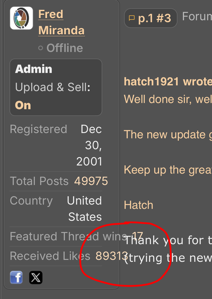
Seems there is much more wasted space and extra scrolling due to the tall profile section on the left side. It's about 1/3 of the whole page height. Maybe make it collapsed and then expand details if necessary. We don't need to see the full profile again and again if someone posts many times in the same thread for example.
The FM banner ads are a bit excessive. Maybe just have it load once after logging in or visiting a page, not having to reload and redraw the page 8 times when viewing 8 forums.
EBH
The FM banner ads are a bit excessive. Maybe just have it load once after logging in or visiting a page, not having to reload and redraw the page 8 times when viewing 8 forums.
EBH
Nov 02, 2026 at 10:54 PM
|
p.1 #11Forum updates: new layout and image upload
I like the new rounded look as it feels sleek and modern. Would it be possible to add a light theme as well?
Nov 02, 2026 at 11:17 PM

p.1 #12Forum updates: new layout and image upload
EB-1 wrote:
Seems there is much more wasted space and extra scrolling due to the tall profile section on the left side. It's about 1/3 of the whole page height. Maybe make it collapsed and then expand details if necessary. We don't need to see the full profile again and again if someone posts many times in the same thread for example.
The FM banner ads are a bit excessive. Maybe just have it load once after logging in or visiting a page, not having to reload and redraw the page 8 times when viewing 8 forums.
EBH
Or load the ad first, and not the last thing loaded on the page
Seems there is much more wasted space and extra scrolling due to the tall profile section on the left side. It's about 1/3 of the whole page height. Maybe make it collapsed and then expand details if necessary. We don't need to see the full profile again and again if someone posts many times in the same thread for example.
The FM banner ads are a bit excessive. Maybe just have it load once after logging in or visiting a page, not having to reload and redraw the page 8 times when viewing 8 forums.
EBH
Or load the ad first, and not the last thing loaded on the page
Nov 03, 2026 at 07:06 AM
p.1 #13Forum updates: new layout and image upload
Really nice update Fred! I am liking the refresh.
One tiny thing that could be a big help... Not sure how difficult it would be to implement the Preview option in posting, but I know the engine is already there because I found I can choose to preview a PM before hitting send. I think it would help immensely with peace of mind and also with users not doing double posts so they can review the content then post the clean version, plus avoid responses before we are ready with our final version posted as intended.
Eric
One tiny thing that could be a big help... Not sure how difficult it would be to implement the Preview option in posting, but I know the engine is already there because I found I can choose to preview a PM before hitting send. I think it would help immensely with peace of mind and also with users not doing double posts so they can review the content then post the clean version, plus avoid responses before we are ready with our final version posted as intended.
Eric
Nov 03, 2026 at 08:04 AM
p.1 #14Forum updates: new layout and image upload
Very well done Fred! "Snazzy" as I stated earlier. While FM has always been highly professional in its website layout, this is REALLY great!
Dan
Edited on Nov 03, 2026 at 10:29 AM · View previous versions
Dan
Edited on Nov 03, 2026 at 10:29 AM · View previous versions
Nov 03, 2026 at 09:07 AM
p.1 #15Forum updates: new layout and image upload
Imagemaster wrote:
I am getting an overlap on left side of page. Would be nice if there was a white vertical line separating the two sections.
Tony
Hi Tony,
Thanks for reporting this. I wasn't able to reproduce the issue on my end, but I have updated the code with a potential fix.
Could you please test it out and let me know if it resolves the issue for you?
I am getting an overlap on left side of page. Would be nice if there was a white vertical line separating the two sections.
Tony
Hi Tony,
Thanks for reporting this. I wasn't able to reproduce the issue on my end, but I have updated the code with a potential fix.
Could you please test it out and let me know if it resolves the issue for you?
Nov 03, 2026 at 09:40 AM
p.1 #16Forum updates: new layout and image upload
EB-1 wrote:
Seems there is much more wasted space and extra scrolling due to the tall profile section on the left side. It's about 1/3 of the whole page height. Maybe make it collapsed and then expand details if necessary. We don't need to see the full profile again and again if someone posts many times in the same thread for example.
The FM banner ads are a bit excessive. Maybe just have it load once after logging in or visiting a page, not having to reload and redraw the page 8 times when viewing 8 forums.
EBH
Thanks for the suggestions, EB-1, they were both helpful.
The member info on the left is now collapsed by default. You see the avatar, name, online status, activity level and Upload & Sell status, and a small "Details" link opens the rest (registered date, posts, country, likes and so on) when you want it. That should cut a lot of the extra scrolling.
For the FM banners, I've limited them to one per visit. After you see one, you won't get another until you come back later. That should stop the repeated redraws as you move between forums....Thanks again for taking the time to share this. If anything still feels off, let me know.
Seems there is much more wasted space and extra scrolling due to the tall profile section on the left side. It's about 1/3 of the whole page height. Maybe make it collapsed and then expand details if necessary. We don't need to see the full profile again and again if someone posts many times in the same thread for example.
The FM banner ads are a bit excessive. Maybe just have it load once after logging in or visiting a page, not having to reload and redraw the page 8 times when viewing 8 forums.
EBH
Thanks for the suggestions, EB-1, they were both helpful.
The member info on the left is now collapsed by default. You see the avatar, name, online status, activity level and Upload & Sell status, and a small "Details" link opens the rest (registered date, posts, country, likes and so on) when you want it. That should cut a lot of the extra scrolling.
For the FM banners, I've limited them to one per visit. After you see one, you won't get another until you come back later. That should stop the repeated redraws as you move between forums....Thanks again for taking the time to share this. If anything still feels off, let me know.
Nov 03, 2026 at 10:07 AM
p.1 #17Forum updates: new layout and image upload
Danpbphoto wrote:
Very well done Fred! "Snazzy" as I stated earlier. While FM has always been highly professional in its website layout, this is REALLY great!
There seems to be a small glitch on the "Assignment" pages.
It has missed a week.
It could be a reason I have discussed with you before, if so fine.
Again SUPER!
Dan
Hi Dan,
Which week has it missed? An older one or a recent one? Thanks for info.
Very well done Fred! "Snazzy" as I stated earlier. While FM has always been highly professional in its website layout, this is REALLY great!
There seems to be a small glitch on the "Assignment" pages.
It has missed a week.
It could be a reason I have discussed with you before, if so fine.
Again SUPER!
Dan
Hi Dan,
Which week has it missed? An older one or a recent one? Thanks for info.
Nov 03, 2026 at 10:10 AM
p.1 #18Forum updates: new layout and image upload
RWNPhoto wrote:
The FM banner ads are a bit excessive. Maybe just have it load once after logging in or visiting a page, not having to reload and redraw the page 8 times when viewing 8 forums.
EBHOr load the ad first, and not the last thing loaded on the page
I made the banner appear sooner during the page load, so it no longer shows up as the last thing to load.
EB-1 wrote
Seems there is much more wasted space and extra scrolling due to the tall profile section on the left side. It's about 1/3 of the whole page height. Maybe make it collapsed and then expand details if necessary. We don't need to see the full profile again and again if someone posts many times in the same thread for example.The FM banner ads are a bit excessive. Maybe just have it load once after logging in or visiting a page, not having to reload and redraw the page 8 times when viewing 8 forums.
EBH
I made the banner appear sooner during the page load, so it no longer shows up as the last thing to load.
Nov 03, 2026 at 10:11 AM
p.1 #19Forum updates: new layout and image upload
Erictator wrote:
Really nice update Fred! I am liking the refresh.
One tiny thing that could be a big help... Not sure how difficult it would be to implement the Preview option in posting, but I know the engine is already there because I found I can choose to preview a PM before hitting send. I think it would help immensely with peace of mind and also with users not doing double posts so they can review the content then post the clean version, plus avoid responses before we are ready with our final version posted as intended.
Eric
Thanks, Eric, that's a good suggestion. The forum post form doesn't have a preview right now, only PMs do, but it's something I can add but I can't do it quickly as it's not as trivial as it seems. I will add it to my list for the posting forms.
Really nice update Fred! I am liking the refresh.
One tiny thing that could be a big help... Not sure how difficult it would be to implement the Preview option in posting, but I know the engine is already there because I found I can choose to preview a PM before hitting send. I think it would help immensely with peace of mind and also with users not doing double posts so they can review the content then post the clean version, plus avoid responses before we are ready with our final version posted as intended.
Eric
Thanks, Eric, that's a good suggestion. The forum post form doesn't have a preview right now, only PMs do, but it's something I can add but I can't do it quickly as it's not as trivial as it seems. I will add it to my list for the posting forms.
Nov 03, 2026 at 10:22 AM
p.1 #20Forum updates: new layout and image upload
Fred Miranda wrote:
There seems to be a small glitch on the "Assignment" pages.
It has missed a week.
It could be a reason I have discussed with you before, if so fine.
Again SUPER!
DanHi Dan,
Which week has it missed? An older one or a recent one? Thanks for info.
I apologize as I "spoke out of" ignorance Fred.
I am missing a few weeks in the last 30 days and my comment was "ill timed".
Dan
OH!...Could there be a military emoticon added to the list? We have many veterans on FM as a "specialized" Thank you might be nice. Be they vets, active or otherwise.
There was an issue but Fred resolved immediately.
Edited on Nov 06, 2026 at 10:44 AM · View previous versions
Danpbphoto wrote
Very well done Fred! "Snazzy" as I stated earlier. While FM has always been highly professional in its website layout, this is REALLY great!There seems to be a small glitch on the "Assignment" pages.
It has missed a week.
It could be a reason I have discussed with you before, if so fine.
Again SUPER!
Dan
Which week has it missed? An older one or a recent one? Thanks for info.
I apologize as I "spoke out of" ignorance Fred.
I am missing a few weeks in the last 30 days and my comment was "ill timed".
Dan
OH!...Could there be a military emoticon added to the list? We have many veterans on FM as a "specialized" Thank you might be nice. Be they vets, active or otherwise.
There was an issue but Fred resolved immediately.
Edited on Nov 06, 2026 at 10:44 AM · View previous versions
Nov 03, 2026 at 10:28 AM