
Forum updates: new layout and image upload
p.5 #1Forum updates: new layout and image upload
Small item, but there seems to be something wrong with the "my notifications". I saw a notification about 2 new likes. I looked at the first and the number dropped to 1, but now when I visit the entries in the list I don't see new likes and the new likes stays at 1.
Nov 09, 2026 at 10:54 PM
p.5 #2Forum updates: new layout and image upload
RomanMF wrote:
@Fred Miranda is there a way to see the threads you've created or your open B&S items in the profile dashboard? I've got two lenses up for sale now and I don't see an easy way to track down those threads.
Roman,
Please check out the updates I made to the Dashboard...I think you'll like them. When you select a board (such as B&S), it will now save your choice and remember it when you return.
@Fred Miranda is there a way to see the threads you've created or your open B&S items in the profile dashboard? I've got two lenses up for sale now and I don't see an easy way to track down those threads.
Roman,
Please check out the updates I made to the Dashboard...I think you'll like them. When you select a board (such as B&S), it will now save your choice and remember it when you return.
Nov 10, 2026 at 10:16 AM
p.5 #3Forum updates: new layout and image upload
Before it was a lot easier to go to different forums than now having to go to 'FM Forum' and scroll through them there.
Nov 10, 2026 at 10:52 AM
p.5 #4Forum updates: new layout and image upload
Imagemaster wrote:
Before it was a lot easier to go to different forums than now having to go to 'FM Forum' and scroll through them there.
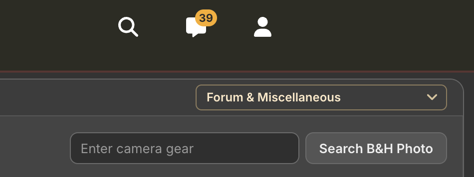
Thanks for the feedback! Could you clarify what you mean? The forum, board, and topic views all include a "Surf to" board dropdown menu in the top right corner of every page.
Here is an image showing its exact location:
Before it was a lot easier to go to different forums than now having to go to 'FM Forum' and scroll through them there.
Thanks for the feedback! Could you clarify what you mean? The forum, board, and topic views all include a "Surf to" board dropdown menu in the top right corner of every page.
Here is an image showing its exact location:
 |
||
 |
||
|
Nov 10, 2026 at 11:03 AM
p.5 #6Forum updates: new layout and image upload
Imagemaster wrote:
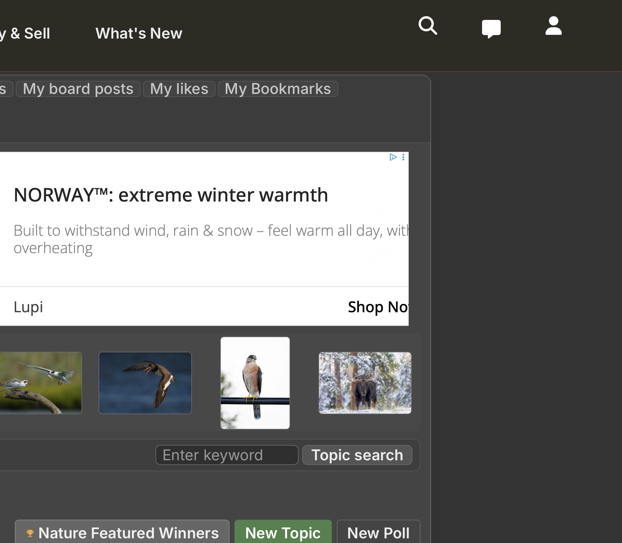
I have this:
Can you post a full width of the top of the page? Thank you!
I have this:
Can you post a full width of the top of the page? Thank you!
Nov 10, 2026 at 12:42 PM
p.5 #8Forum updates: new layout and image upload
Imagemaster wrote:
*
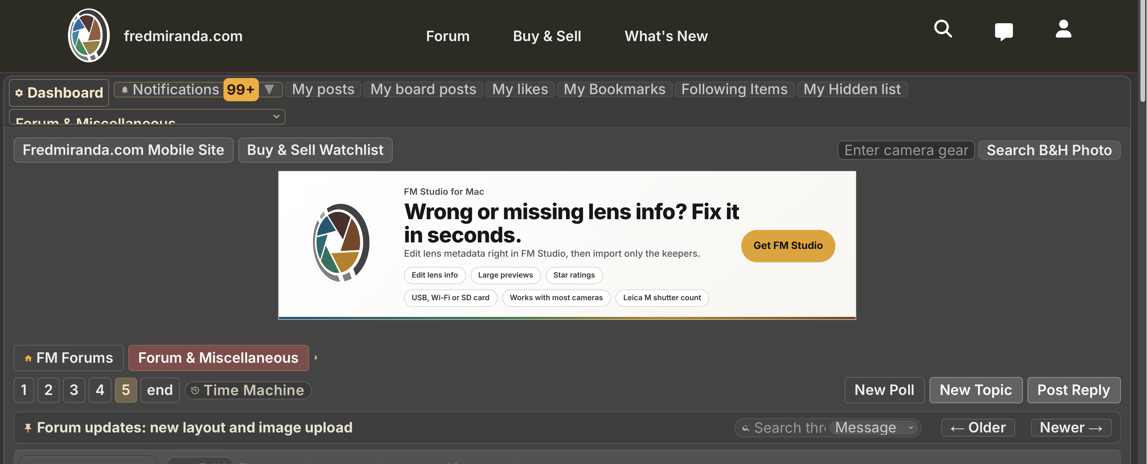
I see what's happening to you. it's skipping a line and the "jump to board" dropdown is showing up on the other side. I will work on it, thanks for the screenshot.
*
I see what's happening to you. it's skipping a line and the "jump to board" dropdown is showing up on the other side. I will work on it, thanks for the screenshot.
Nov 10, 2026 at 02:05 PM
p.5 #10Forum updates: new layout and image upload
I've updated the layout so that regardless of how you're viewing the site, the 'Jump to Board' menu will always stay anchored on the far right...right where muscle memory expects it to be. 
Nov 10, 2026 at 03:26 PM
|
p.5 #11Forum updates: new layout and image upload
Fred Miranda wrote:
I've updated the layout so that regardless of how you're viewing the site, the 'Jump to Board' menu will always stay anchored on the far right...right where muscle memory expects it to be.
Thanks, because I only have half muscle memory now.
Or

I've updated the layout so that regardless of how you're viewing the site, the 'Jump to Board' menu will always stay anchored on the far right...right where muscle memory expects it to be.
Thanks, because I only have half muscle memory now.
Or
Nov 10, 2026 at 09:35 PM
p.5 #12Forum updates: new layout and image upload
Now Live: We've launched a fresh mobile layout that brings the newly-updated, full-featured feel of fredmiranda.com's desktop experience to your phone.
Nov 10, 2026 at 09:59 PM
p.5 #13Forum updates: new layout and image upload
Imagemaster wrote:
Thanks, because I only have half muscle memory now.
Or
Please try again. While your browser defaults seem to have changed significantly, I believe my recent fix will resolve the issue.
Fred Miranda wrote
I've updated the layout so that regardless of how you're viewing the site, the 'Jump to Board' menu will always stay anchored on the far right...right where muscle memory expects it to be.Or
Please try again. While your browser defaults seem to have changed significantly, I believe my recent fix will resolve the issue.
Nov 10, 2026 at 10:52 PM
p.5 #14Forum updates: new layout and image upload
Is it possible to move the 'Mark board as read' to the top as well? That way there's no need to scroll the bottom to click that button.
Nov 11, 2026 at 07:15 AM

p.5 #16Forum updates: new layout and image upload
I really don’t like the new look.
There are borders around every single link, and they all have different colors! That makes the overall look so much more distracting than before.
It also seems like we lost the link to go into PM Inbox directly. Now the only way to go there from any page is through the notification dropdown, which doesn’t work on mobile devices (click the menu item would trigger the link below).
Would send a screenshot if it doesn’t require upload & sell.
There are borders around every single link, and they all have different colors! That makes the overall look so much more distracting than before.
It also seems like we lost the link to go into PM Inbox directly. Now the only way to go there from any page is through the notification dropdown, which doesn’t work on mobile devices (click the menu item would trigger the link below).
Would send a screenshot if it doesn’t require upload & sell.
Nov 11, 2026 at 03:30 PM
p.5 #17Forum updates: new layout and image upload
gjoliver wrote:
I really don’t like the new look.
There are borders around every single link, and they all have different colors! That makes the overall look so much more distracting than before.
It also seems like we lost the link to go into PM Inbox directly. Now the only way to go there from any page is through the notification dropdown, which doesn’t work on mobile devices (click the menu item would trigger the link below).
Would send a screenshot if it doesn’t require upload & sell.
Thanks for the honest feedback, gjoliver. Most of the feedback so far has been positive, but I know it's a matter of taste and I appreciate you telling me. We kept the same colors as before so the site would still feel familiar, and I will keep an eye on how members react to the link borders.
On the PMs, there should still be a direct way in. The new header has a PM icon on both desktop and mobile, and it shows a count when you have new messages. If you don’t see it, please reload the page, since the old header can stay cached. If it's still missing, could you tell me if you're on desktop or mobile, and which device and browser? That will help me track it down. The notification dropdown issue on mobile is useful to know about too.
For a screenshot, you don't need Upload & Sell. You can email it to me or send it by PM, whichever is easier.
Thanks again for taking the time to write.
I really don’t like the new look.
There are borders around every single link, and they all have different colors! That makes the overall look so much more distracting than before.
It also seems like we lost the link to go into PM Inbox directly. Now the only way to go there from any page is through the notification dropdown, which doesn’t work on mobile devices (click the menu item would trigger the link below).
Would send a screenshot if it doesn’t require upload & sell.
Thanks for the honest feedback, gjoliver. Most of the feedback so far has been positive, but I know it's a matter of taste and I appreciate you telling me. We kept the same colors as before so the site would still feel familiar, and I will keep an eye on how members react to the link borders.
On the PMs, there should still be a direct way in. The new header has a PM icon on both desktop and mobile, and it shows a count when you have new messages. If you don’t see it, please reload the page, since the old header can stay cached. If it's still missing, could you tell me if you're on desktop or mobile, and which device and browser? That will help me track it down. The notification dropdown issue on mobile is useful to know about too.
For a screenshot, you don't need Upload & Sell. You can email it to me or send it by PM, whichever is easier.
Thanks again for taking the time to write.
Nov 11, 2026 at 07:45 PM
p.5 #18Forum updates: new layout and image upload
Been out taking photos for the last 5 days with no internet service. Definitely not a fan of the latest design changes for mobile.
When viewing a Board, Topics now take up too many lines with extraneous info (pages, posts, views, etc.). Having to scroll more to access the same important info (title, author, link to last post) is a degraded experience IMO.
Same opinion of the similar changes to posts in a thread. Do we really need to see all the member info on every post? You could make it expandable and collapsed by default if you really think people want access to that on their phones. Number of likes is displayed twice per post. The buttons at the bottom of a post now consume up to 3 lines and are a odd mix of post (reply, quote) and poster (top 15, www, hide me, etc.) related actions.
Again, all this clutter is burying the most important info (author, images, text, post date) and obscuring the back and forth of the thread discussion.
Desktop site is looking good, but the mobile experience needs some streamlining.
When viewing a Board, Topics now take up too many lines with extraneous info (pages, posts, views, etc.). Having to scroll more to access the same important info (title, author, link to last post) is a degraded experience IMO.
Same opinion of the similar changes to posts in a thread. Do we really need to see all the member info on every post? You could make it expandable and collapsed by default if you really think people want access to that on their phones. Number of likes is displayed twice per post. The buttons at the bottom of a post now consume up to 3 lines and are a odd mix of post (reply, quote) and poster (top 15, www, hide me, etc.) related actions.
Again, all this clutter is burying the most important info (author, images, text, post date) and obscuring the back and forth of the thread discussion.
Desktop site is looking good, but the mobile experience needs some streamlining.
Nov 11, 2026 at 07:55 PM
p.5 #19Forum updates: new layout and image upload
OregonSun wrote:
Been out taking photos for the last 5 days with no internet service. Definitely not a fan of the latest design changes for mobile.
When viewing a Board, Topics now take up too many lines with extraneous info (pages, posts, views, etc.). Having to scroll more to access the same important info (title, author, link to last post) is a degraded experience IMO.
Same opinion of the similar changes to posts in a thread. Do we really need to see all the member info on every post? You could make it expandable and collapsed by default if you really think people want...Show more →
Thanks for the detailed feedback, I really appreciate it.
I agree with most of it, and I'm still working on the mobile layout. I've already made some changes: shorter topic rows on the board, a more compact poster info area on each post (tap Details for the rest), and fewer buttons per post. Please check it out and let me know what you think. If it still looks the same, reload the page first. More tweaks are coming.
Been out taking photos for the last 5 days with no internet service. Definitely not a fan of the latest design changes for mobile.
When viewing a Board, Topics now take up too many lines with extraneous info (pages, posts, views, etc.). Having to scroll more to access the same important info (title, author, link to last post) is a degraded experience IMO.
Same opinion of the similar changes to posts in a thread. Do we really need to see all the member info on every post? You could make it expandable and collapsed by default if you really think people want...Show more →
Thanks for the detailed feedback, I really appreciate it.
I agree with most of it, and I'm still working on the mobile layout. I've already made some changes: shorter topic rows on the board, a more compact poster info area on each post (tap Details for the rest), and fewer buttons per post. Please check it out and let me know what you think. If it still looks the same, reload the page first. More tweaks are coming.
Nov 11, 2026 at 08:50 PM
p.5 #20Forum updates: new layout and image upload
OregonSun wrote:
Been out taking photos for the last 5 days with no internet service. Definitely not a fan of the latest design changes for mobile.
When viewing a Board, Topics now take up too many lines with extraneous info (pages, posts, views, etc.). Having to scroll more to access the same important info (title, author, link to last post) is a degraded experience IMO.
Same opinion of the similar changes to posts in a thread. Do we really need to see all the member info on every post? You could make it expandable and collapsed by default if you really think people want...Show more →
I feel the same way about current mobile UI, very cluttered.
I also checked out the site on my laptop today, which seemed a lot better.
I hope we can clean things up for small screens.
Been out taking photos for the last 5 days with no internet service. Definitely not a fan of the latest design changes for mobile.
When viewing a Board, Topics now take up too many lines with extraneous info (pages, posts, views, etc.). Having to scroll more to access the same important info (title, author, link to last post) is a degraded experience IMO.
Same opinion of the similar changes to posts in a thread. Do we really need to see all the member info on every post? You could make it expandable and collapsed by default if you really think people want...Show more →
I feel the same way about current mobile UI, very cluttered.
I also checked out the site on my laptop today, which seemed a lot better.
I hope we can clean things up for small screens.
Nov 11, 2026 at 08:53 PM