In the early 90s, I was on an ocean tug doing survey work in the North Atlantic. The only reliable radio station we could pick up was one out of Iceland. They were doing some sort of fundraising marathon or something and would play one song on repeat until the bid was high enough to get a new one on.
Well, In-A-Gadda-Da-Vida must have had one high price tag. Because they played it over and over and over for hours....
I think that song will be seared into my brain forever.
I want to keep playing in the flower parade, but today is windy and gloomy and tomorrow is a washout and windy. So here's something from a week back. If the wind would ever stop I'd try to do a wide aperture focus stack copycat of George to smooth out the background, but it never seems to stop. So the best I can do is to try to have pleasing or complimentary shapes in the background.
In the early 90s, I was on an ocean tug doing survey work in the North Atlantic. The only reliable radio station we could pick up was one out of Iceland. They were doing some sort of fundraising marathon or something and would play one song on repeat until the bid was high enough to get a new one on.
Well, In-A-Gadda-Da-Vida must have had one high price tag. Because they played it over and over and over for hours....
I think that song will be seared into my brain forever.
This is hilarious. I remember playing this on my drums A LOT in the basement. I bet my parents felt the same way you did.
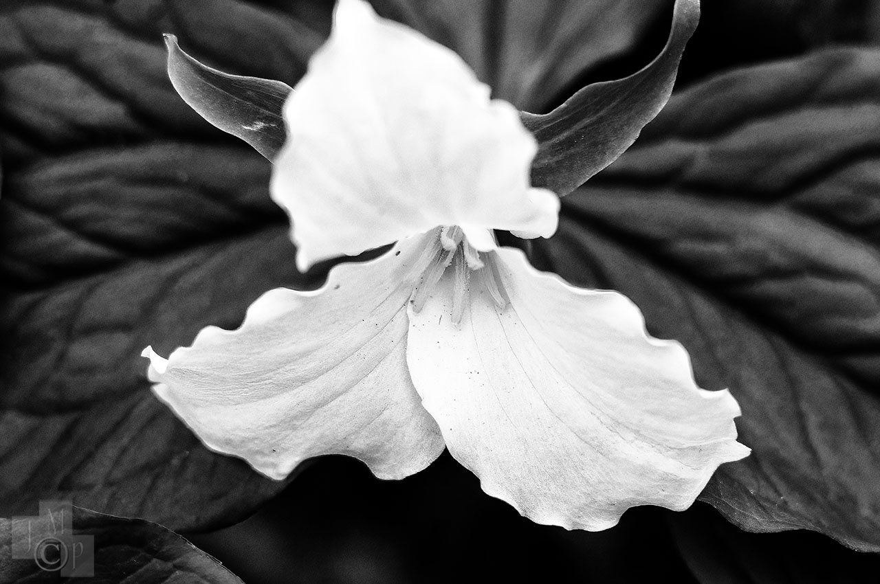
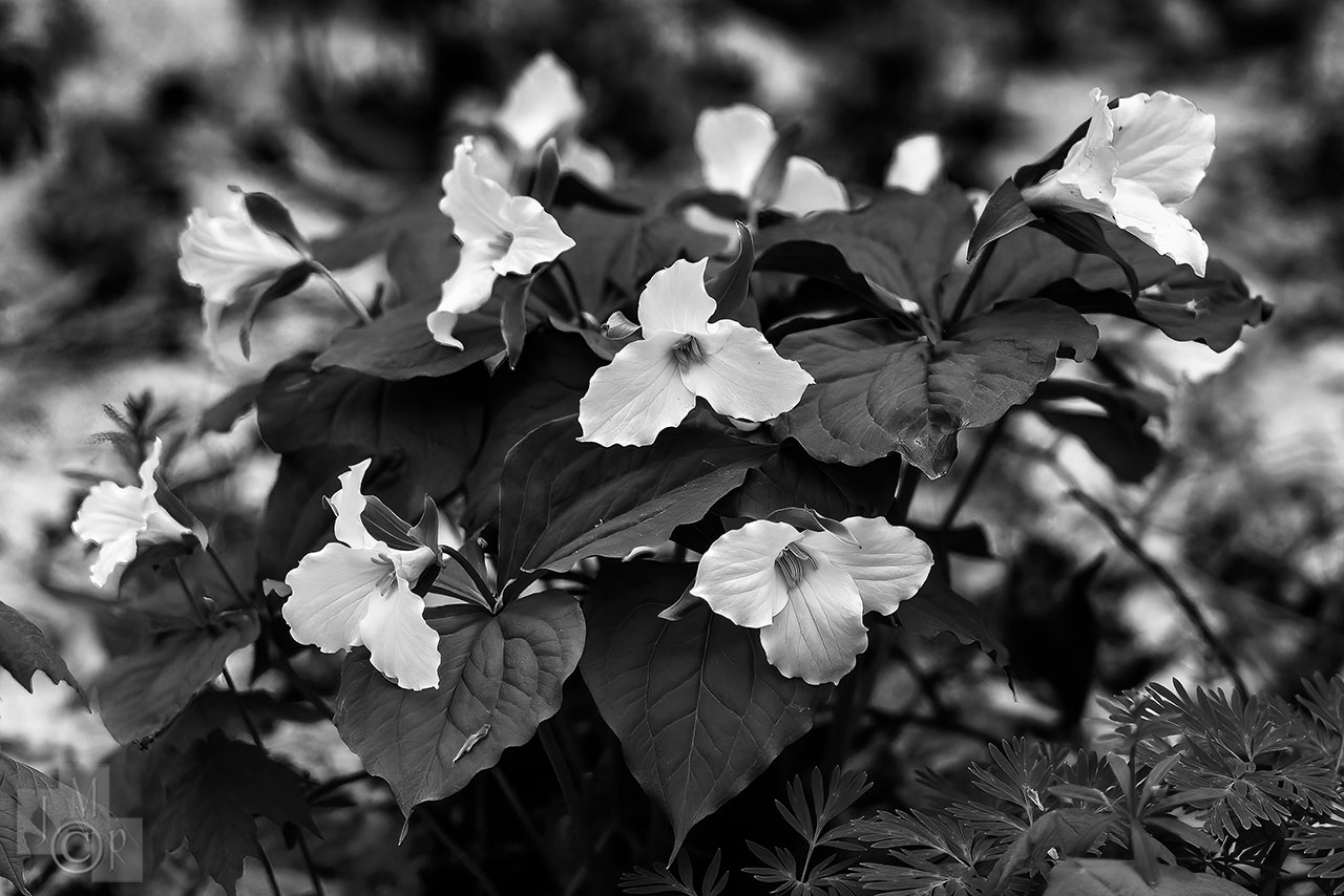
Great processing on the B&W trilliums James! If you're seeing them now that means I'm probably a little behind in getting out to the local population here.
Thanks Ray. However, these were from a walk five years ago on April 28th 2017. So now may be a good time to check, but they are not current.
pbraymond wrote:
Great processing on the B&W trilliums James! If you're seeing them now that means I'm probably a little behind in getting out to the local population here.
pbraymond wrote:
If the wind would ever stop I'd try to do a wide aperture focus stack copycat of George to smooth out the background, but it never seems to stop. So the best I can do is to try to have pleasing or complimentary shapes in the background.
I hear you Ray!
Your flower looks like our Glacier Lilly (Erythronium grandiflorum). It is our first mountain wildflower, and can be very prolific, sometimes leaving meadows a carpet of yellow. The bulbs are an important food source for bears. It's appearance is a sure affirmation that spring has arrived.
I was out yesterday and it is virtually impossible to focus stack these guys - never calm enough, so I tried to find some against a neutral background that might blur in an unobjectional manner. The 55 micro isn't the best for bokeh (not the worst, either)
Here's a question for our gang here. It has nothing to do with manual lenses, but I know how erudite and experienced everyone here is. I didn't want to go to the general Nikon or the Z board for this (yet) and the Df thread gets very little action these days.
I have found a large difference between the images I get from my Df and those I get from my Sony A7RIII. The colors are so different. Images from the Df are a breeze to work up, while I sometimes feel I have to wrestle with those from my Sony in Lightroom to get them to look the way I would like. I realize this is part of the reputation of the Df, maybe because that sensor was made by Toshiba, I think.
So my question is directed to those who have experience with both the Zs and Sonys. The Z sensor is also made by Sony, so would you say you get similar results from both the A7Rs and the Zs, or do you see a real difference in the look of the RAWs fro each of those? [maybe how the internal processor handles the sensor data?]. I don't have a Z so I can't shoot them side by side.
Now that I have read it -(and no-one hass posted on top of this yet)
Of course many of these posts take often excursions away from the main question - but it was helpful/interesting in comparing the Z to the Df. It would be interesting to compare the Sony to the Zs and I am sure that is out there, but I suspect that difference to be less than that of the Df to the Z.
Thanks again
Doug, I don't have a Z or a Sony camera body. I had thought all Nikon's used Sony sensors (some tweaked to a Nikon design spec), but maybe the DF is a Toshiba. Thing is, a company has to have extremely deep pockets to build a full frame digital sensor fab. The first portable DSLR took three companies to fund and develop - Kodak did the sensor, Nikon the body, and the Associated Press did the software. Initially colors were all over the place. Then Canon added their bodies to the three company mix. Canon had already been making small video CCDs, and it was natural for them to continue making their own, and Nikon turned to Sony to fabricate their designs. It is a very long road to color. Our eyes see a little less than 8 bit color (>16.7 million), a CRT monitor can display full 16 bit color (billions), but most LED monitors display less than SRGB palette or approximately 2 million colors. Then our cameras usually shoot between 10 and 14 bit color - using various palettes or "color spaces". (Pro Photo is greater than Adobe 1998 which is greater than SRGB). Everything posted on the web needs to be SRGB to look right, and most color differences that people notice are because of color space. I shoot in Pro Photo, or Adobe 1998, and then convert to SRGB for web posts. Many people choose to have entirely a SRGB workflow to avoid the perceived color shift when an incorrect color space is used on the web. The thing is - the human eye is incapable of discerning all the levels of luminosity our cameras shoot.
All this is to say - that it is more complicated than the sensor, or sensor manufacturer. I almost never use auto WB, because all cameras use to be really bad at it. I will likely have to re-think this, because the new bodies are now really good at it - even with mixed sources. Probably to get your Sony to more closely match the df you should change it's color profile (like Nikon's standard, natural, vivid etc), and or color space.
EDIT - Here is a good intro to color space LINK HERE
James Markus wrote:
Probably to get your Sony to more closely match the df you should change it's color profile (like Nikon's standard, natural, vivid etc), and or color space.