Leica M/X/T/S/Q/CL/SL Picture Thread
p.1084 #1Leica M/X/T/S/Q/CL/SL Picture Thread
Believe if or not but below, brutal as it looks, is a breakthrough picture for me. I’ve been trying to formulate the approach for the second chapter of my current book project Alone in Bangkok. Visually, I wanted a look that can best be described as a cross between Ralph Gibson and Michael Ackerman, of which the picture below is my first attempt. (There are 22 pictures in the Alone in Bangkok, which will be edited down perhaps to half that number).
The concept for the second chapter — it may change as I photograph more — is “Escape to the Interior”, which may have a double meaning: escape into oneself or escape from urban pressure (and Thai politics) into nature…still thinking about it. At this stage, I want the pictures in the second chapter not to have any people in them. The picture below, I think can be understood without explanation, in the context of the current political situation in Thailand.
M-Monochrom | DR Summicron-50 | ISO 320 | f/4.8 | 1/1500 sec
 Bangkok
Edited on Jan 29, 2015 at 10:13 PM · View previous versions
The concept for the second chapter — it may change as I photograph more — is “Escape to the Interior”, which may have a double meaning: escape into oneself or escape from urban pressure (and Thai politics) into nature…still thinking about it. At this stage, I want the pictures in the second chapter not to have any people in them. The picture below, I think can be understood without explanation, in the context of the current political situation in Thailand.
M-Monochrom | DR Summicron-50 | ISO 320 | f/4.8 | 1/1500 sec
BangkokEdited on Jan 29, 2015 at 10:13 PM · View previous versions
Jan 29, 2015 at 04:59 PM


p.1084 #3Leica M/X/T/S/Q/CL/SL Picture Thread


Edited on Jan 30, 2015 at 09:20 AM · View previous versions
Jan 29, 2015 at 08:24 PM
p.1084 #4Leica M/X/T/S/Q/CL/SL Picture Thread
Congrats on the lens Charlie. Looking forward to seeing more from it....
Jan 29, 2015 at 08:55 PM
p.1084 #5Leica M/X/T/S/Q/CL/SL Picture Thread
Casinò, Campione D'Italia

L1021307-Bearbeitet-2.jpg by W.Utsch, on Flickr
Jan 30, 2015 at 02:32 AM
p.1084 #6Leica M/X/T/S/Q/CL/SL Picture Thread
I love your pictures! for you some images from the streets of Heidelberg, Germany
René
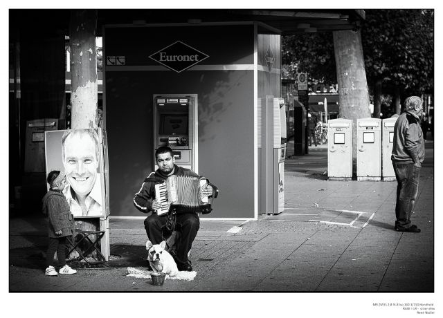
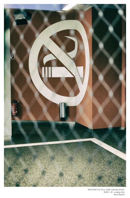
René
Jan 30, 2015 at 04:56 AM
p.1084 #7Leica M/X/T/S/Q/CL/SL Picture Thread
Very nice photos René! Welcome to the Leica thread.
Jan 30, 2015 at 08:30 AM
p.1084 #8Leica M/X/T/S/Q/CL/SL Picture Thread
edwardkaraa wrote:
Very nice photos René! Welcome to the Leica thread.
thank you for the welcome Edward . great pictures here bravo !
Greets René
Very nice photos René! Welcome to the Leica thread.
thank you for the welcome Edward . great pictures here bravo !
Greets René
Jan 30, 2015 at 08:40 AM
p.1084 #9Leica M/X/T/S/Q/CL/SL Picture Thread
and some pictures from the streets of Heidelberg, Germany
cheers René
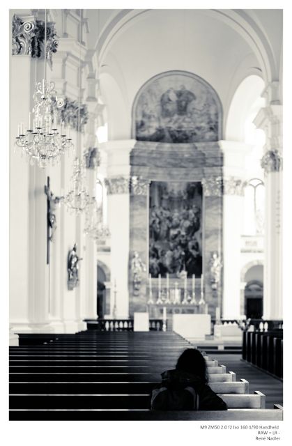
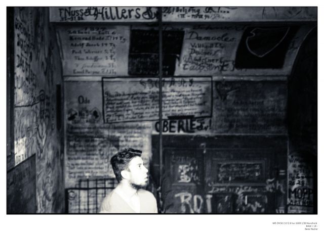
cheers René
Jan 30, 2015 at 08:56 AM
p.1084 #10Leica M/X/T/S/Q/CL/SL Picture Thread
Thank you very much René for you kind words.
I want to give back your compliment: I love your work! Your processing in LR and the NIK plugins is beautiful.
Superb shots from HD.
On my Flickr site you can find some shots from the Jesuit Church in Heidelberg (https://www.flickr.com/photos/w-utsch/sets/72157645924034281/) , a very nice place for a photographer and great for BW's in special.
I see you had been in the Studenten Katzer.....
My best regards to you and my beloved Svizzera from Heidelberg
Jan 30, 2015 at 09:09 AM
|
p.1084 #11Leica M/X/T/S/Q/CL/SL Picture Thread
Werner_Utsch wrote:
Thank you very much René for you kind words.
I want to give back your compliment: I love your work! Your processing in LR and the NIK plugins is beautiful.
Superb shots from HD.
On my Flickr site you can find some shots from the Jesuit Church in Heidelberg (https://www.flickr.com/photos/w-utsch/sets/72157645924034281/) , a very nice place for a photographer and great for BW's in special.
I see you had been in the Studenten Katzer.....
My best regards to you and my beloved Svizzera from Heidelberg
Dear Werner. the pictures of the workshop are awesome! Wow! Thanks for the link. Heidelberg is a beautiful city. Last year was there and go back
best regards
rené
Jan 30, 2015 at 09:37 AM
p.1084 #12Leica M/X/T/S/Q/CL/SL Picture Thread
Great work everyone!
M240 C-Sonnar WO:
 M240 ZM 50/1.5 by edward karaa, on Flickr
M240 C-Sonnar WO:
M240 ZM 50/1.5 by edward karaa, on FlickrJan 30, 2015 at 11:03 AM
p.1084 #13Leica M/X/T/S/Q/CL/SL Picture Thread
This thread is brilliant, so many great photos 
Here's one taken in a studio with M240 and 35 cron at about f/4, I used a tad of tungsten fill lighting.

PS. Image not looking so sharp but it is. Think I need to change my SmugMug settings
Here's one taken in a studio with M240 and 35 cron at about f/4, I used a tad of tungsten fill lighting.
PS. Image not looking so sharp but it is. Think I need to change my SmugMug settings
Jan 30, 2015 at 02:30 PM
p.1084 #14Leica M/X/T/S/Q/CL/SL Picture Thread
Great photos lately!
Thanks for previous likes and comments.
A triplet from a bridge; next to, under and on. M9 and 28 Summicron
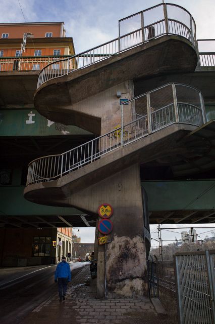
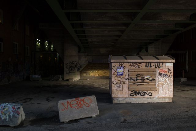
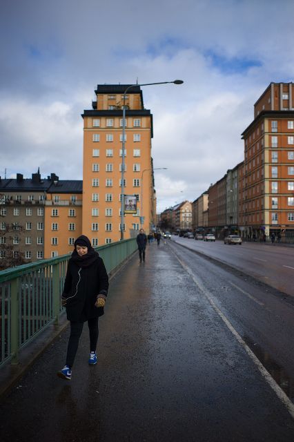
Thanks for previous likes and comments.
A triplet from a bridge; next to, under and on. M9 and 28 Summicron
Jan 30, 2015 at 03:13 PM
p.1084 #15Leica M/X/T/S/Q/CL/SL Picture Thread
Joakim, Nice tone and color!
Jan 30, 2015 at 03:50 PM

p.1084 #17Leica M/X/T/S/Q/CL/SL Picture Thread
M-Monochrom | DR Summicron-50 | ISO 320 | f/8.0 | 1/180

Bangkok
Bangkok
Jan 30, 2015 at 08:20 PM
p.1084 #18Leica M/X/T/S/Q/CL/SL Picture Thread
Love it Charlie! It sure looks like a Sonnar and seems decently sharp too looking at the full-rez file on Flickr. Just really great rendering and tonality in that image. It's a lens I've been curious about too, but haven't been swayed enough to try from earlier examples I saw on Flickr. Maybe because many were using it as a one-trick lens, shooting everything WO for the bokeh balls. Was that actually wide open, or slightly stopped down?
Mitch - regarding your earlier question about the two mannequin photos. I prefer the first one, though the second one, with the row of mannequins is also interesting, but I feel less effective. In the first one, it feels to me that you caught the woman a split second after she realized you were photographing her, just as she was cluing in to that, but before she could smile, pose, etc... and have caught her in a body position that IMO very nicely mimics the poses of the mannequins. I really enjoy it as a transitory moment in time and as an example of where still photography is extremely effective.
Joakim - agreed, love the tonality. That kind of scene with that kind of tonality really screams Leica M to me. Maybe it's something about northern European weather/light at this time of year that meshes well with Leica glass and color philosophy.
Mitch - regarding your earlier question about the two mannequin photos. I prefer the first one, though the second one, with the row of mannequins is also interesting, but I feel less effective. In the first one, it feels to me that you caught the woman a split second after she realized you were photographing her, just as she was cluing in to that, but before she could smile, pose, etc... and have caught her in a body position that IMO very nicely mimics the poses of the mannequins. I really enjoy it as a transitory moment in time and as an example of where still photography is extremely effective.
Joakim - agreed, love the tonality. That kind of scene with that kind of tonality really screams Leica M to me.
Maybe it's something about northern European weather/light at this time of year that meshes well with Leica glass and color philosophy.Jan 30, 2015 at 08:32 PM
p.1084 #19Leica M/X/T/S/Q/CL/SL Picture Thread
Ron - Thanks for the kind words. I agree and also prefer the first one (p.1128 #15 ) — it's the contingent nature that I like about this picture. For example, I tried cropping to the bottom of the woman's foot (which cuts some of the space on the left of the frame) and straightening the frame so that the U.S. Army Never Let lettering becomes horizontal and the edge of the shop building becomes vertical — but this rectilinear approach makes the frame more static and loses some of the feeling that you refer to.
EDIT 31-Jan-2015: After writing the above, I went back to the second mannequin picture (p.1129 #5) and concluded that the crop that I had done, after reading someone's recommendation, which placed the man in the center of the frame made the picture more static. I now have gone back to a slight modification of the original. The man is now off-center and I feel the picture has more visual interest, and becomes less static, with the light area restored in the bottom right of the frame. One has to look for a while at a picture before concluding on a final version, but often the first instinct os the right one, as in this case.
EDIT 31-Jan-2015: After writing the above, I went back to the second mannequin picture (p.1129 #5) and concluded that the crop that I had done, after reading someone's recommendation, which placed the man in the center of the frame made the picture more static. I now have gone back to a slight modification of the original. The man is now off-center and I feel the picture has more visual interest, and becomes less static, with the light area restored in the bottom right of the frame. One has to look for a while at a picture before concluding on a final version, but often the first instinct os the right one, as in this case.
Jan 30, 2015 at 08:45 PM
p.1084 #20Leica M/X/T/S/Q/CL/SL Picture Thread
@Mitch you are just killing it, man!
@ryan superb shots
@Werner love that last one
@xwing wonderful shot on the street and that last dreamy one exquisite
@Edward nice work with ZM 50/1.5 It's got the CZJ bokeh like all the best 50 sonnars! Very crisp too
@Joakim stairway is outstanding
rscheffler wrote:
Love it Charlie! It sure looks like a Sonnar and seems decently sharp too looking at the full-rez file on Flickr. Just really great rendering and tonality in that image. It's a lens I've been curious about too, but haven't been swayed enough to try from earlier examples I saw on Flickr. Maybe because many were using it as a one-trick lens, shooting everything WO for the bokeh balls. Was that actually wide open, or slightly stopped down?
That one I'm pretty sure is f/1.6, for which the lens may be optimised. Several things set the lens apart: the build is an impeccable homage to CZJ and Nikkor with such beautiful touches like the german aperture, no stops and very round, the hood configuration, coma adjustment (driving me crazy ), and of course it's smaller and lighter than the 28 cron. The glass, which has been carefully selected with modern coatings, makes some very rich color.
But it's an anti-modern Leica lens, with more quirks than the original 50/1.5 I do love some of the impressionistic work I've seen from the lens on Flickr, and I now follow some Japanese shooters I never would otherwise have come across. I'm only a diarist, but I do love a nice abstract. Reasonable cost also. It may be great fun on the A7m, where calibration is not critical and the coma adjustment could be the means for all sorts of special mischief.
Back to the future:

Kristin's by unoh7, 28 cron f/8
Well a few of my "missed" sonnetar shots are sort of fun:

L1027465 by unoh7, on Flickr

L1027456 by unoh7, on Flickr

Stopped Table by unoh7, on Flickr

L1027429 by unoh7, on Flickr
@ryan superb shots
@Werner love that last one
@xwing wonderful shot on the street and that last dreamy one exquisite
@Edward nice work with ZM 50/1.5 It's got the CZJ bokeh like all the best 50 sonnars! Very crisp too
@Joakim stairway is outstanding
rscheffler wrote:
Love it Charlie! It sure looks like a Sonnar and seems decently sharp too looking at the full-rez file on Flickr. Just really great rendering and tonality in that image. It's a lens I've been curious about too, but haven't been swayed enough to try from earlier examples I saw on Flickr. Maybe because many were using it as a one-trick lens, shooting everything WO for the bokeh balls. Was that actually wide open, or slightly stopped down?
That one I'm pretty sure is f/1.6, for which the lens may be optimised. Several things set the lens apart: the build is an impeccable homage to CZJ and Nikkor with such beautiful touches like the german aperture, no stops and very round, the hood configuration, coma adjustment (driving me crazy
), and of course it's smaller and lighter than the 28 cron. The glass, which has been carefully selected with modern coatings, makes some very rich color. But it's an anti-modern Leica lens, with more quirks than the original 50/1.5
I do love some of the impressionistic work I've seen from the lens on Flickr, and I now follow some Japanese shooters I never would otherwise have come across. I'm only a diarist, but I do love a nice abstract. Reasonable cost also. It may be great fun on the A7m, where calibration is not critical and the coma adjustment could be the means for all sorts of special mischief. Back to the future:
Kristin's by unoh7, 28 cron f/8
Well a few of my "missed" sonnetar shots are sort of fun:
L1027465 by unoh7, on Flickr
L1027456 by unoh7, on Flickr
Stopped Table by unoh7, on Flickr
L1027429 by unoh7, on Flickr
Jan 30, 2015 at 10:51 PM