p.1 #4 · First post here — would love some feedback on this waterfall from Slovakia.
Welcome to FM and to the Critique Forum.
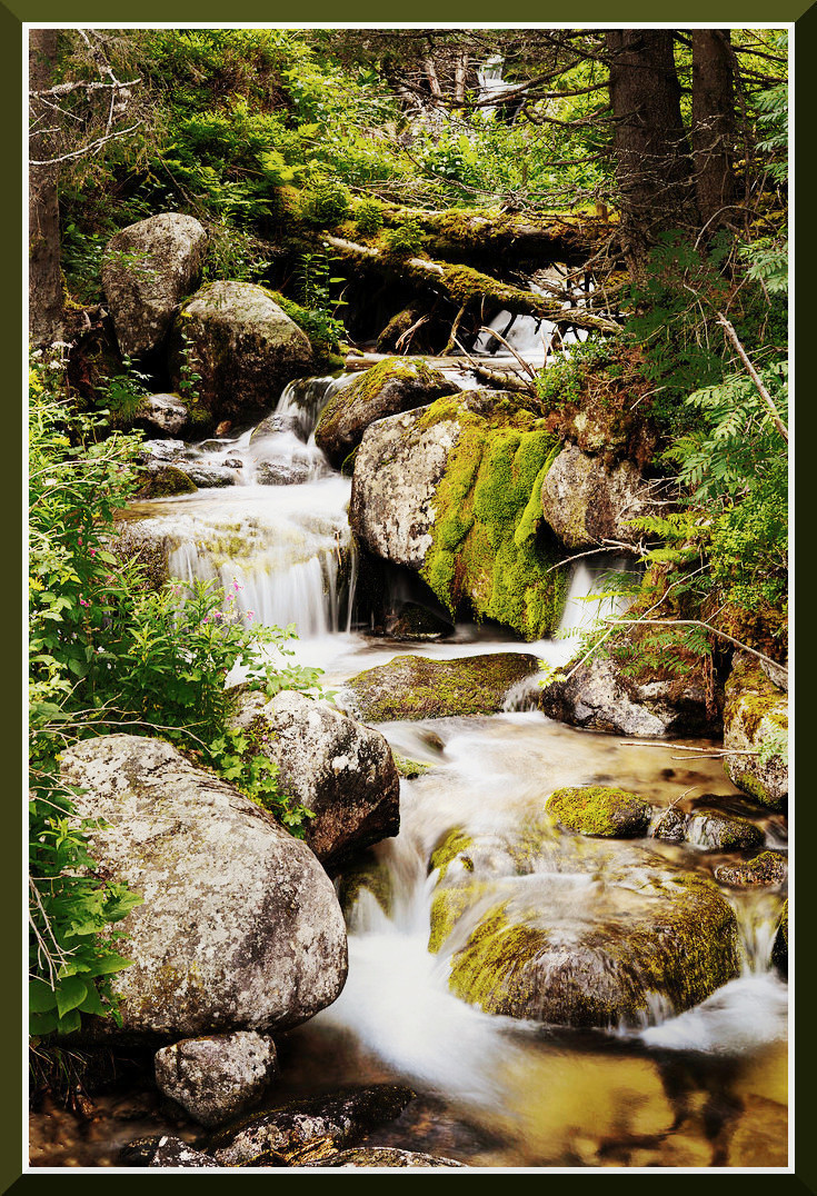
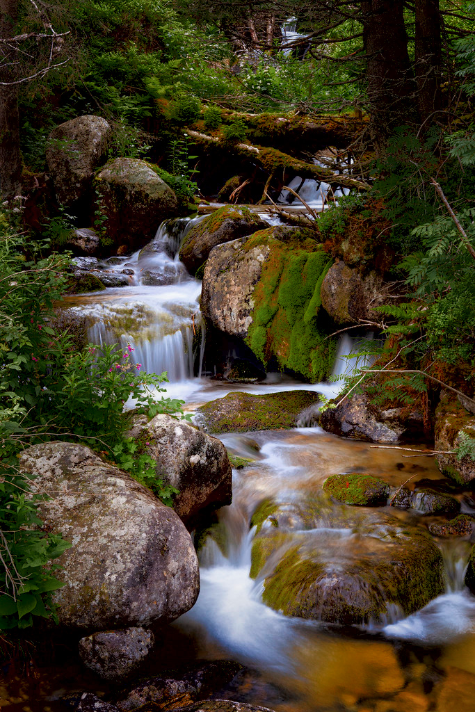
The second image is the stronger one. I find that it draws me in more than the first one. I believe it connects better with the viewer because of the wider perspective and a more inclusion of the waterfall offering a more engaging experience of nature’s beauty and power.
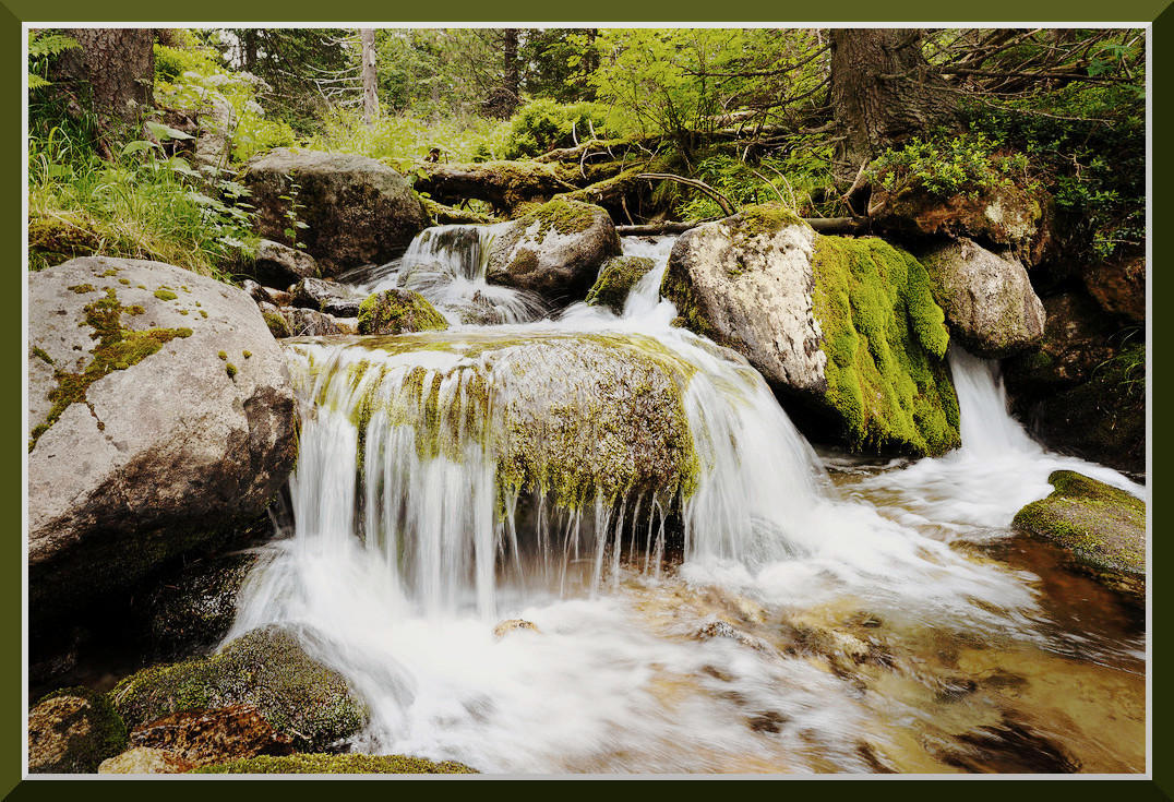
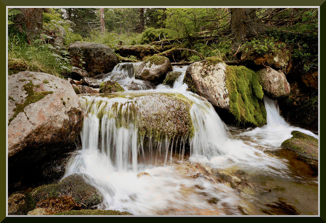
The first image, while lovely, feels a bit more distant. The composition, while good, doesn't quite pull me into the scene with the same immediacy as the second image. The slightly tighter framing and the way the water is rendered, while still showing motion, doesn't quite achieve the same sense of presence that second image does so well. It feels more like observing the scene, rather than being part of it.
The compo of the first image is okay. I am thinking a different framing by lowering the camera to include less top and more foreground water might have worked better giving more presence to the waterfall. I also think that the brightest foliage in the upper right background slightly overpowers the serene mood, pulling attention from the central water and mossy rocks. My suggestion would be to reduce the luminance of the bright background foliage to refocus attention on the water and mossy rocks, preserving the image's overall calmness.
In the second image the moss-covered rocks and cascading water create a scene of lush, dynamic beauty, while the soft movement of the water invites a sense of calm. The composition guides our eyes along the winding stream, and the flow of water creates a natural visual path.
The placement of the foreground elements, particularly the large rock in the FG on the left while offering an anchor point, kind of dominates the Foreground pulling the attention away from the stream. I would suggest reducing the rock’s brightness a bit to better direct the eye toward the cascading water. The long exposure used for the water contributes significantly to the tranquil mood, creating beautiful silk-like effects.
Overall, I find the brightness of both images pushed a bit too much and the color palette to be a bit too vibrant and saturated in both images on my monitor, but that is just a question of personal taste.
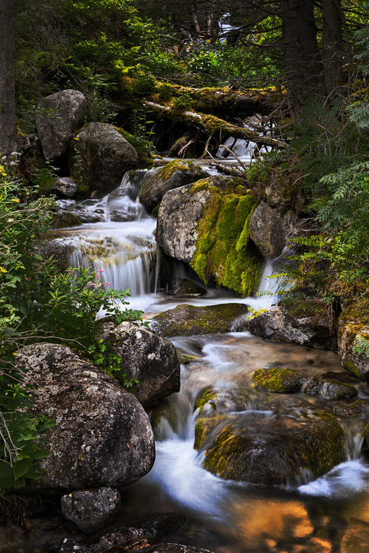
Below I am offering you a version with reduced brightness and sat for you to consider. I wasn't there and I don't know what your eyes saw, if you were under a canopy of trees or plain sun or whatever. I am missing some shadows so I am just basing it on my personal experience in shooting waterfalls. However, If you are happy with your images, that is all it matters.
I think you did a very good job with these two images. The water looks well exposed w/o blown detail and the soft, while the silken flow of water cascades over moss-covered rocks, impart a sense/mood of tranquility. Well-done!
p.1 #5 · First post here — would love some feedback on this waterfall from Slovakia.
Yes, welcome to the Forum.
+1 for much of Socrate's points.
Compositionally:
#1 is more about here's this "thing"
#2 is more about the "journey" into the scene
The difference is in how the image moves (vs. fixes) the viewer's eye.
Tonality / Saturation:
A bit overexposed to my eye.
A bit oversaturated to my eye.
Don't be afraid to let shadows be shadows. Understand what is truly the important aspects of your image / scene / message ... and what is discretionary / sacrificial. Everything doesn't have to be homogenized, or transfer dark into bright. Socrate's re-work does a nice job of illustrating this.
If you consider the tonality / saturation ... you have bright water and bright leaves. Pick which ONE of those two is MOST important to you. THEN, adjust them so that the relationship of those present according to your priority of message to be conveyed. Meaning, one should command our attention more than the other. They should not try to share / compete to divide the viewer's attention.
You can certainly land it where you like it (Socrate's point inclusive), but recognize the conceptual difference(s) between his rework and your OP. Guessing you might desire to split the diff, but at least understand the direction(s) to move the bar ... you stil decide how far to move it.
Again, welcome to the Forum ... oh, and another vote for #2.
p.1 #6 · First post here — would love some feedback on this waterfall from Slovakia.
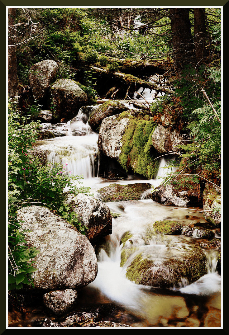
Your images have an early fall look and I am not sure how much of that you want to retain. Here is another example with more of a summer look. I think I like these better.