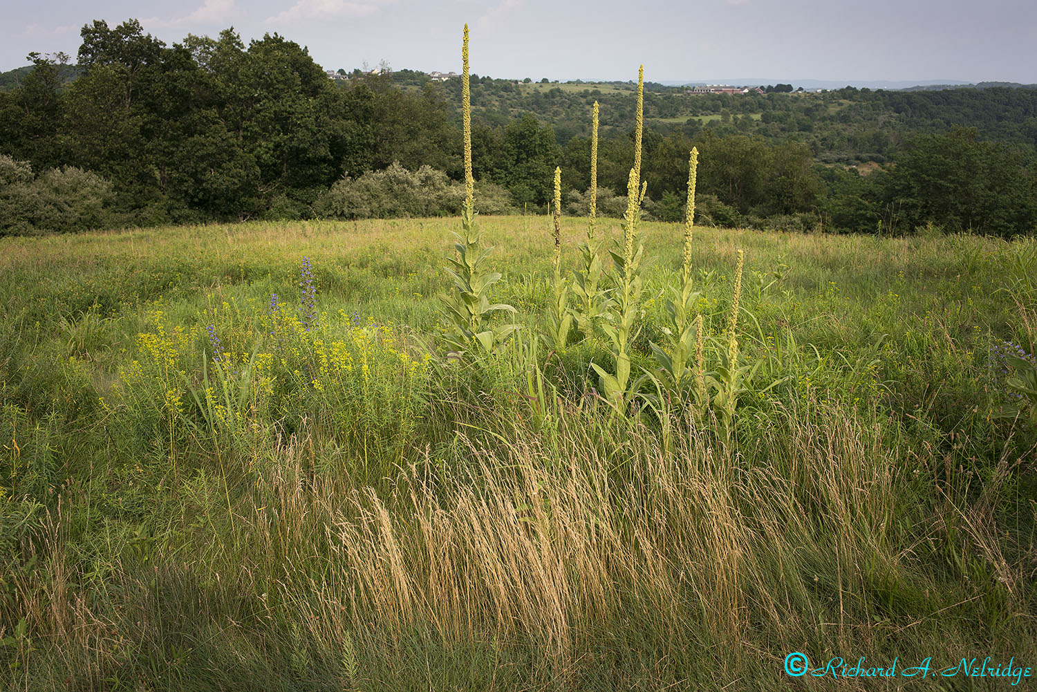
Looking at flowers and grasses across the field toward trees and into the distance at an overlook.
Tripod mounted A7rII Kolari Vision UT sensor modified camera and Voigtlander 28mm f2 Ultron II Asph VM lens; silent shutter.
ISO 100, f8?, 1/320 second.
Exposure Corrected -0.10 Stops.
July 9, 2021
At Trexler Nature Preserve, Schnecksville, PA.
AGeoJO wrote:
Before the pandemic some 2 years ago...
Josh-
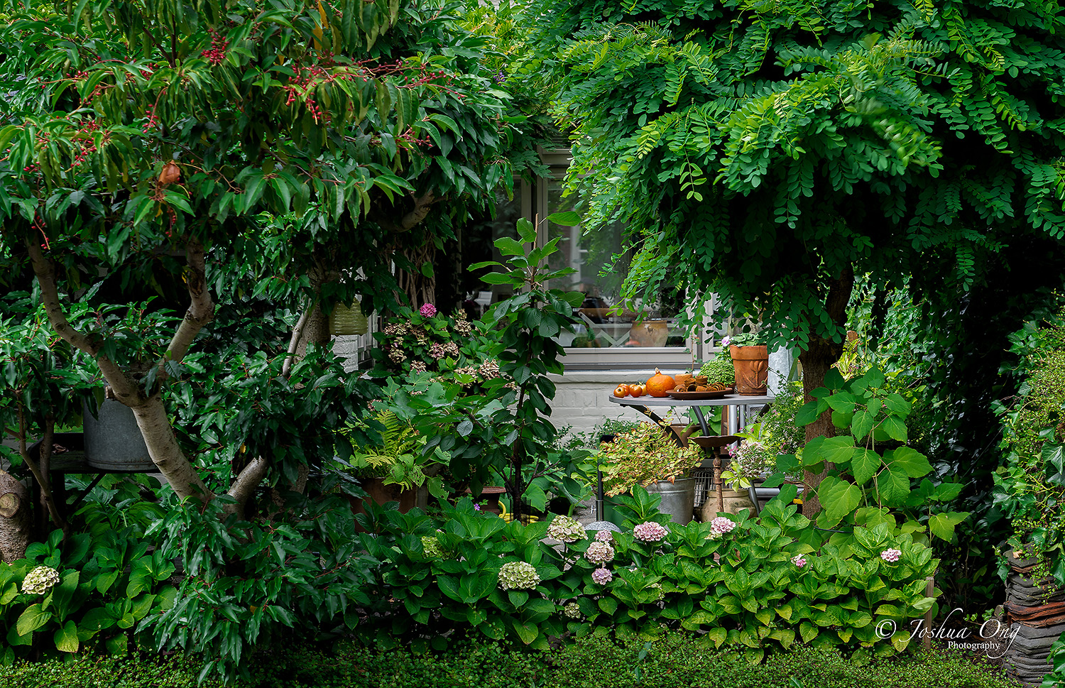
Do you mind if I ask whether you did a hue shift on the greens in this in post?
Three years into being in Sony, I still struggle with getting the greens I want (my gold standard for greens, if that makes sense, was drum scanned portra film, and in digital I have always preferred the way the Sigma DP Merrills rendered foliage color). I never did get greens I liked from Nikon, and I am hit-or-miss with Sony, often needing to do small hue shifts in the advanced color editor in Capture One.
photonoclast wrote:
Josh-
Do you mind if I ask whether you did a hue shift on the greens in this in post?
Three years into being in Sony, I still struggle with getting the greens I want (my gold standard for greens, if that makes sense, was drum scanned portra film, and in digital I have always preferred the way the Sigma DP Merrills rendered foliage color). I never did get greens I liked from Nikon, and I am hit-or-miss with Sony, often needing to do small hue shifts in the advanced color editor in Capture One.
Yes, I did but but frankly at this point, I don’t remember what I did as I did it a while ago. I will have to get back to you on that later on as I am not at my main work station.. But what do think of the green rendition though?
AGeoJO wrote:
Yes, I did but but frankly at this point, I don’t remember what I did as I did it a while ago. I will have to get back to you on that later on as I am not at my main work station.. But what do think of the green rendition though?
Thanks for the reply! I think the green of the tree on the left with the red berries, and the wisteria or whatever it is in the upper right is good. I would probably dial back the saturation just a bit, but the hue looks right. But here is where I struggle: the hue shift that made those look natural resulted in the leaves of the hydrangea and other smaller leaves in the lower part of the image not looking quite natural - they should be a bit yellower. They look a little "nuclear" - not sure how to describe it. I am very interested in how you and others perceive it.
Looking at flowers and grasses across the field toward trees and into the distance at an overlook.
Tripod mounted A7rII Kolari Vision UT sensor modified camera and Voigtlander 28mm f2 Ultron II Asph VM lens; silent shutter.
ISO 100, f8?, 1/320 second.
Exposure Corrected -0.10 Stops.
July 9, 2021
At Trexler Nature Preserve, Schnecksville, PA.
Rich
I captured some of these flowers in a recent trip to Montana:
photonoclast wrote:
Thanks for the reply! I think the green of the tree on the left with the red berries, and the wisteria or whatever it is in the upper right is good. I would probably dial back the saturation just a bit, but the hue looks right. But here is where I struggle: the hue shift that made those look natural resulted in the leaves of the hydrangea and other smaller leaves in the lower part of the image not looking quite natural - they should be a bit yellower. They look a little "nuclear" - not sure how to describe it. I am very interested in how you and others perceive it. ...Show more →
Sorry for the delay in responding… Anyway, I normally do my PP in 3 short steps. I import the file using LR, I do some basic adjustments there and normally, I leave the colors alone. Since it was processed a few years back, I must have used Nik-Software plugin back then and I don’t remember what I did in terms of colors but generally, I leave the colors the same but added some vibrancy/saturation. Then the final touch back in LR where I do the final adjustment and I can look up and trace what I do. I did the green color shift towards blue green, not by much though, but globally and that’s probably what you noticed in some greens of the hydrangea leaves. I could have added more yellow tint selectively for those leaves to reflect the actual colors. Your perception in color separation is very keen and noticed that fine difference. Impressive!
AGeoJO wrote:
Sorry for the delay in responding… Anyway, I normally do my PP in 3 short steps. I import the file using LR, I do some basic adjustments there and normally, I leave the colors alone. Since it was processed a few years back, I must have used Nik-Software plugin back then and I don’t remember what I did in terms of colors but generally, I leave the colors the same but added some vibrancy/saturation. Then the final touch back in LR where I do the final adjustment and I can look up and trace what I do. I did the green color shift towards blue green, not by much though, but globally and that’s probably what you noticed in some greens of the hydrangea leaves. I could have added more yellow tint selectively for those leaves to reflect the actual colors. Your perception in color separation is very keen and noticed that fine difference. Impressive! ...Show more →
Thank you for the details!! I suspected exactly what you just wrote - a global shift to the blue-green. I often do the same, but it doesn't always work globally, and that's my challenge. For some reason I am particularly sensitive to how greens render. Color is totally subjective, so there is no "right" answer. The flip side is that I took one of those online color perception tests, and the only section I got wrong was distinguishing different hues of tan. I found that very interesting, since I have read so many posts here and elsewhere where people argue about skin tones from different sensors and software, and often I simply cannot see the differences in the images that people are talking about. I have no doubt some people see clear differences and are not imagining things - I just can't see subtle differences in skin tones. Foliage is another matter!