Todd wrote:
Nice scenery... how do you like the Batis 25? I’m considering one but not sure yet.
Todd
Hi Todd,
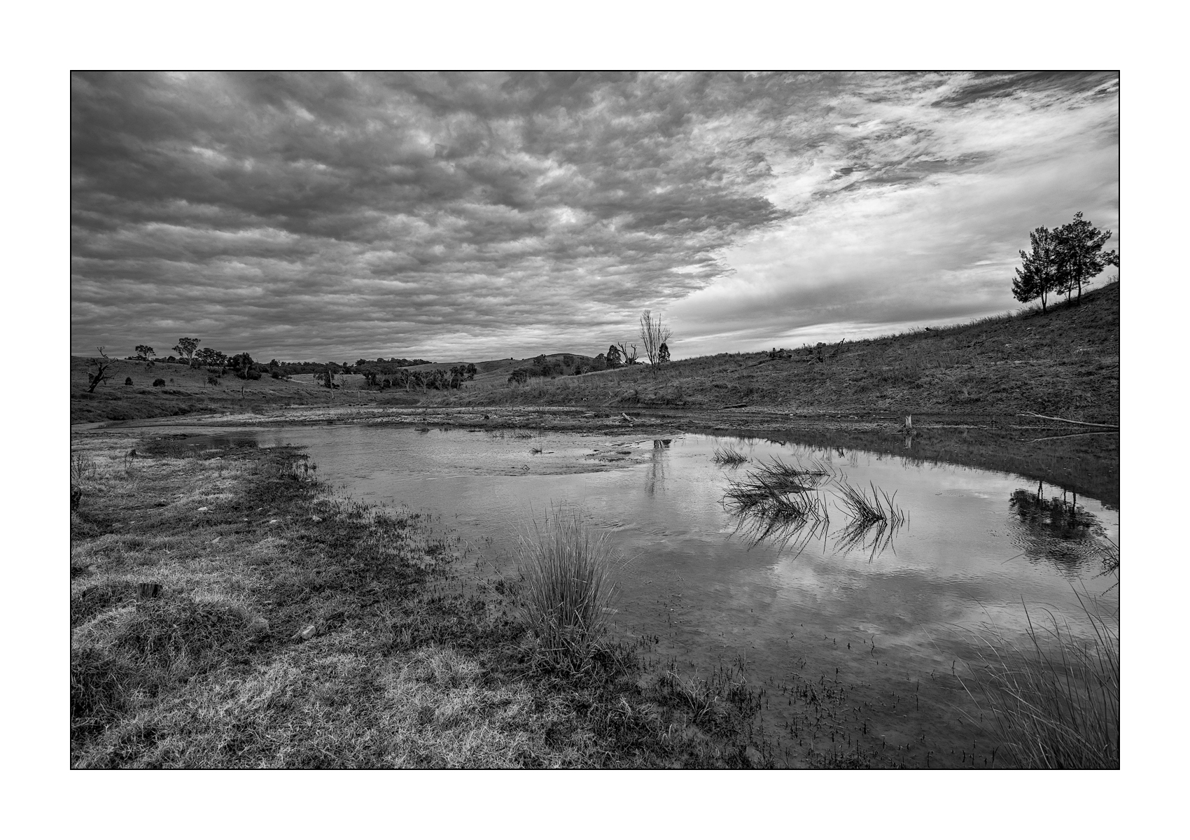
This isn't the Batis 25. This is the Zeiss "ZE" Classic manual focus lens in the Canon EF mount. It has electrical contacts for exif info and electronic aperture. It works with AF adapter (I use Sigma MC-11) on Sony to transmit all the needed electrical info.
I'm anxious to get back in the vicinity of my Canon bodies to see how it works on the 5DsR and maybe the old 1Ds3.
I've used the Batis 25 owned by a friend, and it is nice, but not exactly my cup of tea. I have the Canon 24 TSE II for manual focus and the Canon 24/2.8 IS for AF and stabilization on Canon. My next likely 24-25mm lens is either Sigma 24/1.4 Art or Canon EF 24/1.4L II. A long shot would be to sell this Zeiss and buy the Loxia 25, but that's unlikely in the near future!
If you want a quality prime in 24/25, the Batis is a good choice.
DannyBurkPhoto wrote:
Another infrared from Shiojiri Japanese Garden, Mishawaka, Indiana. A7R, 12-24/4 at 12mm.
Do the tilted trees on the outer sides bother you? Typically I don't like this effect, and I'd thought about returning to the park with a Canon 17mm tilt-shift to reshoot a stitched version with roughly the same composition. After a few days, I started to think that their tilt gives additional weight to the main tree. In short, I'm undecided. Thoughts?
No doubt this is a minority opinion but I hate the tilted trees (as well as the tilted buildings and tilted people) that are often a consequence of using ultra-wide lenses. IMO it's a cheap trick, employed to inject false drama into a scene.
DannyBurkPhoto wrote:
Another infrared from Shiojiri Japanese Garden, Mishawaka, Indiana. A7R, 12-24/4 at 12mm.
Do the tilted trees on the outer sides bother you? Typically I don't like this effect, and I'd thought about returning to the park with a Canon 17mm tilt-shift to reshoot a stitched version with roughly the same composition. After a few days, I started to think that their tilt gives additional weight to the main tree. In short, I'm undecided. Thoughts?
Danny, if you have the luxury to go back and conscientiously compose a better image then more power to you. I do not find those tilted trees since they are fairly small relative to the main target are that objectionable. Of course, straight trees would be ore preferred however. I am not sure what editing software you use but I believe that that condition can be corrected fairly easily, using LR, for example. That is an impressive image you got there.
AGeoJO wrote:
Danny, if you have the luxury to go back and conscientiously compose a better image then more power to you. I do not find those tilted trees since they are fairly small relative to the main target are that objectionable. Of course, straight trees would be ore preferred however. I am not sure what editing software you use but I believe that that condition can be corrected fairly easily, using LR, for example. That is an impressive image you got there.
Thanks to both Jonathan and Joshua for your thoughts. Yes, Joshua, the park is 10 minutes from home and I visit it often; no problem for a reshoot. I'm using Photoshop and I had immediately tried doing a correction in ACR, but it lost so much image area that it became nearly square. Not what I want for this image, so a reshoot will be needed.
I'm rather pleased with how the FE 90/2.8 G Macro has worked on this, it's first holiday. As sharp at distance as close up, and sharp wide open too. However, though I like the bokeh, even wide open, it's 9 blades are visible, ie not perfect circles, which is a bit annoying. I've heard this complaint of the RX1 lens too.
Dougo wrote:
I could not find that I had posted this shot, anyway here is a colour and a B&W version.
A711 andFE 16-35mm F4 ZA OSS
Usually when I see colour and b&w versions of the same picture (whether of my own or other photographer’s images) it’s relatively easy to decide which is better (or, to put it more honestly, which one I like better). In this case I’m hard pressed to express a preference for one version over the other, since both are excellent in their own particular ways.
genji wrote:
Usually when I see colour and b&w versions of the same picture (whether of my own or other photographer’s images) it’s relatively easy to decide which is better (or, to put it more honestly, which one I like better). In this case I’m hard pressed to express a preference for one version over the other, since both are excellent in their own particular ways.
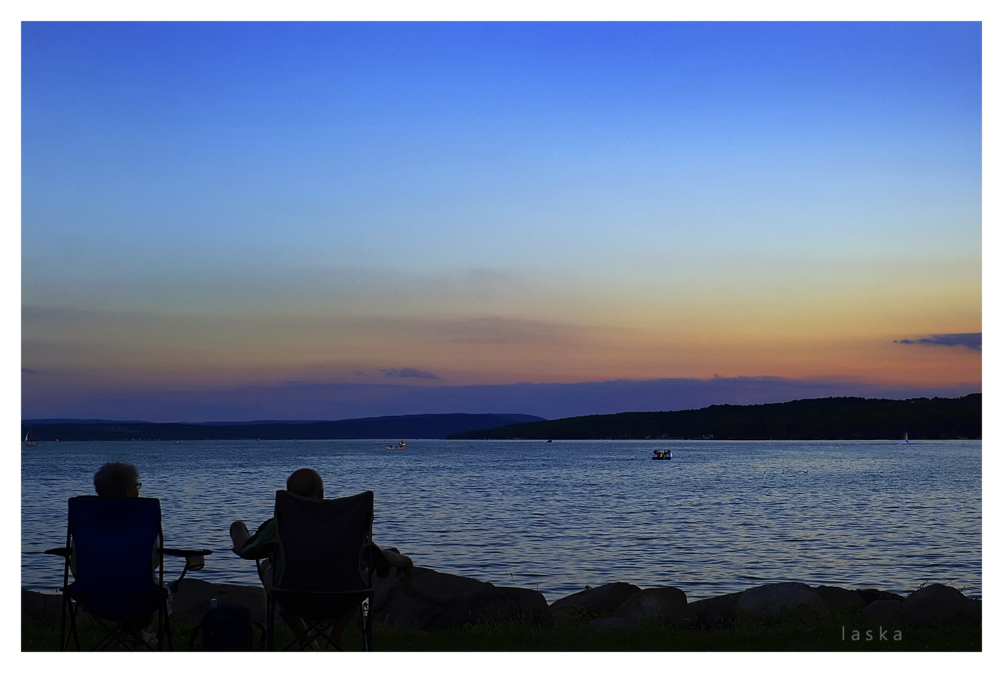
Quiet a sunrise this morning. Colors were almost neon in intensity. The clouds covered the actual sunrise, but boy what a pregame show! Here are a few quick edits on my laptop. Will try to take a better look at these when I get back to my real computer....