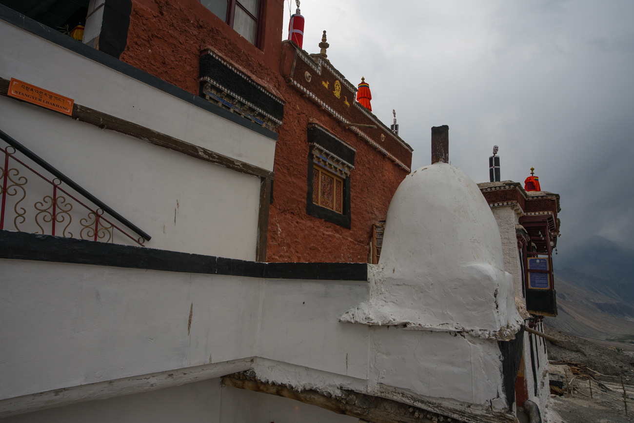
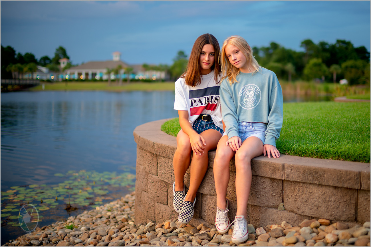
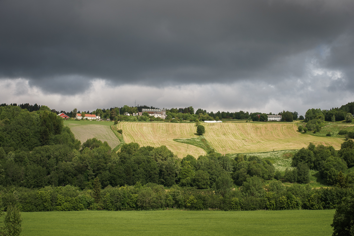
Tried for a sunset. Just after this pic, the clouds moved in and ended up in a cloud for a while. Might as well have had a white sock over the camera. Oh well.
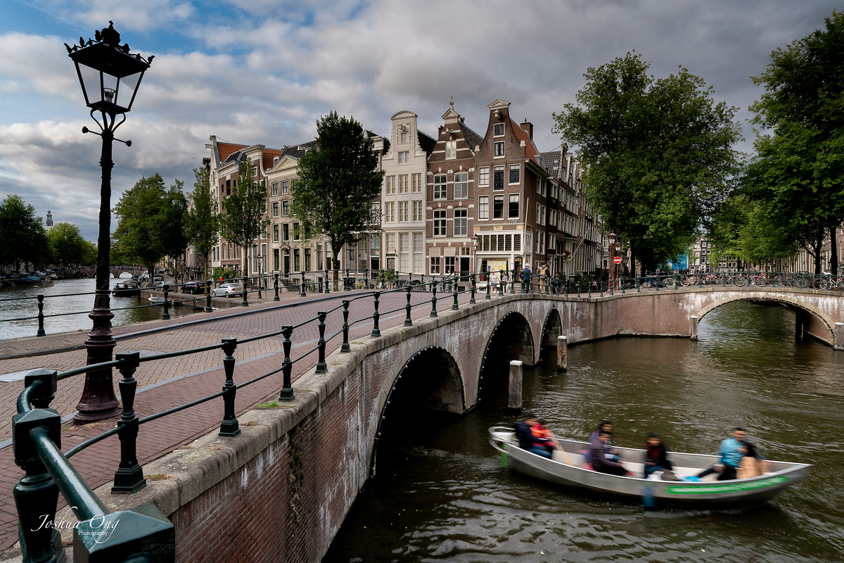
Exposure is too light and too blue -- more PP practice.
Design -- lines lead to uninteresting left side, railing acts to split the frame into thirds. Composition needs work. Horizon looks tilted to the left.
On the plus side -- sharpness and focus seem good!
Allow me to offer the contrary view that all those "mistakes" work together to make the picture quirky, original, and worthy of attention.
Two from Tuscany with CV 40 1.2
Both from the same spot, first one is heavily cropped boschetto-3 by NEMEAD, sur Flickr boschetto-6 by NEMEAD, sur Flickr
Olaf G wrote:
I really like the processing on this one. It has this old-time platinum print look...
Thanks for the kind words! I used to do some alt processes, mainly Kallitypes toned in platinum. It is a look I always liked and which I was trying to replicate with this image.