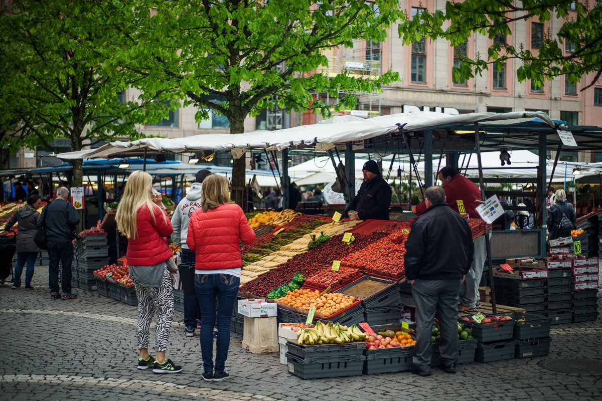
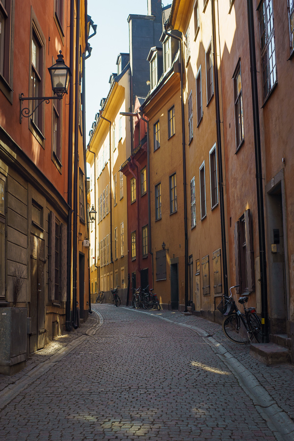
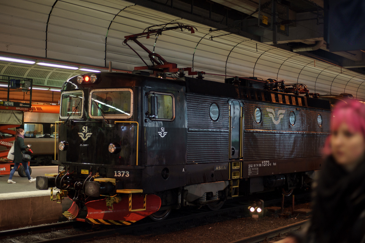
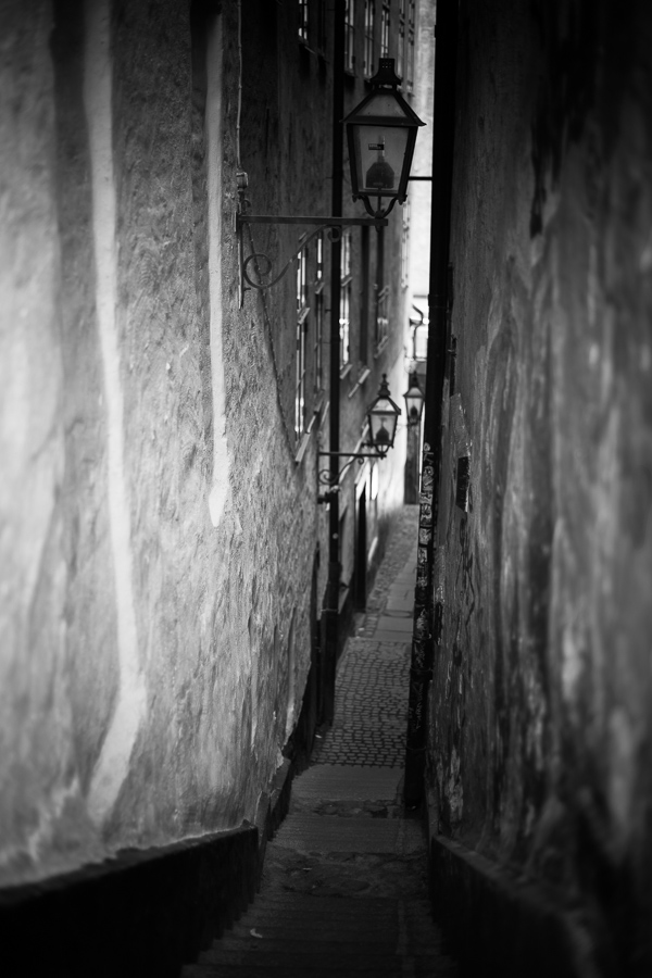
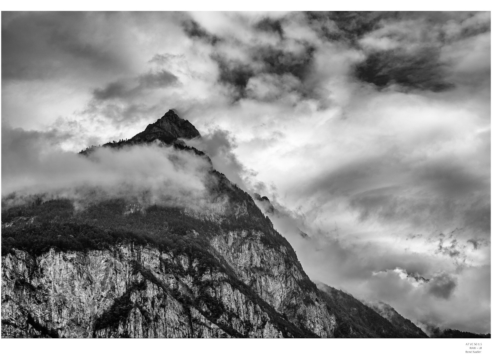
Wonderful shots, every one. It is great to see some different lenses surfacing in the last few pages. However, I continue to be frustrated by all of the amazing shots with the Batis 25 and the FE 35. How am I supposed to save for my kids to go to college with temptations like these?!?!?!?
Jim
New-to-me acquisition, Jupiter-8 50/2. Ridiculously intense colors, especially purple and blue part of the spectrum. Sharp enough in the center but a steep falloff in sharpness wide open towards the edges. Makes for nice portraits and impressionistic shots. Good sharpness across the frame at f/8. Real surprise is the tiny size and weight, easily about 1/3 the weight of the 50/1.5 Summarit. It feels like it would be light enough to fit on an iPhone, let alone a mirrorless. At $70, probably the best lens to dollar ratio I have ever had (possible exception is the Contax 1.7/50 for $125):
Grenache, the Jupiter-8 is a LOT better than the price would suggest. I have a 1956 copy and use it fairly often. I also have a Jupiter-11 135mm f/4, but it has a bit too much character for some situations, and then the $100 Canon 135mm f3.5 comes out. The Industar-69 I picked up for $30 is a blast with a close focus adapter, too. The only expensive-ish modern lens I'm using right now is the CV 35mm f/1.2 VII - and that was used through Ebay and may slow down my Russian lens buying binge by just a little. I love Russian glass!
I have had a variety of Russian glass, but the Jupiter is among my favorites. The Tair 135 f/2.8 was lovely but weighed about three times what it should have. [What do you want from a former Army reconnaissance lens?!?!?] The Helios 58/2 is always fun. I had a 44-2 and found it too wild in bokeh, but the 44-4 is a really nice compromise between character and smooth. I really like the Volna-9 that I just picked up recently when I go the Jupiter. By comparison, the Volna is giant, but it has smoother, sharper rendering and a reasonable close focus distance. It is likely better suited for DSLR than mirrorless, but a great lens.
Please, please, pretty please tell me how you managed to get a shot of the Galeries des glaces with no-one in the picture. Were you the first one in line? A special time? A permit from God?
Blind luck really. I was with a small group that was the first in because one of the members in our group was in a wheelchair. Then as luck would have it, there was a false fire alarm and they evacuated everyone except our group because of the wheelchair. When they reopened we had a 20 minute head start on everyone else and I had the opportunity to shoot every room in the tour with no guests.
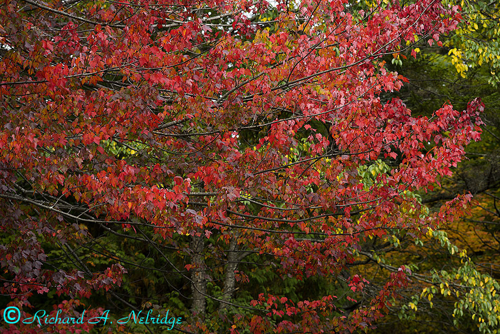
Photo taken October 1, 2015 at 3:21 PM of a Maple Tree at Heart Lake (Lake owned by the Adirondack Mountain Club) at the ADK Loj (Adirodack Mountain Club Lodge at Heart Lake) in the Adirondack Mountains, Lake Placid, NY. Image taken with my tripod mounted A7r and my Leica M 90mm f2.5 Summarit lens, ISO 200, lens set to probably f8 for 1/100 second. Processed in LR6.
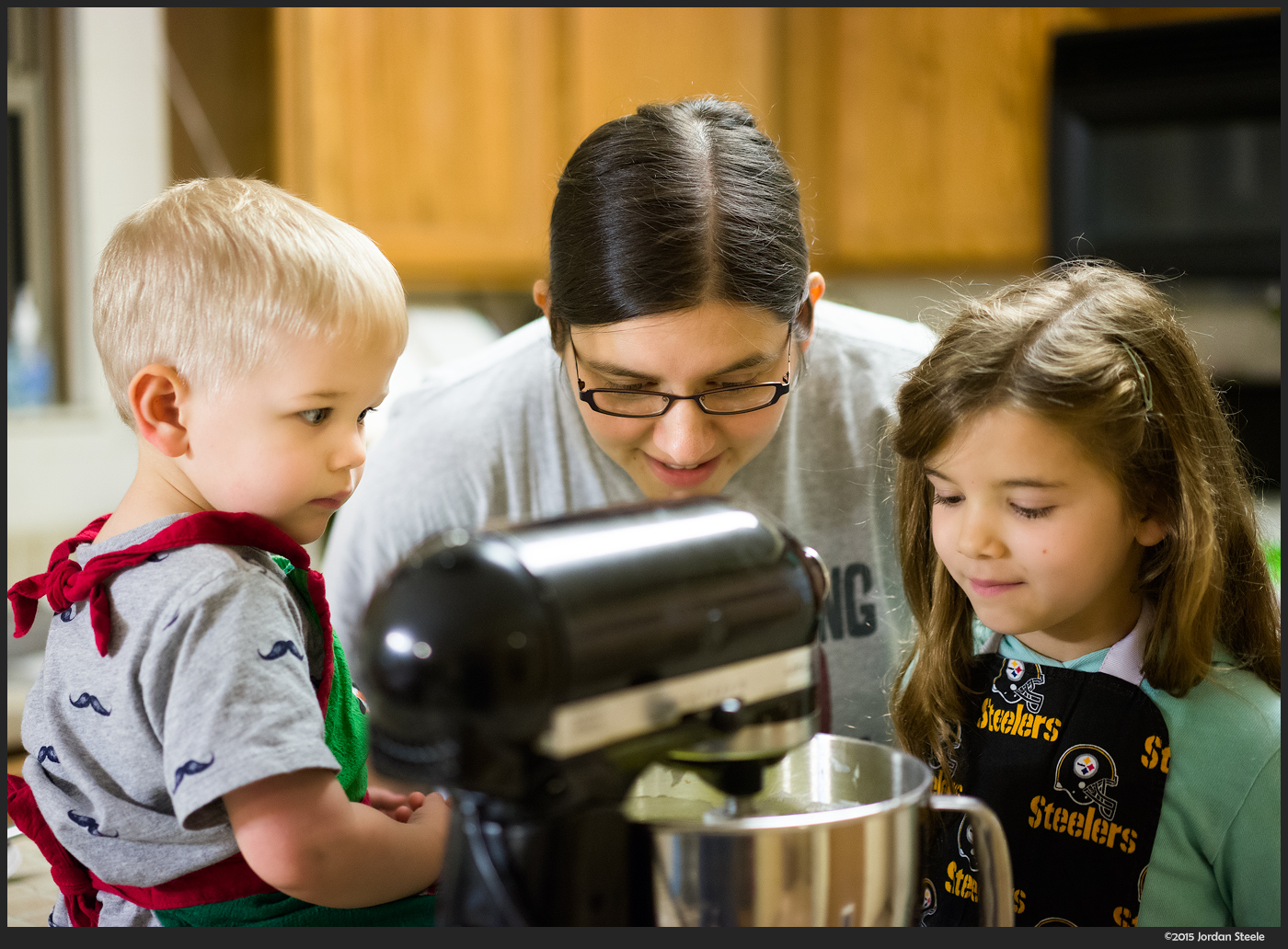
A7 II with FE 55/1.8. It's Christmas cookie time.... Why so early? My wife goes crazy with cookies....she makes 18-20 varieties and around 10 dozen of each...yes, nearly 200 dozen cookies each year.
inro wrote:
Brendans, I have seen so many pictures from you in this thread that I really like.
Having switched from a NEX5-OS X Snow Leopard-PS Elements 9-Epson R3000 to a
A7-OS X Mavericks-DNG Converter-PS Elements 9-Epson R3000 workflow I experienced a lot of problems with color management. For this reason I now mainly print in B&W. You use a lot of B&W too. But it seems that the A7Rii is a real improvement relative to the A7 in terms of color rendition?
Thanks, yeah B&W is my main interest and pretty much all I print (epson 3800). My only experience with the Sonys prior to my A7RII was about a week with an A7r so I don't really feel qualified to answer if colors have really changed (until the A7rII acquisition I used the Sigma Merrills pretty exclusively the past 3 years or so).
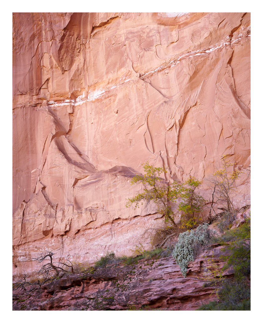
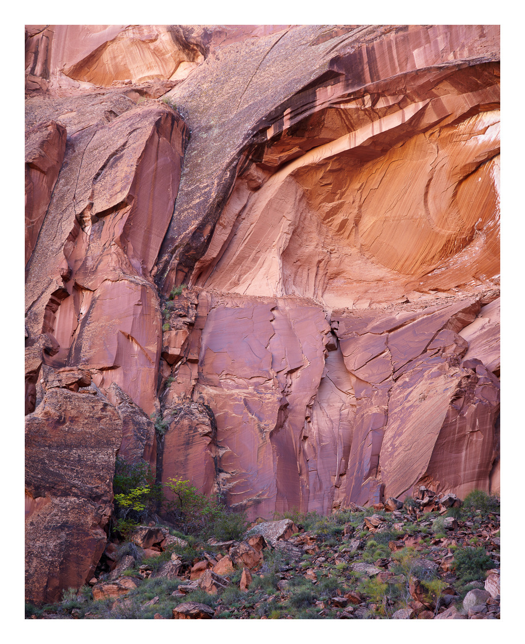
A couple more fall canyons in color...G45 for the first, G90 for the second.