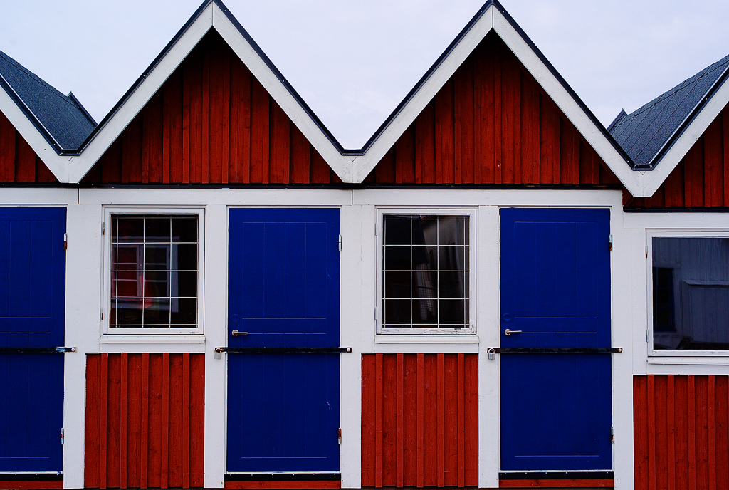
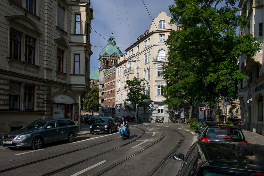
rscheffler Online Upload & Sell: On
|
Thanks Gary for the info. And of course, it's probably pretty obvious I'm also a sucker for lines, patterns, and textures.
Thanks also Joakim and Siddhu!
zhangyue wrote:
Ron, I enjoy your whole first set very much. Nice you keep the same location with different time for last two. They are very consistent shining in colors and contrast. How you handle contrast in post? I have found if I move contrast slide too much in LR, the color get blended, and detail get lost, you seems to keep a very good balance out of it.
In your 2 urban abstract set, I especially like 2,3 and 4. I enjoy the combination of shape, line, color, tone and texture. Very inspiring. Where is it?
Thanks Michael, and I'm partial to your first image. The location of the abstracts is in downtown Hamilton, where I live. It's right across the street from City Hall, occupying a block that was once much like the storefronts in the previous set, but was torn down at some point in the 50s-60s-70s for a big development project that included a convention center, art gallery, theater (for stage and music productions) and shopping mall nearby... totally changed the character of the area, though it's before my time. This coincided with the exodus of residents to the suburbs, resulting in a lot of rundown downtown properties and hard times for the merchants who remained. Plenty of parking lots in some areas where blocks of buildings used to stand. It's probably a fairly typical North American urban redevelopment story. There has also been some debate about the merits of saving some of the remaining 19th-early 20th century architecture in the downtown. One example was the 'Lister Block' which took a nearly $30 million commitment from the city to ensure it would be saved, though 3-4 similar buildings surrounding it were demolished...
At least Hamilton hasn't had the bad luck of Brantford about 30 minutes away, where the city expropriated a whole stretch of downtown buildings, many dating from the mid 1800s, and bulldozed them. Luckily I visited that site just weeks before everything was gone, as documented in my Flickr set here: http://www.flickr.com/photos/ronscheffler/sets/72157624502727144/ (shot with my Canons)
Fortunately it seems times are improving in downtown Hamilton. The storefront images are from an area that has been reinvigorated by numerous small galleries and other arts related enterprises, breathing youthful life back into downtown, though it still has a ways to go.
Hamilton is not a huge city, so we don't have a large selection of modern architecture, but there are certainly examples, as the last set illustrates.
Here are a few more. The last is a more 'normal' view of the location to give you a better idea of context.


All with the 50 Lux.
The concrete building is the theater, called Hamilton Place, the brick building is the convention center. And this is seen from Commonwealth Square, which sounds fancy, but it's just an area over top an underground parking lot shared with the art gallery. The square is almost always desolate of people, other than the random skateboarder, perhaps because it's raised and somewhat shielded from the street, leading it to feel somewhat isolated and possibly give an unsafe impression. Because these buildings are all kind of 'special event' buildings, they seem to draw few people to that area on a regular basis, but it's pretty busy a couple blocks over, which coincidentally was the source for most of the 'across the street' shots in the previous set.
In case you're curious: Google maps: http://tinyurl.com/75tk56z
As for contrast... I leave it around 35 (in LR3) and will adjust the shadow fill slider a bit to compensate if necessary, as well as the tone curve. Any time you boost contrast, saturation will also increase and color fidelity will decrease. If you're having problems with a particular color, you can try adjusting that color's saturation and luminance sliders. My experience is using the shadow fill slider will quickly blow out high saturation colors, at least in LR3.
|