This topic is in the 2008 archive. You can read it and like its posts here. It is read only.
Archive 2008Alex - updated
p.1 #1Alex - updated
Alex for C&C.
This is the revised version based on feedback so far... as well as a color version. Please let me know if you see further area for improvement.
thanks!
http://njw.ca/posts/alex_1bw.jpg
http://njw.ca/posts/alex_1.jpg
Edited by BC_Shutterbug on Mar 22, 2008 at 12:00 PM GMT
Edited on Mar 22, 2008 at 02:00 PM
This is the revised version based on feedback so far... as well as a color version. Please let me know if you see further area for improvement.
thanks!
http://njw.ca/posts/alex_1bw.jpg
http://njw.ca/posts/alex_1.jpg
Edited by BC_Shutterbug on Mar 22, 2008 at 12:00 PM GMT
Edited on Mar 22, 2008 at 02:00 PM
Mar 22, 2008 at 12:41 AM
p.1 #3Alex - updated
The human eye keys to the lightest and darkest tone in a B&W photo to "anchor" the perception of the overall tonal range. If things the mind assumes are white and black are gray in the photo the overall tonal range of the photo will be perceived as being flat. That was the biggest hurdle to get past back in the days of shooting Tri-X and making your own prints in the basement: getting the anchor points right. It is the fundamental concept of the Adams zone system. If you check your photo in levels by holding down the alt/opt key and moving the highlight and shadow sliders you'll see there are no 0,0,0 black and few 255, 255, 255 specular whites. Moving both sliders towards the center a bit will add a bit of snap to the image.
The biggest problem for me perceptually with this image is that the tone of the most important thing in it, the face, doesn't contrast with the background very much, but the bigger black pants do, pulling the overall balance of the photo down to the bottom. A solution compositionally for the "heavy" bottom would be to put more balancing light space on the top above his head. The problem of the light gray face disappearing into the light gray background could be solved a number of ways:
1) Use color: When a person is dressed in black and white on a white background, a warm colorful face will attract attention like a magnet to steel. On white color contrast is equally compelling as the tonal contrast of dark objects. But a caveat - in a color shot the bare feet would be a distraction and should be covered, put in shadow or toned down.
2) Make the background lighter: The problem is a lack of contrast between face and background. If you make the background lighter, the darker face will contrast more. But so will the dark pants.
3) Make the front of the face lighter: Here you have the face turned away from the key light, putting the left side in shadow (broad lighting). Either Short or Butterfly would have been more effective at defining the front "mask" of the face with highlights, creating the needed contrast with the background.
The edit below shows how more contrast, negative space, and light on the face would change the image. I think its more effective at making the face - the center of interest - more compelling with better overall compositional balance:
http://super.nova.org/EDITS/080322Sitting.jpg
Sorry for being so verbose, but it is a photo with hidden potential well worth a 1,000 words to help you find it
Edited by cgardner on Mar 22, 2008 at 06:34 PM GMT
Edited on Mar 22, 2008 at 07:34 AM
The biggest problem for me perceptually with this image is that the tone of the most important thing in it, the face, doesn't contrast with the background very much, but the bigger black pants do, pulling the overall balance of the photo down to the bottom. A solution compositionally for the "heavy" bottom would be to put more balancing light space on the top above his head. The problem of the light gray face disappearing into the light gray background could be solved a number of ways:
1) Use color: When a person is dressed in black and white on a white background, a warm colorful face will attract attention like a magnet to steel. On white color contrast is equally compelling as the tonal contrast of dark objects. But a caveat - in a color shot the bare feet would be a distraction and should be covered, put in shadow or toned down.
2) Make the background lighter: The problem is a lack of contrast between face and background. If you make the background lighter, the darker face will contrast more. But so will the dark pants.
3) Make the front of the face lighter: Here you have the face turned away from the key light, putting the left side in shadow (broad lighting). Either Short or Butterfly would have been more effective at defining the front "mask" of the face with highlights, creating the needed contrast with the background.
The edit below shows how more contrast, negative space, and light on the face would change the image. I think its more effective at making the face - the center of interest - more compelling with better overall compositional balance:
http://super.nova.org/EDITS/080322Sitting.jpg
Sorry for being so verbose, but it is a photo with hidden potential well worth a 1,000 words to help you find it
Edited by cgardner on Mar 22, 2008 at 06:34 PM GMT
Edited on Mar 22, 2008 at 07:34 AM
Mar 22, 2008 at 06:49 AM
p.1 #5Alex - updated
Mr. Gardner, so many people have had the benefit of your detailed and useful feedback. You are a true asset on a board of this nature, and I thank you for taking the time. You never need to apologize for being wordy in my mind.
Cheers!
njw
Cheers!
njw
Mar 22, 2008 at 12:28 PM
p.1 #6Alex - updated
BC_Shutterbug wrote:
Mr. Gardner, so many people have had the benefit of your detailed and useful feedback. You are a true asset on a board of this nature, and I thank you for taking the time. You never need to apologize for being wordy in my mind.
Cheers!
njw
How true, like attending a photo course for free..keep up the great work Mr Gardner!
Good photo Shutterbug, hard to comment after Mr Gardner though.
mark
Mr. Gardner, so many people have had the benefit of your detailed and useful feedback. You are a true asset on a board of this nature, and I thank you for taking the time. You never need to apologize for being wordy in my mind.
Cheers!
njw
How true, like attending a photo course for free..keep up the great work Mr Gardner!
Good photo Shutterbug, hard to comment after Mr Gardner though.
mark
Mar 22, 2008 at 12:51 PM
p.1 #7Alex - updated
Original image replaced and color image added at this point.
Thanks again for feedback!
njw
Thanks again for feedback!
njw
Mar 22, 2008 at 03:04 PM
p.1 #8Alex - updated
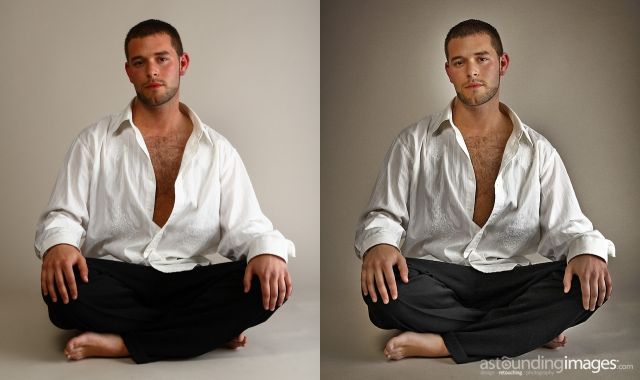
Here an alternate approach njw.
Used the shadow highlight tool and some light painting to even out the exposure.
Added some noise and contrast as well as lowered the saturation in the reds for a more gritty look.
Added a vignette to bring more focus to the subject by lowering the emphasis on the white background.
Edited on Mar 23, 2008 at 05:04 AM
Used the shadow highlight tool and some light painting to even out the exposure.
Added some noise and contrast as well as lowered the saturation in the reds for a more gritty look.
Added a vignette to bring more focus to the subject by lowering the emphasis on the white background.
 |
||
 |
||
|
Edited on Mar 23, 2008 at 05:04 AM
Mar 23, 2008 at 05:03 AM