I just noticed your post/photo has had 100 views by other members and no comments yet by anyone.
I will get you started. Also, don't be discouraged if not many people post comments to your photo. Some apparently just like other subjects.
You have a beautiful sister/model and a very nice photo here.
Lovely eyes and face.
The mood seems very natural.
Your photos posted here may get more comments and tips/suggestions (if that is what you want) if you tell the forum more about your photo, your equipment used, or your projected use of the image (e.g. for an ad). If you have specific needs for help with something, make sure to make that clear too. I have a thread here that is loaded with tips and suggestions (and example) of how I think any member can get better comments and critiques (if you want) when posting photos here. It is all discussed in this thread: https://www.fredmiranda.com/forum/topic/623646
I hope these comments help you.
Edited by Steady Hand on Mar 13, 2008 at 01:36 PM GMT
The vivid, differing colors in this pic make my eyes wander. Skin color, bkg, fingernails, eyes, shirt...the colors make it hard for me to focus on the face. Hope you don't mind, I pulled it into PS channel mixer (mono) at 60/40/10 and this is the result:
What I do when I see a photo where the eye flow and balance doesn't appeal to my eye is to bring the crop tool in close on the most important focal point - the eyes - then slowly expand the frame until I see unnecessary distractions enter the frame. This was the result with this shot:
The wall and hand are eliminated as distractions. The curve of the hair leads to the arm and the line of the arm leads down and back up to the face in a smooth circular path with nothing outside the path which distracts. The arm frames the face without the stripes on the shirt overpowering and competing with it as much. The unfortunate thing in this shot is that she is not looking at the camera. Eye contact makes or breaks a portrait. When there's no connection with the viewer there's little incentive to linger on the face.
Original photo - nice lighting of a pretty lady. Perfect focus. I noticed the nail color was a distraction to an otherwise nice photo. Agree too, the photo made a great b-w conversion.
First... lovely woman with striking features and amazing hair and eye color.
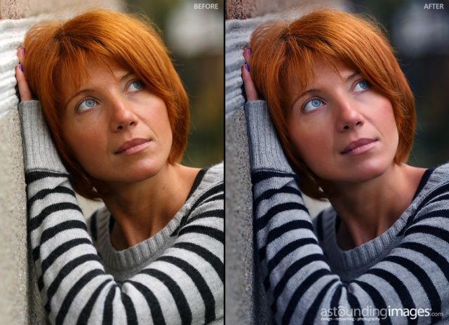
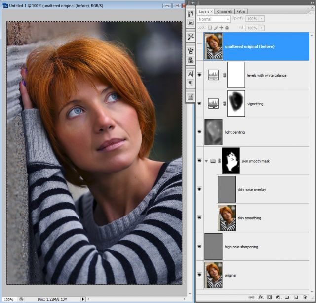
The white balance is actually pretty close but I do see what you mean about the skin appearing to be orange. I rotated the hue a bit as well as a bit of lightpainting, skin smoothing and some film grain. The image has much more of a blue cast onthe sweater now which could have been fixed with a mask and hus rotation but I liked the way the blue emphasized the red of the hair.
Here's the before and after.
Edited by BrittMcT on Mar 14, 2008 at 06:50 AM GMT
Yep...Britt's changes look great. I should have said earlier how much I liked the image before, but it's better with Britt's edits. Only nit is that I might change the nail polish color. Not sure I personally like the tighter crops posted by the others, but I do understand the reasoning for them.
OK, shoot me for saying this, but I like the original. The coloring may be off a bit depending on your monitor but when I view a photo, especially of a person or a landscape, I want to see the real thing - not a painting. Yes, I remove small imperfections in my photos - like a drool spot on a baby's shirt, a hair in the middle of a face, temporary blemishes (cuts, pimples) etc, but I don't alter the essence of the person. I like to see them for what they are with all their character - that's what sets us all apart - with all the PSing these days everyone looks, well like a painting. Look at the fashions mags - there are no "real" people in them - they're all manequines! So, from a technical perspective, I appreciate the above alterations but from a heart/soul perspective, I really like the original. Oh yea, she is stunning.
G
Edited by Gventure on Apr 11, 2008 at 11:51 AM GMT