which lens has the most 3D POP?

p.98 #1which lens has the most 3D POP?
Jonas B wrote:
 .
I've never actually played with selective sharpening and de-sharpening in order to induce that 3d effect. But maybe with enough skill and care it can indeed be used towards that purpose.
When it comes to field curvature, I actually think it can help with 3d pop. Given it's the right kind of curvature for the scene, so that it increases the blur around the subject, but not excessively (i.e. like a toy lens).[...]Of course... "de-sharpening" sounds so much better than my "blurring".
I think the excessive effects are for fun only but also something you get tired of quickly.
Crafting a transition zone that is more rapid than the natural optic used, can be modulated with a series of gradient masks. But, as you mention ... it's one thing to do so on occasion, yet another to "live that way" as a matter of regular process (individual to every image).
j4nu wrote
I'm happy we agree about MTF usefulness in this case .I've never actually played with selective sharpening and de-sharpening in order to induce that 3d effect. But maybe with enough skill and care it can indeed be used towards that purpose.
When it comes to field curvature, I actually think it can help with 3d pop. Given it's the right kind of curvature for the scene, so that it increases the blur around the subject, but not excessively (i.e. like a toy lens).[...]
I think the excessive effects are for fun only but also something you get tired of quickly.
Crafting a transition zone that is more rapid than the natural optic used, can be modulated with a series of gradient masks. But, as you mention ... it's one thing to do so on occasion, yet another to "live that way" as a matter of regular process (individual to every image).
Nov 22, 2025 at 09:29 PM
p.98 #2which lens has the most 3D POP?
j4nu wrote:
I just don't see how one could utilize the MTF graph (which goes from the center to each side) to compose an image in order to evoke more depth from it... Sorry, maybe I'm just ignorant .If it was possible to frame in a way so the outer zones could be cropped away (so they didn't sharpen up again) it didn't hurt. If having the subject close to the border and angled it sometimes made a mess of things where the blur first increased and later decreased. Many times it didn't matter and many images were beautiful.
No, the MTF is useless for this. What it tells me is that we have to check for field curvature, much like tsdevine says. The ZM 35/1.4 is an example of a lens with a bad shaped curvature when used with cameras having a thick sensor stack. That curvature doesn't help at all. Some other lenses may have a field curvature bending in the other direction (making the background at the sides more blurry) and perhaps that makes it easier sometimes when looking for sharp center and blurry background.
What I tried to say earlier is that also small differences in perceived "sharpness" can help with dimensionality or pop. Local sharpening and sometimes blurring.
I like it when the focus plane is flat. I'm a mediocre photographer and have enough problems with my work without extensive field curvature adding to the soup. So, field curvature is one off the things I check when getting a new lens in my hands. I appreciate Fred Miranda's reviews where he post the animated GIF demonstrating possible field curvature.+1 for Fred's FC GIF's. 
So, maybe my CoC x MTF mental gymnastics is more like CoC x MTF x FC (conceptual impact, not literal math).The thing here is that MTF shows us the end result, but it doesn't tell us anything about what causes the resolution to drop...
What causes the resolution to drop ... imo, is the designer wanted it to drop in Zone B, to facilitate different rates from A > B > C.
In some regard, that's the end / means relationship. Is this true of all lenses, maybe not ... but, in Leica's historical concept of striving to create lenses that does that very thing, I'm (assuming) of the perspective that the dip is their resultant effort to craft that projection, by design.
Bear in mind, they have the ability to craft them without the strong dip, as well. Imo, this is a designer's choosing, by intent to yield this kind of rendering that is common to the Lux (vs. the Cron).
RustyBug wrote
Jonas B wrote
j4nu wrote
Ok, that makes sense. But did that drop in sharpness of Leica Summilux-M 35/1.4 pre FLE, contribute to the depth of the image?I just don't see how one could utilize the MTF graph (which goes from the center to each side) to compose an image in order to evoke more depth from it... Sorry, maybe I'm just ignorant
.No, the MTF is useless for this. What it tells me is that we have to check for field curvature, much like tsdevine says. The ZM 35/1.4 is an example of a lens with a bad shaped curvature when used with cameras having a thick sensor stack. That curvature doesn't help at all. Some other lenses may have a field curvature bending in the other direction (making the background at the sides more blurry) and perhaps that makes it easier sometimes when looking for sharp center and blurry background.
What I tried to say earlier is that also small differences in perceived "sharpness" can help with dimensionality or pop. Local sharpening and sometimes blurring.
I like it when the focus plane is flat. I'm a mediocre photographer and have enough problems with my work without extensive field curvature adding to the soup. So, field curvature is one off the things I check when getting a new lens in my hands. I appreciate Fred Miranda's reviews where he post the animated GIF demonstrating possible field curvature.
So, maybe my CoC x MTF mental gymnastics is more like CoC x MTF x FC (conceptual impact, not literal math).
What causes the resolution to drop ... imo, is the designer wanted it to drop in Zone B, to facilitate different rates from A > B > C.
In some regard, that's the end / means relationship. Is this true of all lenses, maybe not ... but, in Leica's historical concept of striving to create lenses that does that very thing, I'm (assuming) of the perspective that the dip is their resultant effort to craft that projection, by design.
Bear in mind, they have the ability to craft them without the strong dip, as well. Imo, this is a designer's choosing, by intent to yield this kind of rendering that is common to the Lux (vs. the Cron).
Nov 22, 2025 at 09:33 PM

p.98 #4which lens has the most 3D POP?
j4nu wrote:
BTW, is there another "old" thread about this? Do you have a link to that post, as it sounds really interesting?
From 2009 archives.
https://www.fredmiranda.com/forum/topic/829238/0?keyword=3d#7701654
BTW, is there another "old" thread about this? Do you have a link to that post, as it sounds really interesting?
From 2009 archives.
https://www.fredmiranda.com/forum/topic/829238/0?keyword=3d#7701654
Nov 22, 2025 at 09:39 PM
p.98 #5which lens has the most 3D POP?
RustyBug wrote:
From 2009 archives.
https://www.fredmiranda.com/forum/topic/829238/0?keyword=3d#7701654
Fun! That thread in turn has a link to thread from 2007.
I started reading the threads and it brought back old memories. The names of the posters... I have missed some of them, one by one, you know, like when you happen to think of someone. In both threads, it's like a cavalcade of people I've exchanged thoughts and ideas with, some of whom I've met (FM Forum member meetings in Berlin, for example). Maybe I also miss being young, or at least younger than I am today.
In any case, we had the same discussion then as we do now. Some differences are that there was no Sony forum, but we hung out in Alternative Gear, 14MP was considered a lot of pixels, and Zeiss lenses were considered the best.
I and a few others disliked Zeiss's typical LoCA (think of the 100/2 macro, 50/2 macro, etc.). Most ignored it in exchange for admiring the micro contrast. I also remember my Canon 5D with C/Y 35/1.4. If you nailed the focus (which sometimes happened), you could get fantastic pictures.
Fun trip down memory lane. Thanks again.
j4nu wrote
BTW, is there another "old" thread about this? Do you have a link to that post, as it sounds really interesting?https://www.fredmiranda.com/forum/topic/829238/0?keyword=3d#7701654
Fun! That thread in turn has a link to thread from 2007.
I started reading the threads and it brought back old memories. The names of the posters... I have missed some of them, one by one, you know, like when you happen to think of someone. In both threads, it's like a cavalcade of people I've exchanged thoughts and ideas with, some of whom I've met (FM Forum member meetings in Berlin, for example). Maybe I also miss being young, or at least younger than I am today.
In any case, we had the same discussion then as we do now. Some differences are that there was no Sony forum, but we hung out in Alternative Gear, 14MP was considered a lot of pixels, and Zeiss lenses were considered the best.
I and a few others disliked Zeiss's typical LoCA (think of the 100/2 macro, 50/2 macro, etc.). Most ignored it in exchange for admiring the micro contrast. I also remember my Canon 5D with C/Y 35/1.4. If you nailed the focus (which sometimes happened), you could get fantastic pictures.
Fun trip down memory lane. Thanks again.
Nov 23, 2025 at 05:40 AM
p.98 #6which lens has the most 3D POP?
RustyBug wrote:
From 2009 archives.
https://www.fredmiranda.com/forum/topic/829238/0?keyword=3d#7701654
Thanks, maybe I'll find some time to start digging through those 47 pages .
Seriously though, I like how that thread starts with an image with "my kind of 3D pop" .
j4nu wrote
BTW, is there another "old" thread about this? Do you have a link to that post, as it sounds really interesting?https://www.fredmiranda.com/forum/topic/829238/0?keyword=3d#7701654
Thanks, maybe I'll find some time to start digging through those 47 pages
.Seriously though, I like how that thread starts with an image with "my kind of 3D pop"
.Nov 23, 2025 at 07:11 AM
p.98 #7which lens has the most 3D POP?
RustyBug wrote:
I just don't see how one could utilize the MTF graph (which goes from the center to each side) to compose an image in order to evoke more depth from it... Sorry, maybe I'm just ignorant .If it was possible to frame in a way so the outer zones could be cropped away (so they didn't sharpen up again) it didn't hurt. If having the subject close to the border and angled it sometimes made a mess of things where the blur first increased and later decreased. Many times it didn't matter and many images were beautiful.
No, the MTF is useless for this. What it tells me is that we have to check for field curvature, much like tsdevine says. The ZM 35/1.4 is an example of a lens with a bad shaped curvature when used with cameras having a thick sensor stack. That curvature doesn't help at all. Some other lenses may have a field curvature bending in the other direction (making the background at the sides more blurry) and perhaps that makes it easier sometimes when looking for sharp center and blurry background.
What I tried to say earlier is that also small differences in perceived "sharpness" can help with dimensionality or pop. Local sharpening and sometimes blurring.
I like it when the focus plane is flat. I'm a mediocre photographer and have enough problems with my work without extensive field curvature adding to the soup. So, field curvature is one off the things I check when getting a new lens in my hands. I appreciate Fred Miranda's reviews where he post the animated GIF demonstrating possible field curvature.+1 for Fred's FC GIF's.
So, maybe my CoC x MTF mental gymnastics is more like CoC x MTF x FC (conceptual impact, not literal math).The thing here is that MTF shows us the end result, but it doesn't tell us anything about what causes the resolution to drop...What causes the resolution to drop ... imo, is the designer wanted it to drop in Zone B, to facilitate different rates from A > B > C.
In some regard, that's the end / means relationship. Is this true of all lenses, maybe not ... but, in Leica's historical concept of striving to create lenses that does that very thing, I'm (assuming) of the perspective that the dip is their resultant effort to craft that projection, by design.
Bear in mind, they have the ability to craft them without the strong dip, as well. Imo, this is a designer's choosing,...Show more →
Yes, you're right. It can be solely the lens designer's choice of course.
... but it can also be a design choice dictated by other factors:
complexity (end price?), size/weight, flare resistance, induced distortion, ...
As for my comment about MTF, it was mainly aimed at that high-level "gymanstics" . Since MTF is the end result, it would create some kind of feedback loop to include it together with CoC and FC in the formula (as MTF already contains the effects of both).
j4nu wrote
RustyBug wrote
Jonas B wrote
j4nu wrote
Ok, that makes sense. But did that drop in sharpness of Leica Summilux-M 35/1.4 pre FLE, contribute to the depth of the image?I just don't see how one could utilize the MTF graph (which goes from the center to each side) to compose an image in order to evoke more depth from it... Sorry, maybe I'm just ignorant
.No, the MTF is useless for this. What it tells me is that we have to check for field curvature, much like tsdevine says. The ZM 35/1.4 is an example of a lens with a bad shaped curvature when used with cameras having a thick sensor stack. That curvature doesn't help at all. Some other lenses may have a field curvature bending in the other direction (making the background at the sides more blurry) and perhaps that makes it easier sometimes when looking for sharp center and blurry background.
What I tried to say earlier is that also small differences in perceived "sharpness" can help with dimensionality or pop. Local sharpening and sometimes blurring.
I like it when the focus plane is flat. I'm a mediocre photographer and have enough problems with my work without extensive field curvature adding to the soup. So, field curvature is one off the things I check when getting a new lens in my hands. I appreciate Fred Miranda's reviews where he post the animated GIF demonstrating possible field curvature.
So, maybe my CoC x MTF mental gymnastics is more like CoC x MTF x FC (conceptual impact, not literal math).
In some regard, that's the end / means relationship. Is this true of all lenses, maybe not ... but, in Leica's historical concept of striving to create lenses that does that very thing, I'm (assuming) of the perspective that the dip is their resultant effort to craft that projection, by design.
Bear in mind, they have the ability to craft them without the strong dip, as well. Imo, this is a designer's choosing,...Show more →
Yes, you're right. It can be solely the lens designer's choice of course.
... but it can also be a design choice dictated by other factors:
complexity (end price?), size/weight, flare resistance, induced distortion, ...
As for my comment about MTF, it was mainly aimed at that high-level "gymanstics"
. Since MTF is the end result, it would create some kind of feedback loop to include it together with CoC and FC in the formula (as MTF already contains the effects of both).Nov 23, 2025 at 07:22 AM
p.98 #8which lens has the most 3D POP?
Jonas B wrote:
From 2009 archives.
https://www.fredmiranda.com/forum/topic/829238/0?keyword=3d#7701654Fun! That thread in turn has a link to thread from 2007.
I started reading the threads and it brought back old memories. The names of the posters... I have missed some of them, one by one, you know, like when you happen to think of someone. In both threads, it's like a cavalcade of people I've exchanged thoughts and ideas with, some of whom I've met (FM Forum member meetings in Berlin, for example). Maybe I also miss being young, or at least younger than I am today.
In any case, we had the same discussion then as we...Show more →
+100
RustyBug wrote
j4nu wrote
BTW, is there another "old" thread about this? Do you have a link to that post, as it sounds really interesting?https://www.fredmiranda.com/forum/topic/829238/0?keyword=3d#7701654
I started reading the threads and it brought back old memories. The names of the posters... I have missed some of them, one by one, you know, like when you happen to think of someone. In both threads, it's like a cavalcade of people I've exchanged thoughts and ideas with, some of whom I've met (FM Forum member meetings in Berlin, for example). Maybe I also miss being young, or at least younger than I am today.
In any case, we had the same discussion then as we...Show more →
+100
Nov 23, 2025 at 08:15 AM
p.98 #9which lens has the most 3D POP?
j4nu wrote:
From 2009 archives.
https://www.fredmiranda.com/forum/topic/829238/0?keyword=3d#7701654Thanks, maybe I'll find some time to start digging through those 47 pages .
Seriously though, I like how that thread starts with an image with "my kind of 3D pop" .
The main downside is that many of the images are no longer available to see.
But, with that caveat ... there's still some and the dialogue among fellow members remains.
It might not seem like that long ago, but a lot has happened since then in the photographic industry ... Zony, Thypoch, Mirrorless. The latter opening a plethora of opportunity for optical formulation differences that DSLR didn't offer. Imo, this is salient to understand, as it allows the gap to be narrowed among different mfr's and optical designs. The bell curve vs. the outliers has changed, but there are still outliers on the endpoints that some designers are approaching.
With the advent of mirrorless, the wider throat and closer registration opportunities inherently provide for different angles to the film plane. Now, former non-rangefinder mfr's can get in the game and take some pages from that playbook, too.
Medium Format
DSLR / SLR
Rangefinder
Mirrorless
Back then, I had a link to the different registration distances ... and you could correlate the way say Pentax glass (longer distance) transitioned vs. EF or F or M mounts. Since the M lenses sat so much closer to the film plane, their ability to generate faster rates of change (also contrast, by definition of sorts), that was notably appreciated by some. When mirrorless came on board (and adapters for M glass), things began somewhat of a paradigm shift in optical design. Even, if we look at Hasselblad's XCD glass vs. it mirrored counterparts, you can see the optical design changes occuring.
Anyway, that was then ... this is now.
Human physiological response / depth perception cues are the same as they have always been throughout history. The matter of Trompe' Loeil (fool the eye) has been an endeavor of artists for centuries to impart this physiological response in a 2D medium. Lens designers throughout history have approached this with different attitudes about it. Mainstream, pretty much "splits the difference", looking for that "edge to edge" performance. Leica and Zeiss (historically) took (some of their designs) into a directional effort to amplify the effects that the optic could contribute.
Where we are in the market today ... the plethora of pre-mirrorless designs, rangefinder designs and mirrorless designs brings a wide range of what the optic can bring to the party. That said, there'll never be a "most", but there will always be different designs that bring varying amounts / rates of change to the party.
Part of the heyday of "Alt" lenses back then (when EF had the closest registration distance and afforded greatest number of adaption options) was the differences that abound. Today's mirrorless registration distances brought a new opportunity to the table for former DSLR / SLR manufacturers.
Enjoy the read.
RustyBug wrote
j4nu wrote
BTW, is there another "old" thread about this? Do you have a link to that post, as it sounds really interesting?https://www.fredmiranda.com/forum/topic/829238/0?keyword=3d#7701654
.Seriously though, I like how that thread starts with an image with "my kind of 3D pop"
.The main downside is that many of the images are no longer available to see.
But, with that caveat ... there's still some and the dialogue among fellow members remains.
It might not seem like that long ago, but a lot has happened since then in the photographic industry ... Zony, Thypoch, Mirrorless. The latter opening a plethora of opportunity for optical formulation differences that DSLR didn't offer. Imo, this is salient to understand, as it allows the gap to be narrowed among different mfr's and optical designs. The bell curve vs. the outliers has changed, but there are still outliers on the endpoints that some designers are approaching.
With the advent of mirrorless, the wider throat and closer registration opportunities inherently provide for different angles to the film plane. Now, former non-rangefinder mfr's can get in the game and take some pages from that playbook, too.
Medium Format
DSLR / SLR
Rangefinder
Mirrorless
Back then, I had a link to the different registration distances ... and you could correlate the way say Pentax glass (longer distance) transitioned vs. EF or F or M mounts. Since the M lenses sat so much closer to the film plane, their ability to generate faster rates of change (also contrast, by definition of sorts), that was notably appreciated by some. When mirrorless came on board (and adapters for M glass), things began somewhat of a paradigm shift in optical design. Even, if we look at Hasselblad's XCD glass vs. it mirrored counterparts, you can see the optical design changes occuring.
Anyway, that was then ... this is now.
Human physiological response / depth perception cues are the same as they have always been throughout history. The matter of Trompe' Loeil (fool the eye) has been an endeavor of artists for centuries to impart this physiological response in a 2D medium. Lens designers throughout history have approached this with different attitudes about it. Mainstream, pretty much "splits the difference", looking for that "edge to edge" performance. Leica and Zeiss (historically) took (some of their designs) into a directional effort to amplify the effects that the optic could contribute.
Where we are in the market today ... the plethora of pre-mirrorless designs, rangefinder designs and mirrorless designs brings a wide range of what the optic can bring to the party. That said, there'll never be a "most", but there will always be different designs that bring varying amounts / rates of change to the party.
Part of the heyday of "Alt" lenses back then (when EF had the closest registration distance and afforded greatest number of adaption options) was the differences that abound. Today's mirrorless registration distances brought a new opportunity to the table for former DSLR / SLR manufacturers.
Enjoy the read.
Nov 23, 2025 at 08:39 AM
p.98 #10which lens has the most 3D POP?
RustyBug wrote:
Part of the heyday of "Alt" lenses back then (when EF had the closest registration distance and afforded greatest number of adaption options) was the differences that abound. Today's mirrorless registration distances brought a new opportunity to the table for former DSLR / SLR manufacturers.
Enjoy the read.
I feel like the pickup of the SL bodies have returned me to the "heyday" of alt lenses. Once again I can properly see what I am doing and fully utilize all the amazing old glass I have.
Yesterday got even better when I scored 4 more L mount type adapters. I only wanted the EF-L autofocus one but landed another M42 screw mount and a Minolta MD one. Now I can use every single lens I have in the house with my SL bodies. Went out yesterday evening testing out a Minolta 50/1.7 lens and with the zoom in function of the EVF I was in photography heaven again.
Nov 23, 2025 at 09:16 AM
|
p.98 #11which lens has the most 3D POP?
jamesdak wrote:
I feel like the pickup of the SL bodies have returned me to the "heyday" of alt lenses. Once again I can properly see what I am doing and fully utilize all the amazing old glass I have.
Yesterday got even better when I scored 4 more L mount type adapters. I only wanted the EF-L autofocus one but landed another M42 screw mount and a Minolta MD one. Now I can use every single lens I have in the house with my SL bodies. Went out yesterday evening testing out a Minolta 50/1.7 lens and with the zoom in...Show more →
Heh. I can relate to that, great fun. Congratulations! I think I'll buy an M42 --> Sony E converter to myself for Christmas. The old russian stuff need some exercise!
Nov 23, 2025 at 09:52 AM
p.98 #12which lens has the most 3D POP?
I recently revisited the rendering of lenses stopped down, and I love what I can get from Leica versus Thypoch (which already punches way above its price tag), in my very personal view the tonality of the Leica lenses tends to give slightly more dimensionality to them. I remember fondly about the Q2 giving similar rendering as well, maybe slightly harsher.

Nov 23, 2025 at 10:07 AM
p.98 #13which lens has the most 3D POP?
RustyBug wrote:
From 2009 archives.
https://www.fredmiranda.com/forum/topic/829238/0?keyword=3d#7701654Thanks, maybe I'll find some time to start digging through those 47 pages .
Seriously though, I like how that thread starts with an image with "my kind of 3D pop" .
The main downside is that many of the images are no longer available to see.
[...]
Enjoy the read.
I think that unfortunately the lack of images coupled with the time required to read that thread, make it highly unlikely I will take on this endeavor anytime soon .
However, maybe some of the images are not displayed in the thread, but are still available after clicking on their links. That's how I got the first image to load and I was very glad I did.
If that's not the case, then I'm afraid that thread would not be of much value to me, as I believe photography is primarily about photos (hmm, getting sort of a deja vu now, as I wrote a very similar thing in an another relatively recent thread around here). I guess I'm a "seeing is believing" kind of person, so the mere discussion itself, without the photos to back it up, won't do much for me. But that's only me of course ...
j4nu wrote
RustyBug wrote
j4nu wrote
BTW, is there another "old" thread about this? Do you have a link to that post, as it sounds really interesting?https://www.fredmiranda.com/forum/topic/829238/0?keyword=3d#7701654
.Seriously though, I like how that thread starts with an image with "my kind of 3D pop"
.The main downside is that many of the images are no longer available to see.
[...]
Enjoy the read.
I think that unfortunately the lack of images coupled with the time required to read that thread, make it highly unlikely I will take on this endeavor anytime soon
.However, maybe some of the images are not displayed in the thread, but are still available after clicking on their links. That's how I got the first image to load and I was very glad I did.
If that's not the case, then I'm afraid that thread would not be of much value to me, as I believe photography is primarily about photos (hmm, getting sort of a deja vu now, as I wrote a very similar thing in an another relatively recent thread around here). I guess I'm a "seeing is believing" kind of person, so the mere discussion itself, without the photos to back it up, won't do much for me. But that's only me of course
...Nov 23, 2025 at 10:32 AM
p.98 #14which lens has the most 3D POP?
RustyBug wrote:
From 2009 archives.
https://www.fredmiranda.com/forum/topic/829238/0?keyword=3d#7701654Thanks, maybe I'll find some time to start digging through those 47 pages .
Seriously though, I like how that thread starts with an image with "my kind of 3D pop" .
It might not seem like that long ago, but a lot has happened since then in the photographic industry ... Zony, Thypoch, Mirrorless. The latter opening a plethora of opportunity for optical formulation differences that DSLR didn't offer. Imo, this is salient to understand, as it allows the gap to be narrowed among different mfr's and optical designs. The bell curve vs. the outliers has changed, but there are still outliers on the endpoints that some designers are approaching.
With the advent of mirrorless, the wider throat and closer registration opportunities inherently provide for different angles to the film plane. Now,...Show more →
So, am I reading this right, that you're suggesting registration distance plays a role in the image's 3D depth as well?
j4nu wrote
RustyBug wrote
j4nu wrote
BTW, is there another "old" thread about this? Do you have a link to that post, as it sounds really interesting?https://www.fredmiranda.com/forum/topic/829238/0?keyword=3d#7701654
.Seriously though, I like how that thread starts with an image with "my kind of 3D pop"
.It might not seem like that long ago, but a lot has happened since then in the photographic industry ... Zony, Thypoch, Mirrorless. The latter opening a plethora of opportunity for optical formulation differences that DSLR didn't offer. Imo, this is salient to understand, as it allows the gap to be narrowed among different mfr's and optical designs. The bell curve vs. the outliers has changed, but there are still outliers on the endpoints that some designers are approaching.
With the advent of mirrorless, the wider throat and closer registration opportunities inherently provide for different angles to the film plane. Now,...Show more →
So, am I reading this right, that you're suggesting registration distance plays a role in the image's 3D depth as well?
Nov 23, 2025 at 10:33 AM
p.98 #15which lens has the most 3D POP?
There are not many black and white movies made, so cine lens producers can be expected to know something about color. Their lenses get used across many different camera platforms, so color must be not just very acceptable but versatile enough to make these transitions, and to tolerate heavy post work. There are probably people who think you will get better color from the camera maker’s own lenses in the photography world.
Color tonality – the range of hue differences, large and small – works in conjunction with brightness tonality to project a powerful influence on stopped down compositions of natural scenery, because DOF extends to largely remove focus fade (let alone bokeh) from consideration. These factors exert a stronger impact on perceived 3D than accepted metrics of quality such as ‘sharpness’, in real life as in our photographs.
It’s so sad seeing the western world’s residential and office architecture turn into a dull array of monochrome boxes, devoid of even accents of color in many cases. The same is happening with motor vehicles. So, it’s no surprise people have turned to ever sharper lenses in a futile bid to inject life into their images. And old established lens makers stoke this fire for all its worth. Not surprisingly, color perception is now much worse in contemporary human populations than their grandparents’ generations.
As with so much else, ‘use it or lose it’ seems to apply here.
Where the technician photographer craves great acutance across the entire frame, 3D advocates of true-to-life photography look closely at color handling and what might be called local contrast, the effect that provides spark to otherwise flat scenes. ‘Color’ cannot be adequately judged by swatches any more than distance can be gauged by mile markers. You just need a good variety of hues and varying levels of brightness to see what lenses can do. You need to see the shaping of image motifs as illumination rolls off them.
But you will be very lucky to see any meaningful comparisons of deep DOF images, needed to let the lens deliver what it has over an extended scene. In these compositions, the assembly of distinctly colored objects act as ‘distance markers’ that enable our vision to build a coherent picture of the scene. That’s the ideal circumstance, but it can be easily thwarted by lenses that do not sufficiently distinguish hue and enough local contrast to add the brightness dimension to the mix.
The way varying illumination of green motifs is particularly important. Greens are 70% of what we see as brightness, followed by reds at 20%. So, the real tragedy is this: ‘Red-green color blindness is the most common type of color vision deficiency, making it difficult to distinguish between colors with red and green hues’.
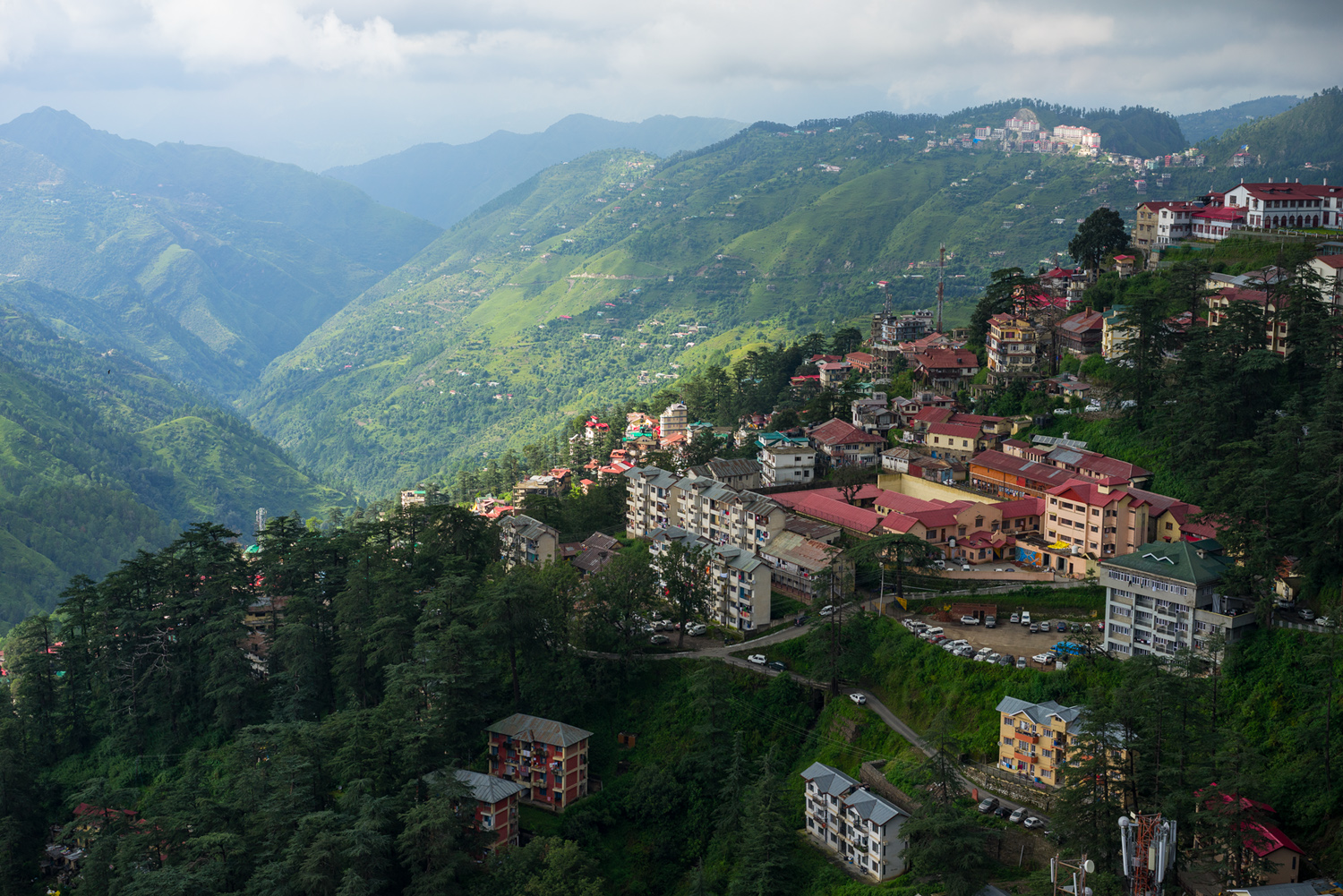
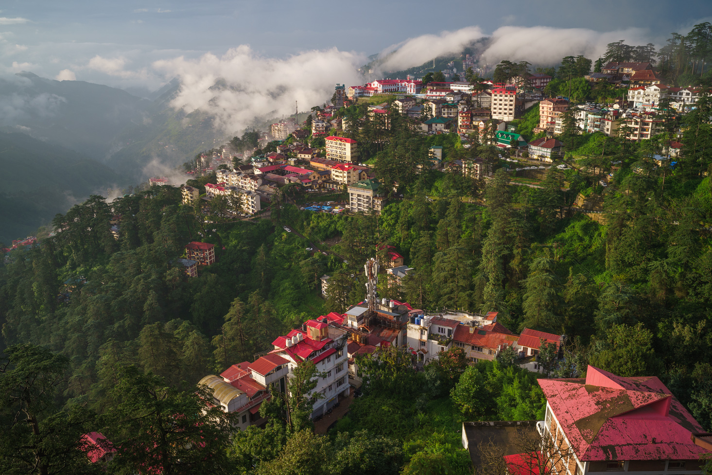
That being said, here are two images, shot with different focal lengths, of the same deep scene. They were shot eight years apart, so we see changes in the built structures and ground cover, but these images were taken one week apart in the monsoon season, both in near constant rain.
Nov 23, 2025 at 06:28 PM
p.98 #16which lens has the most 3D POP?
The first is from Sony’s 55mm f1.8; the UV cast is left intact as it acts as a counterpoint to the near ridge content.
I call my 55mm the blue-green lens as these hue regions are always dominant in its landscape images. The second image, from the Simera 28mm, shows the first image’s scene, plus its extra angle of view material. Lifting WB a little in the Sony photo would bring the overall color balance closer, but it would not change the characteristics I want to point to here.
You could almost be forgiven for thinking the Sony image only has one green, with its variation affected only by differences in brightness. The lens has a reputation for its 3D rendering, but they do not flow from color handling. Moving from greens to reds, we see the same effect – there are differences but they are muted and difficult to perceive easily. So we have the two main colors by which we assess brightness doing a not very good job here, and real life is full of color nuance.
In the Simera image, Immediately obvious are the strikingly wide gamuts of greens and reds. You can clearly see old trees with different hues than their more recent trees nearby. Different species have very different color presentations. Reds (and near tones like red-oranges and crimsons) are very well presented, and roof panels facing different directions are distinct too. We are only looking at color here, but it’s easy to see the exact location and shapes of trees and roofs. In this facile comparison, we can appreciate that color is a dominant force in 3D, enlivening the scene with vigor, shape and information. ‘Sharpness’ is reduced to near-irrelevancy here, because once past a certain threshold, more is not better, or necessary.
You understand the Simera image more easily and fully, as it rapidly engages your vision. A similar deficiency is seen in many modern Leica lenses that, like the Sony 55mm, rely heavily on aspherical surfacing. The range of hues are compressed in a similar fashion in lenses like those fitted to the Q3 and Q3 43 cameras. Asphericals are here to stay – made of both glass and plastic – but they may need careful balancing in designs to deliver better depth. If that aspect is desirable and enters the picture at the design stage, so to speak. A massive proportion of M images are black and white; or feature consistent surfaces of one color; or are of streets. Leica is playing to its strengths there.
Sony FE 55mm f1.8
Thypoch Simera 28mm f1.4
I call my 55mm the blue-green lens as these hue regions are always dominant in its landscape images. The second image, from the Simera 28mm, shows the first image’s scene, plus its extra angle of view material. Lifting WB a little in the Sony photo would bring the overall color balance closer, but it would not change the characteristics I want to point to here.
You could almost be forgiven for thinking the Sony image only has one green, with its variation affected only by differences in brightness. The lens has a reputation for its 3D rendering, but they do not flow from color handling. Moving from greens to reds, we see the same effect – there are differences but they are muted and difficult to perceive easily. So we have the two main colors by which we assess brightness doing a not very good job here, and real life is full of color nuance.
In the Simera image, Immediately obvious are the strikingly wide gamuts of greens and reds. You can clearly see old trees with different hues than their more recent trees nearby. Different species have very different color presentations. Reds (and near tones like red-oranges and crimsons) are very well presented, and roof panels facing different directions are distinct too. We are only looking at color here, but it’s easy to see the exact location and shapes of trees and roofs. In this facile comparison, we can appreciate that color is a dominant force in 3D, enlivening the scene with vigor, shape and information. ‘Sharpness’ is reduced to near-irrelevancy here, because once past a certain threshold, more is not better, or necessary.
You understand the Simera image more easily and fully, as it rapidly engages your vision. A similar deficiency is seen in many modern Leica lenses that, like the Sony 55mm, rely heavily on aspherical surfacing. The range of hues are compressed in a similar fashion in lenses like those fitted to the Q3 and Q3 43 cameras. Asphericals are here to stay – made of both glass and plastic – but they may need careful balancing in designs to deliver better depth. If that aspect is desirable and enters the picture at the design stage, so to speak. A massive proportion of M images are black and white; or feature consistent surfaces of one color; or are of streets. Leica is playing to its strengths there.
 |
||
 |
||
|
Sony FE 55mm f1.8
|
||
 |
||
|
Thypoch Simera 28mm f1.4
Nov 23, 2025 at 06:31 PM
p.98 #17which lens has the most 3D POP?
Quite different lighting in those shots Philip.
Nov 23, 2025 at 06:56 PM
p.98 #18which lens has the most 3D POP?
Yes, not the best examples of comparison. But I agreed to his remarks about certain lenses able to capture more shades of colors, which I personally gravitate towards. There are lenses that capture broad and detailed tonality in terms of bright and dark tones, and there are lenses that capture wide range of shades and hues of colors. And then there are lenses that can capture both...
tsdevine wrote:
Quite different lighting in those shots Philip.
tsdevine wrote:
Quite different lighting in those shots Philip.
Nov 23, 2025 at 07:38 PM
p.98 #19which lens has the most 3D POP?
jeffersoncasey wrote:
Yes, not the best examples of comparison. But I agreed to his remarks about certain lenses able to capture more shades of colors, which I personally gravitate towards. There are lenses that capture broad and detailed tonality in terms of bright and dark tones, and there are lenses that capture wide range of shades and hues of colors. And then there are lenses that can capture both...
The left and lower left portion of the Simera shot seems to be in shade, and you don't see the color differentiation as much. While the FE 55 shot, the whole section being compared is pretty much in shade, and the valley beyond has sunlight. The Simera tends towards cooler from a color balance perspective, but shown here it's warmer than the FE 55. Granted I think the FE 55 tends towards cooler as well. And if you notice, a majority of the FE 55 shot is the mid to left portion of the slope where the Simera doesn't show as much differentiation either.
What time of the year were these shot? Different trees green up in the spring at different times. They often mature to a darker green. Too many variables. Not arguing anything about the merits trying to be proven, other than these shots aren't really all that great for comparison.
So again, not arguing that what is being said isn't true. But I don't feel I could form strong opinions from these.
Yes, not the best examples of comparison. But I agreed to his remarks about certain lenses able to capture more shades of colors, which I personally gravitate towards. There are lenses that capture broad and detailed tonality in terms of bright and dark tones, and there are lenses that capture wide range of shades and hues of colors. And then there are lenses that can capture both...
tsdevine wrote
Quite different lighting in those shots Philip.The left and lower left portion of the Simera shot seems to be in shade, and you don't see the color differentiation as much. While the FE 55 shot, the whole section being compared is pretty much in shade, and the valley beyond has sunlight. The Simera tends towards cooler from a color balance perspective, but shown here it's warmer than the FE 55. Granted I think the FE 55 tends towards cooler as well. And if you notice, a majority of the FE 55 shot is the mid to left portion of the slope where the Simera doesn't show as much differentiation either.
What time of the year were these shot? Different trees green up in the spring at different times. They often mature to a darker green. Too many variables. Not arguing anything about the merits trying to be proven, other than these shots aren't really all that great for comparison.
So again, not arguing that what is being said isn't true. But I don't feel I could form strong opinions from these.
Nov 23, 2025 at 07:46 PM
p.98 #20which lens has the most 3D POP?
Not a good comparison. As others have already called out lighting is very different. Some lenses paint warmer but the ZA is cooler than the simera ? Hmm... The photos also seem to be taken at very different time periods (there is a tree covering one of the buildings in the second photo that isn't on the first). As much as you'd like to claim the wide gamuts of reds and greens in the simera :-), nothing meaningful can be inferred from these photos unfortunately.
Nov 23, 2025 at 11:13 PM