Hey guys,
great photos, this thread keeps getting better!
I just got my photos back from the lab, these are all shots from my trip to Charleston, SC.
I went there with,
my M6,
Zeiss 50 sonnar
and a Voigtlander 15.
I shot two rolls of film, one roll of KOdak Ektar and a roll of Ilford FP4.
First I will start with the BW shots, I shot this roll first so these are from the first day or two of my trip:
carstenw wrote:
Ron, I am a noob when it comes to Photoshop, but couldn't you first use an edge-selection layer as a mask to avoid the halos?
You could if the intent was to sharpen the image, but the use of the high pass filter is like using unsharp mask set to a low amount and high radius - the intent is to increase contrast across the image and that is what the halos do. In many scenes the halos are not obvious, but as I mentioned, in certain situations they are. Best is to test it yourself to get a feel of how it works. Either with the high pass filter or using USM, perhaps starting at 20/50/0. The advantage of working in an adjustment layer is you can apply a mask to it and paint it in, selectively masking specific areas from the effect.
Looks good Charles. You could also add a hue/saturation adjustment layer over the high pass layer and play with that to adjust skin tones. To my eyes, I feel the saturation of the skin is slightly too high, which could then be adjusted. And, you could play around with the hue values, particularly the yellow and red settings.
Luka, good examples. Yes, LAB offers a lot of options and I have to admit, it's not an area in Photoshop with which I'm very familiar. If working in RGB mode and using the curves tool results in too high color saturation, immediately after applying the curve setting, do a Command + Shift F (Fade) and select luminosity from the list of options. It should be similar to making the adjustment in LAB mode to the L channel. But probably not exactly the same. There are so many ways to do similar things in PS... it seems almost infinite.
Another 'trick' in LAB is quick & dirty noise reduction by applying gaussian blur to the A & B channels.
KL: excellent series! I really like #1, 5 and 8. One nitpick about #5: careful with the highlight recovery in the background. There's an area with no color information that has a strange transition. In such situations I would likely leave it blown out and in PS use the paint brush set to multiply, probably at around 10-15% and paint in some color density manually. If done carefully it will look natural. It's also a great way to recreate blown skin tones.
Thanks also for bringing up another peeve I have with the M9: no sync outlet. I love using the thumbs up, but sometimes I need to use flash, or a radio trigger... would like to use both. I have applied a strip of masking tape to the back of the M9 where my thumb would rest, and also one to the front over the M9. It adds a bit of grip when working without the thumbs up. I'm sure there are other types of tape that have a coarser surface that would serve this purpose even better.
ZM35C:
The last one was literally an exposure test shot but I like it.
ZM50 Planar:
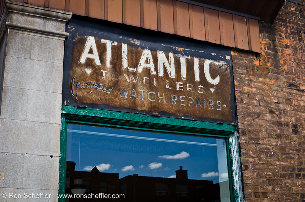
I like the old sign and the reflection in the window.. but due to various factors couldn't get the scene lined up in a more pleasing way..
Kyle, nice series of shots!
Ron, thanks, yes the saturation was high, which I included to exaggerate the effect on screen.
I love the film like appearance of your shots! My favourites are #5 and 6.
Really appreciate your input on PP with PS. I'm new to using LAB, and I have read before, how it is beneficial, but did not feel it was necessary or more the point, I didn't understand how to use it properly. I had used LAB with smart sharpen, or in RGB use smart sharpen with luminosity, but I had not been aware of subtleties of LAB. Back to the tutorials for me!!!
Yes another vote for a Sync outlet for the M9! I don't know why they cannot modify a version of the thumbs up, to allow direct connection to the contacts.
charles.K wrote:
Yes another vote for a Sync outlet for the M9! I don't know why they cannot modify a version of the thumbs up, to allow direct connection to the contacts.
Yes, that would be ideal. I'm sure it's considerably more complicated to manufacture, but would be the best solution for the current M9 design.
Edit: Kyle - nice series. You posted just before me and I didn't catch it until revisiting the thread a few hours later. Like the one with all the birds.
I can clearly see the difference between RGB and LAB mode in your examples Luka, I guess I should try it myself. Any recommended reading on-line or should I just dive into it?
Kyle, I love The Lone Soldier. It breaks several composition rules and becomes a great photo that way.
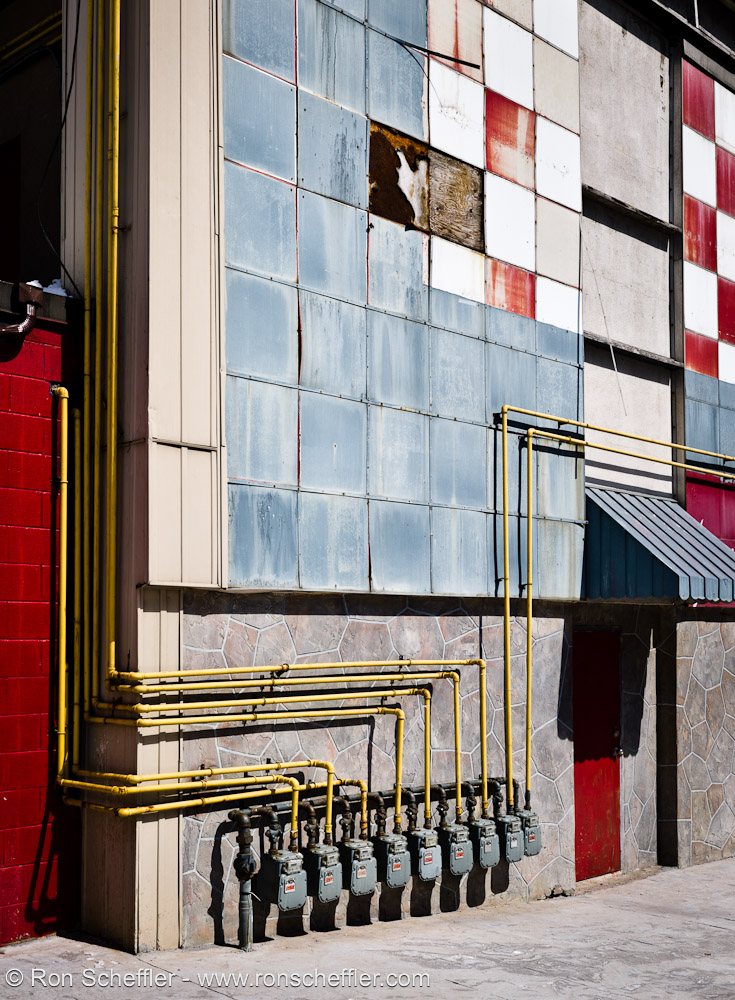
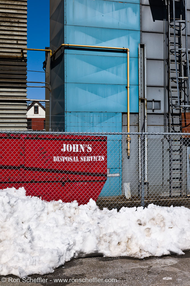
Ron, you really know how to get good exposures and colours in harsh sunlight. I like the one with yellow pipes the most in this set.
lovinglife, great skyscrape shot. I think it is the flags that makes the photo.
Luka, wow! I wished you didn't show those LAB results - now i'll have to dump LR (which has been so amazingly convenient) if i can just figure out how to follow your tips. I don't have PS yet so most of the stuff you mentioned is totally greek to me.
Great pics Charles! You must write something for us non-tech inclined ones. Do you still use LR?
Thanks for the tip Ron! I was having a tought time with the blown out highlights - will try your suggestion soon. I really like the last 2 shots of your series - especially the 2nd last one with the clouds. AWesome!
Has anyone tried SNOB from Leicagoodies.com? I was hoping to use it when using flash with the M9. especially during photo shoots, one is basically holding the camera the entire session so a good grip aid is pretty crucial.
KL, you still need a RAW converter to create an output (assuming you shoot RAW) before you can start working in LAB. IMO, depending on what 'look' you want, you can probably achieve it, or get close to it, in LR with some careful tweaking.
Thanks Joakim - I also like that one quite a bit. I find the M9 very good in harsh lighting conditions. As Luka so effectively demonstrated with his Egypt images, there's loads of shadow headroom to play with, at least at base ISO without noise being a significant issue. I just shoot to preserve highlights and go from there in LR depending on the scene.
Charles, I'd be interested to see those images posted with the previous versions to see the differences. Those two look really good, especially the skin tone.
Lovinglife - nice one - the clouds are very interesting and effectively contrast the stark angular nature of the building. Nice timing on the flags with the opposing curls.
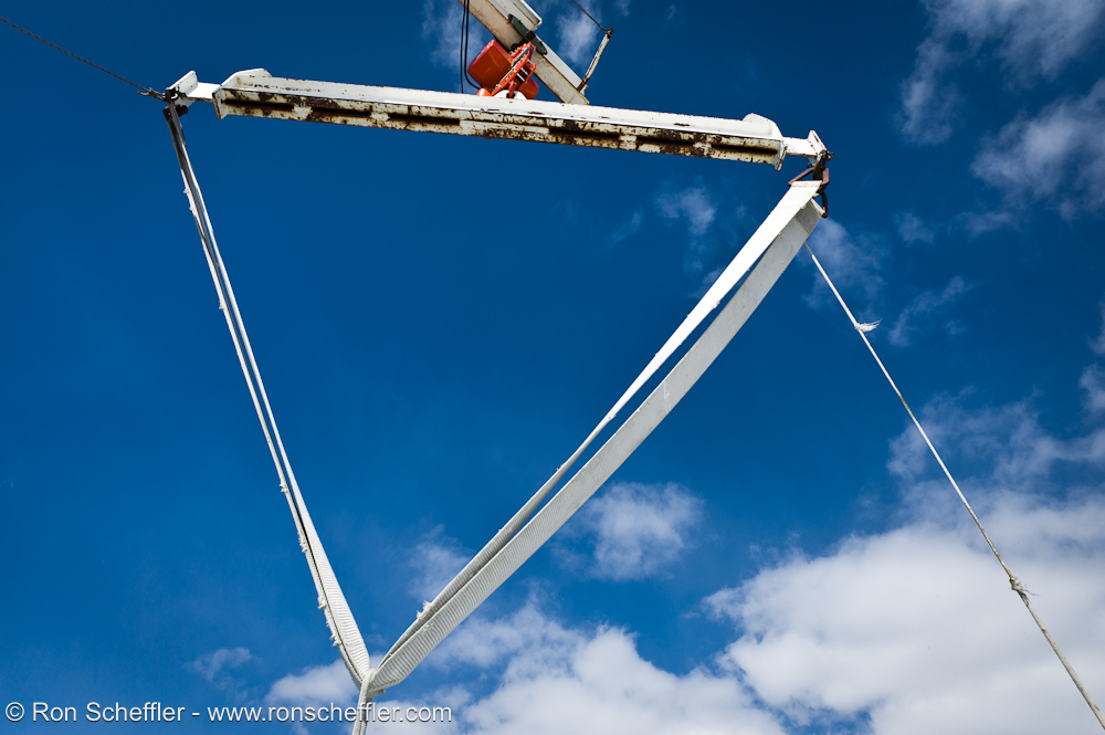
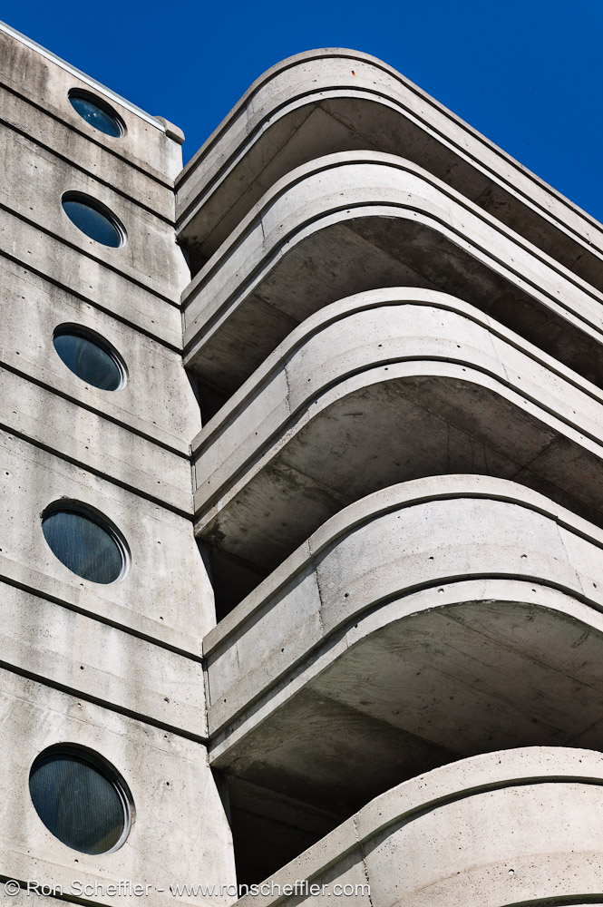
Ron, nice first set! I really like #3. And I really like the triangle set!
Lovinglife, I really like the shot. I agree with Joakim that it's the flags that make the image.
Joakim, regarding LAB - I'm following a video tutorial on kelbytraining.com (subscription service). Conceptually LAB is rather simple though. You have the L channel which contains the lightness/luminosity information and a & b that contain the color information. So any changes in L won't affect the colors. The a and b channels are the equivalent to tint and temperature when setting the white balance. a goes from green to magenta and b goes from blue to yellow.
It's basically a simple coordinate system. One special attribute is that the gamut is huge. a = 100, b=100 is waay outside anything you can display or print. So you have a lot of headroom for manipulation without the risk of clipping.
I know basically how to do two things in LAB. One is playing around with the L channel, which is trivial. The L channel is just like a B/W version of your shot and you can play with contrasts and curves without affecting the colors.
The other thing is to increase saturation. In LAB you do this by compressing the a & b channels. This is done by expanding the a and b channels using curves:
In essence what this does is to drive apart the reds & magentas and the blues & yellows. Since you compress the max/min values you are in effect stretching/expanding the color range within your usable gamut (yellow becomes very yellow and blue becomes very blue and anything between those gets expanded into that new range).
Since you are dealing with four basic color components rather than three the effect is a better color separation.
There are situation though where you don't want to use LAB. If you have strongly saturated relatively uniform colors, LAB will nuke the variation within the individual colors. So it will only work well with certain types of images.
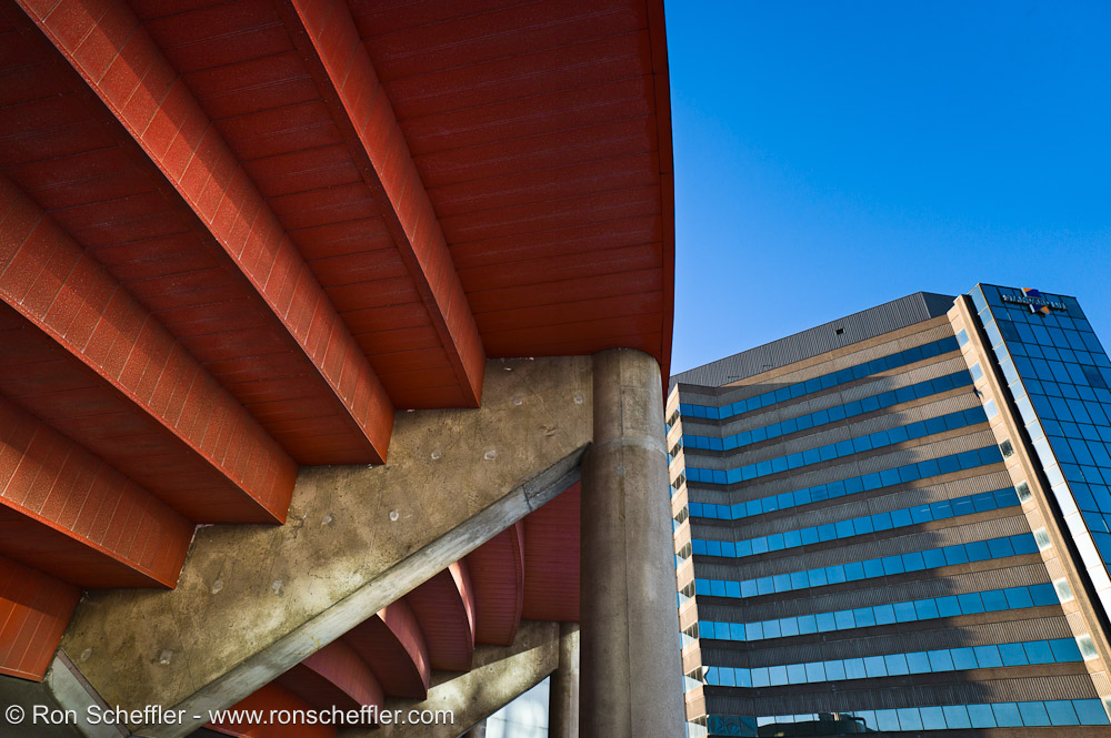
Just to add to the triangle stuff by Ron - here's one of the first shots I took with the 50 Lux ASPH:
Lovinglife, great shot! I love the composition and angle
KL, I don't use LR, but I do use CS5 64 bit with C1 Pro as the RAW convertor. I find I use CS5, as it is easier to plugin ICC's for specific printers/paper combo's and for larger prints. Luka have given an excellent brief on LAB colour space and its merits. As Luka suggested, the Lynda video series is excellent to watch, which I have also been doing this afternoon
Ron, great shots! Striking, very bold and great colours! I will try to attach the original shots, for the comparisons. IMO the difference is huge, particularly with portraits. All the information is there within the DNG files, but is matter of drawing the information from the files.
Luka, excellent discussion on LAB colour space !!! Great shot. Love the bold and striking colours in your shot!
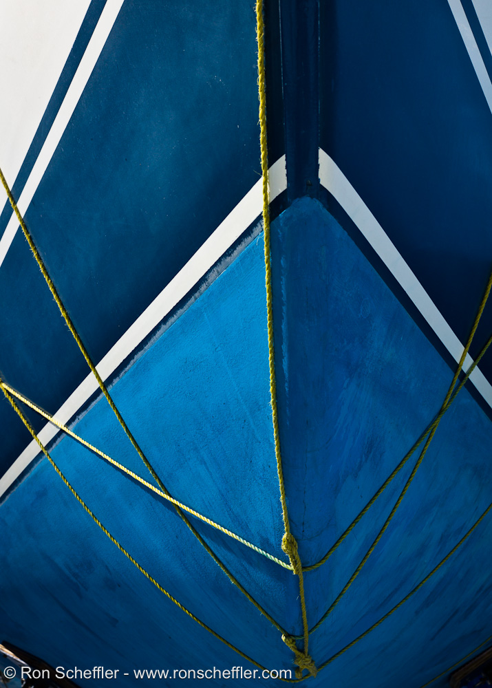
Luka, your photo of the three ropes actually was in my mind when I saw the yellow ropes lashed around the hull of the boat
Charles - excellent set and really like all of them, but especially the feel of #3!
Kyle, I agree with Joakim and prefer the color version. The B&W has a strange looking vignette, that might be in combination with clouds in the sky, but gives me the feeling that there was something stuck to the front of the lens. Perhaps a darker B&W version would be more in line with the feeling of the color version? But that's just me