Fall Folliage Softened - works?
p.1 #1Fall Folliage Softened - works?
My local river side park is a charming place to walk in but is a challenge to photograph. It's too overgrown and messy.
I'd found that reducing clarity and increasing haze in LR helps camouflage the clutter while retaining the original experience. There is even a touch of impressionism, at least to my eyes, a surprising but welcome side effect.
Curious what others think. What's your take? Does it work as I think it does?
Thanks!
Malka
PS Now I understand how empty duplicate posts came to be. It refused to upload my picture for being too large, but meanwhile created a blank post. I don't see how to delete it, although technically I should be able to delete my own post.
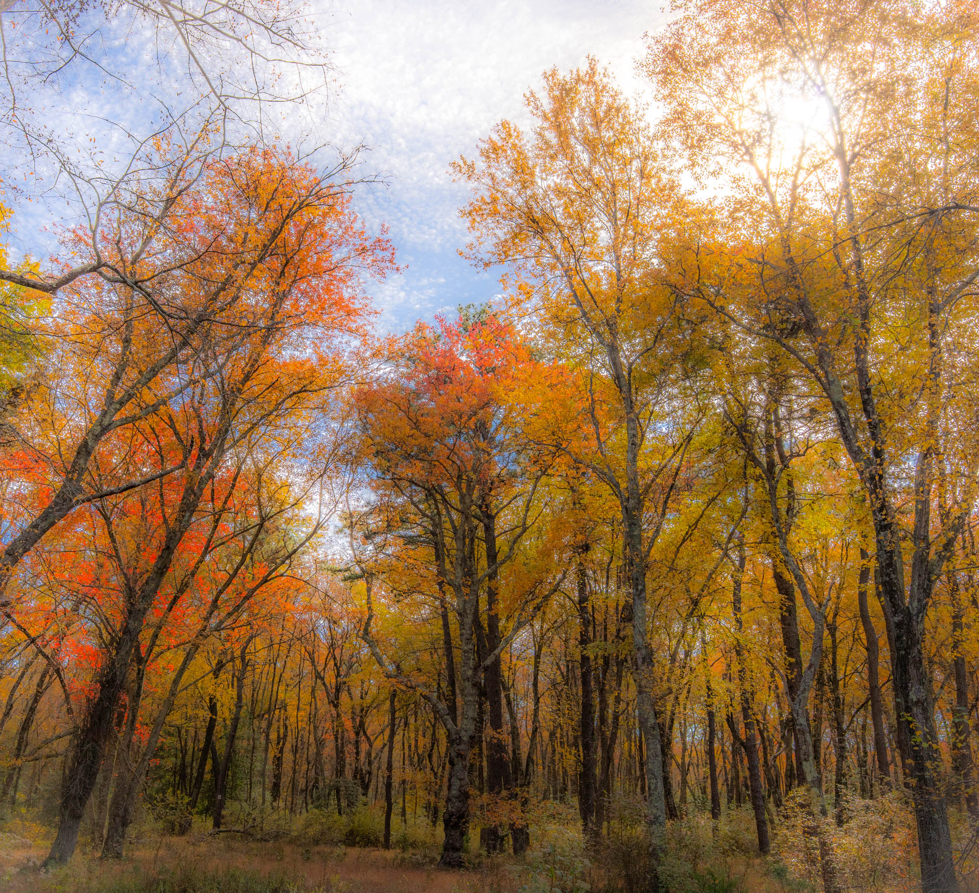
I'd found that reducing clarity and increasing haze in LR helps camouflage the clutter while retaining the original experience. There is even a touch of impressionism, at least to my eyes, a surprising but welcome side effect.
Curious what others think. What's your take? Does it work as I think it does?
Thanks!
Malka
PS Now I understand how empty duplicate posts came to be. It refused to upload my picture for being too large, but meanwhile created a blank post. I don't see how to delete it, although technically I should be able to delete my own post.
© Malka Z 2026
ILCE-7M5 24-70mm F2.8 DG DN II | Art 024 lens 24mm f/11.0 1/320s 125 ISO -2.0 EV
Oct 29, 2026 at 06:59 PM
p.1 #2Fall Folliage Softened - works?
Interesting image! Fall colors are always a welcome site. I would like to see the whole image, but it is your choice.
I have blinkies that I can either turn on or off to let me know when a color channel is blown. Might check your camera settings for warnings. All three color channels in this image are blown. Even though I didn’t see anything that looked blown I still backed the histogram down a little bit. I am not a fan of square photos. I just don’t think they are as interesting as rectangle, however others do like square, so it is not one size fits all, do what you are comfortable with.
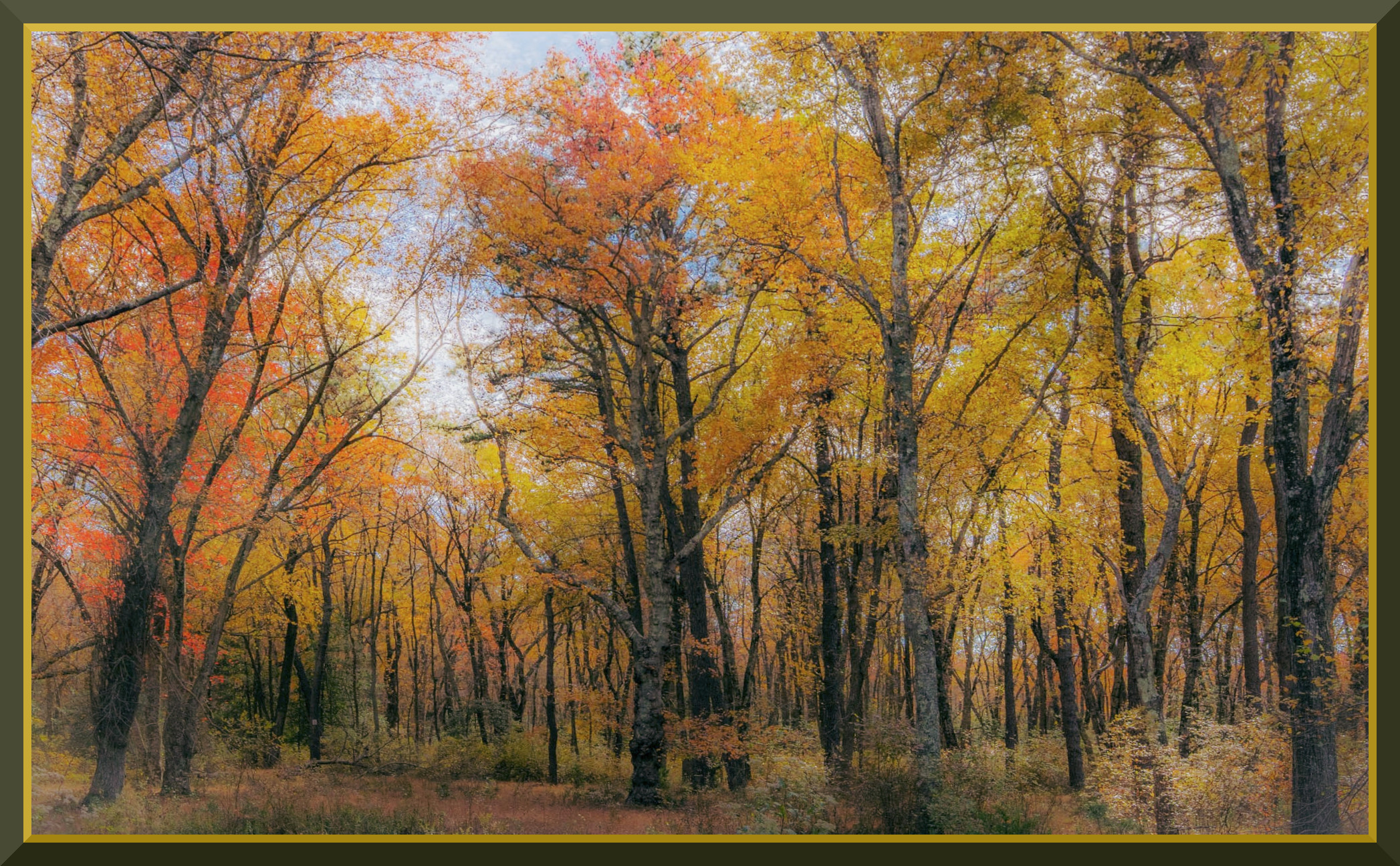
I also did a little perspective correction. I didn’t think the bare limbs in the sky were adding anything, so I did a rectangle crop.
This is not necessarily better, just a different view of a different idea.
I have blinkies that I can either turn on or off to let me know when a color channel is blown. Might check your camera settings for warnings. All three color channels in this image are blown. Even though I didn’t see anything that looked blown I still backed the histogram down a little bit. I am not a fan of square photos. I just don’t think they are as interesting as rectangle, however others do like square, so it is not one size fits all, do what you are comfortable with.
I also did a little perspective correction. I didn’t think the bare limbs in the sky were adding anything, so I did a rectangle crop.
This is not necessarily better, just a different view of a different idea.
Oct 29, 2026 at 09:27 PM
p.1 #3Fall Folliage Softened - works?
It is a very pleasing image of an autumnal woodland scene that the reduction in clarity moves it toward a dreamlike, hazy aesthetic scene. I can see what you mean about the impressionistic touch. I believe the patchy cloud pattern helps get that feeling.
I agree with your assessment. By pulling down the Clarity slider you lower the midtone contrast, which blends “chaotic” details together. Adjusting Dehaze (or Texture) in the opposite direction further smooths distracting elements, creating a look that mimics natural atmospheric depth. It also softens and diffuses the light, which keeps the scene feeling intimate rather than harsh.
I really like the upward-looking perspective. It creates a feeling of “immersion”, connecting the forest floor to the sky. The glow from the upper right corner provides a nice, natural highlight, even though it slightly flattens the depth of the foliage immediately surrounding it.
The color is working well, as it evokes a sense of seasonal warmth. I would leave these colors largely as they are.
One thing I find a bit distracting is what I believe is a big tree branch (?) emerging from the lower left frame. Feels like a falling tree, slightly disturbing the mood/harmony of the scene to my eyes, if you know what I mean. Just a personal feeling, though, (and being picky). I can't think of an easy solution for that, except may be cropping (ouch!).
I don’t see any significant issues. One last thing you may want to try is to use some selective sharpening (or masking the effect of Clarity and Dehaze) on the trunks and lower branches to bring back more textures of the forest floor to offer more visual interest for the viewer, unless you rather go for a more painterly look. As I see it feels a bit detached from the scene. Then it might ruin the mood you are looking for. Worth trying though, IMO.
Socrate
I agree with your assessment. By pulling down the Clarity slider you lower the midtone contrast, which blends “chaotic” details together. Adjusting Dehaze (or Texture) in the opposite direction further smooths distracting elements, creating a look that mimics natural atmospheric depth. It also softens and diffuses the light, which keeps the scene feeling intimate rather than harsh.
I really like the upward-looking perspective. It creates a feeling of “immersion”, connecting the forest floor to the sky.
The glow from the upper right corner provides a nice, natural highlight, even though it slightly flattens the depth of the foliage immediately surrounding it. The color is working well, as it evokes a sense of seasonal warmth. I would leave these colors largely as they are.
One thing I find a bit distracting is what I believe is a big tree branch (?) emerging from the lower left frame. Feels like a falling tree, slightly disturbing the mood/harmony of the scene to my eyes, if you know what I mean. Just a personal feeling, though, (and being picky). I can't think of an easy solution for that, except may be cropping (ouch!).
I don’t see any significant issues. One last thing you may want to try is to use some selective sharpening (or masking the effect of Clarity and Dehaze) on the trunks and lower branches to bring back more textures of the forest floor to offer more visual interest for the viewer, unless you rather go for a more painterly look. As I see it feels a bit detached from the scene. Then it might ruin the mood you are looking for.
Worth trying though, IMO.Socrate
Oct 30, 2026 at 02:28 PM
p.1 #4Fall Folliage Softened - works?
grandmas wrote:
Interesting image! Fall colors are always a welcome site. I would like to see the whole image, but it is your choice.
I have blinkies that I can either turn on or off to let me know when a color channel is blown. Might check your camera settings for warnings. All three color channels in this image are blown. Even though I didn’t see anything that looked blown I still backed the histogram down a little bit. I am not a fan of square photos. I just don’t think they are as interesting as rectangle, however others do like square, so...Show more →
Hi! Thank you for your composition and exposure feedback, great points.
Interesting image! Fall colors are always a welcome site. I would like to see the whole image, but it is your choice.
I have blinkies that I can either turn on or off to let me know when a color channel is blown. Might check your camera settings for warnings. All three color channels in this image are blown. Even though I didn’t see anything that looked blown I still backed the histogram down a little bit. I am not a fan of square photos. I just don’t think they are as interesting as rectangle, however others do like square, so...Show more →
Hi! Thank you for your composition and exposure feedback, great points.
Nov 05, 2026 at 10:04 AM
|
p.1 #5Fall Folliage Softened - works?
Shasoc wrote:
It is a very pleasing image of an autumnal woodland scene that the reduction in clarity moves it toward a dreamlike, hazy aesthetic scene. I can see what you mean about the impressionistic touch. I believe the patchy cloud pattern helps get that feeling.
I agree with your assessment. By pulling down the Clarity slider you lower the midtone contrast, which blends “chaotic” details together. Adjusting Dehaze (or Texture) in the opposite direction further smooths distracting elements, creating a look that mimics natural atmospheric depth. It also softens and diffuses the light, which keeps the scene feeling intimate rather than...Show more →
Thank you for your thoughtful response, as always! I am glad to hear my experimenting worked as intended. I will try to play around with the lower part of the image as you suggested. The composition was the best I could make from the very messy and haphazard space, but the my main objective was to see what I can do in post-processing to bring in that specific effect. Another tool in my toolbox for future pictures of this type.
Would love move more recommendations as to how to ramp up impressionism more without resorting to specialized AI tools. Plenty of those out there but that feels like a cheat and kills the image for me.
It is a very pleasing image of an autumnal woodland scene that the reduction in clarity moves it toward a dreamlike, hazy aesthetic scene. I can see what you mean about the impressionistic touch. I believe the patchy cloud pattern helps get that feeling.
I agree with your assessment. By pulling down the Clarity slider you lower the midtone contrast, which blends “chaotic” details together. Adjusting Dehaze (or Texture) in the opposite direction further smooths distracting elements, creating a look that mimics natural atmospheric depth. It also softens and diffuses the light, which keeps the scene feeling intimate rather than...Show more →
Thank you for your thoughtful response, as always! I am glad to hear my experimenting worked as intended. I will try to play around with the lower part of the image as you suggested. The composition was the best I could make from the very messy and haphazard space, but the my main objective was to see what I can do in post-processing to bring in that specific effect. Another tool in my toolbox for future pictures of this type.
Would love move more recommendations as to how to ramp up impressionism more without resorting to specialized AI tools. Plenty of those out there but that feels like a cheat and kills the image for me.
Nov 05, 2026 at 10:09 AM

p.1 #6Fall Folliage Softened - works?
Malka_1 wrote:
Would love move more recommendations as to how to ramp up impressionism more without resorting to specialized AI tools.
The understanding of the principles of impressionism will serve to develop your understanding. ONCE you understand the principles you are aspiring toward, THEN you can manually utilize the tools your your choosing to present those principles in your work.
To that end, I'd study the history far before photography, regarding what makes impressionism ... impressionism ... in principle and in execution ... BUT, PRINCIPLE FIRST.
Once you are armed with that knowledge, you'll never allow your creations to be left to the uncontrolled matters of AI or others.
It's a study, and a journey ... but, THEN ... YOU own it.
HTH

Would love move more recommendations as to how to ramp up impressionism more without resorting to specialized AI tools.
The understanding of the principles of impressionism will serve to develop your understanding. ONCE you understand the principles you are aspiring toward, THEN you can manually utilize the tools your your choosing to present those principles in your work.
To that end, I'd study the history far before photography, regarding what makes impressionism ... impressionism ... in principle and in execution ... BUT, PRINCIPLE FIRST.
Once you are armed with that knowledge, you'll never allow your creations to be left to the uncontrolled matters of AI or others.
It's a study, and a journey ... but, THEN ... YOU own it.
HTH
Nov 05, 2026 at 07:38 PM
p.1 #7Fall Folliage Softened - works?
I find the reduced clarity makes the image look lower quality and unnatural in a visually unappealing kind of way, not in a dreamlike way. I personally would much rather see the scene without it. Thanks for sharing though!
Nov 06, 2026 at 03:05 PM
p.1 #8Fall Folliage Softened - works?
Malka_1 wrote:
I agree with your assessment. By pulling down the Clarity slider you lower the midtone contrast, which blends “chaotic” details together. Adjusting Dehaze (or Texture) in the opposite direction further smooths distracting elements, creating a look that mimics natural atmospheric depth. It also softens and diffuses the light, which keeps the scene feeling intimate rather than harsh.
I really like the upward-looking perspective. It creates a feeling of “immersion”, connecting the forest floor to the sky. The glow from the upper right corner provides a nice, natural highlight, even though it slightly flattens the depth of the foliage immediately surrounding it.
The color is working well, as it evokes a sense of seasonal warmth. I would leave these colors largely as they are.
One thing I find a bit distracting is what I believe is a big tree branch (?) emerging from the lower left frame. Feels like a falling tree, slightly disturbing the mood/harmony of the scene to my eyes, if you know what I mean. Just a personal feeling, though, (and being picky). I can't think of an easy solution for that, except may be cropping (ouch!).
I don’t see any significant issues. One last thing you may want to try is to use some selective sharpening (or masking the effect of Clarity and Dehaze) on the trunks and lower branches to bring back more textures of the forest floor to offer more visual interest for the viewer, unless you rather go for a more painterly look. As I see it feels a bit detached from the scene. Then it might ruin the mood you are looking for. Worth trying though, IMO.
SocrateThank you for your thoughtful response, as always! I am glad to hear my experimenting worked as intended. I will try to play around with the lower part of the image as you suggested. The composition was the best I could make from the very messy and haphazard space, but the my main objective was to see what I can do in post-processing to bring in that specific effect. Another tool in my toolbox for future pictures of this type.
Would love move more recommendations as to how to ramp up impressionism more without resorting to specialized AI tools....Show more →
Here are some suggestions to ramp up the impressionistic mood of your photo, that should be all applicable in LR. In PS you will have better tools for the same purpose, especially if you are leaning towards an artistic mood.
Use high values of Luminance Noise Reduction. Drop Detail and Sharpening down, together with the Texture to reduce edge sharpness. You may need to bump global Contrast and increase the Whites.
If you are aiming for a soft look reduce the contrast and highlights and increase the Shadows, Whites (a bit) and Blacks. Use radial gradient to paint on some light to create some impressionistic, glowing illumination.
I don’t know if it is possible in LR but some Motion blur at very low value in the direction of the flow of the leaves will also work, together with some Orton Effect.
These are all the tools I can think of you could use as you better like that will hopefully help you to get where you want to land.
You can get an impressionist effect directly in camera using the ICM technique (Intentional Camera Movement) by shaking the camera in a vertical or horizontal motion while making the exposure. The result is a painterly style image with a motion blur that resembles an impressionistic painting. It is not a typical impressionistic style effect, rather is an impressionistic photography effect. Use a slow shutter speed.
You can also get the Orton Effect with the camera (this is how it actually started), by taking two shots of the same subject, both a bit overexposed, one in sharp focus and the other one OOF (a softer version of the same photo), Then you combine them together, with the sharp focus photo keeping the “structure” intact, while the blurred photograph adds a soft glow around the brighter areas and reduces the contrast. Your photo would have been a perfect subject for that technique.
Have fun!
Socrate
Shasoc wrote
It is a very pleasing image of an autumnal woodland scene that the reduction in clarity moves it toward a dreamlike, hazy aesthetic scene. I can see what you mean about the impressionistic touch. I believe the patchy cloud pattern helps get that feeling.I agree with your assessment. By pulling down the Clarity slider you lower the midtone contrast, which blends “chaotic” details together. Adjusting Dehaze (or Texture) in the opposite direction further smooths distracting elements, creating a look that mimics natural atmospheric depth. It also softens and diffuses the light, which keeps the scene feeling intimate rather than harsh.
I really like the upward-looking perspective. It creates a feeling of “immersion”, connecting the forest floor to the sky.
The glow from the upper right corner provides a nice, natural highlight, even though it slightly flattens the depth of the foliage immediately surrounding it. The color is working well, as it evokes a sense of seasonal warmth. I would leave these colors largely as they are.
One thing I find a bit distracting is what I believe is a big tree branch (?) emerging from the lower left frame. Feels like a falling tree, slightly disturbing the mood/harmony of the scene to my eyes, if you know what I mean. Just a personal feeling, though, (and being picky). I can't think of an easy solution for that, except may be cropping (ouch!).
I don’t see any significant issues. One last thing you may want to try is to use some selective sharpening (or masking the effect of Clarity and Dehaze) on the trunks and lower branches to bring back more textures of the forest floor to offer more visual interest for the viewer, unless you rather go for a more painterly look. As I see it feels a bit detached from the scene. Then it might ruin the mood you are looking for.
Worth trying though, IMO.Socrate
Would love move more recommendations as to how to ramp up impressionism more without resorting to specialized AI tools....Show more →
Here are some suggestions to ramp up the impressionistic mood of your photo, that should be all applicable in LR. In PS you will have better tools for the same purpose, especially if you are leaning towards an artistic mood.
Use high values of Luminance Noise Reduction. Drop Detail and Sharpening down, together with the Texture to reduce edge sharpness. You may need to bump global Contrast and increase the Whites.
If you are aiming for a soft look reduce the contrast and highlights and increase the Shadows, Whites (a bit) and Blacks. Use radial gradient to paint on some light to create some impressionistic, glowing illumination.
I don’t know if it is possible in LR but some Motion blur at very low value in the direction of the flow of the leaves will also work, together with some Orton Effect.
These are all the tools I can think of you could use as you better like that will hopefully help you to get where you want to land.
You can get an impressionist effect directly in camera using the ICM technique (Intentional Camera Movement) by shaking the camera in a vertical or horizontal motion while making the exposure. The result is a painterly style image with a motion blur that resembles an impressionistic painting. It is not a typical impressionistic style effect, rather is an impressionistic photography effect. Use a slow shutter speed.
You can also get the Orton Effect with the camera (this is how it actually started), by taking two shots of the same subject, both a bit overexposed, one in sharp focus and the other one OOF (a softer version of the same photo), Then you combine them together, with the sharp focus photo keeping the “structure” intact, while the blurred photograph adds a soft glow around the brighter areas and reduces the contrast. Your photo would have been a perfect subject for that technique.
Have fun!
Socrate
Nov 06, 2026 at 04:38 PM