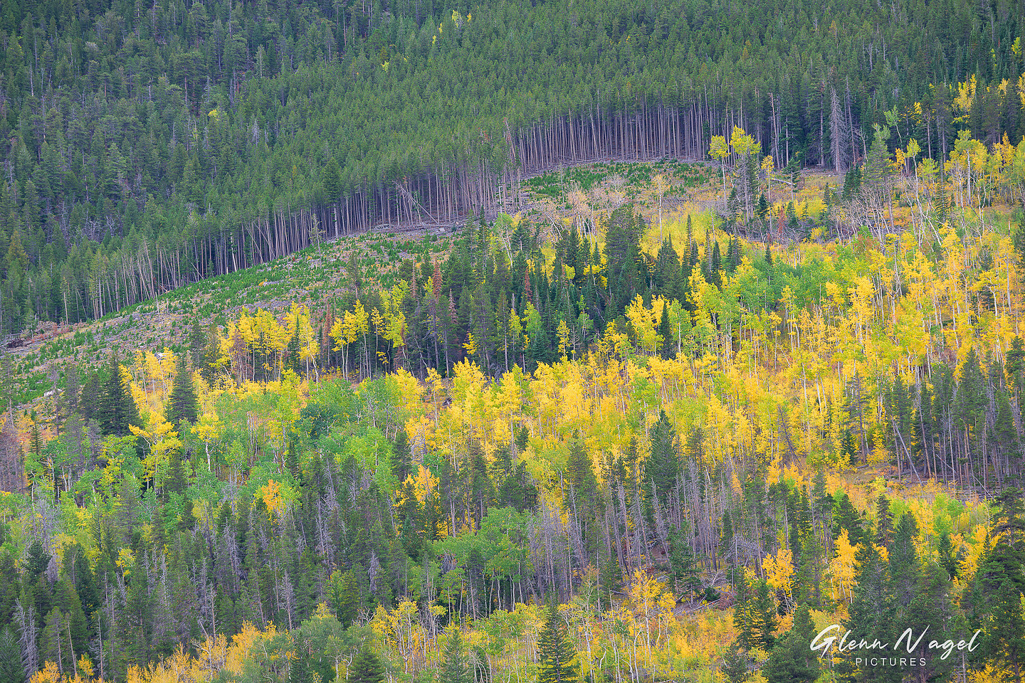
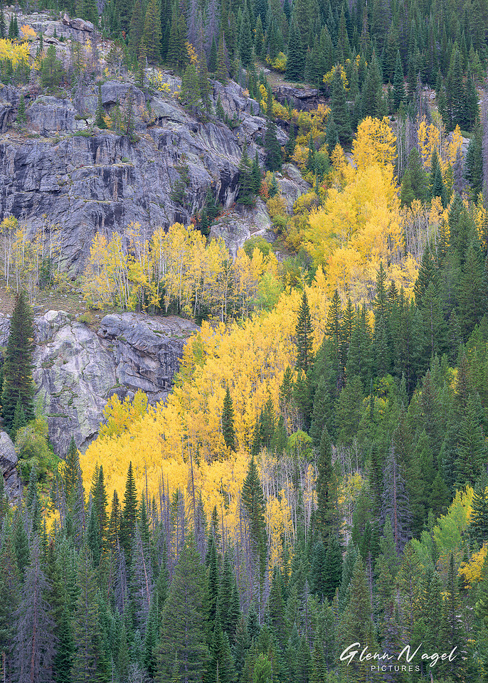
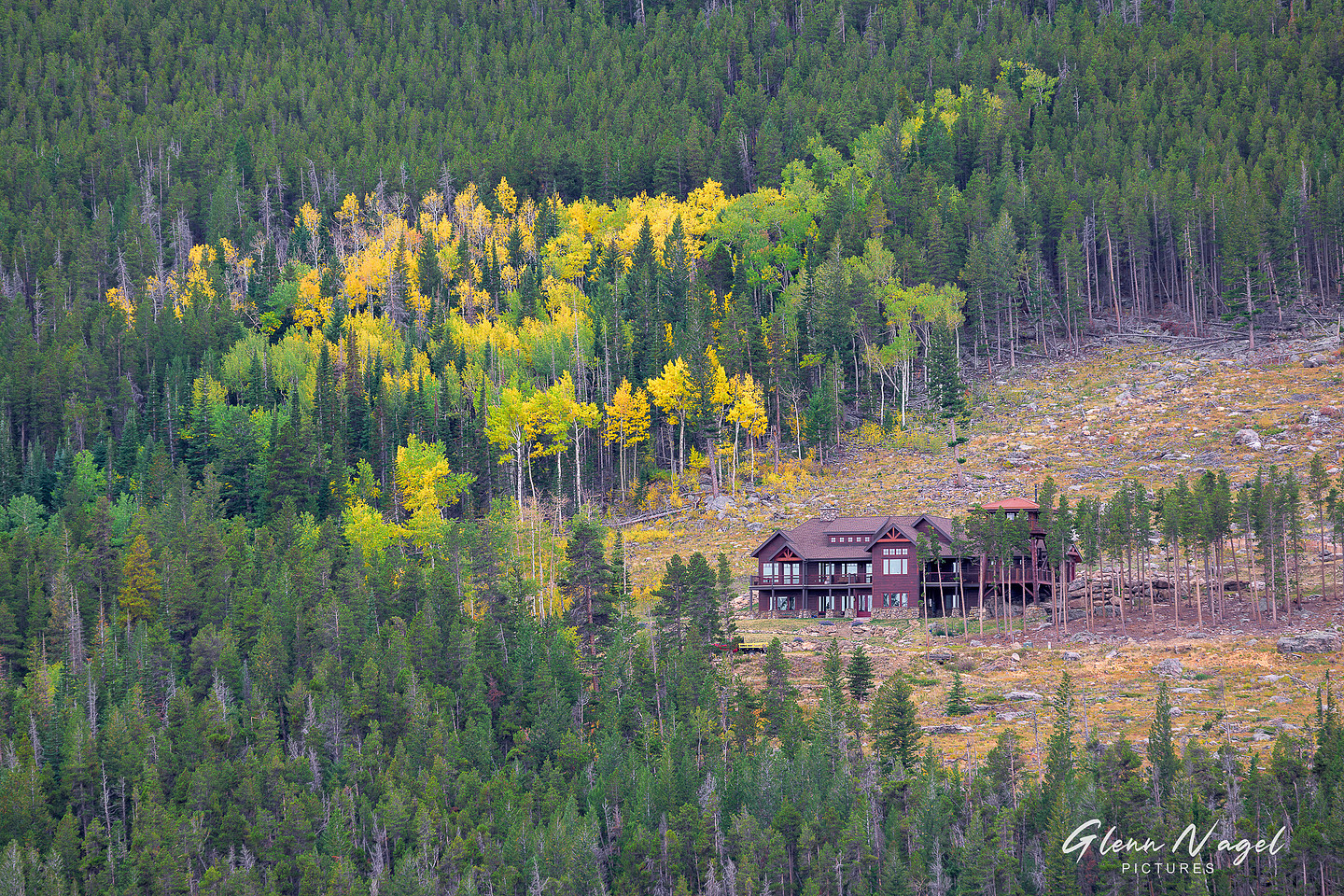
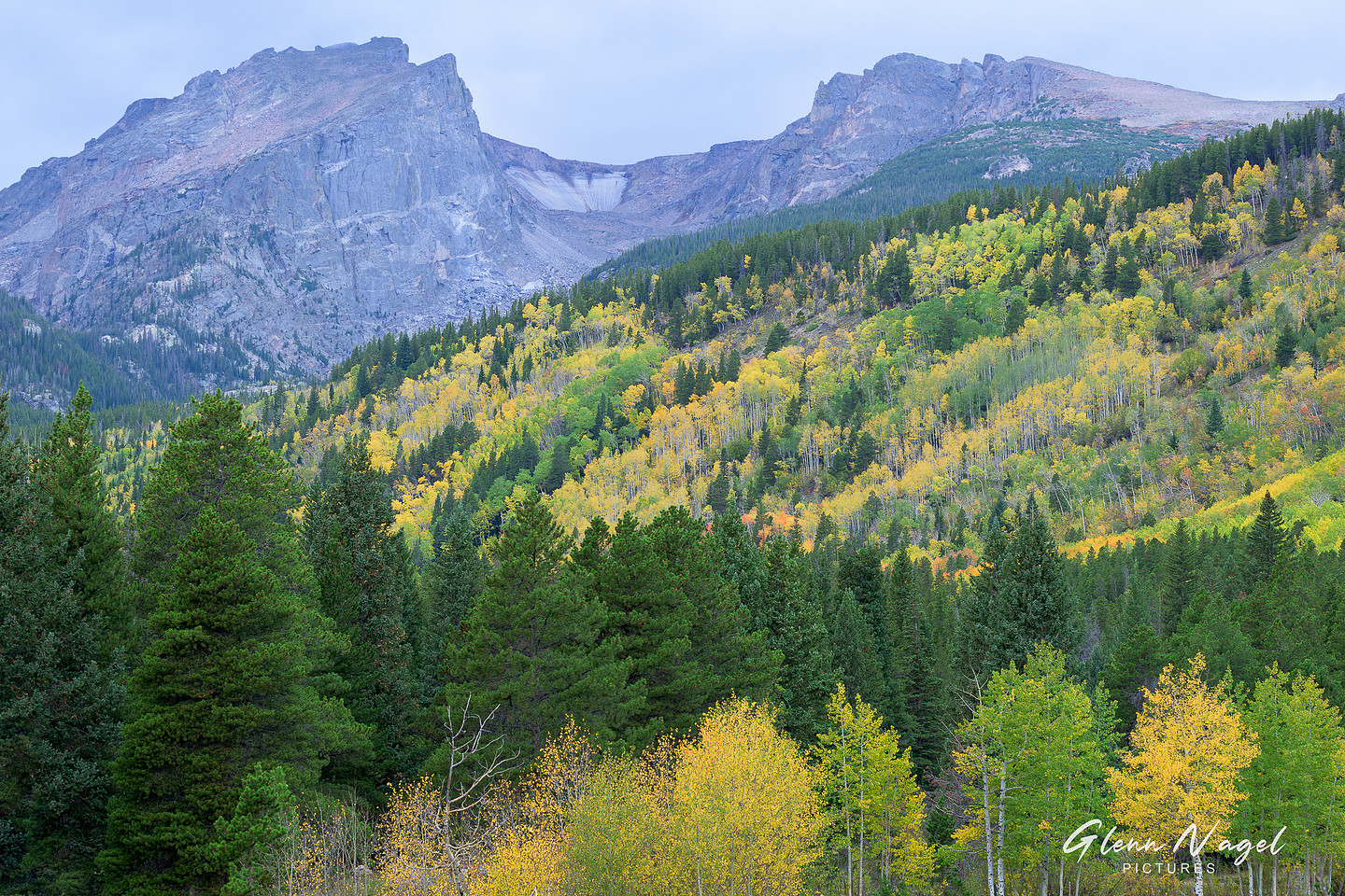
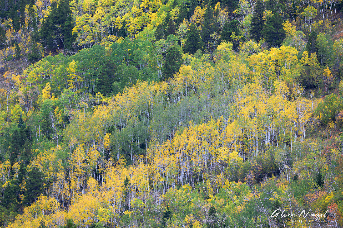
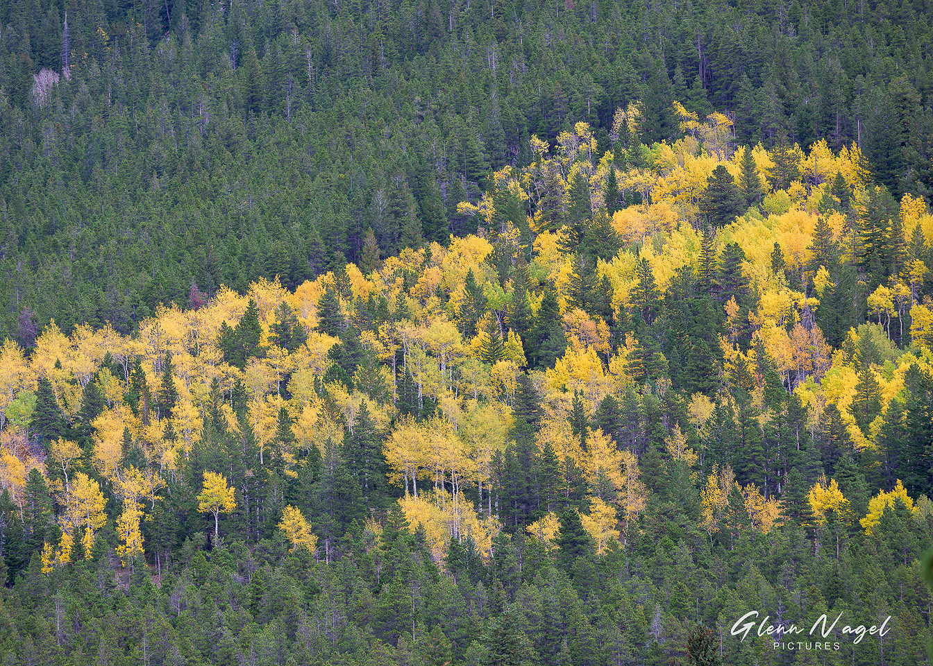
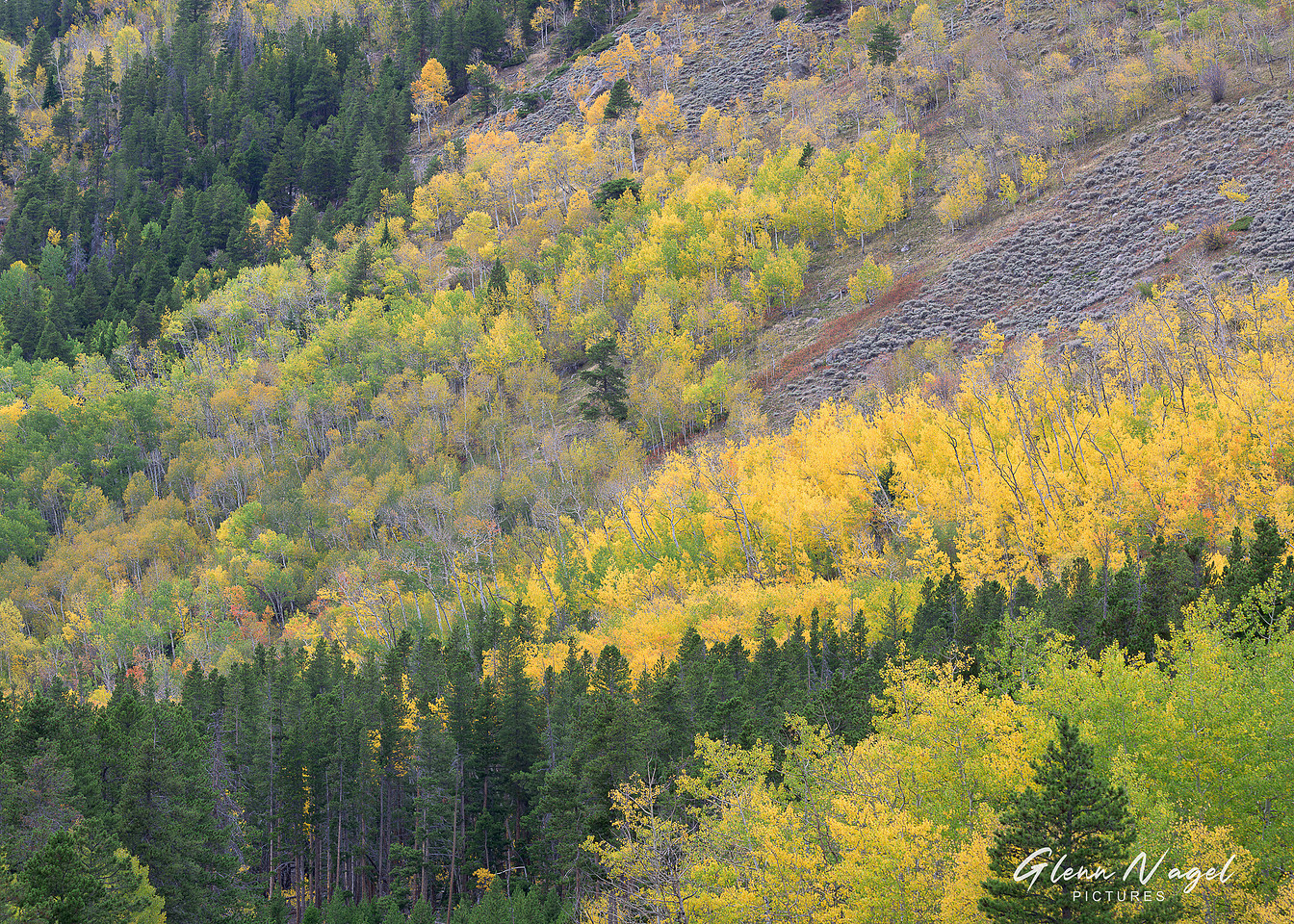
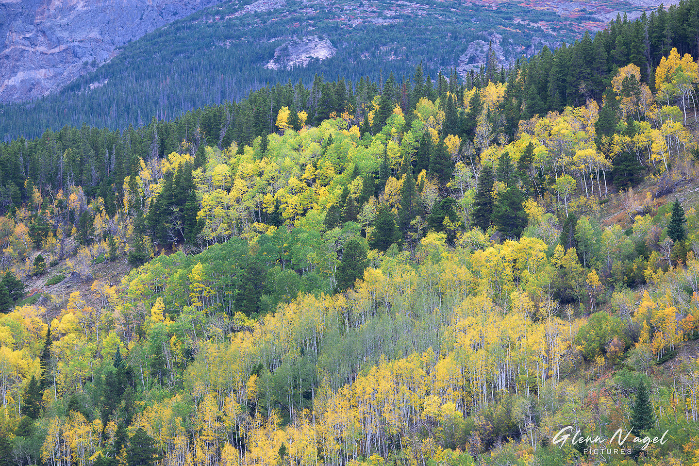
I like the 2nd and 5th of this set. Second one is nicely balanced. For the 5th (Aspen Impression), If it were my image, I'd crop the left and right sides a bit to make it more abstract placing more attention on the pattern, maybe add some vignette or edge burning also.
Ken
KMSlandscape wrote:
I like the 2nd and 5th of this set. Second one is nicely balanced. For the 5th (Aspen Impression), If it were my image, I'd crop the left and right sides a bit to make it more abstract placing more attention on the pattern, maybe add some vignette or edge burning also.
Ken
Thanks Ken...and I like your suggestion for #5. I think having a cropped version which emphasizes the pattern could be very effective. I appreciate it!
gnagel wrote:
Thanks Ken...and I like your suggestion for #5. I think having a cropped version which emphasizes the pattern could be very effective. I appreciate it!