Sleeping On The Job
p.1 #1Sleeping On The Job
I wasn't sure if I should post this here or elsewhere, but I decided I'd rather have critique than polite silence.
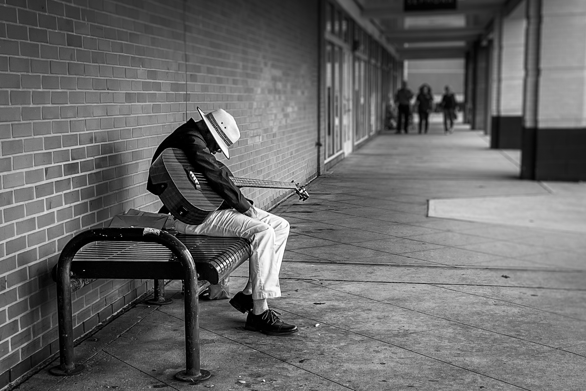
This quiet suburban shopping strip isn't exactly a hot spot for street photography, so I couldn't resist taking the picture. With my older iPhone, which limited cropping options, among other things, but that's all I had with me. A little b&w magic and editing in LR, and here it is, my first ever street photography attempt. I deposited a little cash for my oblivious model, so he ended up earning while sleeping.
I think the subject is worthwhile, but not sure if I did him justice. Pretty sure this type of b&w is the way to go. But would love to get constructive feedback!
Thank you,
Malka
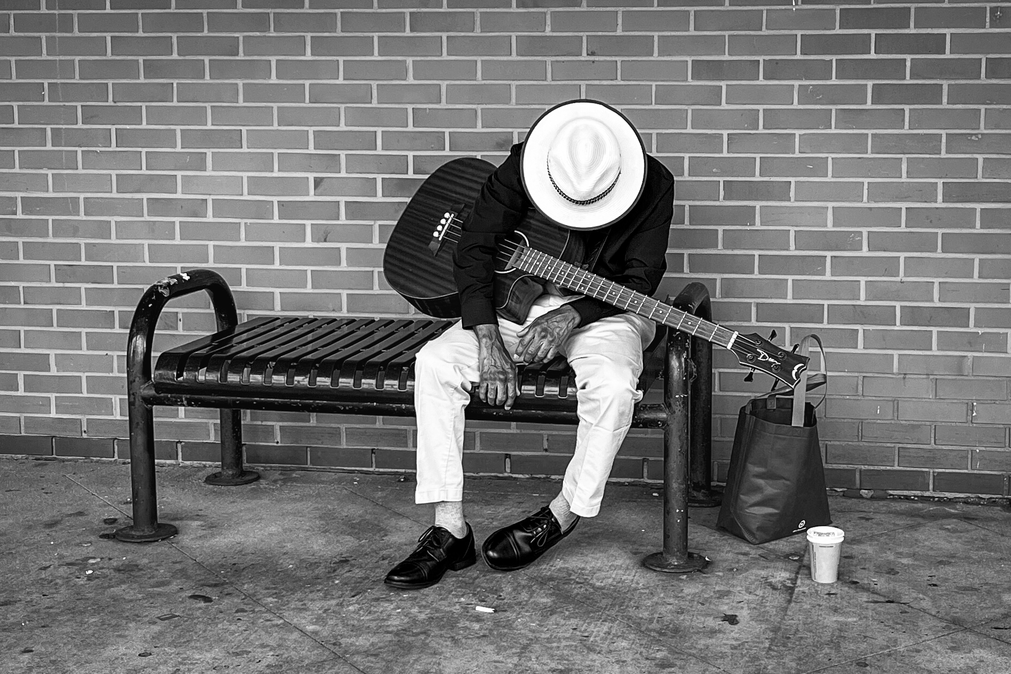
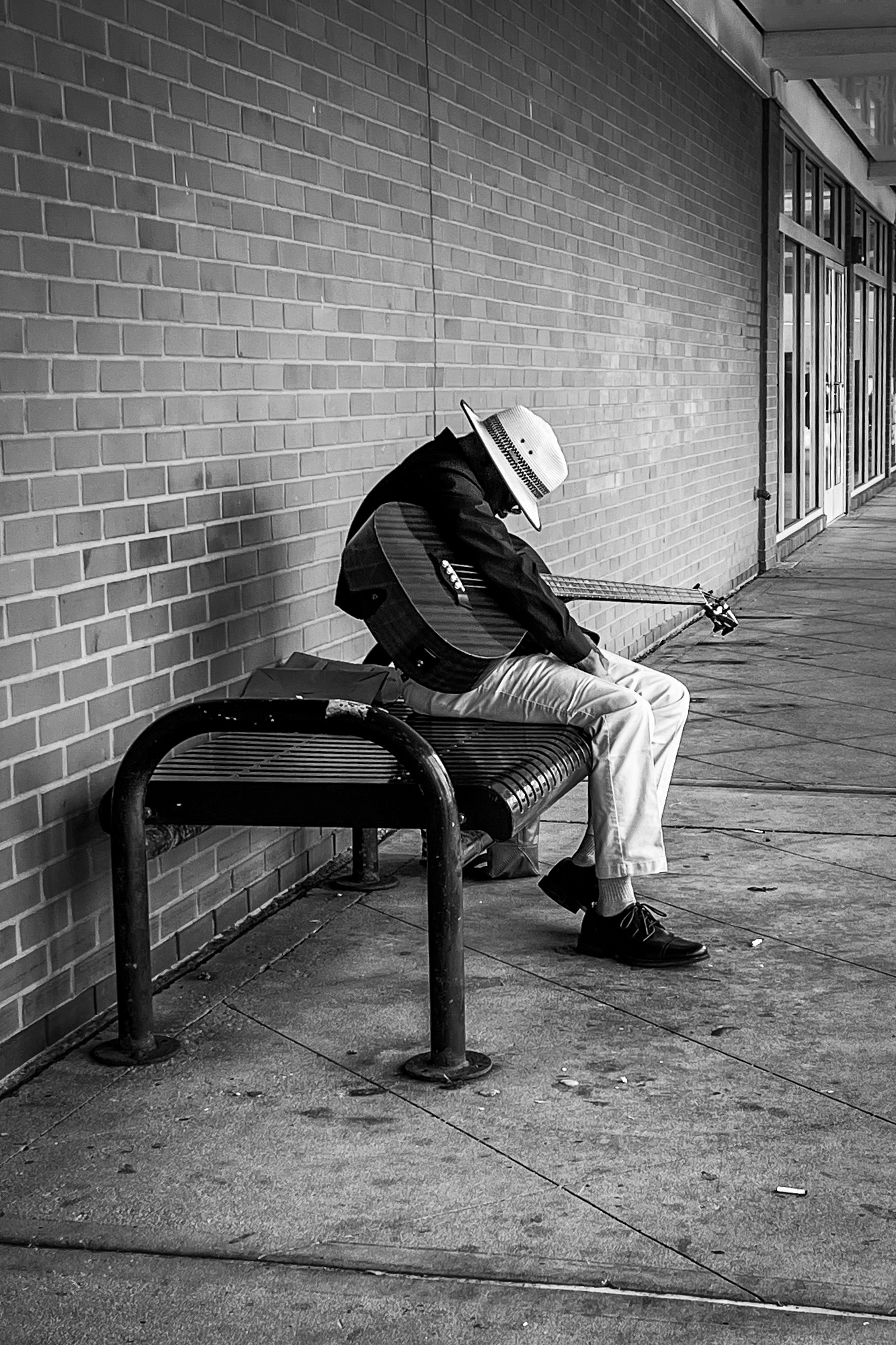
This quiet suburban shopping strip isn't exactly a hot spot for street photography, so I couldn't resist taking the picture. With my older iPhone, which limited cropping options, among other things, but that's all I had with me. A little b&w magic and editing in LR, and here it is, my first ever street photography attempt. I deposited a little cash for my oblivious model, so he ended up earning while sleeping.
I think the subject is worthwhile, but not sure if I did him justice. Pretty sure this type of b&w is the way to go. But would love to get constructive feedback!
Thank you,
Malka
iPhone 13 mini iPhone 13 mini back dual wide camera 5.1mm f/1.6 lens 5mm f/1.6 1/120s 50 ISO 0.0 EV
iPhone 13 mini iPhone 13 mini back dual wide camera 5.1mm f/1.6 lens 5mm f/1.6 1/120s 40 ISO 0.0 EV
Oct 01, 2026 at 08:03 PM
p.1 #2Sleeping On The Job
Too sharp and contrasty for the mood it should convey.
Maybe duller?
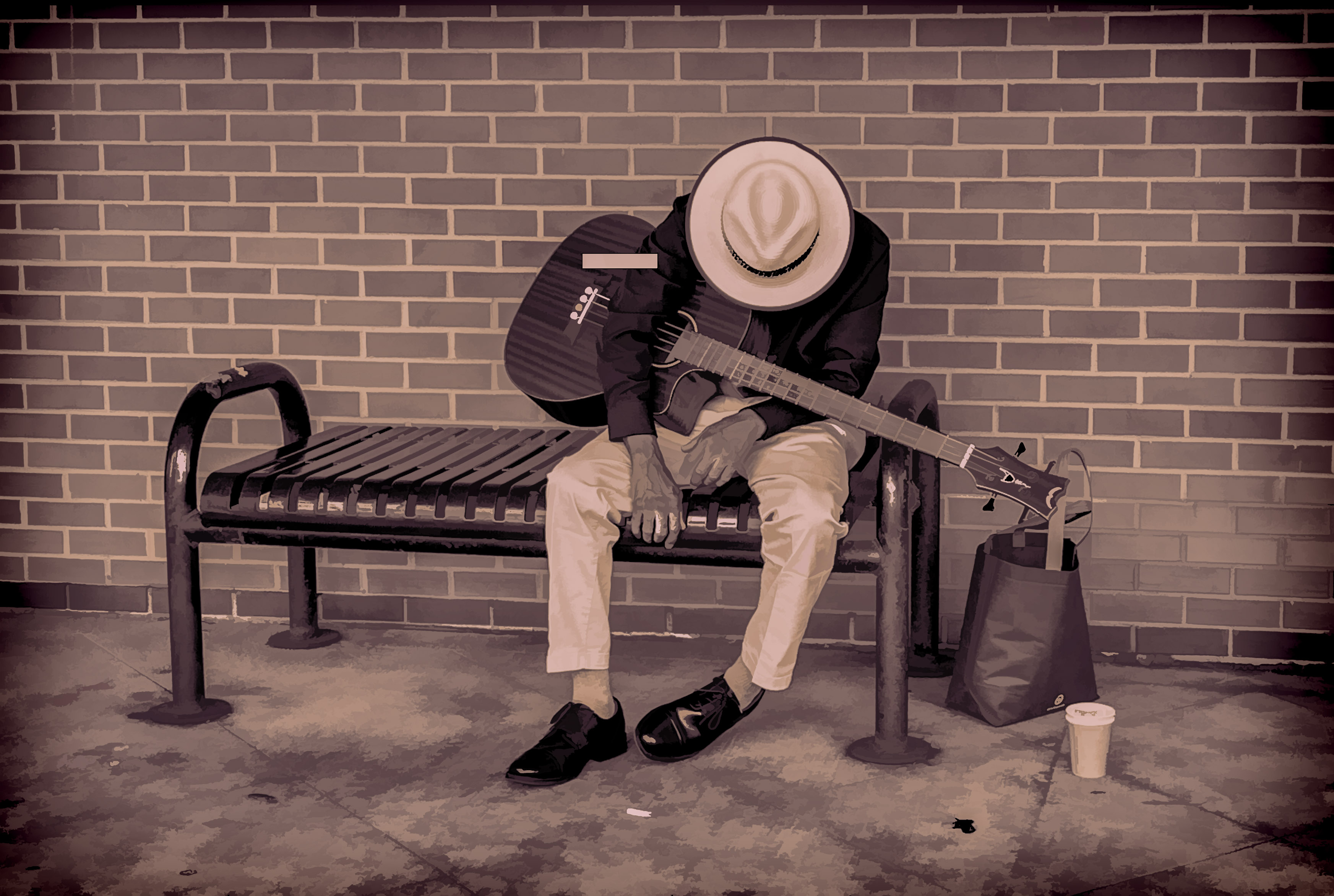
Maybe duller?
Oct 02, 2026 at 11:01 AM
p.1 #3Sleeping On The Job
I like the B&W conversion. For some reason seem to work well with street photography. I think black and white vision work particularly well on these, since the absence of color enhances the mood of solitude of your photos. In addition the strong contrast between light and dark areas emphasizes the subject's isolation and contributes to a sober mood.
I find the first image to be the strongest one as it places us directly in front of the subject. The direct confrontation with the man, despite the obscured face, creates a more immediate and intimate connection with the viewer, inviting us to share in his moment of rest while conveying a sense of solitude.
My eyes are captivated by the stark contrast of his light-colored hat and pants against the dark clothing. I usually don’t like central placement of the subject but in this case, it feels like it helps isolating the subject. The noticeable veins on his hands tell his age and that he has been playing a guitar for a long time.
I couldn’t help noticing he is playing a four-string guitar which was popular in the 1950s–1960s in the Folk and Jazz music arena. Interesting!
The second image, while well-composed and technically sound with the placement of the subject creating a strong visual anchor and the empty space to the right providing a sense of context and environment, places the viewer at a greater distance creating a sense of observation rather than connection. Which is fine if that is what you are aiming for. However, I feel like, compared to the first image, it diminishes the intimacy and the emotional sense of solitude. The wider view offers more context for the environment, but at the cost of a direct emotional connection with the musician. However, I believe it works by itself (not compared to the first one).
From the tech point of view looks like the contrast/sharpness, especially of the subject, feels a bit too strong on my monitor.
The two images look good the way they are and there isn’t much to improve them.
Apart from reducing the subject’s sharpness in the second image, the only improvement I can think of is that you may want to try to selectively darken the highlights in the hat and trousers of the first image. Those competing bright areas may distract from what your intended message is of the resting/sleeping musician. This will also help the darker tones of the jacket and the guitar establish a stronger anchor for the viewer's eye, creating a more focused and impactful image. See if it works for you and if it helps your narrative.
Socrate
I find the first image to be the strongest one as it places us directly in front of the subject. The direct confrontation with the man, despite the obscured face, creates a more immediate and intimate connection with the viewer, inviting us to share in his moment of rest while conveying a sense of solitude.
My eyes are captivated by the stark contrast of his light-colored hat and pants against the dark clothing. I usually don’t like central placement of the subject but in this case, it feels like it helps isolating the subject. The noticeable veins on his hands tell his age and that he has been playing a guitar for a long time.
I couldn’t help noticing he is playing a four-string guitar which was popular in the 1950s–1960s in the Folk and Jazz music arena. Interesting!
The second image, while well-composed and technically sound with the placement of the subject creating a strong visual anchor and the empty space to the right providing a sense of context and environment, places the viewer at a greater distance creating a sense of observation rather than connection. Which is fine if that is what you are aiming for. However, I feel like, compared to the first image, it diminishes the intimacy and the emotional sense of solitude. The wider view offers more context for the environment, but at the cost of a direct emotional connection with the musician. However, I believe it works by itself (not compared to the first one).
From the tech point of view looks like the contrast/sharpness, especially of the subject, feels a bit too strong on my monitor.
The two images look good the way they are and there isn’t much to improve them.
Apart from reducing the subject’s sharpness in the second image, the only improvement I can think of is that you may want to try to selectively darken the highlights in the hat and trousers of the first image. Those competing bright areas may distract from what your intended message is of the resting/sleeping musician. This will also help the darker tones of the jacket and the guitar establish a stronger anchor for the viewer's eye, creating a more focused and impactful image. See if it works for you and if it helps your narrative.
Socrate
Oct 02, 2026 at 12:46 PM
p.1 #4Sleeping On The Job
Imagemaster wrote:
Too sharp and contrasty for the mood it should convey.
Maybe duller?
Hi, thanks for your input! I experimented with different B&W presets, ended liking specifically the high-contrast one. I did soften the background - bricks - to get them to them fade a little.
Too sharp and contrasty for the mood it should convey.
Maybe duller?
Hi, thanks for your input! I experimented with different B&W presets, ended liking specifically the high-contrast one. I did soften the background - bricks - to get them to them fade a little.
Oct 06, 2026 at 07:57 PM
p.1 #5Sleeping On The Job
Shasoc wrote:
I like the B&W conversion. For some reason seem to work well with street photography. I think black and white vision work particularly well on these, since the absence of color enhances the mood of solitude of your photos. In addition the strong contrast between light and dark areas emphasizes the subject's isolation and contributes to a sober mood.
I find the first image to be the strongest one as it places us directly in front of the subject. The direct confrontation with the man, despite the obscured face, creates a more immediate and intimate connection with the viewer, inviting...Show more →
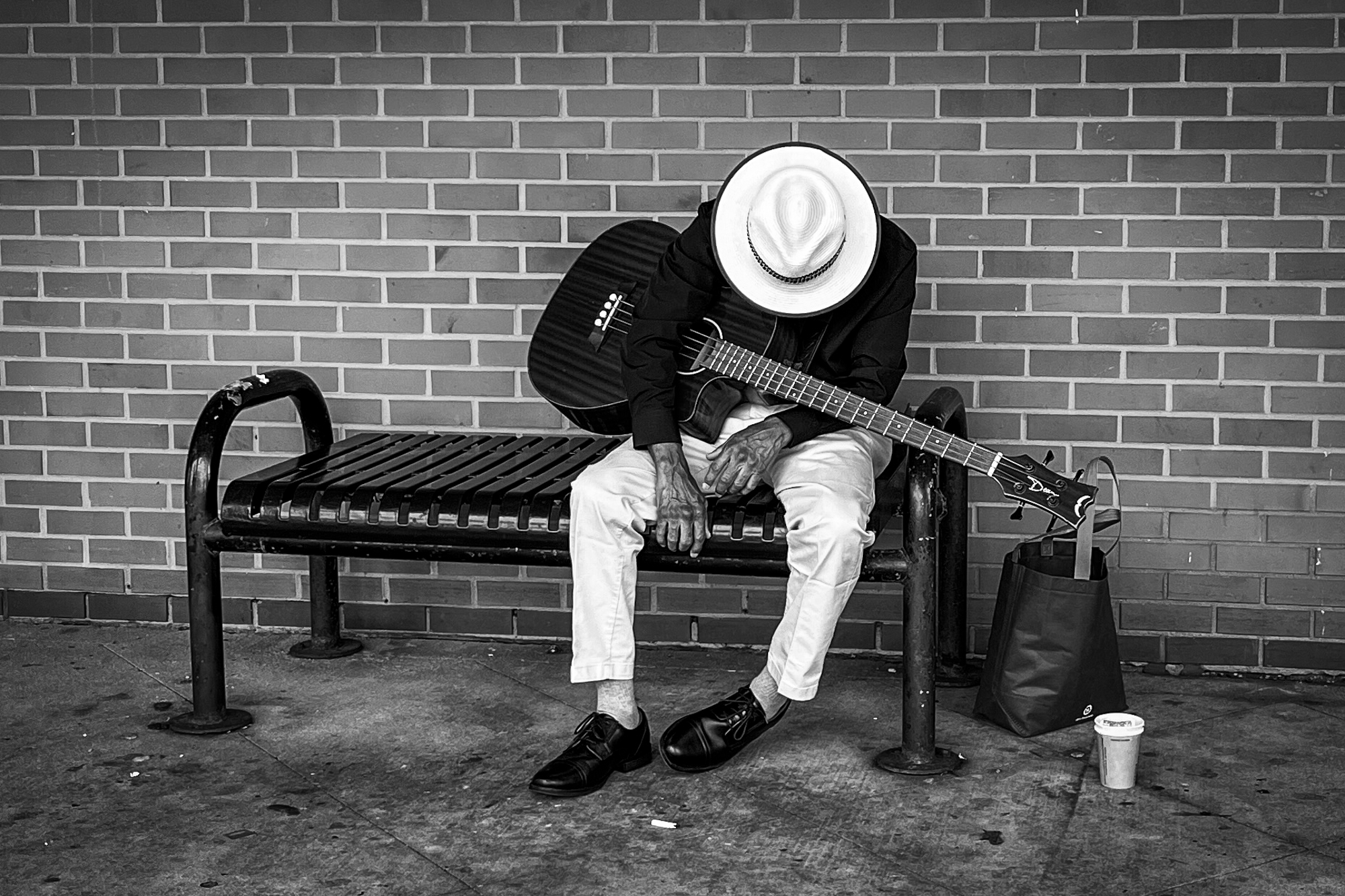
Hi Socrate, thank you for your thoughtful reply. I took time to think it through and experiment with the images further, the results below. I re-cropped the second one to include elements I excluded before, and I like it more than the first. To me it now tells the story of an unexpected musician in a mundane shopping space. What do you think?
I was wondering about the guitar strings! I am not an expert - my instrument is piano - but it did seem off. The guitar itself is a beautiful deep burgundy color, glossy and well cared for. I would've loved to hear him play, will try to revisit the area.
I like the B&W conversion. For some reason seem to work well with street photography. I think black and white vision work particularly well on these, since the absence of color enhances the mood of solitude of your photos. In addition the strong contrast between light and dark areas emphasizes the subject's isolation and contributes to a sober mood.
I find the first image to be the strongest one as it places us directly in front of the subject. The direct confrontation with the man, despite the obscured face, creates a more immediate and intimate connection with the viewer, inviting...Show more →
Hi Socrate, thank you for your thoughtful reply. I took time to think it through and experiment with the images further, the results below. I re-cropped the second one to include elements I excluded before, and I like it more than the first. To me it now tells the story of an unexpected musician in a mundane shopping space. What do you think?
I was wondering about the guitar strings! I am not an expert - my instrument is piano - but it did seem off. The guitar itself is a beautiful deep burgundy color, glossy and well cared for. I would've loved to hear him play, will try to revisit the area.
Oct 06, 2026 at 08:03 PM
|

p.1 #6Sleeping On The Job
Malka, I really like the latest edit of the second photograph. It now has a lot of depth and people in the background add contrasting context to the image.
Sreedhar
Oct 07, 2026 at 07:20 AM
p.1 #7Sleeping On The Job
Malka_1 wrote:
I find the first image to be the strongest one as it places us directly in front of the subject. The direct confrontation with the man, despite the obscured face, creates a more immediate and intimate connection with the viewer, inviting us to share in his moment of rest while conveying a sense of solitude.
My eyes are captivated by the stark contrast of his light-colored hat and pants against the dark clothing. I usually don’t like central placement of the subject but in this case, it feels like it helps isolating the subject. The noticeable veins on his hands tell his age and that he has been playing a guitar for a long time.
I couldn’t help noticing he is playing a four-string guitar which was popular in the 1950s–1960s in the Folk and Jazz music arena. Interesting!
The second image, while well-composed and technically sound with the placement of the subject creating a strong visual anchor and the empty space to the right providing a sense of context and environment, places the viewer at a greater distance creating a sense of observation rather than connection. Which is fine if that is what you are aiming for. However, I feel like, compared to the first image, it diminishes the intimacy and the emotional sense of solitude. The wider view offers more context for the environment, but at the cost of a direct emotional connection with the musician. However, I believe it works by itself (not compared to the first one).
From the tech point of view looks like the contrast/sharpness, especially of the subject, feels a bit too strong on my monitor.
The two images look good the way they are and there isn’t much to improve them.
Apart from reducing the subject’s sharpness in the second image, the only improvement I can think of is that you may want to try to selectively darken the highlights in the hat and trousers of the first image. Those competing bright areas may distract from what your intended message is of the resting/sleeping musician. This will also help the darker tones of the jacket and the guitar establish a stronger anchor for the viewer's eye, creating a more focused and impactful image. See if it works for you and if it helps your narrative.
SocrateHi Socrate, thank you for your thoughtful reply. I took time to think it through and experiment with the images further, the results below. I re-cropped the second one to include elements I excluded before, and I like it more than the first. To me it now tells the story of an unexpected musician in a mundane shopping space. What do you think?
I was wondering about the guitar strings! I am not an expert - my instrument is piano - but it did seem off. The guitar itself is a beautiful deep burgundy color, glossy and well cared for. I...Show more →
I agree with your assessment. The last image is the stronger photograph. What a difference a composition can make!
It connects better with the viewer; it conveys a strong sense of introspection and urban solitude and creates a sense of narrative and isolation. IOW it tells the story.
The focus also plays a crucial role, ensuring the attention remains on the musician without distraction and allows the atmosphere of the scene to contribute to the narrative. You got a winner
Socrate
Shasoc wrote
I like the B&W conversion. For some reason seem to work well with street photography. I think black and white vision work particularly well on these, since the absence of color enhances the mood of solitude of your photos. In addition the strong contrast between light and dark areas emphasizes the subject's isolation and contributes to a sober mood.I find the first image to be the strongest one as it places us directly in front of the subject. The direct confrontation with the man, despite the obscured face, creates a more immediate and intimate connection with the viewer, inviting us to share in his moment of rest while conveying a sense of solitude.
My eyes are captivated by the stark contrast of his light-colored hat and pants against the dark clothing. I usually don’t like central placement of the subject but in this case, it feels like it helps isolating the subject. The noticeable veins on his hands tell his age and that he has been playing a guitar for a long time.
I couldn’t help noticing he is playing a four-string guitar which was popular in the 1950s–1960s in the Folk and Jazz music arena. Interesting!
The second image, while well-composed and technically sound with the placement of the subject creating a strong visual anchor and the empty space to the right providing a sense of context and environment, places the viewer at a greater distance creating a sense of observation rather than connection. Which is fine if that is what you are aiming for. However, I feel like, compared to the first image, it diminishes the intimacy and the emotional sense of solitude. The wider view offers more context for the environment, but at the cost of a direct emotional connection with the musician. However, I believe it works by itself (not compared to the first one).
From the tech point of view looks like the contrast/sharpness, especially of the subject, feels a bit too strong on my monitor.
The two images look good the way they are and there isn’t much to improve them.
Apart from reducing the subject’s sharpness in the second image, the only improvement I can think of is that you may want to try to selectively darken the highlights in the hat and trousers of the first image. Those competing bright areas may distract from what your intended message is of the resting/sleeping musician. This will also help the darker tones of the jacket and the guitar establish a stronger anchor for the viewer's eye, creating a more focused and impactful image. See if it works for you and if it helps your narrative.
Socrate
I was wondering about the guitar strings! I am not an expert - my instrument is piano - but it did seem off. The guitar itself is a beautiful deep burgundy color, glossy and well cared for. I...Show more →
I agree with your assessment. The last image is the stronger photograph. What a difference a composition can make!
It connects better with the viewer; it conveys a strong sense of introspection and urban solitude and creates a sense of narrative and isolation. IOW it tells the story.
The focus also plays a crucial role, ensuring the attention remains on the musician without distraction and allows the atmosphere of the scene to contribute to the narrative. You got a winner
Socrate
Oct 07, 2026 at 07:49 AM
p.1 #8Sleeping On The Job
guywithgas wrote:
Malka, I really like the latest edit of the second photograph. It now has a lot of depth and people in the background add contrasting context to the image.
Sreedhar
---------------------------------------------
Shasoc wrote:
I find the first image to be the strongest one as it places us directly in front of the subject. The direct confrontation with the man, despite the obscured face, creates a more immediate and intimate connection with the viewer, inviting us to share in his moment of rest while conveying a sense of solitude.
My eyes are captivated by the stark contrast of his light-colored hat and pants against the dark clothing. I usually don’t like central placement of the subject but in this case, it feels like it helps isolating the subject. The noticeable veins on his hands tell his age and that he has been playing a guitar for a long time.
I couldn’t help noticing he is playing a four-string guitar which was popular in the 1950s–1960s in the Folk and Jazz music arena. Interesting!
The second image, while well-composed and technically sound with the placement of the subject creating a strong visual anchor and the empty space to the right providing a sense of context and environment, places the viewer at a greater distance creating a sense of observation rather than connection. Which is fine if that is what you are aiming for. However, I feel like, compared to the first image, it diminishes the intimacy and the emotional sense of solitude. The wider view offers more context for the environment, but at the cost of a direct emotional connection with the musician. However, I believe it works by itself (not compared to the first one).
From the tech point of view looks like the contrast/sharpness, especially of the subject, feels a bit too strong on my monitor.
The two images look good the way they are and there isn’t much to improve them.
Apart from reducing the subject’s sharpness in the second image, the only improvement I can think of is that you may want to try to selectively darken the highlights in the hat and trousers of the first image. Those competing bright areas may distract from what your intended message is of the resting/sleeping musician. This will also help the darker tones of the jacket and the guitar establish a stronger anchor for the viewer's eye, creating a more focused and impactful image. See if it works for you and if it helps your narrative.
SocrateHi Socrate, thank you for your thoughtful reply. I took time to think it through and experiment with the images further, the results below. I re-cropped the second one to include elements I excluded before, and I like it more than the first. To me it now tells the story of an unexpected musician in a mundane shopping space. What do you think?
I was wondering about the guitar strings! I am not an expert - my instrument is piano - but it did seem off. The guitar itself is a beautiful deep burgundy color, glossy and well cared for. I would've loved to hear him play, will try to revisit the area.I agree with your assessment. The last image is the stronger photograph. What a difference a composition can make!
It connects better with the viewer; it conveys a strong sense of introspection and urban solitude and creates a sense of narrative and isolation. IOW it tells the story.
The focus also plays a crucial role, ensuring the attention remains on the musician without distraction and allows the atmosphere of the scene to contribute to the narrative. You got a winner
Socrate
Thank you both! Your feedback is very valuable to me, because images I find most compelling are the ones that tell a story, but I've been struggling to bring that into my own my photography. It also reinforces the concept that it's the photographer, not the equipment. This image was taken with an aging iPhone and not my many thousands-worth "real" gear.
Malka, I really like the latest edit of the second photograph. It now has a lot of depth and people in the background add contrasting context to the image.
Sreedhar
---------------------------------------------
Shasoc wrote:
Malka_1 wrote
Shasoc wrote
I like the B&W conversion. For some reason seem to work well with street photography. I think black and white vision work particularly well on these, since the absence of color enhances the mood of solitude of your photos. In addition the strong contrast between light and dark areas emphasizes the subject's isolation and contributes to a sober mood.I find the first image to be the strongest one as it places us directly in front of the subject. The direct confrontation with the man, despite the obscured face, creates a more immediate and intimate connection with the viewer, inviting us to share in his moment of rest while conveying a sense of solitude.
My eyes are captivated by the stark contrast of his light-colored hat and pants against the dark clothing. I usually don’t like central placement of the subject but in this case, it feels like it helps isolating the subject. The noticeable veins on his hands tell his age and that he has been playing a guitar for a long time.
I couldn’t help noticing he is playing a four-string guitar which was popular in the 1950s–1960s in the Folk and Jazz music arena. Interesting!
The second image, while well-composed and technically sound with the placement of the subject creating a strong visual anchor and the empty space to the right providing a sense of context and environment, places the viewer at a greater distance creating a sense of observation rather than connection. Which is fine if that is what you are aiming for. However, I feel like, compared to the first image, it diminishes the intimacy and the emotional sense of solitude. The wider view offers more context for the environment, but at the cost of a direct emotional connection with the musician. However, I believe it works by itself (not compared to the first one).
From the tech point of view looks like the contrast/sharpness, especially of the subject, feels a bit too strong on my monitor.
The two images look good the way they are and there isn’t much to improve them.
Apart from reducing the subject’s sharpness in the second image, the only improvement I can think of is that you may want to try to selectively darken the highlights in the hat and trousers of the first image. Those competing bright areas may distract from what your intended message is of the resting/sleeping musician. This will also help the darker tones of the jacket and the guitar establish a stronger anchor for the viewer's eye, creating a more focused and impactful image. See if it works for you and if it helps your narrative.
Socrate
I was wondering about the guitar strings! I am not an expert - my instrument is piano - but it did seem off. The guitar itself is a beautiful deep burgundy color, glossy and well cared for. I would've loved to hear him play, will try to revisit the area.
It connects better with the viewer; it conveys a strong sense of introspection and urban solitude and creates a sense of narrative and isolation. IOW it tells the story.
The focus also plays a crucial role, ensuring the attention remains on the musician without distraction and allows the atmosphere of the scene to contribute to the narrative. You got a winner
Socrate
Thank you both! Your feedback is very valuable to me, because images I find most compelling are the ones that tell a story, but I've been struggling to bring that into my own my photography. It also reinforces the concept that it's the photographer, not the equipment. This image was taken with an aging iPhone and not my many thousands-worth "real" gear.
Oct 07, 2026 at 09:34 AM
p.1 #9Sleeping On The Job
Malka_1 wrote:
Sreedhar---------------------------------------------
I find the first image to be the strongest one as it places us directly in front of the subject. The direct confrontation with the man, despite the obscured face, creates a more immediate and intimate connection with the viewer, inviting us to share in his moment of rest while conveying a sense of solitude.
My eyes are captivated by the stark contrast of his light-colored hat and pants against the dark clothing. I usually don’t like central placement of the subject but in this case, it feels like it helps isolating the subject. The noticeable veins on his hands tell his age and that he has been playing a guitar for a long time.
I couldn’t help noticing he is playing a four-string guitar which was popular in the 1950s–1960s in the Folk and Jazz music arena. Interesting!
The second image, while well-composed and technically sound with the placement of the subject creating a strong visual anchor and the empty space to the right providing a sense of context and environment, places the viewer at a greater distance creating a sense of observation rather than connection. Which is fine if that is what you are aiming for. However, I feel like, compared to the first image, it diminishes the intimacy and the emotional sense of solitude. The wider view offers more context for the environment, but at the cost of a direct emotional connection with the musician. However, I believe it works by itself (not compared to the first one).
From the tech point of view looks like the contrast/sharpness, especially of the subject, feels a bit too strong on my monitor.
The two images look good the way they are and there isn’t much to improve them.
Apart from reducing the subject’s sharpness in the second image, the only improvement I can think of is that you may want to try to selectively darken the highlights in the hat and trousers of the first image. Those competing bright areas may distract from what your intended message is of the resting/sleeping musician. This will also help the darker tones of the jacket and the guitar establish a stronger anchor for the viewer's eye, creating a more focused and impactful image. See if it works for you and if it helps your narrative.
SocrateHi Socrate, thank you for your thoughtful reply. I took time to think it through and experiment with the images further, the results below. I re-cropped the second one to include elements I excluded before, and I like it more than the first. To me it now tells the story of an unexpected musician in a mundane shopping space. What do you think?
I was wondering about the guitar strings! I am not an expert - my instrument is piano - but it did seem off. The guitar itself is a beautiful deep burgundy color, glossy and well cared for. I would've loved to hear him play, will try to revisit the area.I agree with your assessment. The last image is the stronger photograph. What a difference a composition can make!
It connects better with the viewer; it conveys a strong sense of introspection and urban solitude and creates a sense of narrative and isolation. IOW it tells the story.
The focus also plays a crucial role, ensuring the attention remains on the musician without distraction and allows the atmosphere of the scene to contribute to the narrative. You got a winner
SocrateThank you both! Your feedback is very valuable to me, because images I find most compelling are the ones that tell a story, but I've been struggling to bring that into my own my photography. It also reinforces the concept that it's the photographer, not the equipment. This image was taken with an aging iPhone and not my many thousands-worth "real" gear.
Your point about the photographer (eye, mind, vision, message, voice, etc.) ... that also extends to the authorship of processing (as well as authorship composition, exposure, etc.), as it extends and applies to the conveyance. There's a reason why Adams wrote his trilogy (1980-ish) as a compilation from his preceding works (1950-ish).
Some folks embrace the processing, others reject it. Personal choice, but even if one chooses to use "standard" or "in camera" processing ... the author has still made the choice (baked in profile(s) at the hand of others, vs custom at the hand of the author).
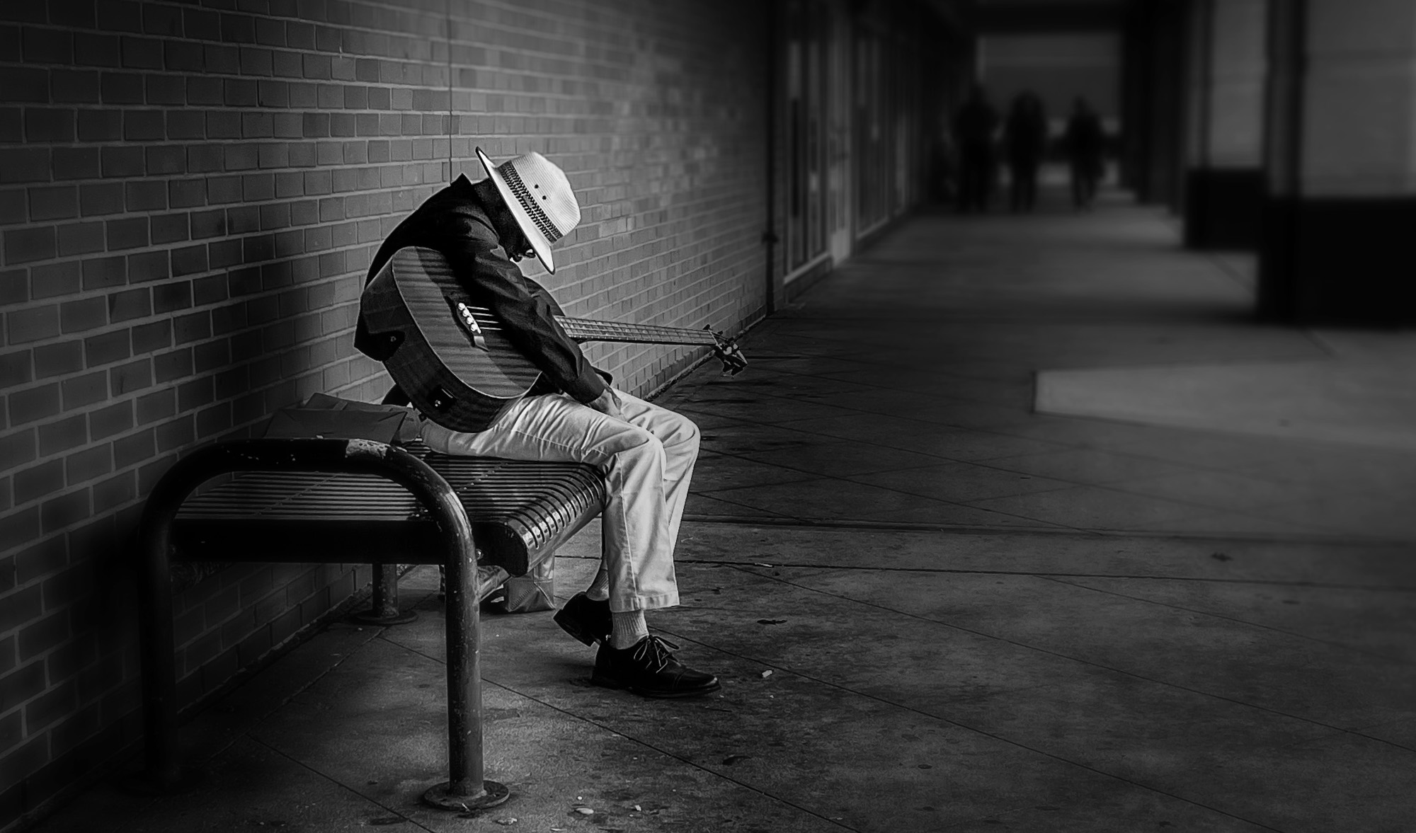
That said, the wider environmental view, includes additional elements. Now that you HAVE them, WHAT are you gonna DO with them. Do they become main characters, co-characters or merely backgound characters? The treatment / processing decisions you make can influence this to the degree your authorship presents.
Here's some processing variance to illustrate how processing might convey a differing level of element influence. I won't repeat the telephone game, but it still is relevant for consideration, regarding the weighting you aspire to give to the different elements. Just a quick variant for illustration of the concept.
Your pic, your message, your call.
Nicely seen ... photographer.

guywithgas wrote
Malka, I really like the latest edit of the second photograph. It now has a lot of depth and people in the background add contrasting context to the image.Sreedhar
Shasoc wrote
Malka_1 wrote
Shasoc wrote
I like the B&W conversion. For some reason seem to work well with street photography. I think black and white vision work particularly well on these, since the absence of color enhances the mood of solitude of your photos. In addition the strong contrast between light and dark areas emphasizes the subject's isolation and contributes to a sober mood.I find the first image to be the strongest one as it places us directly in front of the subject. The direct confrontation with the man, despite the obscured face, creates a more immediate and intimate connection with the viewer, inviting us to share in his moment of rest while conveying a sense of solitude.
My eyes are captivated by the stark contrast of his light-colored hat and pants against the dark clothing. I usually don’t like central placement of the subject but in this case, it feels like it helps isolating the subject. The noticeable veins on his hands tell his age and that he has been playing a guitar for a long time.
I couldn’t help noticing he is playing a four-string guitar which was popular in the 1950s–1960s in the Folk and Jazz music arena. Interesting!
The second image, while well-composed and technically sound with the placement of the subject creating a strong visual anchor and the empty space to the right providing a sense of context and environment, places the viewer at a greater distance creating a sense of observation rather than connection. Which is fine if that is what you are aiming for. However, I feel like, compared to the first image, it diminishes the intimacy and the emotional sense of solitude. The wider view offers more context for the environment, but at the cost of a direct emotional connection with the musician. However, I believe it works by itself (not compared to the first one).
From the tech point of view looks like the contrast/sharpness, especially of the subject, feels a bit too strong on my monitor.
The two images look good the way they are and there isn’t much to improve them.
Apart from reducing the subject’s sharpness in the second image, the only improvement I can think of is that you may want to try to selectively darken the highlights in the hat and trousers of the first image. Those competing bright areas may distract from what your intended message is of the resting/sleeping musician. This will also help the darker tones of the jacket and the guitar establish a stronger anchor for the viewer's eye, creating a more focused and impactful image. See if it works for you and if it helps your narrative.
Socrate
I was wondering about the guitar strings! I am not an expert - my instrument is piano - but it did seem off. The guitar itself is a beautiful deep burgundy color, glossy and well cared for. I would've loved to hear him play, will try to revisit the area.
It connects better with the viewer; it conveys a strong sense of introspection and urban solitude and creates a sense of narrative and isolation. IOW it tells the story.
The focus also plays a crucial role, ensuring the attention remains on the musician without distraction and allows the atmosphere of the scene to contribute to the narrative. You got a winner
Socrate
Your point about the photographer (eye, mind, vision, message, voice, etc.) ... that also extends to the authorship of processing (as well as authorship composition, exposure, etc.), as it extends and applies to the conveyance. There's a reason why Adams wrote his trilogy (1980-ish) as a compilation from his preceding works (1950-ish).
Some folks embrace the processing, others reject it. Personal choice, but even if one chooses to use "standard" or "in camera" processing ... the author has still made the choice (baked in profile(s) at the hand of others, vs custom at the hand of the author).
That said, the wider environmental view, includes additional elements. Now that you HAVE them, WHAT are you gonna DO with them. Do they become main characters, co-characters or merely backgound characters? The treatment / processing decisions you make can influence this to the degree your authorship presents.
Here's some processing variance to illustrate how processing might convey a differing level of element influence. I won't repeat the telephone game, but it still is relevant for consideration, regarding the weighting you aspire to give to the different elements. Just a quick variant for illustration of the concept.
Your pic, your message, your call.
Nicely seen ... photographer.
 |
||
 |
||
|
Oct 07, 2026 at 03:55 PM
p.1 #10Sleeping On The Job
RustyBug wrote:
Sreedhar---------------------------------------------
I find the first image to be the strongest one as it places us directly in front of the subject. The direct confrontation with the man, despite the obscured face, creates a more immediate and intimate connection with the viewer, inviting us to share in his moment of rest while conveying a sense of solitude.
My eyes are captivated by the stark contrast of his light-colored hat and pants against the dark clothing. I usually don’t like central placement of the subject but in this case, it feels like it helps isolating the subject. The noticeable veins on his hands tell his age and that he has been playing a guitar for a long time.
I couldn’t help noticing he is playing a four-string guitar which was popular in the 1950s–1960s in the Folk and Jazz music arena. Interesting!
The second image, while well-composed and technically sound with the placement of the subject creating a strong visual anchor and the empty space to the right providing a sense of context and environment, places the viewer at a greater distance creating a sense of observation rather than connection. Which is fine if that is what you are aiming for. However, I feel like, compared to the first image, it diminishes the intimacy and the emotional sense of solitude. The wider view offers more context for the environment, but at the cost of a direct emotional connection with the musician. However, I believe it works by itself (not compared to the first one).
From the tech point of view looks like the contrast/sharpness, especially of the subject, feels a bit too strong on my monitor.
The two images look good the way they are and there isn’t much to improve them.
Apart from reducing the subject’s sharpness in the second image, the only improvement I can think of is that you may want to try to selectively darken the highlights in the hat and trousers of the first image. Those competing bright areas may distract from what your intended message is of the resting/sleeping musician. This will also help the darker tones of the jacket and the guitar establish a stronger anchor for the viewer's eye, creating a more focused and impactful image. See if it works for you and if it helps your narrative.
SocrateHi Socrate, thank you for your thoughtful reply. I took time to think it through and experiment with the images further, the results below. I re-cropped the second one to include elements I excluded before, and I like it more than the first. To me it now tells the story of an unexpected musician in a mundane shopping space. What do you think?
I was wondering about the guitar strings! I am not an expert - my instrument is piano - but it did seem off. The guitar itself is a beautiful deep burgundy color, glossy and well cared for. I would've loved to hear him play, will try to revisit the area.I agree with your assessment. The last image is the stronger photograph. What a difference a composition can make!
It connects better with the viewer; it conveys a strong sense of introspection and urban solitude and creates a sense of narrative and isolation. IOW it tells the story.
The focus also plays a crucial role, ensuring the attention remains on the musician without distraction and allows the atmosphere of the scene to contribute to the narrative. You got a winner
SocrateThank you both! Your feedback is very valuable to me, because images I find most compelling are the ones that tell a story, but I've been struggling to bring that into my own my photography. It also reinforces the concept that it's the photographer, not the equipment. This image was taken with an aging iPhone and not my many thousands-worth "real" gear.Your point about the photographer (eye, mind, vision, message, voice, etc.) ... that also extends to the authorship of processing (as well as authorship composition, exposure, etc.), as it extends and applies to the conveyance. There's a reason why Adams wrote his trilogy (1980-ish) as a compilation from his preceding works (1950-ish).
Some folks embrace the processing, others reject it. Personal choice, but even if one chooses to use "standard" or "in camera" processing ... the author has still made the choice (baked in profile(s) at the hand of others, vs custom at the hand of the author).
That said, the...Show more →
100% agreed on post processing - it's an integral part of coaxing the vision out. I find that I need more time to ruminate on the image than I usually have (or give myself) at the capture. Let's consider it included in the "it's the photographer".
Thanks for sharing another version. A darker flavor and a good illustration how a little edit changes the entire tone. Feels very spooky - they are coming for him...
Malka_1 wrote
guywithgas wrote
Malka, I really like the latest edit of the second photograph. It now has a lot of depth and people in the background add contrasting context to the image.Sreedhar
Shasoc wrote
Malka_1 wrote
Shasoc wrote
I like the B&W conversion. For some reason seem to work well with street photography. I think black and white vision work particularly well on these, since the absence of color enhances the mood of solitude of your photos. In addition the strong contrast between light and dark areas emphasizes the subject's isolation and contributes to a sober mood.I find the first image to be the strongest one as it places us directly in front of the subject. The direct confrontation with the man, despite the obscured face, creates a more immediate and intimate connection with the viewer, inviting us to share in his moment of rest while conveying a sense of solitude.
My eyes are captivated by the stark contrast of his light-colored hat and pants against the dark clothing. I usually don’t like central placement of the subject but in this case, it feels like it helps isolating the subject. The noticeable veins on his hands tell his age and that he has been playing a guitar for a long time.
I couldn’t help noticing he is playing a four-string guitar which was popular in the 1950s–1960s in the Folk and Jazz music arena. Interesting!
The second image, while well-composed and technically sound with the placement of the subject creating a strong visual anchor and the empty space to the right providing a sense of context and environment, places the viewer at a greater distance creating a sense of observation rather than connection. Which is fine if that is what you are aiming for. However, I feel like, compared to the first image, it diminishes the intimacy and the emotional sense of solitude. The wider view offers more context for the environment, but at the cost of a direct emotional connection with the musician. However, I believe it works by itself (not compared to the first one).
From the tech point of view looks like the contrast/sharpness, especially of the subject, feels a bit too strong on my monitor.
The two images look good the way they are and there isn’t much to improve them.
Apart from reducing the subject’s sharpness in the second image, the only improvement I can think of is that you may want to try to selectively darken the highlights in the hat and trousers of the first image. Those competing bright areas may distract from what your intended message is of the resting/sleeping musician. This will also help the darker tones of the jacket and the guitar establish a stronger anchor for the viewer's eye, creating a more focused and impactful image. See if it works for you and if it helps your narrative.
Socrate
I was wondering about the guitar strings! I am not an expert - my instrument is piano - but it did seem off. The guitar itself is a beautiful deep burgundy color, glossy and well cared for. I would've loved to hear him play, will try to revisit the area.
It connects better with the viewer; it conveys a strong sense of introspection and urban solitude and creates a sense of narrative and isolation. IOW it tells the story.
The focus also plays a crucial role, ensuring the attention remains on the musician without distraction and allows the atmosphere of the scene to contribute to the narrative. You got a winner
Socrate
Some folks embrace the processing, others reject it. Personal choice, but even if one chooses to use "standard" or "in camera" processing ... the author has still made the choice (baked in profile(s) at the hand of others, vs custom at the hand of the author).
That said, the...Show more →
100% agreed on post processing - it's an integral part of coaxing the vision out. I find that I need more time to ruminate on the image than I usually have (or give myself) at the capture. Let's consider it included in the "it's the photographer".
Thanks for sharing another version. A darker flavor and a good illustration how a little edit changes the entire tone. Feels very spooky - they are coming for him...
Oct 07, 2026 at 08:17 PM