I wasn't sure if I should post this here or elsewhere, but I decided I'd rather have critique than polite silence.
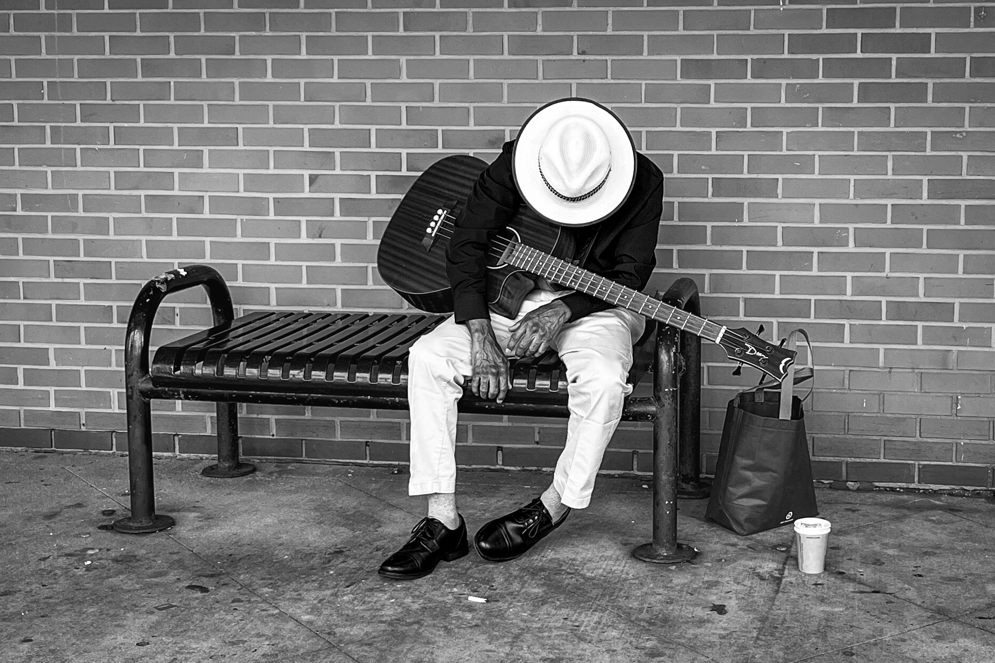
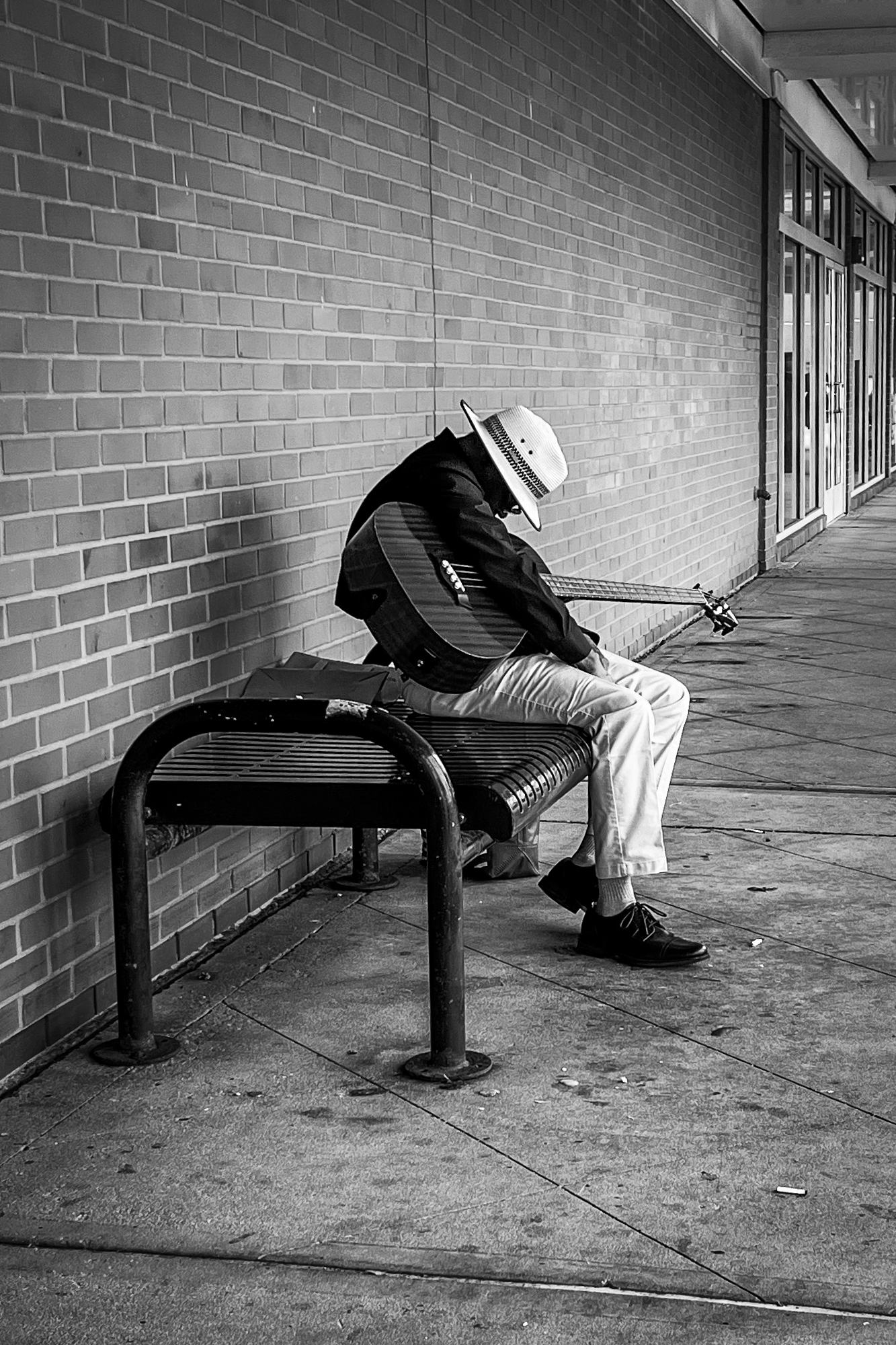
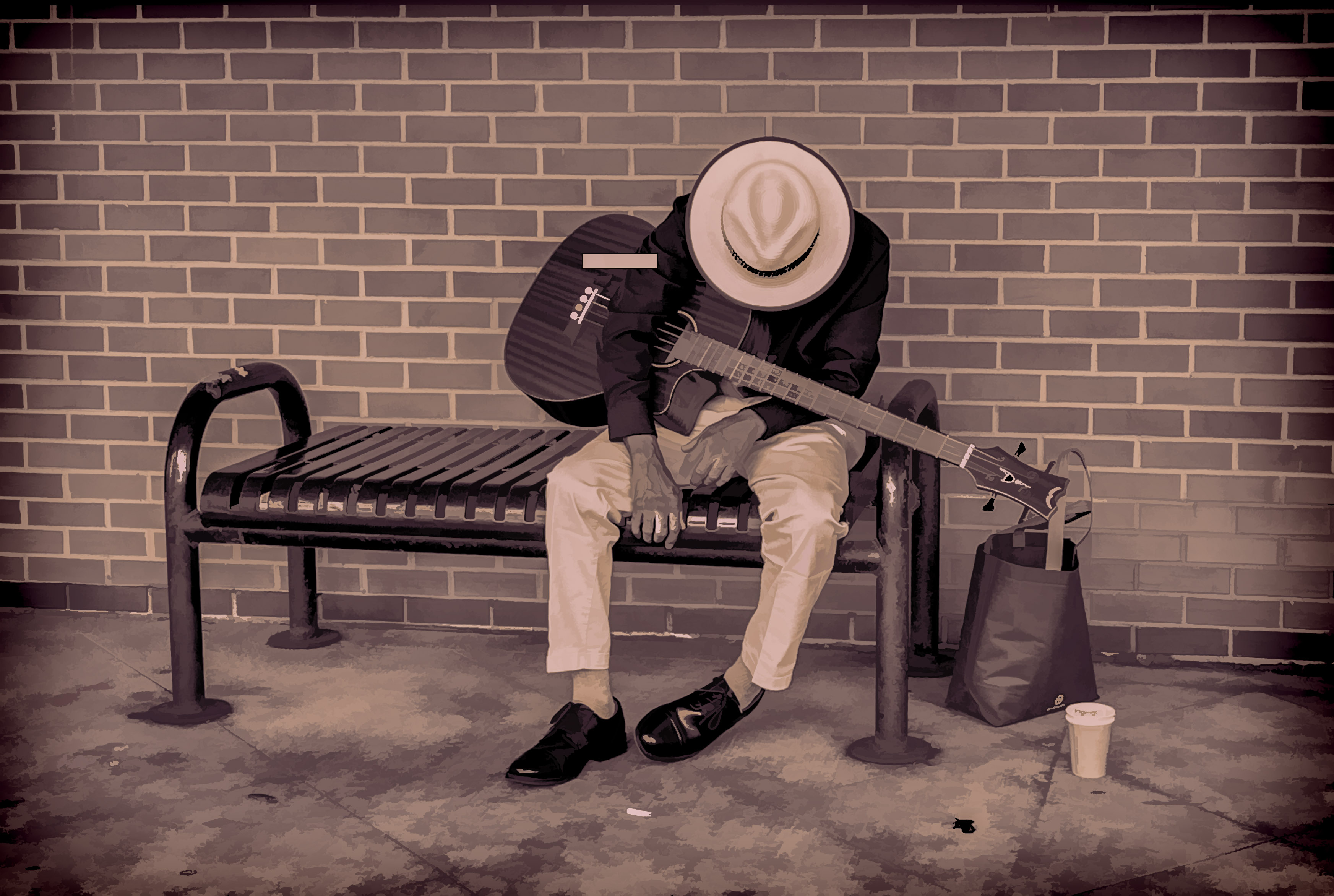
This quiet suburban shopping strip isn't exactly a hot spot for street photography, so I couldn't resist taking the picture. With my older iPhone, which limited cropping options, among other things, but that's all I had with me. A little b&w magic and editing in LR, and here it is, my first ever street photography attempt. I deposited a little cash for my oblivious model, so he ended up earning while sleeping.
I think the subject is worthwhile, but not sure if I did him justice. Pretty sure this type of b&w is the way to go. But would love to get constructive feedback!
Thank you,
Malka
iPhone 13 miniiPhone 13 mini back dual wide camera 5.1mm f/1.6 lens5mmf/1.61/120s50 ISO0.0 EV
iPhone 13 miniiPhone 13 mini back dual wide camera 5.1mm f/1.6 lens5mmf/1.61/120s40 ISO0.0 EV
I like the B&W conversion. For some reason seem to work well with street photography. I think black and white vision work particularly well here, since the absence of color enhances the mood of solitude of your photos. In addition the strong contrast between light and dark areas emphasizes the subject's isolation and contributes to a sober mood.
I find the first image to be the strongest one as it places us directly in front of the subject. The direct confrontation with the man, despite the obscured face, creates a more immediate and intimate connection with the viewer, inviting us to share in his moment of rest while conveying a sense of solitude.
My eyes are captivated by the stark contrast of his light-colored hat and pants against the dark clothing. I usually don’t like central placement of the subject but in this case, it feels like it helps isolating the subject. The noticeable veins on his hands tell his age and that he has been playing a guitar for a long time.
I couldn’t help noticing he is playing a four-string guitar which was popular in the 1950s–1960s in the Folk and Jazz music arena. Interesting!
The second image, while well-composed and technically sound with the placement of the subject creating a strong visual anchor and the empty space to the right providing a sense of context and environment, places the viewer at a greater distance creating a sense of observation rather than connection. Which is fine if that is what you are aiming for. However, I feel like, compared to the first image, it diminishes the intimacy and the emotional sense of solitude. The wider view offers more context for the environment, but at the cost of a direct emotional connection with the musician. However, I believe it works by itself (not compared to the first one).
From the tech point of view looks like the contrast/sharpness, especially of the subject, feels a bit too strong on my monitor.
The two images look good the way they are and there isn’t much to improve them.
Apart from reducing the subject’s sharpness in the second image, the only improvement I can think of is that you may want to try to selectively darken the highlights in the hat and trousers of the first image. Those competing bright areas may distract from what your intended message is of the resting/sleeping musician. This will also help the darker tones of the jacket and the guitar establish a stronger anchor for the viewer's eye, creating a more focused and impactful image. See if it works for you and if it helps your narrative.