RustyBug 
Offline
• • • • • • •
Upload & Sell: On
|
 p.1 #6 · Critique - Banff Travel Photos p.1 #6 · Critique - Banff Travel Photos | |
Welcome to the Forum.
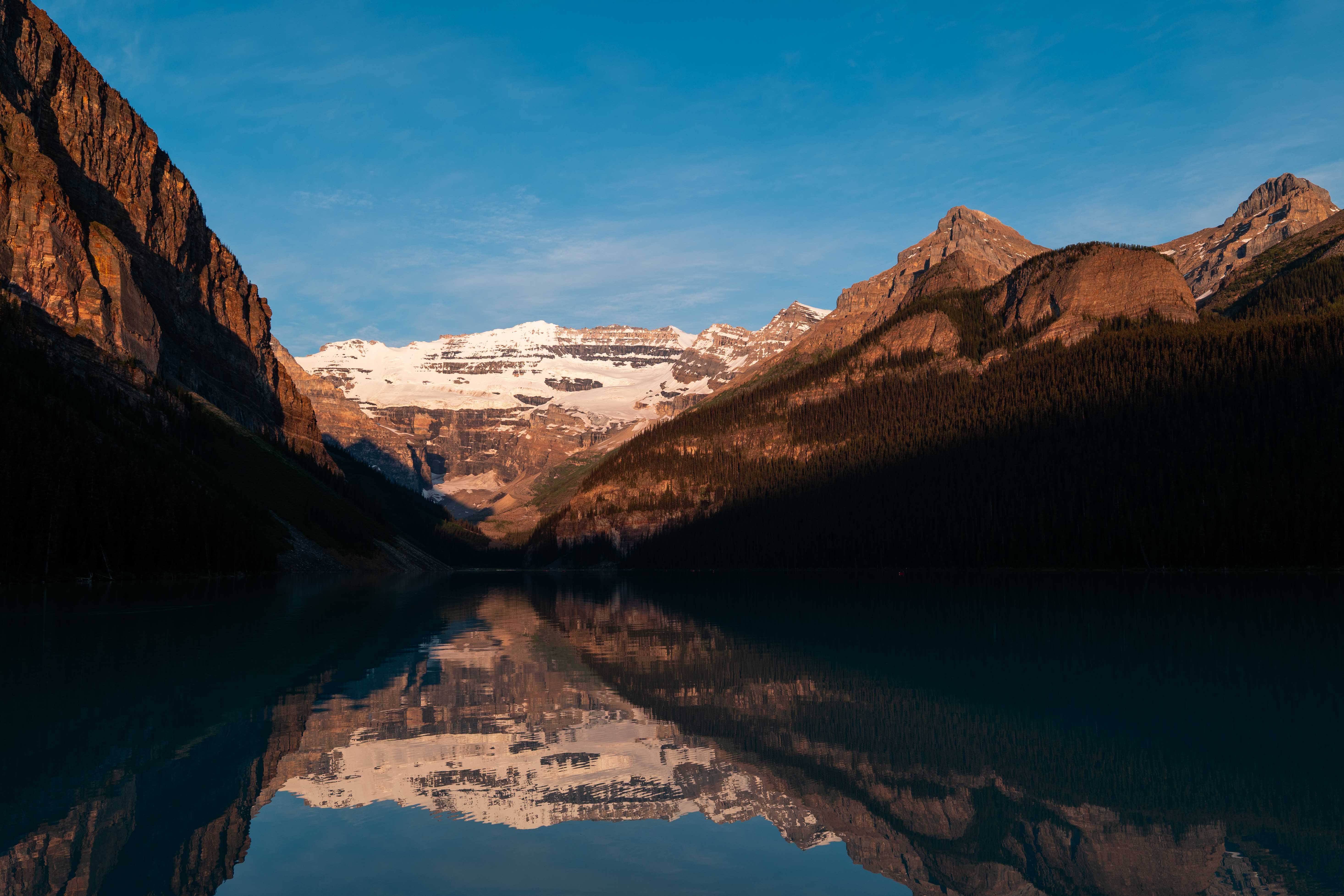
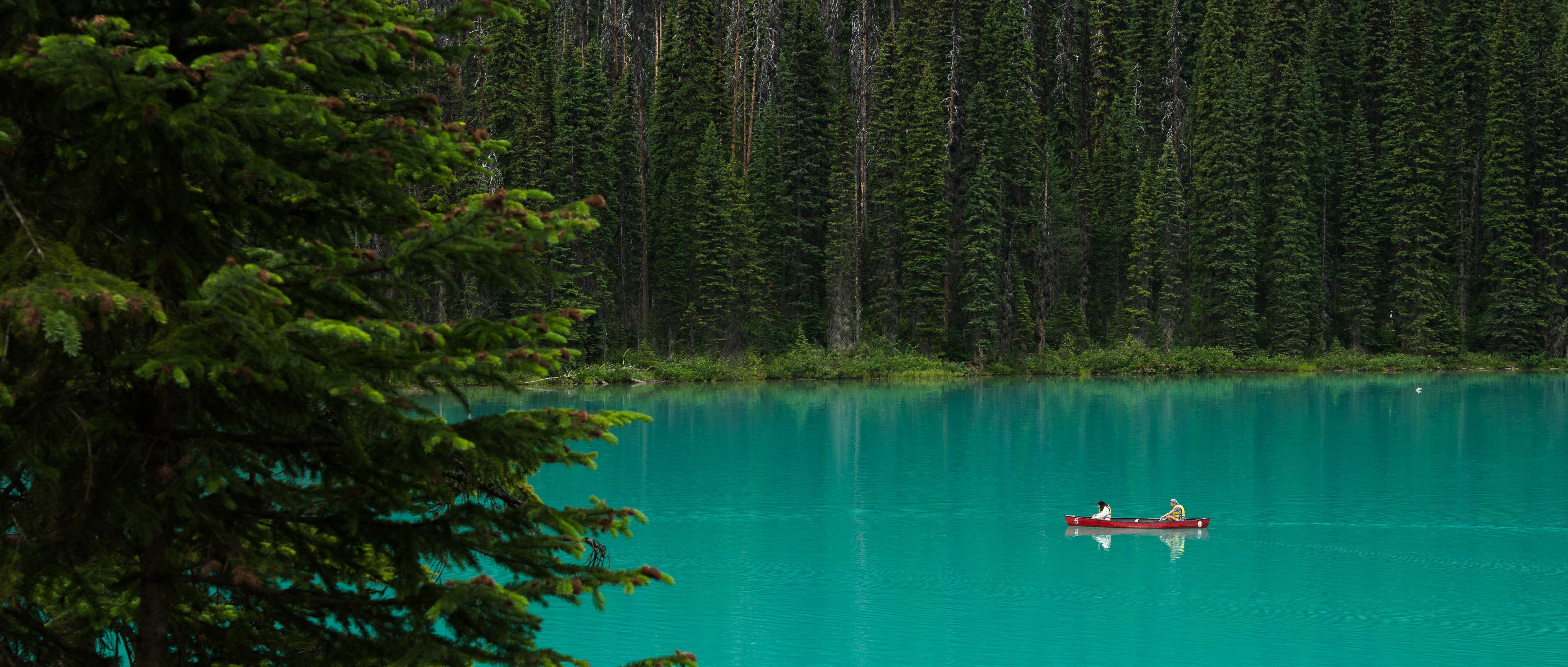
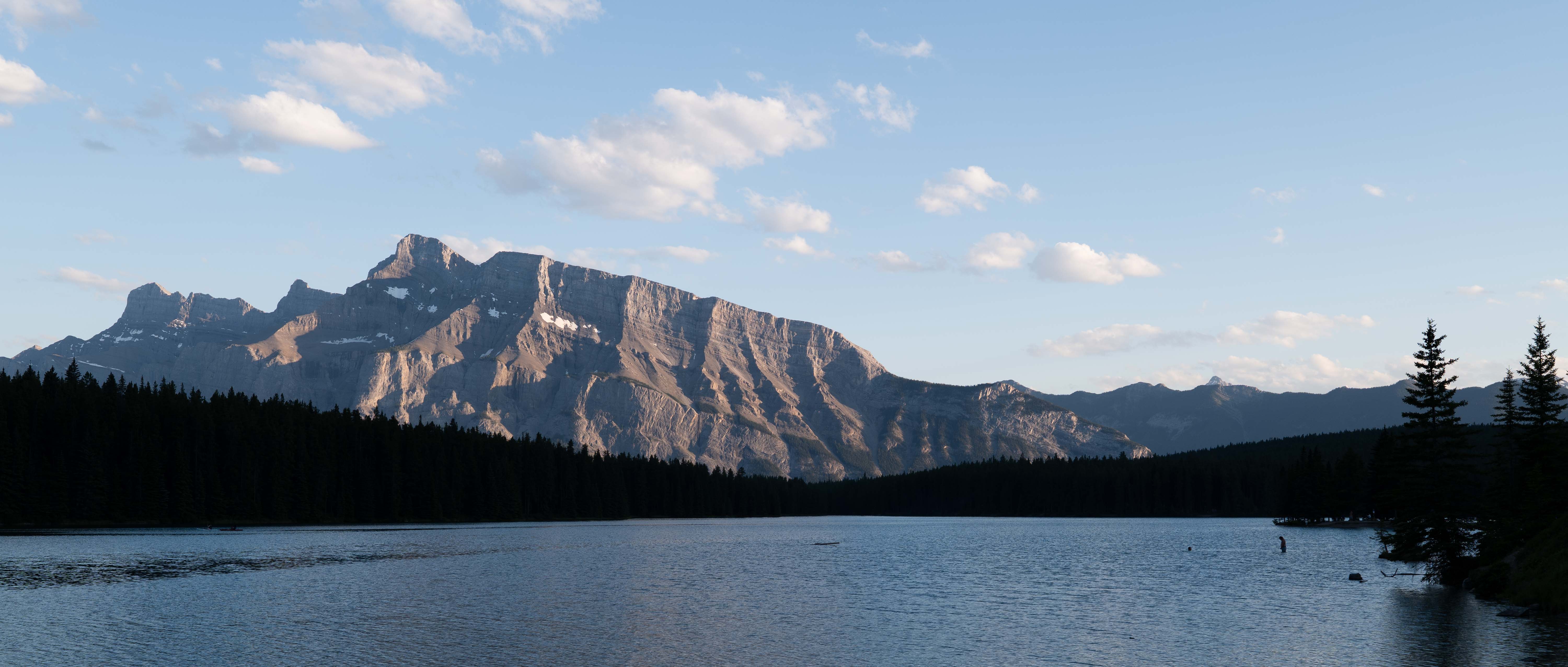
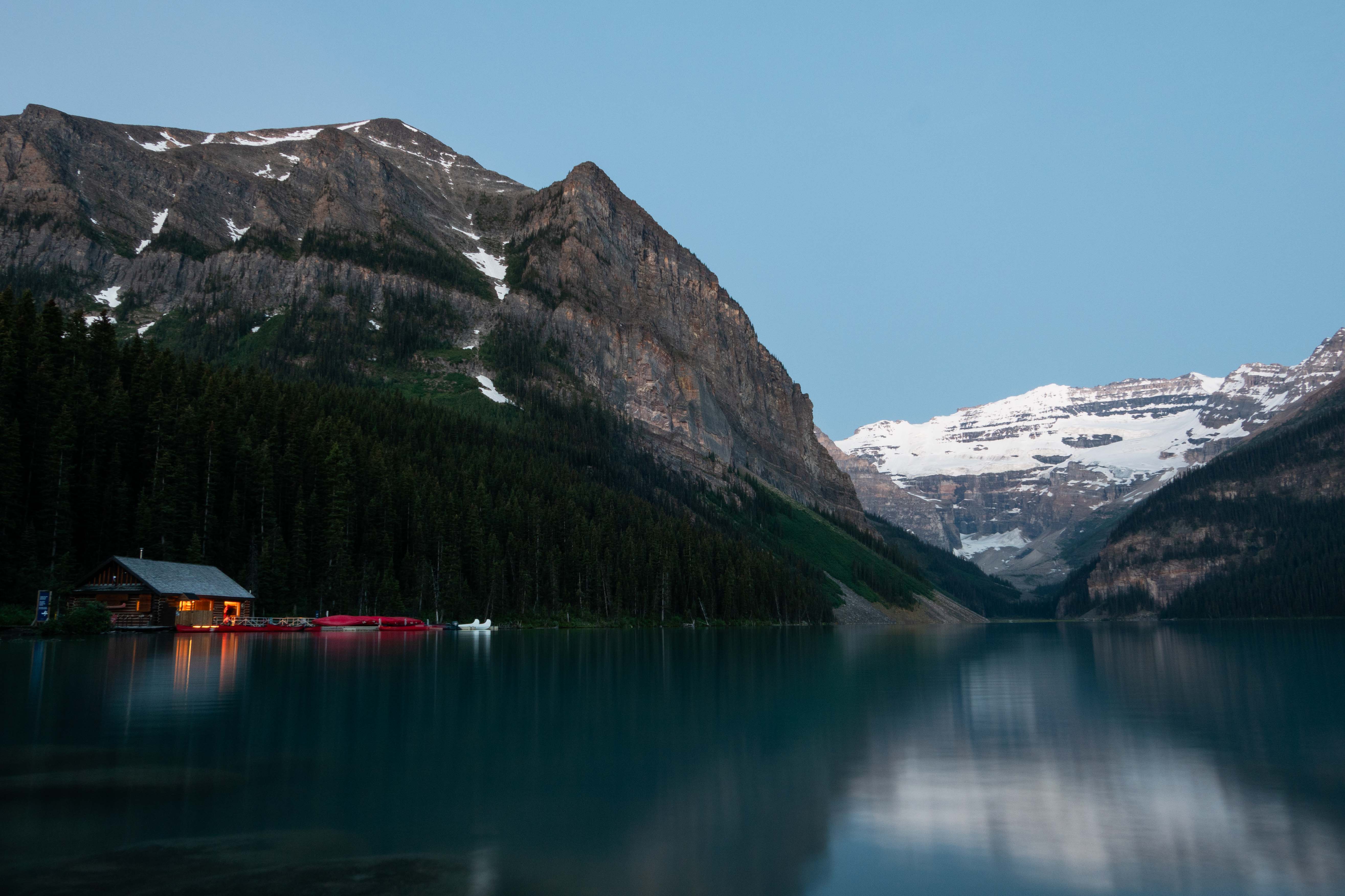
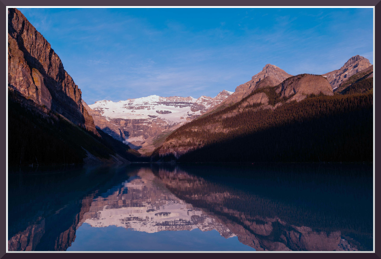
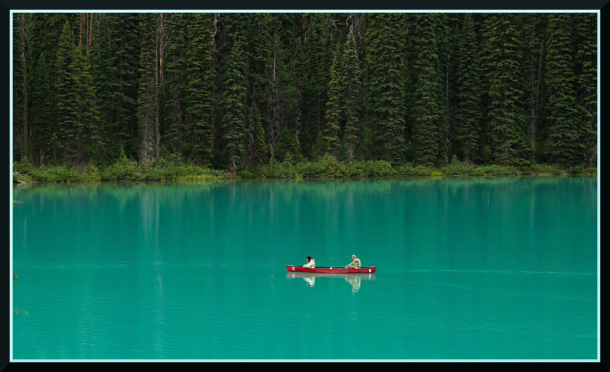
Nice presentation ... it gives us a vibe of being there somewhat, collectivley.
As to the issue of matching colors, etc. Unless you are working in a sect of the industry that DEMANDS it (and you wouldn't be asking, if you did), then it isn't going to be uber critical for perfect color matching, etc.
As an ambient shooter, we KNOW that the color of the LIGHT for a given time of day, as well as orientation of NESW, and a few other aspects are constantly in play.
To that degree ... you have "some" decisions to make. Primarily, are you trying to use the scene to SHOWCASE the color of the light ... OR, are you trying to use the light to SHOWCASE the scene (subject).
From that, you are also making decisions if your intent is to present the matter as a "recording device", or an "artistic rendering".
If we look to the history of Ektachrome / Kodachrome, Fujichrome (Velvia), we had distinctly different profiles in those film stocks. Generally speaking a photographer would adopt ONE of those as their "go to" film ... depending on which attributes they preferred.
Rarely did someone go "jumping around" from one film to another WITHIN a given shoot. Could, but mostly, didn't. Personally, I shot landscapes and general work with Fujichrome ... and portraits / weddings with Kodak VPS 160.
Going back to the 3 chromes ... while their color profiles did not match one another, there were TRAITS about them. One notable trait was the amount of saturation the profile(s) had. Kodachrome kinda rocked the world with its processing that allowed for more saturation than Ektachrome. Fujihrome had inherently strong saturation in the cool hues.
Insert color science of digital cameras, and we're off to the races between natural, low saturation and knock your socks off uber-saturation.
Hang with me ... almost there. 
As a generalist ... we can certainly go with "whatever you like" and in today's realm, the world is your oyster.
However, if you want to build a certain degree of consistency across your work ... I'd suggest you make (sometime down the road is fine) some consideration to what levels of saturation you want to present in.
Imo, if you operate in a reasonable band of saturation range, your images will retain a certain cohesiveness to them ... and THAT is (I assume) the crux of your question ... how do I keep my work cohesive, so I'm not all over the map.
That's not to say, that everything, every time must be matchy-matchy ... and when shifting genre's etc. your apporach may indeed vary. But, to Socrate's point, unless you are repro-art, studio controlled, etc. ... perfect color calibration matching files is not for most folks. But, they can aid themselves by harnessing a degree of consistency in overall things like saturation, contrast vibes, etc. .. even if colors aren't perfect matches.
That said, take a lap back at nice images above ... consider the saturation levels applied in each, for your review.
HTH 
Again, welcome to the Forum.

|