RustyBug 
Offline
• • • • • • •
Upload & Sell: On
|
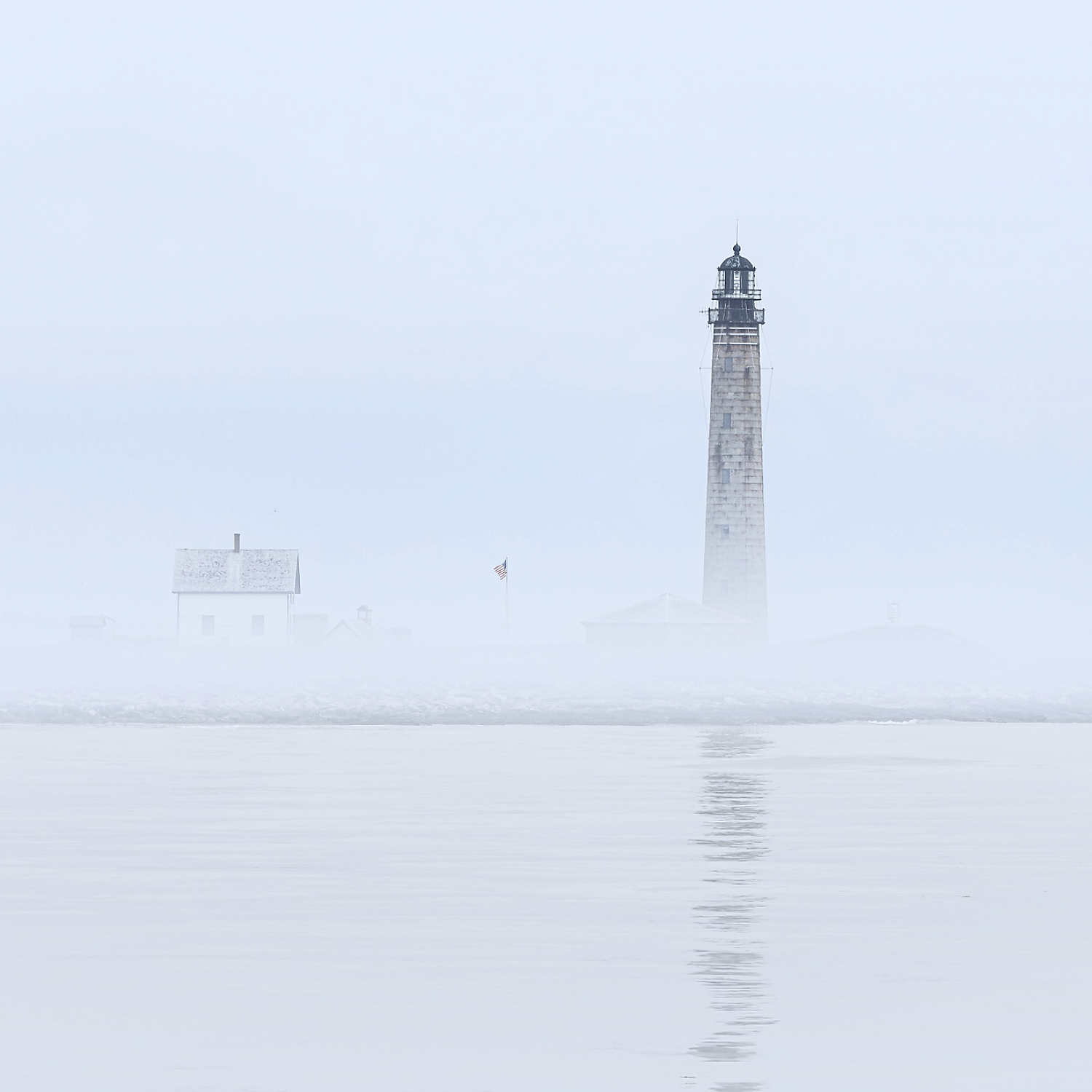
 p.1 #3 · High Key Lighthouse in Fog p.1 #3 · High Key Lighthouse in Fog | |
+1 a nice one.
+1 on the blue cast. That's not necessarily a problem, but it is a decision. The blue can be a clue to time of day or atmospheric conditions. If that information is part of your desired intent to convey, then it's all good to have it in there. Might even consider going "more blue" to further convey that (explore it a bit).
Conversely, if you take the blue out, the neutral aspect shifts the emotive a bit in that regard, too. Either way, your call. Just depends on the mood of intent you desire to convey.
As to the crop ... again, a decision.
If I look at the implied lines of the lighthouse and reflection, they create a strong vertical. If I crop the bottom (say, right at the duck), then the strength of that vertical is reduced, in comparison to the strength of the horizon. This change in line strength relationship shifts the spatial relationship. One is going to present "looser" spatially, the other "tighter" spatially. So, here again it becomes a decision regarding how you want the viewer to perceive the spatial relationship on what you want them to feel.
Now, going back to the blue ... now coupled with the spatial ... you have a matrix of decisions, regarding what you may want to do with the image. That said, I'm good with it as is in large degree. Any changes you may want to make are going to be based on your understanding of what it is you are desiring to convey to the viewer. And, if that is something you haven't considered strongly before ... then, I'd recommend you play with each (extremes even) to get a feel for how it shifts things.
Here's one thing I've found about good images ... when they can still work well in a variety of ways, you've usually got a good one. Then, it is just a matter of (sometimes easier said, than done) deciding what it is YOU want to CONVEY to your viewer. Kinda like do you wear the red dress or the black one. The miniskirt or the pencil or the long one. Those are decisions of conveyance in the fashion design realm, where they can all be good choices depending on what message you want to send. Our's is similarly inclined toward the message we desire to convey. Answer that, and you give yourself some cues and clues with how to answer your questions.
Personally, I crop below the duck ... about equal distance below the duck, as the duck is below the horizon. Then, the matter of duck / no duck is a choice. Then, the matter of blue / no blue is a choice. But, start with your spatial relationships as they dictate the mood in a way, that your other choices can either harmonize with or juxtapose against, regarding mood you want to convey to your viewer ... tight / loose / relaxed / focused. Imo, this one deserves to be more about relaxing the viewer, rather than tightening their view. But, you can take it whichever direction(s) you desire.
It's a good one ... good job. 
HTH

|