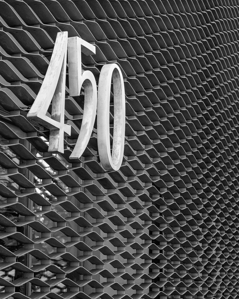
450... It is on the graphical "wall art" which is gold but in color it just looked blah so it is in B&W. Maybe not blah...?
And, sorry for anyone thinking it was a cubic inch engine.
RWNPhoto wrote:
450... It is on the graphical "wall art" which is gold but in color it just looked blah so it is in B&W. Maybe not blah...?
And, sorry for anyone thinking it was a cubic inch engine.
My guess is that you shot this, this way for a reason.
Here is a link to balancing art you might be interested in reading. I am one of those who find “off balance” in photos bothersome.
grandmas wrote:
I am one of those who find “off balance” in photos bothersome.
Yeah. The 450 is near the edge of the wall art thing so can't center it, which I assume you would prefer, unless you have a stark white wall going 90 degrees away on the left 3rd with 450 centered to get the pattern.
Conversely, I find asymmetrical balance interesting ... it may afford more movement than a centrally, uniform weighted might, in many instances.
For a moment, I wondered if the 450 was the number of geometric voids, but it seems to not be the case. Do you know the significance of the number 450 in this one?
RWNPhoto wrote:
Yeah. The 450 is near the edge of the wall art thing so can't center it, which I assume you would prefer, unless you have a stark white wall going 90 degrees away on the left 3rd with 450 centered to get the pattern.
I am getting different vibes with this image. I think it might have been more interesting to me without the 450. I find the background interesting as an abstract.
RustyBug wrote:
For a moment, I wondered if the 450 was the number of geometric voids, but it seems to not be the case. Do you know the significance of the number 450 in this one?
I don't really know any more than you do, but my assumption was that 450 is street number of the property.
Well, I like it. I do like the asymmetrical balance of the numbers and the texture of the screen. Personally, I find large scale textural images compelling. If it were my image, I would probably adjust the zoom/crop so the numbers were smaller and there was more of the sea of pattern.
Kevner wrote:
Well, I like it. I do like the asymmetrical balance of the numbers and the texture of the screen. Personally, I find large scale textural images compelling. If it were my image, I would probably adjust the zoom/crop so the numbers were smaller and there was more of the sea of pattern.
Nice image and processing - Kudos!
-Kk
With the background the same throughout the image, I think you need something or some things on the opposite side of the image with about the same amount of visual weight as the 450 for asymmetrical balance.
I think the mass of the grate design provides a few things that offer an opportunity for movement about the frame ... i.e. the ability to move away from the "450" and yet the "450" being strong enough to have us come back to it.
There is oodles of symmetry / rhythm for exploration. There is also the directional flow of the vanishing line / diminishing size of the grating. And again, once you get to the end of the line, there's the mass and tonality (and numeric) of the "450" to return your travels. In that regard, there is opportunity for movement which lets you go "to and fro" ... never really getting "stuck" in a single place.
For some, the concept of balance is about centricity and / or symmetry. For others there is the matter of asymmetry. The components that move the eye can be "things" or they can be relationships, implied lines, and a host of other aspects of compositional elements.
There's also the matter of static balance ... where things just kinda "sit" in a place that really is about "counter-balancing". This is in contrast to the concept of dynamically balanced, wherein the movement can have a greater life span to it ... yet, nothing is so strongly weighted that one gets "stuck" and cannot resume movement. Asymmetrical / dynamic balance can offer tremendous movement opportunity. Of course, if one's goal is to induce a "fixed gaze" to a given point, then the approach to balance / counter-balance may be akin to a means of "framing" also.
Point being ... there are a variety of ways to achieve balance, and there are different kinds of balance depending on your goals for whether you want your viewer's attention to be more "fixed" (static) vs. more "movement" (dynamic) oriented.
RustyBug wrote:
I think the mass of the grate design provides a few things that offer an opportunity for movement about the frame ... i.e. the ability to move away from the "450" and yet the "450" being strong enough to have us come back to it.
There is oodles of symmetry / rhythm for exploration. There is also the directional flow of the vanishing line / diminishing size of the grating. And again, once you get to the end of the line, there's the mass and tonality (and numeric) of the "450" to return your travels. In that regard, there is opportunity for movement which lets you go "to and fro" ... never really getting "stuck" in a single place.
For some, the concept of balance is about centricity and / or symmetry. For others there is the matter of asymmetry. The components that move the eye can be "things" or they can be relationships, implied lines, and a host of other aspects of compositional elements.
There's also the matter of static balance ... where things just kinda "sit" in a place that really is about "counter-balancing". This is in contrast to the concept of dynamically balanced, wherein the movement can have a greater life span to it ... yet, nothing is so strongly weighted that one gets "stuck" and cannot resume movement. Asymmetrical / dynamic balance can offer tremendous movement opportunity. Of course, if one's goal is to induce a "fixed gaze" to a given point, then the approach to balance / counter-balance may be akin to a means of "framing" also.
Point being ... there are a variety of ways to achieve balance, and there are different kinds of balance depending on your goals for whether you want your viewer's attention to be more "fixed" (static) vs. more "movement" (dynamic) oriented....Show more →
The thing I find most bothersome is that this is probably the single most used composition today. In using this composition you have no individuality in your images. I think what happens is that someone sees a small thing they find interesting, and think I will put it on the grid and have a wonderful image. In doing that they never bother to explore different compositions. Go out and look for things that are already composed in an interesting way that tell a story. You might not get as many photos, but the ones you do get will probably give you more joy. The other thing I find with this composition is you have a background and some text, which adds up to two. The number two in art is not considered the most interesting number unless you have a pair of something.
I will always encourage others to explore more interesting compositions, when I see this composition. You can’t up your game without trying new stuff. I am not saying this composition should never ever be used, just use it very very sparingly.
I don't think it is good advice to tell someone to simply compose your images the same way most others do.
grandmas wrote:
I don't think it is good advice to tell someone to simply compose your images the same way most others do.
This is confusing to me ... you have a very strong historical advocacy for central / static balance. Whenever someone goes asymmetrical, you frequently decry they don't know what they are doing, and should be using a central / static balance approach (which likely is the more common "most others do", anyway), or suggest they are following the crowd, or somehow doing something that doesn't align with your expertise.
Given the context of the comment above, against the background of your historical central / static balance preferences (vs. others) ... there is an element of antithetical consideration being proposed by your comment above, for when others compose differently from your preferred ideology.
I guess I'm saying "look in the mirror" a bit on this one.
I spent nearly forty years as an academic in a field where design criticism is the principal discourse. I posted earlier that I like this image as it sits well within my aesthetic predilections. I think the argument to see this as diptych or triptych is misplaced. I see this more clearly as an object and field composition with each bringing different information to the image. I suggested earlier that I would like the numbers to be smaller. That is not an accurate comment. I wish there was more of the field as we can begin to see emerging patterns that would help inform the location and object status of the numbers. The field holds vertical, diagonal, and horizontal orders and if the image were cropped more horizontally with more of the metal screen this would become more apparent. That is my take on the image. It is not a rule and there are certainly other ways to critique what the image is and could be. I hope my comments prove useful to the photographer, but I'm just as happy to be told that is not what their intent was.
RustyBug wrote:
This is confusing to me ... you have a very strong historical advocacy for central / static balance. Whenever someone goes asymmetrical, you frequently decry they don't know what they are doing, and should be using a central / static balance approach (which likely is the more common "most others do", anyway), or suggest they are following the crowd, or somehow doing something that doesn't align with your expertise.
Given the context of the comment above, against the background of your historical central / static balance preferences (vs. others) ... there is an element of antithetical consideration being proposed by your comment above, for when others compose differently from your preferred ideology.
I guess I'm saying "look in the mirror" a bit on this one.
I think you missed this, the other thing I see is the background and text, that adds up to two. The number two in art is not considered as interesting as 1, 3, or 5, unless you have a pair of something.
This composition has continued use simply because it is easy and requires zero thought. Any one without any artistic ability can make an image composed like this. When that is true anyone with a camera is an artist. I can only wish that other arts were that easy.
grandmas wrote:
This composition has continued use simply because it is easy and requires zero thought. Any one without any artistic ability can make an image composed like this. When that is true anyone with a camera is an artist. I can only wish that other arts were that easy.
Sorry, but that statement is garbage. I'm not defending this image, or praising it, but if putting what could be the subject on the rule of thirds points requires "zero thought" then to put it smack dab centered requires more thought? I don't really care how much someone knows about art, or has taught it, or studied it, but smack dead center is clearly using LESS thought.
Anyone WITH artistic ability can make an image composed like this also. And from what you said, anyone with a camera putting a subject on the rule of thirds points is an artist is also suspect. But that is what you said. So, you HATE the image, HATE the composition, but stated that the photographer IS an artist.
I'm positive the OP is very sorry this image was posted, or that you decided to state over and over that you hate one of the compositional rules that has been around since 1800...
RWNPhoto wrote:
Sorry, but that statement is garbage. I'm not defending this image, or praising it, but if putting what could be the subject on the rule of thirds points requires "zero thought" then to put it smack dab centered requires more thought? I don't really care how much someone knows about art, or has taught it, or studied it, but smack dead center is clearly using LESS thought.
Anyone WITH artistic ability can make an image composed like this also. And from what you said, anyone with a camera putting a subject on the rule of thirds points is an artist is also suspect. But that is what you said. So, you HATE the image, HATE the composition, but stated that the photographer IS an artist.
I'm positive the OP is very sorry this image was posted, or that you decided to state over and over that you hate one of the compositional rules that has been around since 1800......Show more →
There is no where I suggested centering the text. I also mentioned that I thought the background (that I find interesting) could stand alone, and not needing the text. In this image I see the text as distracting.
Do you seriously want your images to be composed like others or would you like some individuality in your work?
Did you read the link I posted earlier, it is filled with very good information?
At this point I feel very bad for the OP, but it is posted in the critique forum.
For anyone interested, and if I remember correctly, the rule of thirds was originally intended to be used for landscape art. This divided the art in thirds horizontally, with foreground, middle ground, and sky to give the image more depth.
Kevner wrote:
Aren’t 1,3,5 and the rule of thirds just standard conventions of composition? What’s the old saying: “Formulaic thinking is the antithesis of art?”.
That was kind of a starter to get people away from using 2 in their images, kind of a path to grow into. 1,3,5 can be used in lots of different ways, and might require some thinking.