Archive 2023 · Annalise
p.1 #1Annalise
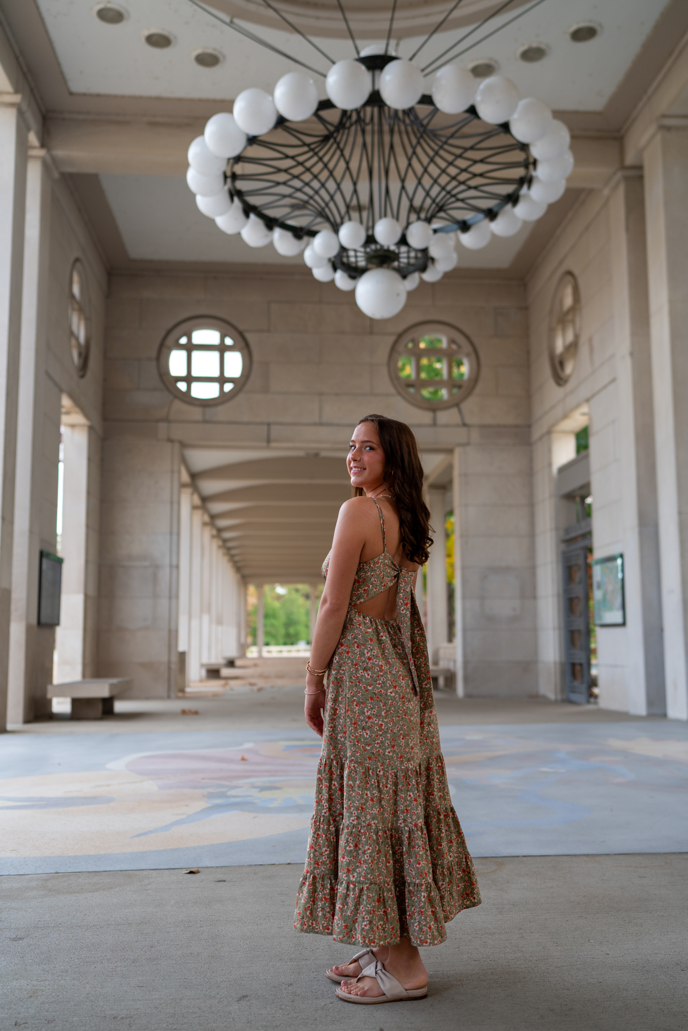
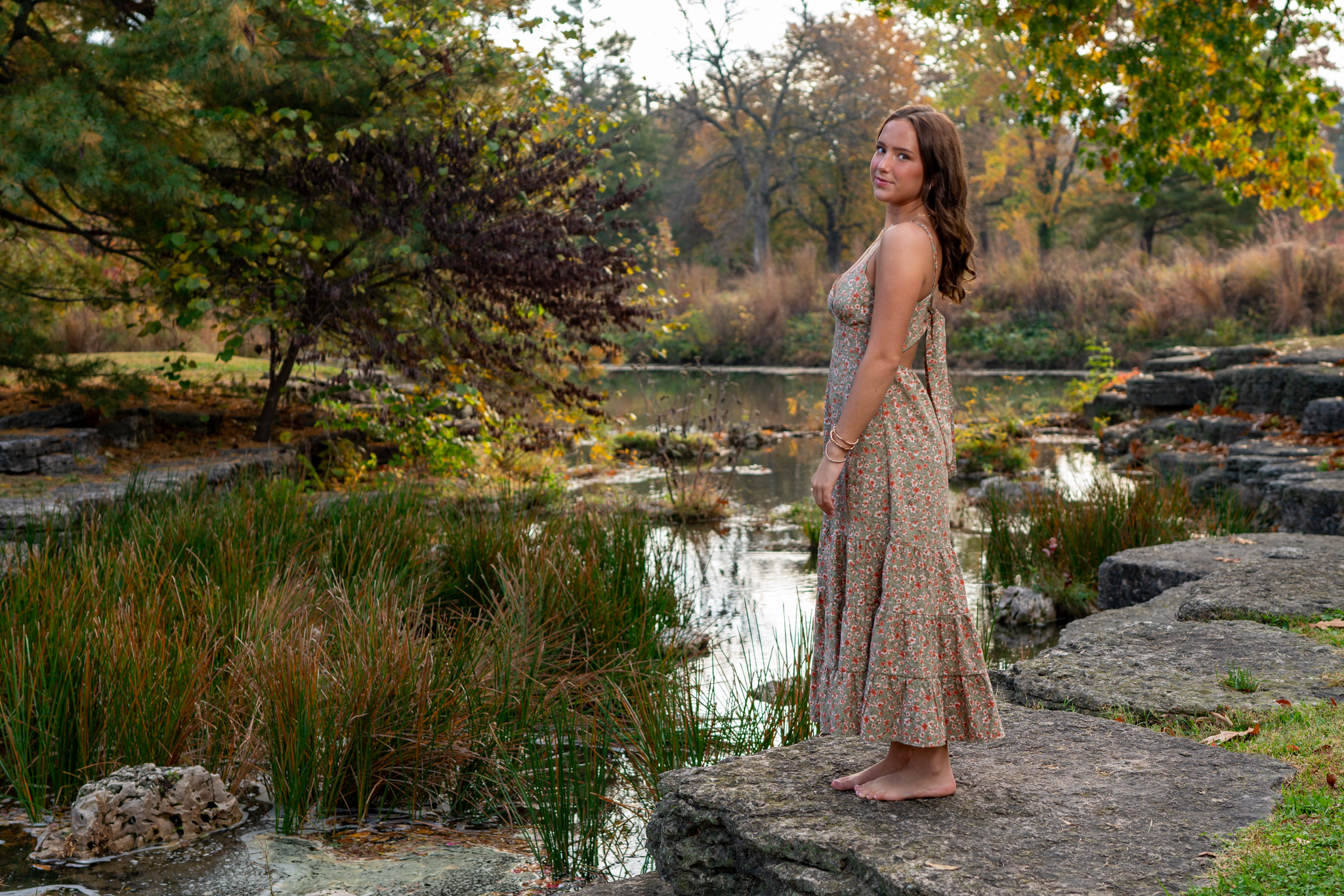
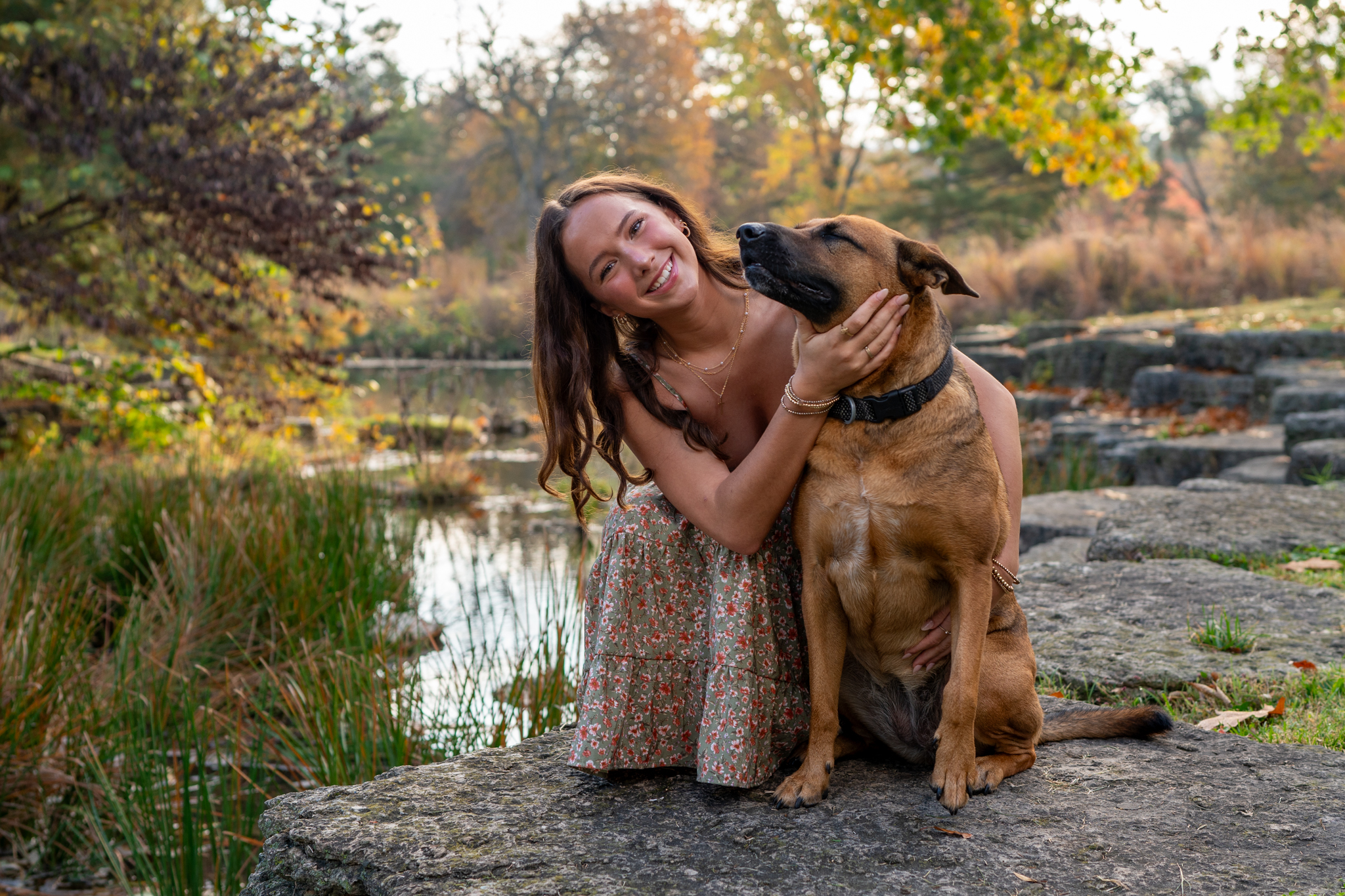
These were taken in Forest Park, St Louis. I did use a Flashpoint AD300 with the A7riii-35 GM combo and did my best to massage out any hotspots, especially on tip of her nose. A9ii-85 DG DN was natural light on this mostly overcast day.
CC welcome.
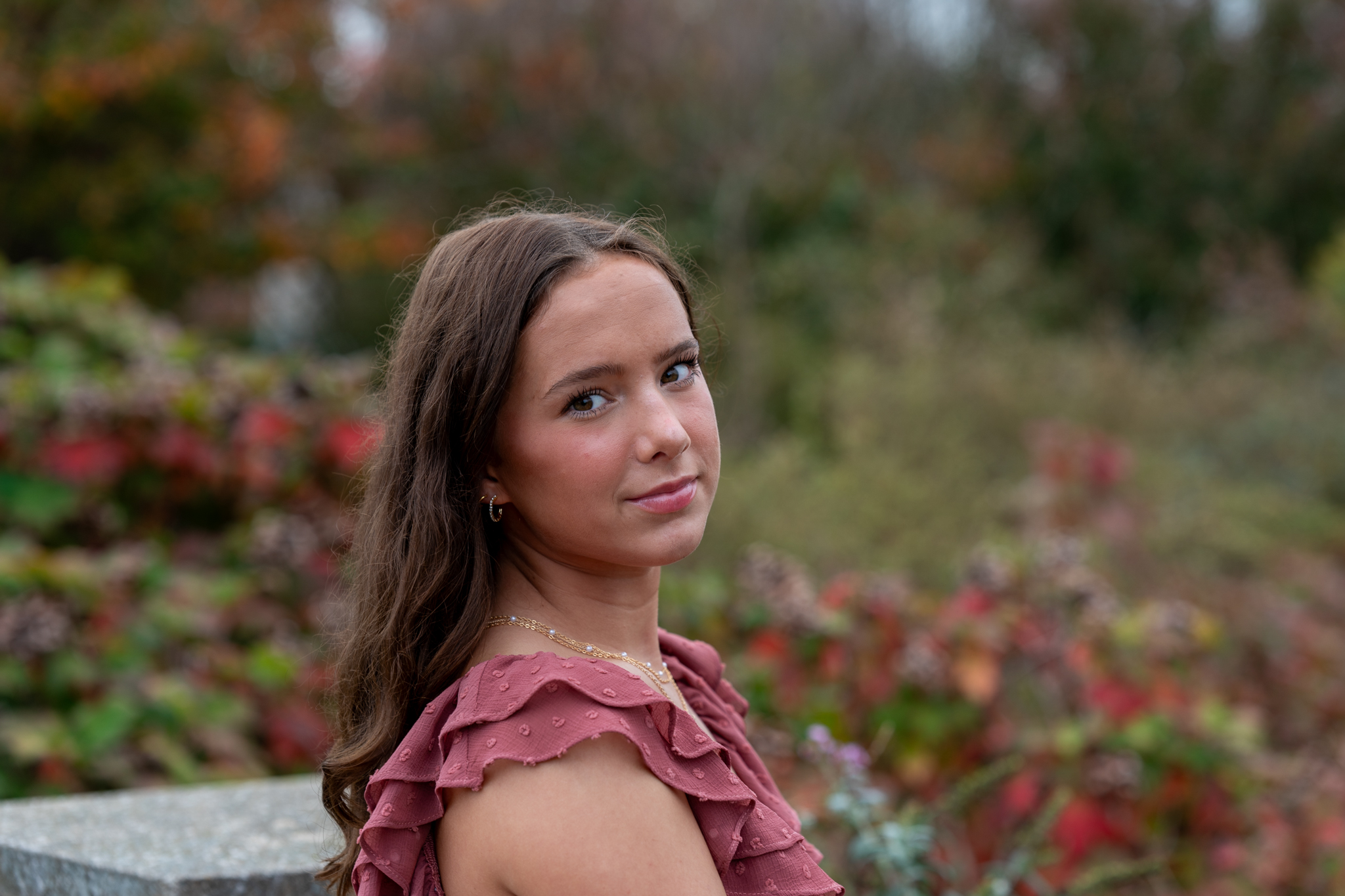
CC welcome.
ILCE-7RM3 FE 35mm F1.4 GM lens 35mm f/2.0 1/250s 200 ISO 0.0 EV
ILCE-7RM3 FE 35mm F1.4 GM lens 35mm f/2.5 1/250s 100 ISO 0.0 EV
ILCE-7RM3 FE 35mm F1.4 GM lens 35mm f/2.8 1/320s 125 ISO 0.0 EV
ILCE-9M2 85mm F1.4 DG DN | Art 020 lens 85mm f/2.8 1/800s 100 ISO 0.0 EV
ILCE-9M2 85mm F1.4 DG DN | Art 020 lens 85mm f/3.2 1/125s 100 ISO 0.0 EV
Oct 28, 2023 at 05:40 AM

p.1 #2Annalise
BEAUTIFUL young woman and two of my most favorite creatures in #3!
Nice colors....you did her proud!
Dan
Nice colors....you did her proud!
Dan
Oct 28, 2023 at 09:48 AM
p.1 #3Annalise
Thank you. I am always nervous going in but am really pleased with the results.
Danpbphoto wrote:
BEAUTIFUL young woman and two of my most favorite creatures in #3!
Nice colors....you did her proud!
Dan
Danpbphoto wrote:
BEAUTIFUL young woman and two of my most favorite creatures in #3!
Nice colors....you did her proud!
Dan
Oct 28, 2023 at 10:21 AM
p.1 #4Annalise
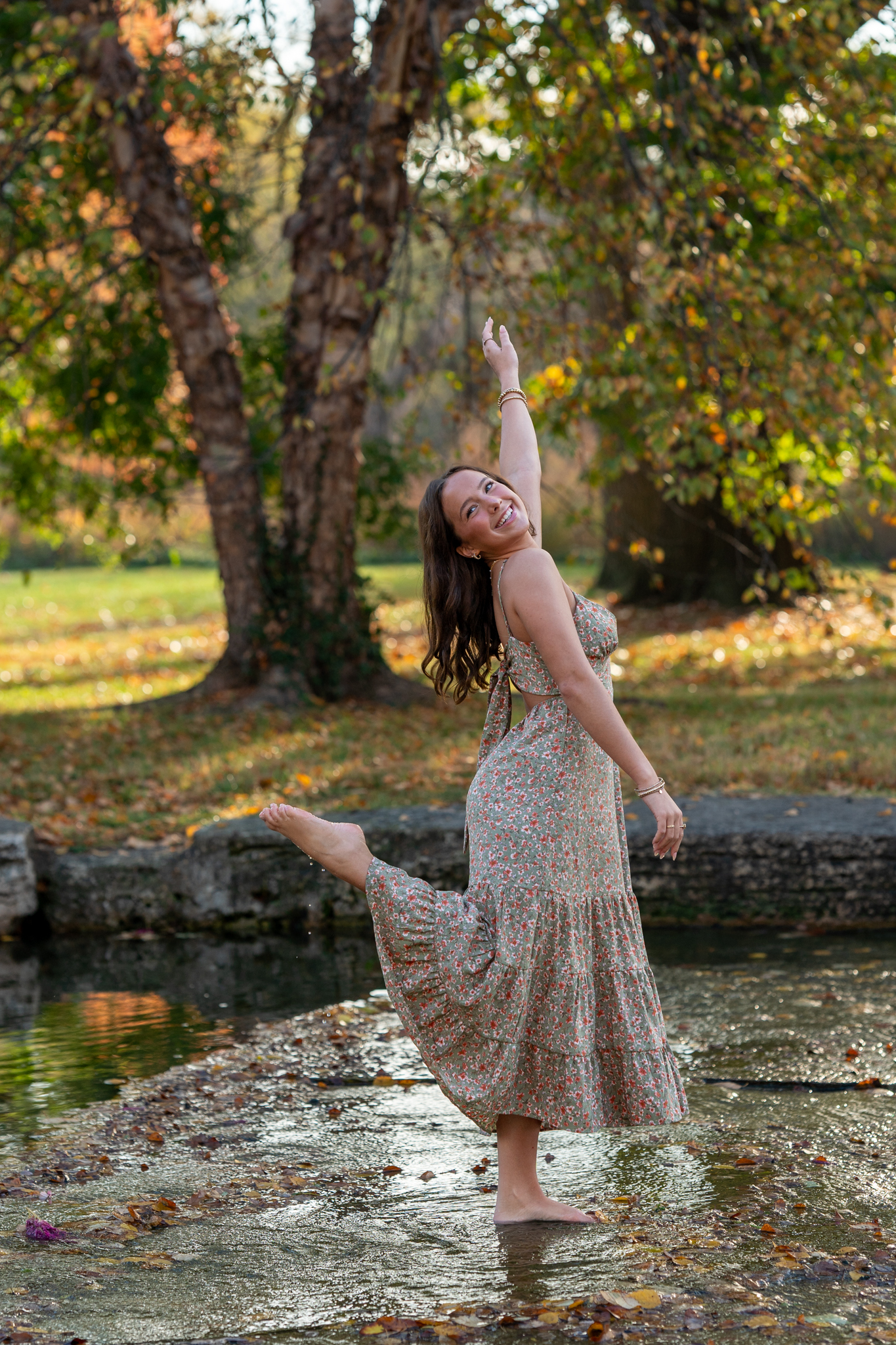
These are solid bro! I really love the location. The last is my fave, however, if I may ask...did you clone out or deaden the reflection in her eyes? I really like reflection because it because it gives the photo life and depth. The only reason I ask is because you said you flashed it.
Joel
Joel
Oct 29, 2023 at 06:12 AM
p.1 #5Annalise
No flash. I used flash with my A7riii. A9ii was natural light. I probably could have worded it better.
Thank you for the compliments.
J. Pow wrote:
These are solid bro! I really love the location. The last is my fave, however, if I may ask...did you clone out or deaden the reflection in her eyes? I really like reflection because it because it gives the photo life and depth. The only reason I ask is because you said you flashed it.
Joel
Oct 29, 2023 at 06:16 AM
p.1 #6Annalise
Dig the drops coming off her foot. Fun, creative and more dynamic than most folks I see shooting at that location. 
Oct 29, 2023 at 08:11 AM
p.1 #8Annalise
Thank you. Sometimes I struggle to think outside the box but she and her mother were helping. Her mother is out figure skating coach and the subject is an accomplished figure skater and gymnast, so that probably helped.🙂
RustyBug wrote:
Dig the drops coming off her foot. Fun, creative and more dynamic than most folks I see shooting at that location.
RustyBug wrote:
Dig the drops coming off her foot. Fun, creative and more dynamic than most folks I see shooting at that location.
Oct 29, 2023 at 08:32 AM
p.1 #9Annalise
Thank you. One of the few times I am not 2nd guessing myself much after the fact.
J. Pow wrote:
Got ya bro, Again, these are really cool!
Joel
J. Pow wrote:
Got ya bro, Again, these are really cool!
Joel
Oct 29, 2023 at 08:33 AM
p.1 #10Annalise
I am supposed to be shooting her twin brother in the Central West End this coming Friday.
RustyBug wrote:
Dig the drops coming off her foot. Fun, creative and more dynamic than most folks I see shooting at that location.
RustyBug wrote:
Dig the drops coming off her foot. Fun, creative and more dynamic than most folks I see shooting at that location.
Oct 29, 2023 at 08:35 AM
p.1 #11Annalise
I really like 2-4, great tones throughout.
The last one seems awkwardly framed or cropped.
The first one I love the location but none of the lines work for me. I'd love to see how this would look with a step back and to the right in order to level the lines at the top and create the leading lines centering her within the columns in the back. I'd consider cloning out the blown highlights in the top left window to match the right too as it's distracting.
Oct 31, 2023 at 09:56 AM
p.1 #12Annalise
Thank you. Points noted. I see what you are saying in 1 and 5. I did crop 5 and can see what you are saying. I might look at that again later. As far as 1 goes, I did try to straighten the architectural lines and lost her feet. I also shot having the other wing (without the chandelier) and captured her down the center.
Vcook wrote:
I really like 2-4, great tones throughout.
The last one seems awkwardly framed or cropped.
The first one I love the location but none of the lines work for me. I'd love to see how this would look with a step back and to the right in order to level the lines at the top and create the leading lines centering her within the columns in the back. I'd consider cloning out the blown highlights in the top left window to match the right too as it's distracting.
Oct 31, 2023 at 10:25 AM