This topic is in the 2017 archive. You can read it and like its posts here. It is read only.
Archive 2017Official Nikon D850 image & resource hub thread ...
p.67 #1Official Nikon D850 image & resource hub thread ( images picture )
sritri wrote:
...
hey sritri -
Really good captures in probably not the best of conditions concerning the light.
By the way - which of the 150-600mm options are you using?
...
hey sritri -
Really good captures in probably not the best of conditions concerning the light.
By the way - which of the 150-600mm options are you using?
Feb 08, 2018 at 02:23 AM
p.67 #2Official Nikon D850 image & resource hub thread ( images picture )
Tony Admana wrote:
500mm F4 G + TC1.4 EIII
Hey Tony.
What a great picture, the little guy looks somewhat curiou.
Even with the tc 14 attached, it is just such a great combo, d850 + 500mm f4!
500mm F4 G + TC1.4 EIII
Hey Tony.
What a great picture, the little guy looks somewhat curiou.
Even with the tc 14 attached, it is just such a great combo, d850 + 500mm f4!
Feb 08, 2018 at 02:25 AM
p.67 #3Official Nikon D850 image & resource hub thread ( images picture )
Hardcore wrote:
Few shots from a recent trip to Mexico for a wedding. Definitely had to do a few shots centred around this beautiful dock.
Wow!
These pictures are absolutely fantastic!
I love the mood and the almost paintery quality of the 2nd and 3rd one with the couple.
They will love your work I‘m sure!
First one is different ( of course) but breathtaking as well, what a great light and powerful atmosphere here!
Few shots from a recent trip to Mexico for a wedding. Definitely had to do a few shots centred around this beautiful dock.
Wow!
These pictures are absolutely fantastic!
I love the mood and the almost paintery quality of the 2nd and 3rd one with the couple.
They will love your work I‘m sure!
First one is different ( of course) but breathtaking as well, what a great light and powerful atmosphere here!
Feb 08, 2018 at 02:28 AM

p.67 #4Official Nikon D850 image & resource hub thread ( images picture )
nikonos6 wrote:
Haha !
Bruce seems to be as impressed by the camera lens combination as we are indeed!
Nice shot!
Bruce is a mix of american bulldog / husky & border collie. It's more like "Why are we sitting We can do some fun things instead".

Haha !
Bruce seems to be as impressed by the camera lens combination as we are indeed!
Nice shot!
Bruce is a mix of american bulldog / husky & border collie. It's more like "Why are we sitting
We can do some fun things instead". Feb 08, 2018 at 08:54 AM
p.67 #5Official Nikon D850 image & resource hub thread ( images picture )
nikonos6 wrote:
By the way - which of the 150-600mm options are you using?
The Tamron 150-600 f/5-6.3 VC G2 on both the bodies.
By the way - which of the 150-600mm options are you using?
The Tamron 150-600 f/5-6.3 VC G2 on both the bodies.
Feb 08, 2018 at 09:11 AM
p.67 #6Official Nikon D850 image & resource hub thread ( images picture )
nikonos6 wrote:
Wow!
These pictures are absolutely fantastic!
I love the mood and the almost paintery quality of the 2nd and 3rd one with the couple.
They will love your work I‘m sure!
First one is different ( of course) but breathtaking as well, what a great light and powerful atmosphere here!
Thanks! Appreciate the kind words!
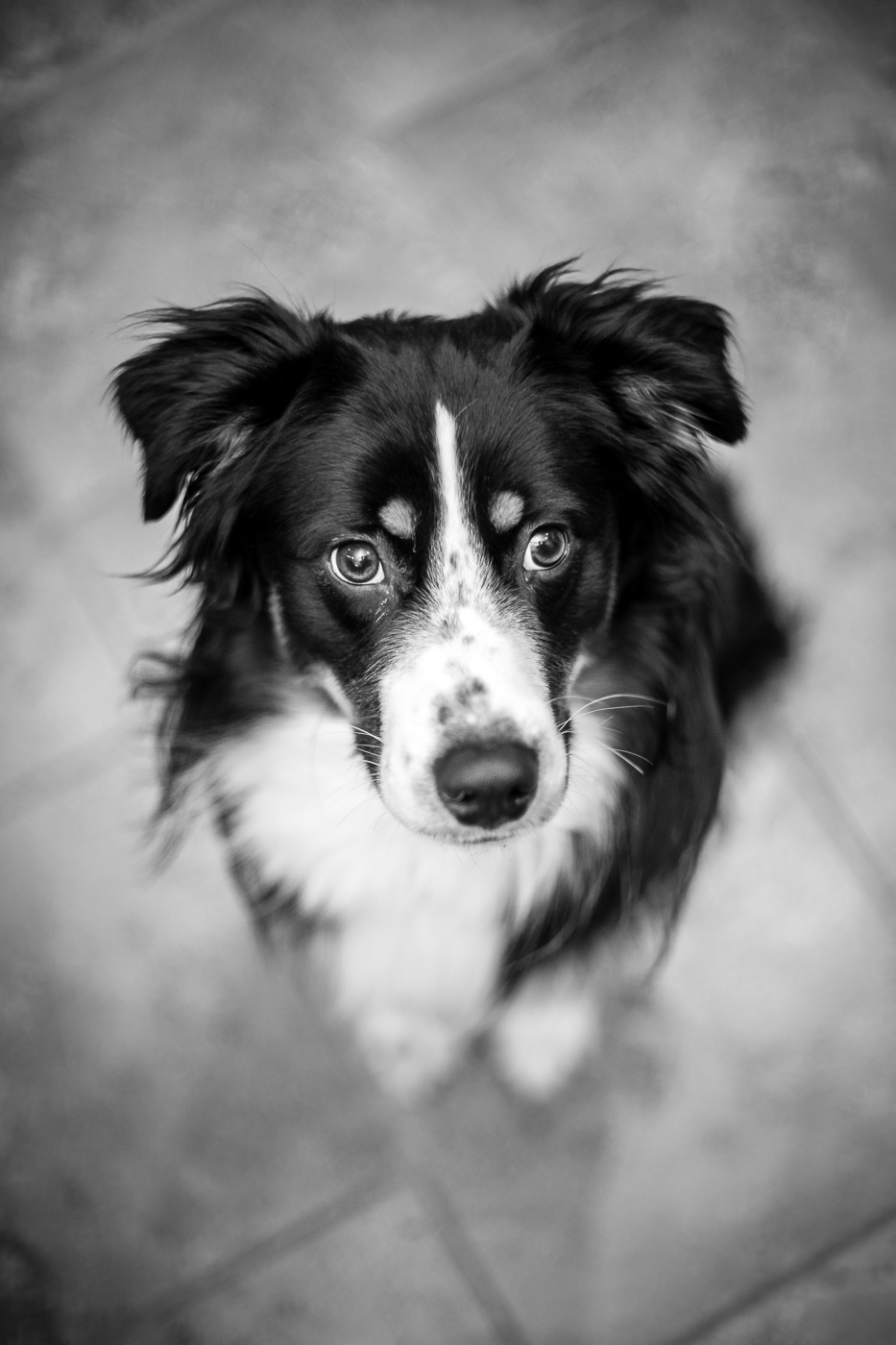
Here is one of the pup with my Rikenon 55mm F1.4 wide open @ F1.4. Such a cool lens... or should I say hot... as in radioactive.
Hardcore wrote
Few shots from a recent trip to Mexico for a wedding. Definitely had to do a few shots centred around this beautiful dock.These pictures are absolutely fantastic!
I love the mood and the almost paintery quality of the 2nd and 3rd one with the couple.
They will love your work I‘m sure!
First one is different ( of course) but breathtaking as well, what a great light and powerful atmosphere here!
Thanks! Appreciate the kind words!
Here is one of the pup with my Rikenon 55mm F1.4 wide open @ F1.4. Such a cool lens... or should I say hot... as in radioactive.
 |
||
 |
||
|
Feb 09, 2018 at 08:03 PM
p.67 #7Official Nikon D850 image & resource hub thread ( images picture )
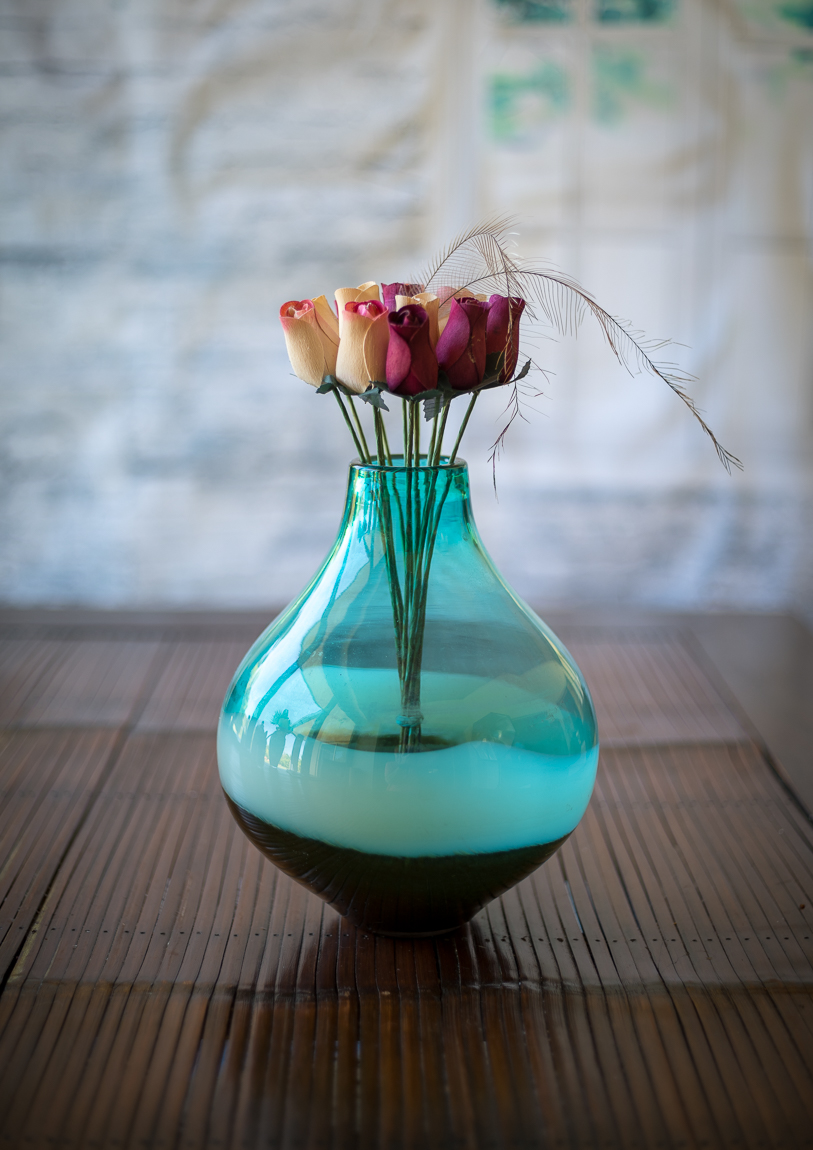
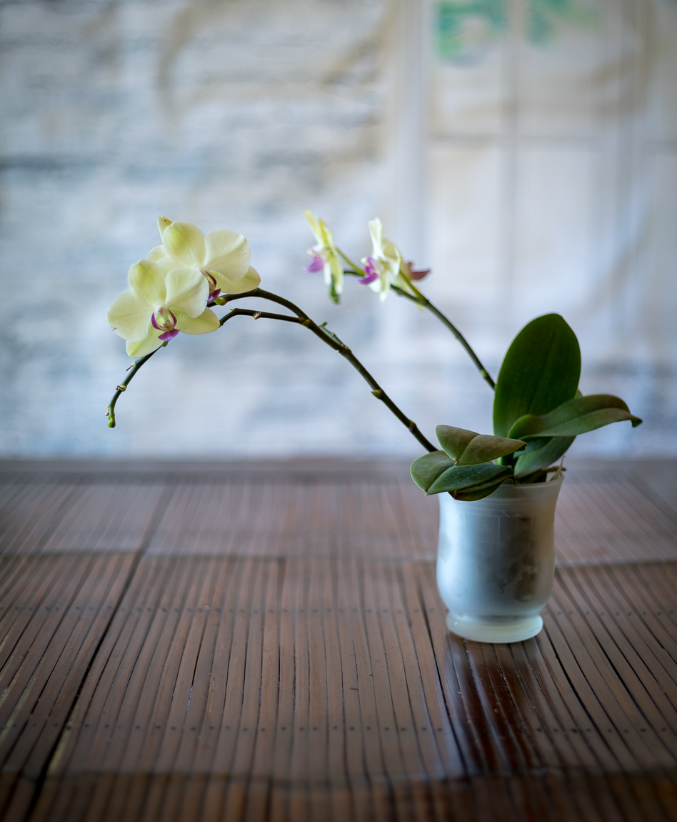
Shot with D850 and R 50 Cron (Mandler) @f/2.0
 |
||
 |
||
|
|
||
 |
||
|
Feb 09, 2018 at 09:48 PM
p.67 #8Official Nikon D850 image & resource hub thread ( images picture )
NIKON D850 600.0 mm f/4.0 lens 840mm f/8.0 1/640s 1400 ISO
 554398 by eric laquerre, sur Flickr
Feb 10, 2018 at 07:04 PM
p.67 #9Official Nikon D850 image & resource hub thread ( images picture )
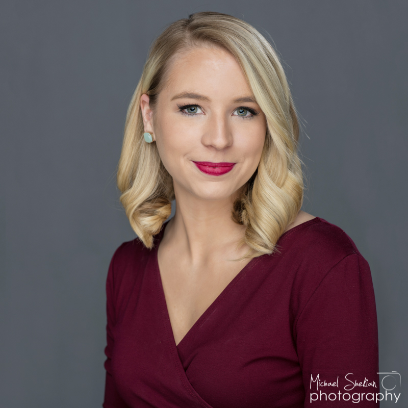
one B1 shot into large umbrella and eylighter reflector for fill
 |
||
 |
||
|
Feb 10, 2018 at 07:28 PM
p.67 #10Official Nikon D850 image & resource hub thread ( images picture )
Michael, love the the portrait !! The 85/1.4G I feel is a great lens.
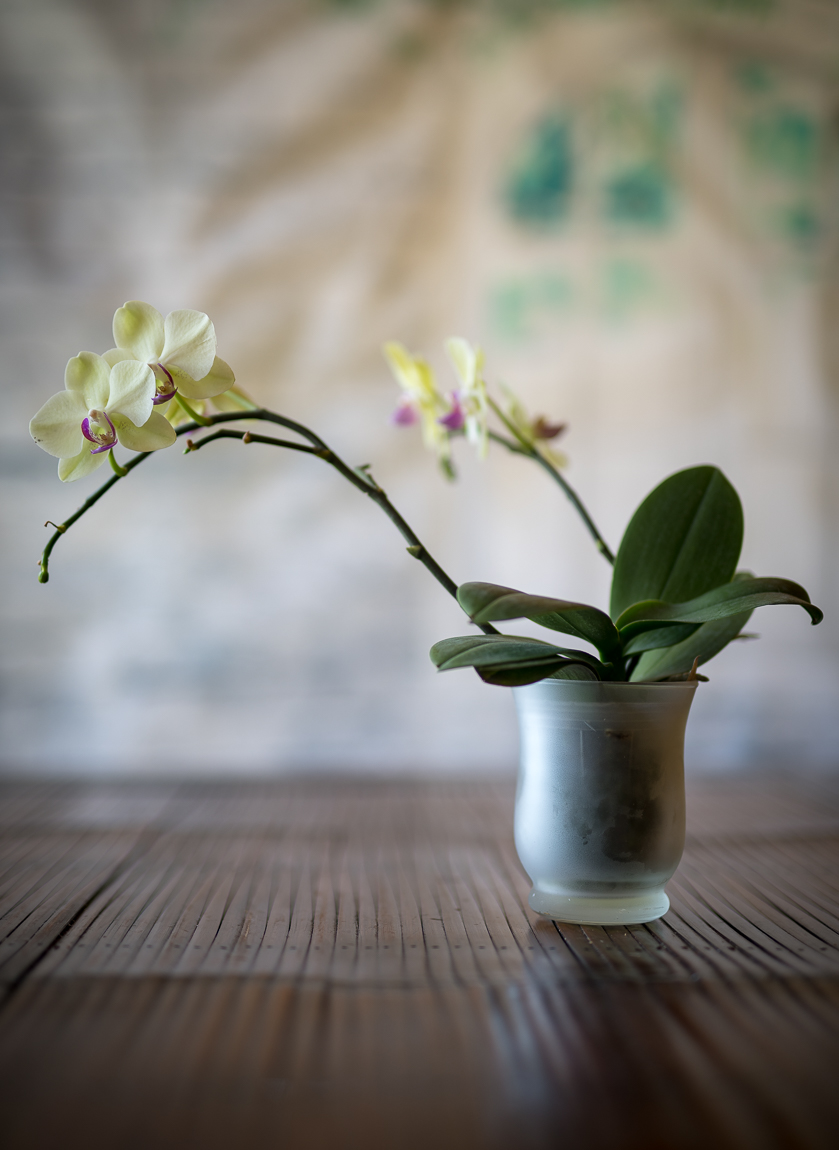
Shot this afternoon with the 50 Art and D850 as compared to yesterday with the R 50 Cron Mandler
Shot this afternoon with the 50 Art and D850 as compared to yesterday with the R 50 Cron Mandler
|
||
 |
||
|
Feb 10, 2018 at 09:15 PM
p.67 #11Official Nikon D850 image & resource hub thread ( images picture )
When sunlight hits frozen tree trunk.
Photographed with slightly stopped (f/2.2) down 58mm.

Steaming Tree
Photographed with slightly stopped (f/2.2) down 58mm.
Feb 10, 2018 at 10:20 PM
p.67 #12Official Nikon D850 image & resource hub thread ( images picture )
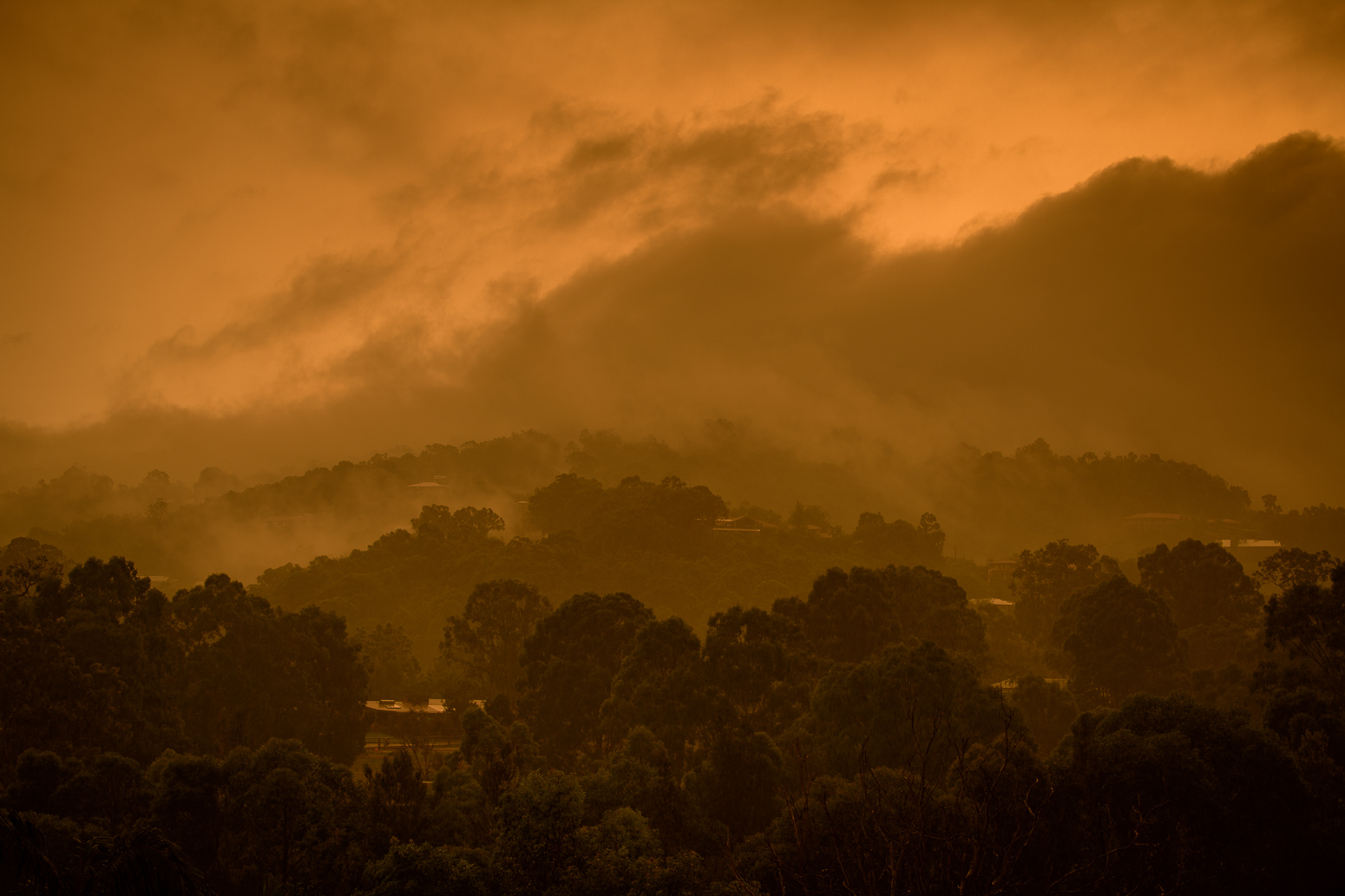
It has been heatwave conditions in Queensland today and thunderstorms started rolling in late afternoon. The sky started to glow an eerie orange as the storms passed.
D850 and 70-200E
D850 and 70-200E
|
||
 |
||
|
Feb 11, 2018 at 04:25 AM
p.67 #13Official Nikon D850 image & resource hub thread ( images picture )
ty Charles, much appreciated. the 85 is a keeper.
Feb 11, 2018 at 06:25 AM
p.67 #14Official Nikon D850 image & resource hub thread ( images picture )
The queen of the balance beam.
Eric
https://photos.smugmug.com/FM/i-hrt3D4W/0/2af25a85/X2/EG2_2019leopardontreebranchlr-X2.jpg
Eric
https://photos.smugmug.com/FM/i-hrt3D4W/0/2af25a85/X2/EG2_2019leopardontreebranchlr-X2.jpg
Feb 11, 2018 at 08:13 AM
p.67 #15Official Nikon D850 image & resource hub thread ( images picture )
What are you guys using for PP ? I'm not that great when it comes to PP and tend to keep things basic. I use DXO optics if noise reduction is needed and export to Lightroom or just import the NEF files using LR 6.13 . I've noticed sometimes the colour looks quite bleached with the D850 , I've tried the different profiles from Adobe standard to camera standard . With LR this Deer has an almost green tint to it . I tried Paintshop pro on my old windows laptop , unfortunately its far too slow and was really struggling compared to the Macbook with LR. Anyway I tried the same NEF file , just a few adjustments and the colour seemed closer to what I was seeing (right pic) without that greenish tint (left pic)
 Screen Shot 2018-02-11 at 17.49.17 by leon kirkbride, on Flickr
Feb 11, 2018 at 12:18 PM
brian_sp
Offline
Activity
[X]
Details
p.67 #16Official Nikon D850 image & resource hub thread ( images picture )
to me the right image is leaning to too much magenta and is the one thing i find i do not like about the 850, reminds me of canon colors too much, i am using lightroom cc
Feb 11, 2018 at 02:58 PM
p.67 #17Official Nikon D850 image & resource hub thread ( images picture )
i never shoot raw anymore with my d850. one of my favorite features are the outstanding jpg's out of this camera. i find the white balance spot on also. i use the standard picture control with plus 1 on saturation and plus 1 on sharpness. lightroom cc.
Feb 11, 2018 at 03:05 PM
p.67 #18Official Nikon D850 image & resource hub thread ( images picture )
I use capture nxd and export the tiff afterwards. The white balance and profile are much better in capture nx-d imo
Feb 11, 2018 at 03:28 PM
p.67 #19Official Nikon D850 image & resource hub thread ( images picture )
I use Lr CC/PS with various plugins. I also have Capture Pro but I find the cataloguing not as easy and little difference in the final result.
With the D850 I only shoot RAW unless I need quick Jpegs. Auto WB on 0 or 1, sometimes Daylight. For portraits/normal shoots I use Adobe Standard or Camera Portrait. Adobe seems to have a more natural skin tones obviously supported by Adobe The colors from the D850 are the best I have seen.
I am assuming you have color calibrated your monitor and complete workflow. This is most often the culprit.
From your example above make sure you set your WB on AUTO and 0 and use Profile: Adobe. This should resolve the issue above.
The latest version of Lr CC is great! Try the AUTO in the TONE module as this has vastly improved over the last 2 updates. It really works great with the D850 RAW and if not a great starting point
The flat output you see initially relates to the higher DR and if your record Jpegs alongside the RAWs you have post processed image to compare with.
If you are seeking color accuracy I find Nikon's Capture NXD superb.
With the D850 I only shoot RAW unless I need quick Jpegs. Auto WB on 0 or 1, sometimes Daylight. For portraits/normal shoots I use Adobe Standard or Camera Portrait. Adobe seems to have a more natural skin tones obviously supported by Adobe
The colors from the D850 are the best I have seen.I am assuming you have color calibrated your monitor and complete workflow. This is most often the culprit.
From your example above make sure you set your WB on AUTO and 0 and use Profile: Adobe. This should resolve the issue above.
The latest version of Lr CC is great! Try the AUTO in the TONE module as this has vastly improved over the last 2 updates. It really works great with the D850 RAW and if not a great starting point
The flat output you see initially relates to the higher DR and if your record Jpegs alongside the RAWs you have post processed image to compare with.
If you are seeking color accuracy I find Nikon's Capture NXD superb.
Feb 11, 2018 at 03:49 PM
p.67 #20Official Nikon D850 image & resource hub thread ( images picture )
Thank you for the replies, its much appreciated . I had the Macbook calibrated but it was a long time again, maybe time to get it done again.
I must admit the Jpegs are really good, I mainly shoot raw so might try both.
I must admit the Jpegs are really good, I mainly shoot raw so might try both.
Feb 11, 2018 at 04:48 PM