This topic is in the 2016 archive. You can read it and like its posts here. It is read only.
Archive 2016The White Pocket Planet
p.1 #1The White Pocket Planet
Congratulations to Kane Engelbert for winning Feature Thread of the Week with 8 votes - View Previous Winners
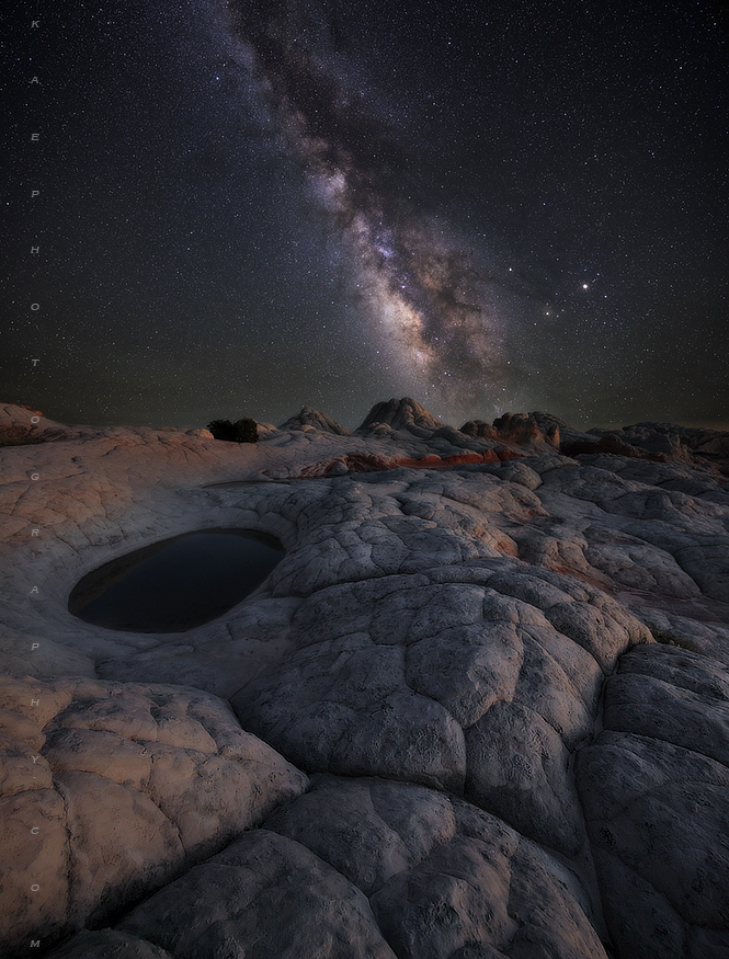
Looking for some solid critique on this one...Its Photo Art...My Vision. Its a Very Wide landscape scene at White Pocket. I blended in a Astro Tracker (no star trails) wide Milky Way.
Hows the scene feel? Too warm? Realistic? Feel Good?
Comments welcome...

The rework.. Ok, so the feedback here was basically unanimous, darken sky, brighten up the MW stars, and slightly darken the foreground. So I went through all the steps, in the end I came up with an image that feels a little more contrasty. Now I'm thin
Edited on Jun 07, 2016 at 08:26 PM · View previous versions
Jun 06, 2016 at 08:15 PM
p.1 #2The White Pocket Planet
Wonderful image Kane. I wouldn't change a thing with the composition. I think the color balance in the foreground and sky is just right and the foreground is not overly bright, though I might be tempted to darken it further. For me, I would clone out the plane or satellite trail on the left.
Jun 06, 2016 at 08:32 PM
p.1 #4The White Pocket Planet
I think it's PERFECT just as you have presented it. Very, very nice!
Jun 06, 2016 at 09:54 PM
p.1 #5The White Pocket Planet
Comp is fantastic! However, landside seems too light to me - kind of like I'm on an asteroid in outer space that has no atmosphere - pleasing to the eye yet unnatural. However, that should be an easy fix.
Dave
Dave
Jun 06, 2016 at 10:28 PM
p.1 #6The White Pocket Planet
Hey Kane,
Pretty cool work here. It's looking pretty good, for my cents, I would actually brighten up the stars and Milky way just a bit more. I would leave the background sky dark, just brighten up the stars. With the ground, I think the light on the ground kind of splits the ground layer into a left side and a right side. I wish the light was a bit more directional, and not so much on the left edge as that has a tendency to lead the eye right out of the shot then since it's the edge that's lit.
Jim
Jun 06, 2016 at 11:24 PM
p.1 #8The White Pocket Planet
Excellent. As previously stated, the sky part could use a bit brightening when it comes to the stars. Just a bit.
Otherwise, feels like an alien planet with soft and creamy light.
Otherwise, feels like an alien planet with soft and creamy light.
Jun 07, 2016 at 03:23 AM
p.1 #9The White Pocket Planet
Full respect for denoting 'photo art'. Bottom line for me is that it is spectacular. So well envisioned and executed. Nothing I'd change period.
I don't understand 'blended in a Astro Tracker'....though I do understand astro tracking. Is that your way of saying you composited two images, one of them the MW obtained by tracking to avoid star trails? Not a thing, me being curious is all.
I don't understand 'blended in a Astro Tracker'....though I do understand astro tracking. Is that your way of saying you composited two images, one of them the MW obtained by tracking to avoid star trails? Not a thing, me being curious is all.
Jun 07, 2016 at 04:11 AM
p.1 #10The White Pocket Planet
Fabulous image. Great composition. I'd darken the foreground slightly to bring out the milky way. Otherwise...excellent.
Jun 07, 2016 at 05:35 AM
p.1 #11The White Pocket Planet
Amazing. I wish I could take photos like this.
Jun 07, 2016 at 10:08 AM

p.1 #12The White Pocket Planet
Wonderful! I think the processing and light levels are just perfect. Curious - when combining your Astro Tracker MW image with the foreground image, did you need to enlarge one of these images to account for the "blurred foreground" Astro Tracker image? Not sure if I explained myself but I'm trying to understand (with my limited Photoshop knowledge) how you lined the two images up? Thanks in advance.
Jun 07, 2016 at 10:16 AM
p.1 #14The White Pocket Planet
Admittingly, I don't have much for a critique, however I think it's a wonderful photo. Very neat!!
Jun 07, 2016 at 12:24 PM
p.1 #15The White Pocket Planet
I'm only on my laptop (not calibrated) in a safeway parking lot so I can not offer any careful critical feedback here. Maybe I'll respond later when I am on a more controlled situation. But my impression here is Great Job!  I love how otherworld it is. That is what WP is, so the motif and comp are great.
 Jun 07, 2016 at 12:35 PM
p.1 #16The White Pocket Planet
Gary Clennan wrote:
Wonderful! I think the processing and light levels are just perfect. Curious - when combining your Astro Tracker MW image with the foreground image, did you need to enlarge one of these images to account for the "blurred foreground" Astro Tracker image? Not sure if I explained myself but I'm trying to understand (with my limited Photoshop knowledge) how you lined the two images up? Thanks in advance.
Hey Gary,
When shooting with a star tracker, since it's moving the camera to track the stars, it means that the ground layer then gets blurry and actually swings up above the horizon. So yes, a 2nd image of the ground without the tracker moving is needed. When they are combined in Photoshop, usually the lower part of the stars that were captured is lost, because part of the ground layer is curving up into the sky as the tracker had moved.
Jim
Jun 07, 2016 at 01:12 PM
p.1 #17The White Pocket Planet
voted as soon as I saw it. The light in this shot is so good.
Jun 07, 2016 at 02:17 PM
p.1 #18The White Pocket Planet
Hey Kane!
Great scene here, love the alien feel, to sum it up i agree with darkening the FG a bit and brightening the stars a bit, leveling the light in FG could massively improve too.
Cheers!
Andrey
Great scene here, love the alien feel, to sum it up i agree with darkening the FG a bit and brightening the stars a bit, leveling the light in FG could massively improve too.
Cheers!
Andrey
Jun 07, 2016 at 02:54 PM
p.1 #19The White Pocket Planet
MedicineMan404 wrote:
Full respect for denoting 'photo art'. Bottom line for me is that it is spectacular. So well envisioned and executed. Nothing I'd change period.
I don't understand 'blended in a Astro Tracker'....though I do understand astro tracking. Is that your way of saying you composited two images, one of them the MW obtained by tracking to avoid star trails? Not a thing, me being curious is all.
Yep, just blended the two together. I do use Photo Pills to ensure the MW will track over my subjects at some point during the night, plus I use the true MW perspective for that night . I suppose its better than shooting a MW from my backyard and pasting it to a White pocket image.
Jun 07, 2016 at 05:36 PM
p.1 #20The White Pocket Planet
Gary Clennan wrote:
Wonderful! I think the processing and light levels are just perfect. Curious - when combining your Astro Tracker MW image with the foreground image, did you need to enlarge one of these images to account for the "blurred foreground" Astro Tracker image? Not sure if I explained myself but I'm trying to understand (with my limited Photoshop knowledge) how you lined the two images up? Thanks in advance.
Hi Gary, No need to enlarge an image to match another when shooting scenes with equal pixel counts.
Jun 07, 2016 at 05:41 PM