Sony FE Images Thread
p.5287 #1Sony FE Images Thread
adventure_photo wrote:
Color profile test in regard to my last post responding to Jack - this one shows more of a difference, 1st is sRGB color profile embedded, 2nd has Display P3 profile embedded. On my monitor the P3 looks richer and has better greens. Let me know if you see a difference and what your posting methods/profile used are.
Interesting. My browser is Safari which is fully color aware, but both images look identical as posted in this thread to me. However, if I pull the Display P3 file into PS or even just open it Preview I can see it pop and render the difference you describe, so the color tag is there. So either Safari isn't reading the tagged profile correctly from this site, or this site (or possibly your image host site if using one) appears to be auto-converting to sRGB for site display purposes. IDK...
Color profile test in regard to my last post responding to Jack - this one shows more of a difference, 1st is sRGB color profile embedded, 2nd has Display P3 profile embedded. On my monitor the P3 looks richer and has better greens. Let me know if you see a difference and what your posting methods/profile used are.
Interesting. My browser is Safari which is fully color aware, but both images look identical as posted in this thread to me. However, if I pull the Display P3 file into PS or even just open it Preview I can see it pop and render the difference you describe, so the color tag is there. So either Safari isn't reading the tagged profile correctly from this site, or this site (or possibly your image host site if using one) appears to be auto-converting to sRGB for site display purposes. IDK...
Nov 12, 2026 at 11:14 PM

p.5287 #2Sony FE Images Thread
Jack Flesher wrote:
Interesting. My browser is Safari which is fully color aware, but both images look identical as posted in this thread to me. However, if I pull the Display P3 file into PS or even just open it Preview I can see it pop and render the difference you describe, so the color tag is there. So either Safari isn't reading the tagged profile correctly from this site, or this site (or possibly your image host site if using one) appears to be auto-converting to sRGB for site display purposes. IDK...
Thanks for the responses Jack. That’s what I’m seeing here too using Safari. I also tested looking at the above posts in Firefox and Chrome and the images look the same as they do in Safari in those browsers as well. But if I download each image from my post and then view them in Photoshop or Preview, I can clearly see the difference. I think I will go back to just outputting my jpg’s to share here as sRGB since I’m not seeing the benefit of P3 here in the long run. Like you mentioned, somewhere along the way the P3 file is being displayed as sRGB anyway. I appreciate your insights!
adventure_photo wrote
Color profile test in regard to my last post responding to Jack - this one shows more of a difference, 1st is sRGB color profile embedded, 2nd has Display P3 profile embedded. On my monitor the P3 looks richer and has better greens. Let me know if you see a difference and what your posting methods/profile used are.Thanks for the responses Jack. That’s what I’m seeing here too using Safari. I also tested looking at the above posts in Firefox and Chrome and the images look the same as they do in Safari in those browsers as well. But if I download each image from my post and then view them in Photoshop or Preview, I can clearly see the difference. I think I will go back to just outputting my jpg’s to share here as sRGB since I’m not seeing the benefit of P3 here in the long run. Like you mentioned, somewhere along the way the P3 file is being displayed as sRGB anyway. I appreciate your insights!
Nov 13, 2026 at 12:36 AM
p.5287 #3Sony FE Images Thread
I don't take my A7R V out much these days. It's still such a phenomenal tool outside of the horrible EVF experience, which is the thing that'll make me upgrade this to an A7R VI.
 Idyllwild Nights I by Roman France, on Flickr
Nov 13, 2026 at 02:09 AM
p.5287 #4Sony FE Images Thread
Safari and Firefox here -- all look the same.
adventure_photo wrote:
That’s what I’m seeing here too using Safari. I also tested looking at the above posts in Firefox and Chrome and the images look the same
adventure_photo wrote:
That’s what I’m seeing here too using Safari. I also tested looking at the above posts in Firefox and Chrome and the images look the same
Nov 13, 2026 at 02:21 AM
p.5287 #5Sony FE Images Thread
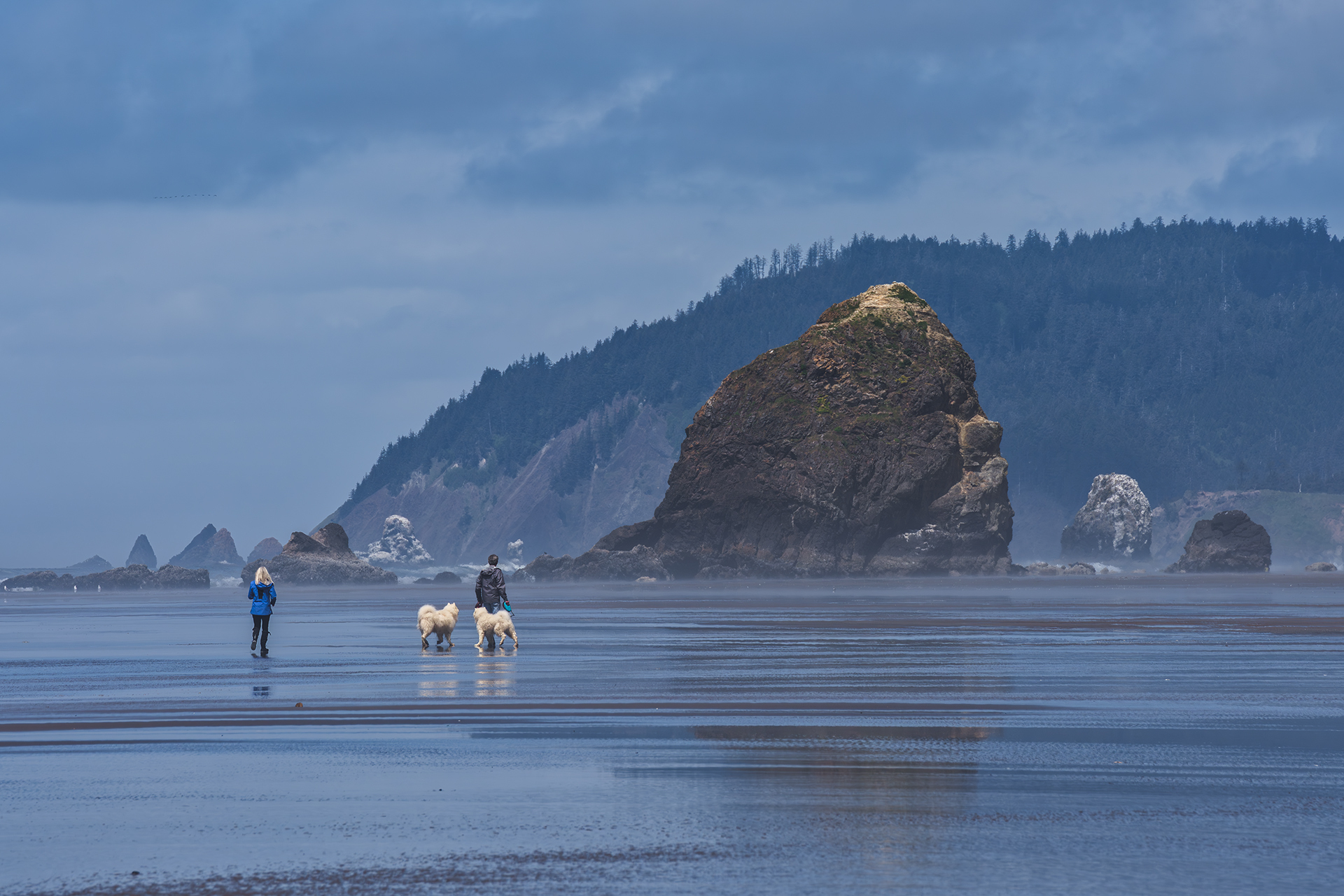
JF-MSGS
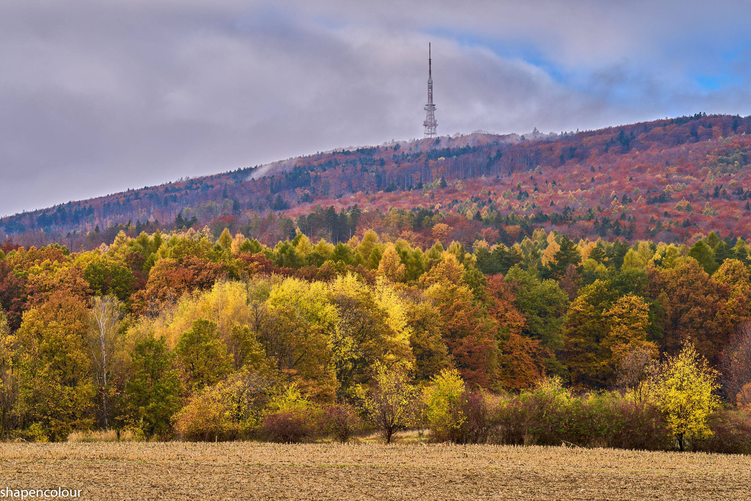
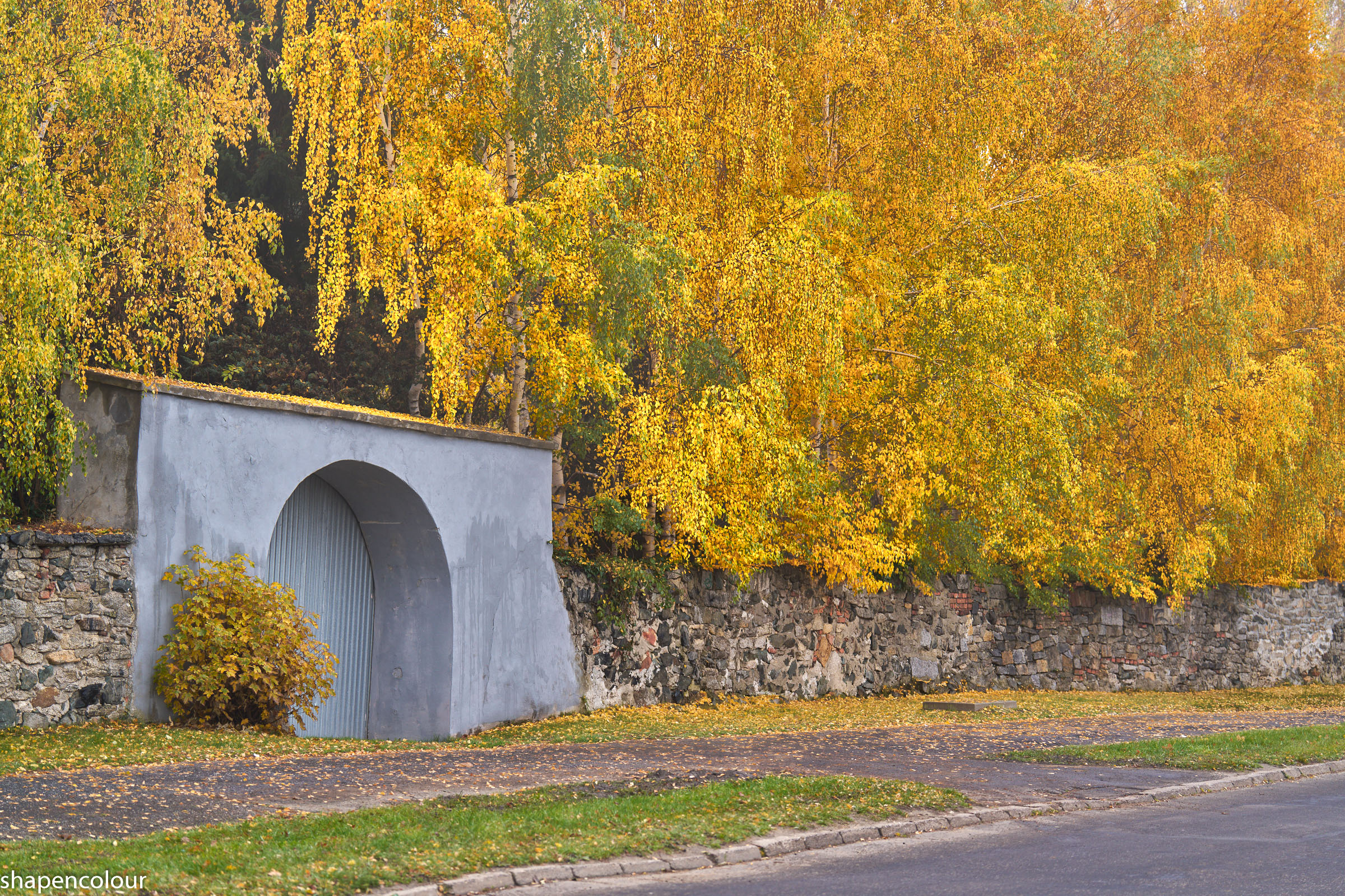
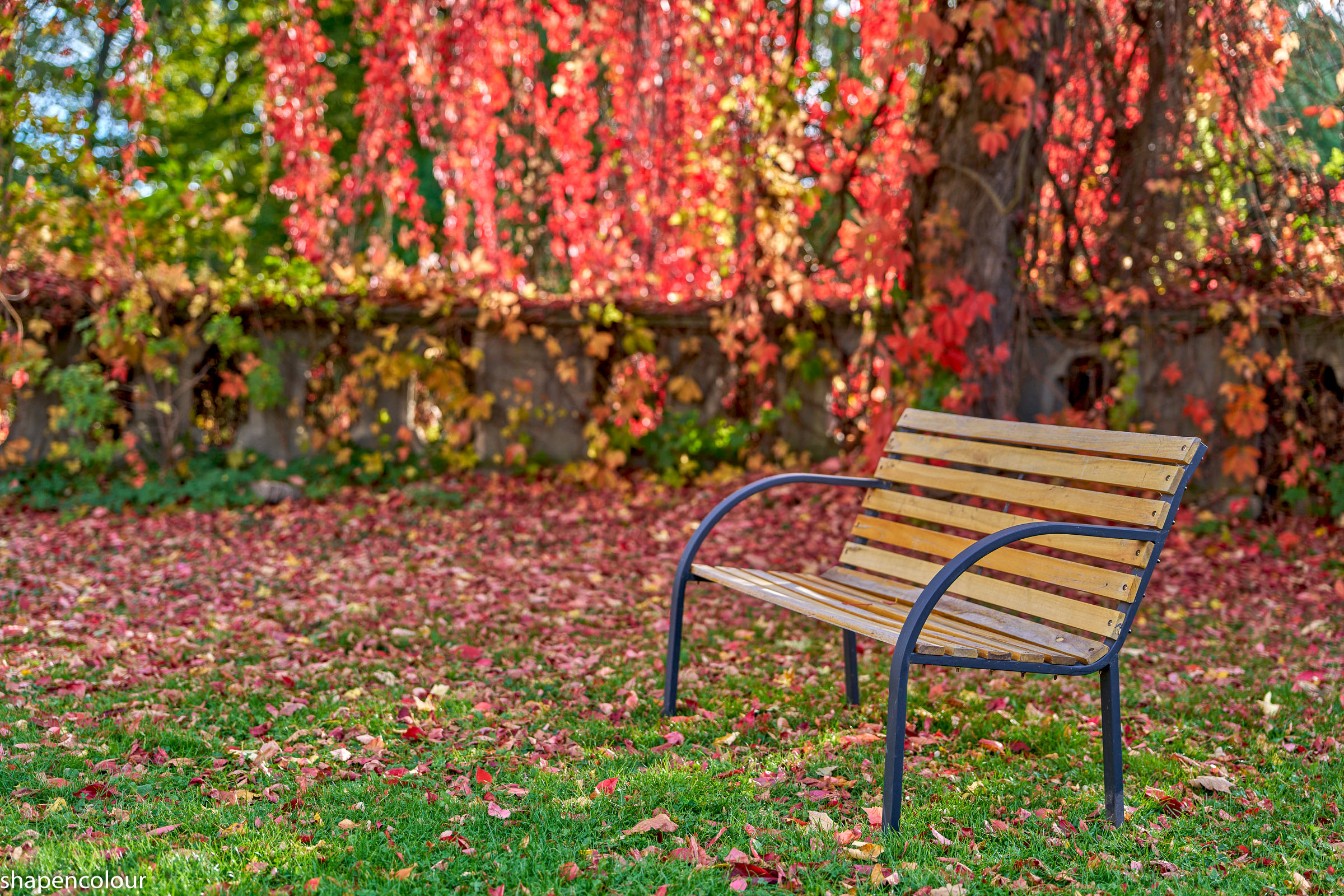
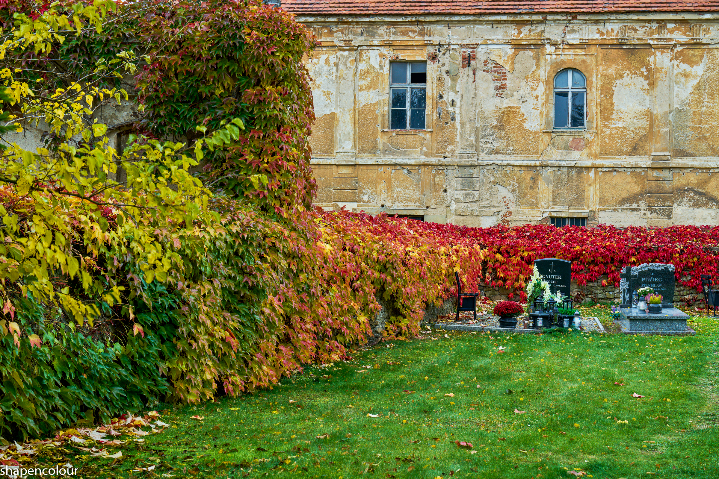
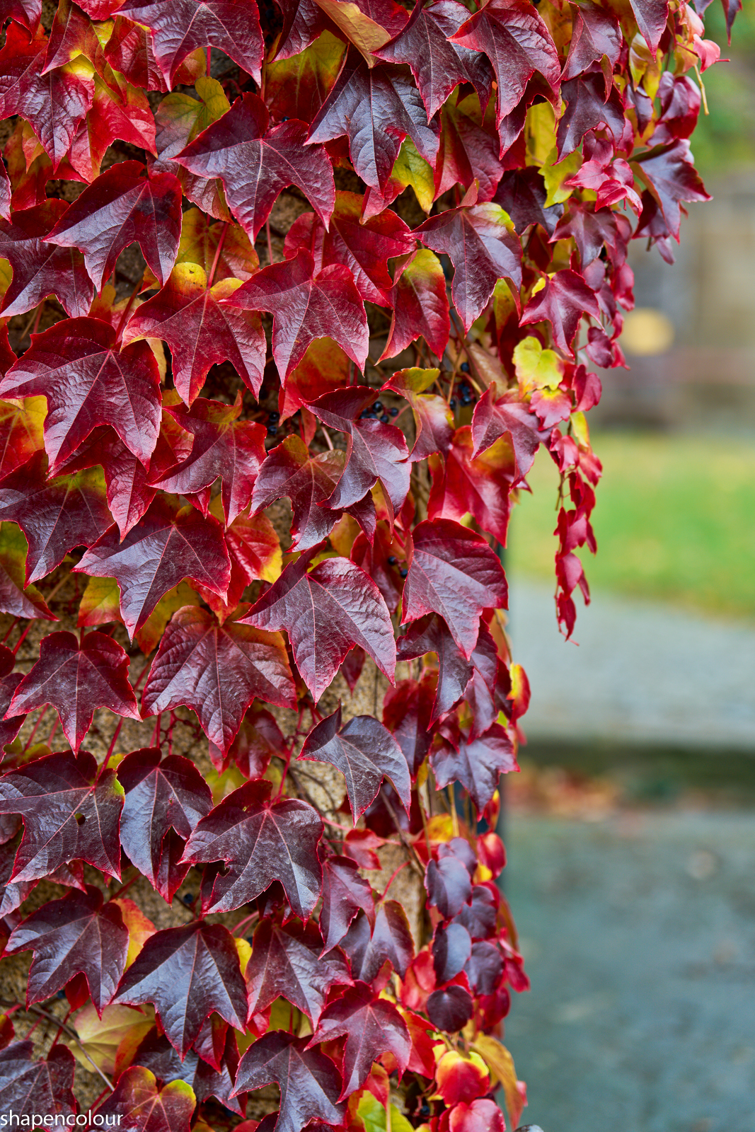
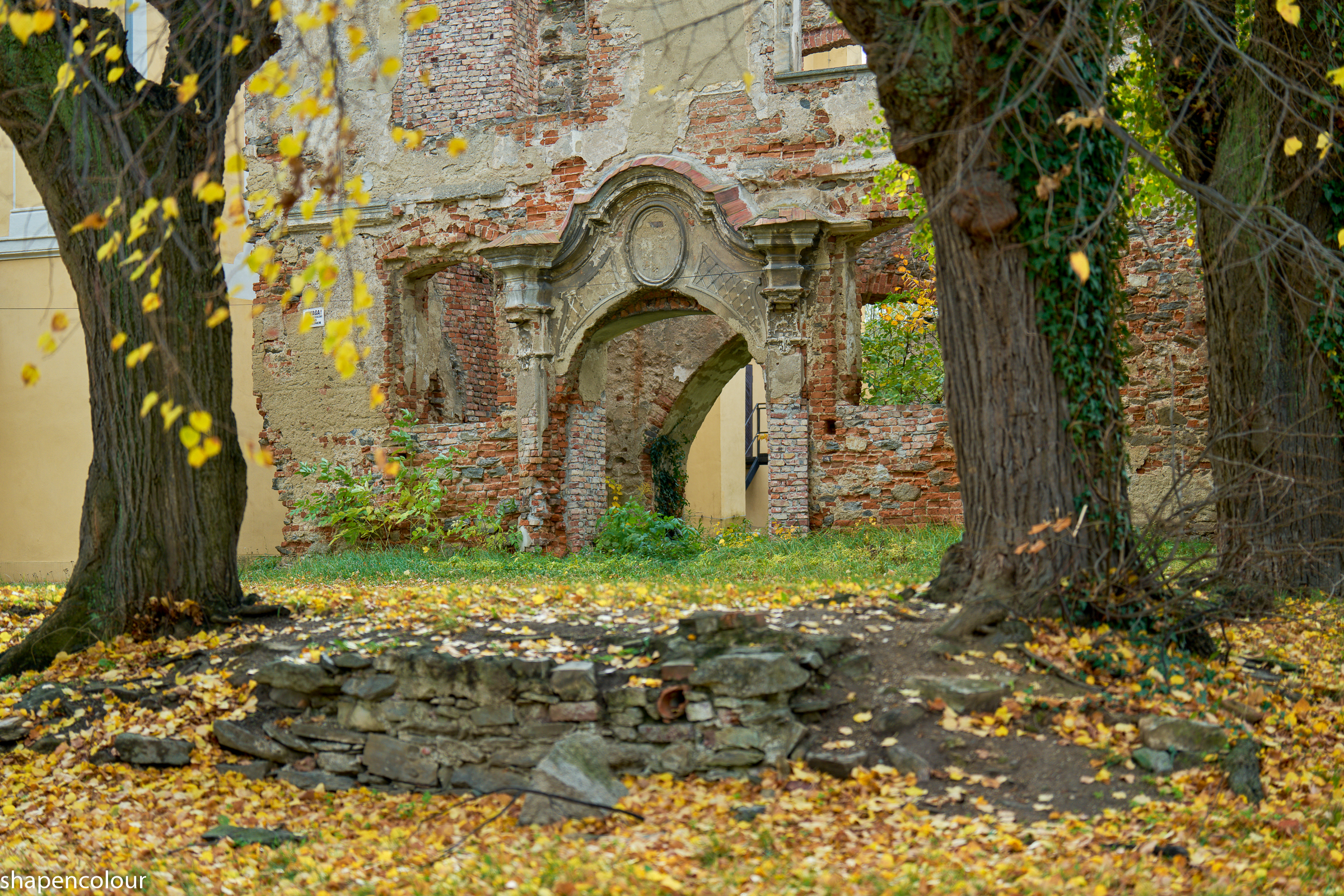
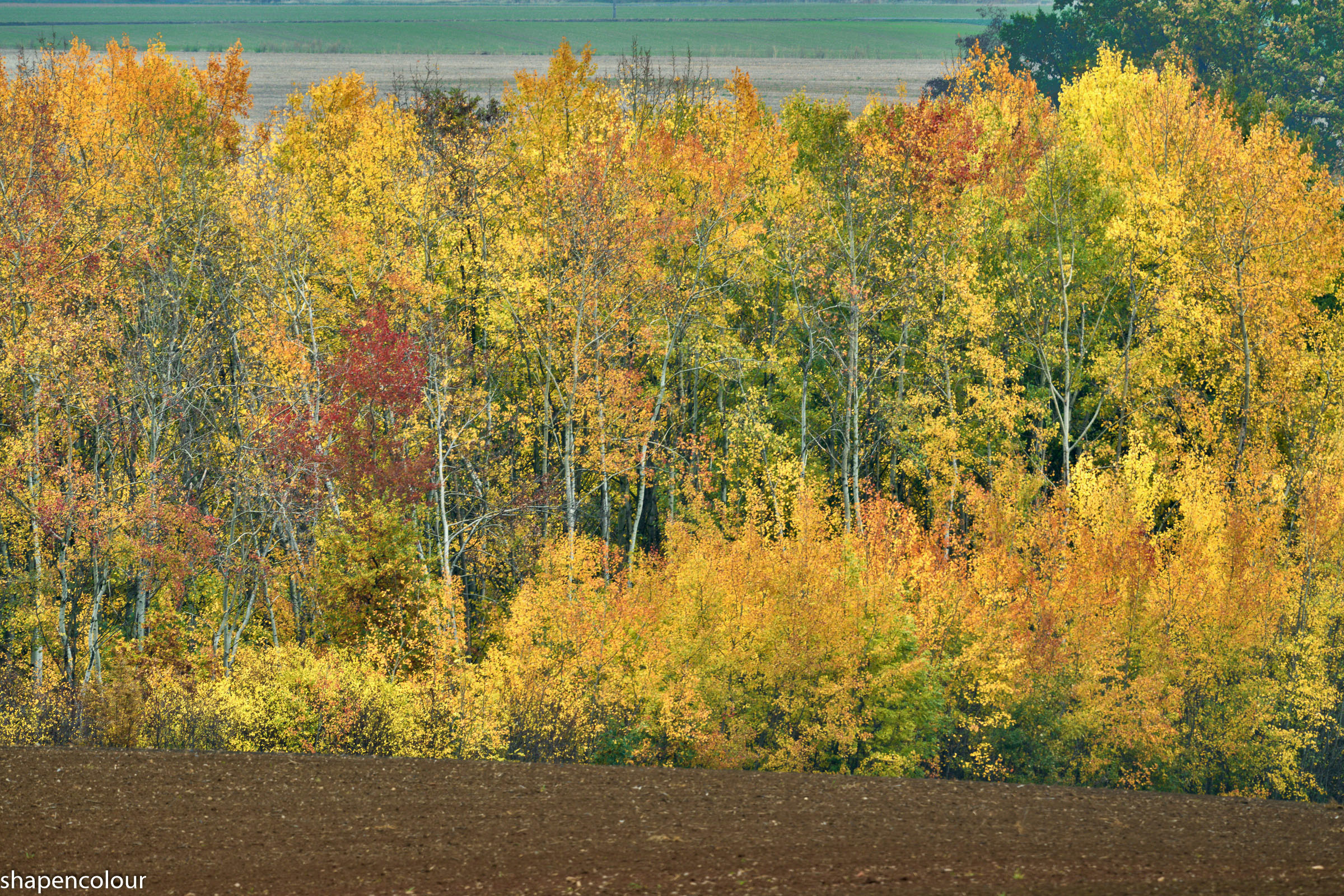
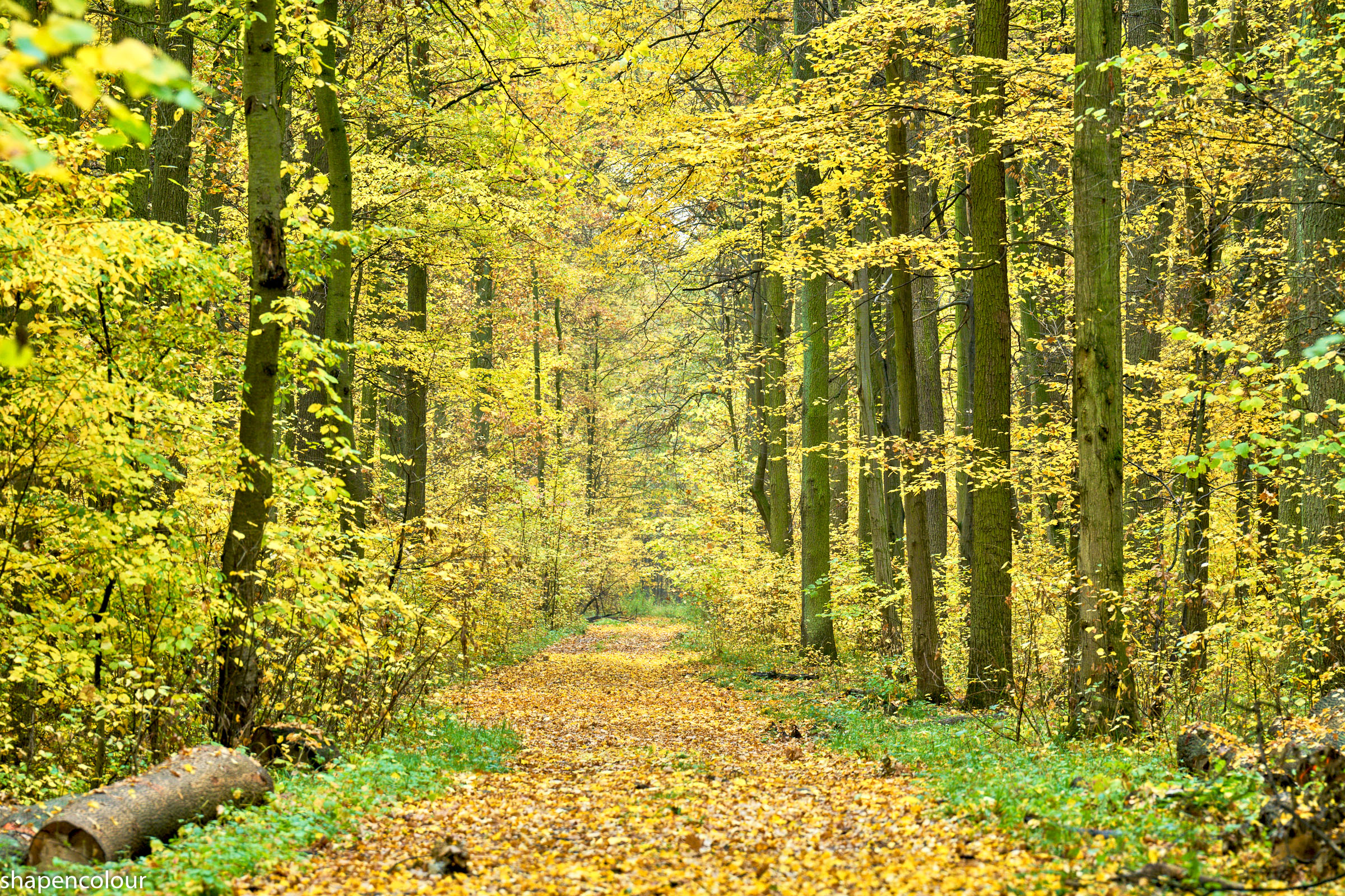
ILCE-7RM5 Sony FE 70-200mm F2.8 GM OSS II (SEL70200GM2) lens 115mm f/11.0 1/60s 100 ISO 0.0 EV
ILCE-7RM5 Sony FE 70-200mm F2.8 GM OSS II (SEL70200GM2) lens 70mm f/2.8 1/160s 100 ISO 0.0 EV
ILCE-7RM5 FE 28-70mm F2 GM lens 48mm f/2.0 1/320s 100 ISO -0.7 EV
ILCE-7RM5 Sony FE 70-200mm F2.8 GM OSS II (SEL70200GM2) lens 70mm f/8.0 1/30s 100 ISO -0.7 EV
ILCE-7RM5 Sony FE 70-200mm F2.8 GM OSS II (SEL70200GM2) lens 82mm f/2.8 1/100s 100 ISO -0.7 EV
ILCE-7RM5 Sony FE 70-200mm F2.8 GM OSS II (SEL70200GM2) lens 70mm f/2.8 1/320s 100 ISO -0.7 EV
ILCE-7RM5 Sony FE 200–600mm F5.6–6.3 G OSS (SEL200600G) lens 600mm f/11.0 1/50s 100 ISO -0.7 EV
ILCE-7RM5 Sony FE 70-200mm F2.8 GM OSS II (SEL70200GM2) lens 200mm f/8.0 1/30s 400 ISO -0.7 EV
Nov 13, 2026 at 03:06 AM


p.5287 #7Sony FE Images Thread
RomanMF wrote:
I don't take my A7R V out much these days. It's still such a phenomenal tool outside of the horrible EVF experience, which is the thing that'll make me upgrade this to an A7R VI.
https://live.staticflickr.com/65535/55649016617_0526735aa6_k.jpgIdyllwild Nights I by Roman France, on Flickr
Nice picture. What horrible EVF of the A7RV were you referring to? I feel the A7RV's EVF is marvelous. I don't recall it any different from the R6's EVF in use.
Edited on Nov 13, 2026 at 05:00 AM · View previous versions
I don't take my A7R V out much these days. It's still such a phenomenal tool outside of the horrible EVF experience, which is the thing that'll make me upgrade this to an A7R VI.
https://live.staticflickr.com/65535/55649016617_0526735aa6_k.jpgIdyllwild Nights I by Roman France, on Flickr
Nice picture. What horrible EVF of the A7RV were you referring to? I feel the A7RV's EVF is marvelous. I don't recall it any different from the R6's EVF in use.
Edited on Nov 13, 2026 at 05:00 AM · View previous versions
Nov 13, 2026 at 04:37 AM
p.5287 #8Sony FE Images Thread
adventure_photo wrote:
Hey Jack, I have struggled with what profile to use when posting here for best display of my photos. My workflow is RAW ProPhoto RGB from Lightroom Classic > Photoshop and then back to Lightroom Classic saved as a tiff file. From Lightroom Classic I export with color profile embedded. I was always using sRGB but recently started using Display P3 as it has a higher gamut and retains better colors especially for greens, oranges, reds, and yellows. Display P3 seems to be heading toward the new standard for internet sharing and display over the old sRGB standard. As far...Show more →
Crome here. They look the same on my BenQ monitors.
Very interesting discussion and a thank you to Jack for starting it. I just asked Gemini about Display P3 vs sRGB, very educational response. I recently watched some videos on Youtube about "Orton Effect" which utilize negative clarity, dehaze. The new "bloom" feature in LR will probably increase the popularity of the "Orton Effect". I have two identical 32" 4K BenQ monitor side by side for quite a few years. I think they came calibrated (not 100% sure). I bought one of these Spyder monitor calibrator but have never used it on the BenQ monitors.
I mainly use Lightroom, and occasionally use Photoshop for focus bracket stacking and for removing objects when LR is not doing a good enough job. I export from LR in sRGB. Very often the pictures look nice and saturated on the BenQ but look washout on my iPad. Maybe I need to calibrate my BenQ.
Jack Flesher wrote
For whatever reason, a few of the posters images on this forum render on my display as sort of "washed out" for lack of a better term. Most look normal saturation and contrast to me. I am wondering if this is a stylistic choice, like they purposefully use heavier negative clarity and/or negative contrast and saturation, or maybe just lift shadows heavily? Or perhaps it's a profile mismatch they're unaware of, like perhaps they're posting Adobe RGB JPEG images in sRGB colorspace? I am only curious and don't want to name names so as to avoid offending anybody, but wondering if it's intentional or perhaps something is wrong with my monitor or browser?Crome here. They look the same on my BenQ monitors.
Very interesting discussion and a thank you to Jack for starting it. I just asked Gemini about Display P3 vs sRGB, very educational response. I recently watched some videos on Youtube about "Orton Effect" which utilize negative clarity, dehaze. The new "bloom" feature in LR will probably increase the popularity of the "Orton Effect". I have two identical 32" 4K BenQ monitor side by side for quite a few years. I think they came calibrated (not 100% sure). I bought one of these Spyder monitor calibrator but have never used it on the BenQ monitors.
I mainly use Lightroom, and occasionally use Photoshop for focus bracket stacking and for removing objects when LR is not doing a good enough job. I export from LR in sRGB. Very often the pictures look nice and saturated on the BenQ but look washout on my iPad. Maybe I need to calibrate my BenQ.
Nov 13, 2026 at 04:58 AM
p.5287 #9Sony FE Images Thread
Douglas L wrote:
Hey Jack, I have struggled with what profile to use when posting here for best display of my photos. My workflow is RAW ProPhoto RGB from Lightroom Classic > Photoshop and then back to Lightroom Classic saved as a tiff file. From Lightroom Classic I export with color profile embedded. I was always using sRGB but recently started using Display P3 as it has a higher gamut and retains better colors especially for greens, oranges, reds, and yellows. Display P3 seems to be heading toward the new standard for internet sharing and display over the old sRGB standard. As far as I can tell, this site does not strip the profile and I assume most browsers/monitors can display P3 properly. Is it my images you are referring to? Maybe you could mention what posters you see this with and we can all learn here. What is your method of posting on the site? Do you output to sRGB? Do you embed profile? Here are two versions of the same image - the first has sRGB profile embedded and the second Display P3 profile embedded. Let me know if one looks better than the other or if one is grossly washed out or they look the same. And what do you think are the best color profile posting practices, I'd be curious to hear your insights?
Taos, New Mexico in Spring - 1st is sRGB, 2nd is Display P3Crome here. They look the same on my BenQ monitors.
Very interesting discussion and a thank you to Jack for starting it. I just asked Gemini about Display P3 vs sRGB, very educational response. I recently watched some videos on Youtube about "Orton Effect" which utilize negative clarity, dehaze. The new "bloom" feature in LR will probably increase the popularity of the "Orton Effect". I have two identical 32" 4K BenQ monitor side by side for quite a few years. I think they came calibrated (not 100% sure). I bought one of these Spyder monitor calibrator but have never used...Show more →
It’s always a good idea to calibrate your monitor regardless, as different systems and gpus can drive them differently. Also it should be done periodically as monitor output can shift over time.
Converting to sRGB from any larger camera space is going to cause a drop in saturation because the space simply isn’t big enough to hold all the colors. The different rendering intents used during this conversion process can make small differences as well, so I recommend comparing the Relative Colorimetric to Perceptual rendering intents and see if you prefer one over the other. RC is generally more accurate, and Perceptual a little smoother, but either may require a tweak after conversion to satisfy your taste for that image. Oh, I also reco always using Black Point Compensation as this def aids maintaining general WB appearance throughout the process.
adventure_photo wrote
Jack Flesher wrote
For whatever reason, a few of the posters images on this forum render on my display as sort of "washed out" for lack of a better term. Most look normal saturation and contrast to me. I am wondering if this is a stylistic choice, like they purposefully use heavier negative clarity and/or negative contrast and saturation, or maybe just lift shadows heavily? Or perhaps it's a profile mismatch they're unaware of, like perhaps they're posting Adobe RGB JPEG images in sRGB colorspace? I am only curious and don't want to name names so as to avoid offending anybody, but wondering if it's intentional or perhaps something is wrong with my monitor or browser?Taos, New Mexico in Spring - 1st is sRGB, 2nd is Display P3
Very interesting discussion and a thank you to Jack for starting it. I just asked Gemini about Display P3 vs sRGB, very educational response. I recently watched some videos on Youtube about "Orton Effect" which utilize negative clarity, dehaze. The new "bloom" feature in LR will probably increase the popularity of the "Orton Effect". I have two identical 32" 4K BenQ monitor side by side for quite a few years. I think they came calibrated (not 100% sure). I bought one of these Spyder monitor calibrator but have never used...Show more →
It’s always a good idea to calibrate your monitor regardless, as different systems and gpus can drive them differently. Also it should be done periodically as monitor output can shift over time.
Converting to sRGB from any larger camera space is going to cause a drop in saturation because the space simply isn’t big enough to hold all the colors. The different rendering intents used during this conversion process can make small differences as well, so I recommend comparing the Relative Colorimetric to Perceptual rendering intents and see if you prefer one over the other. RC is generally more accurate, and Perceptual a little smoother, but either may require a tweak after conversion to satisfy your taste for that image. Oh, I also reco always using Black Point Compensation as this def aids maintaining general WB appearance throughout the process.
Nov 13, 2026 at 06:01 AM
p.5287 #10Sony FE Images Thread
 20261109-20261109_Downsview Park_00198 by Jose Raposo, on Flickr
Nov 13, 2026 at 06:17 AM
|
p.5287 #11Sony FE Images Thread
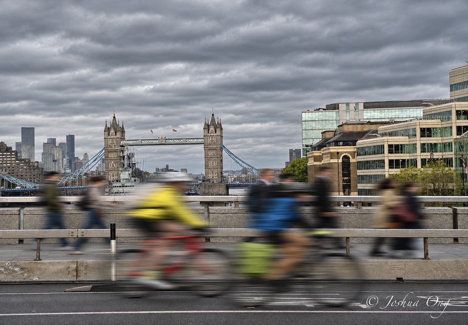
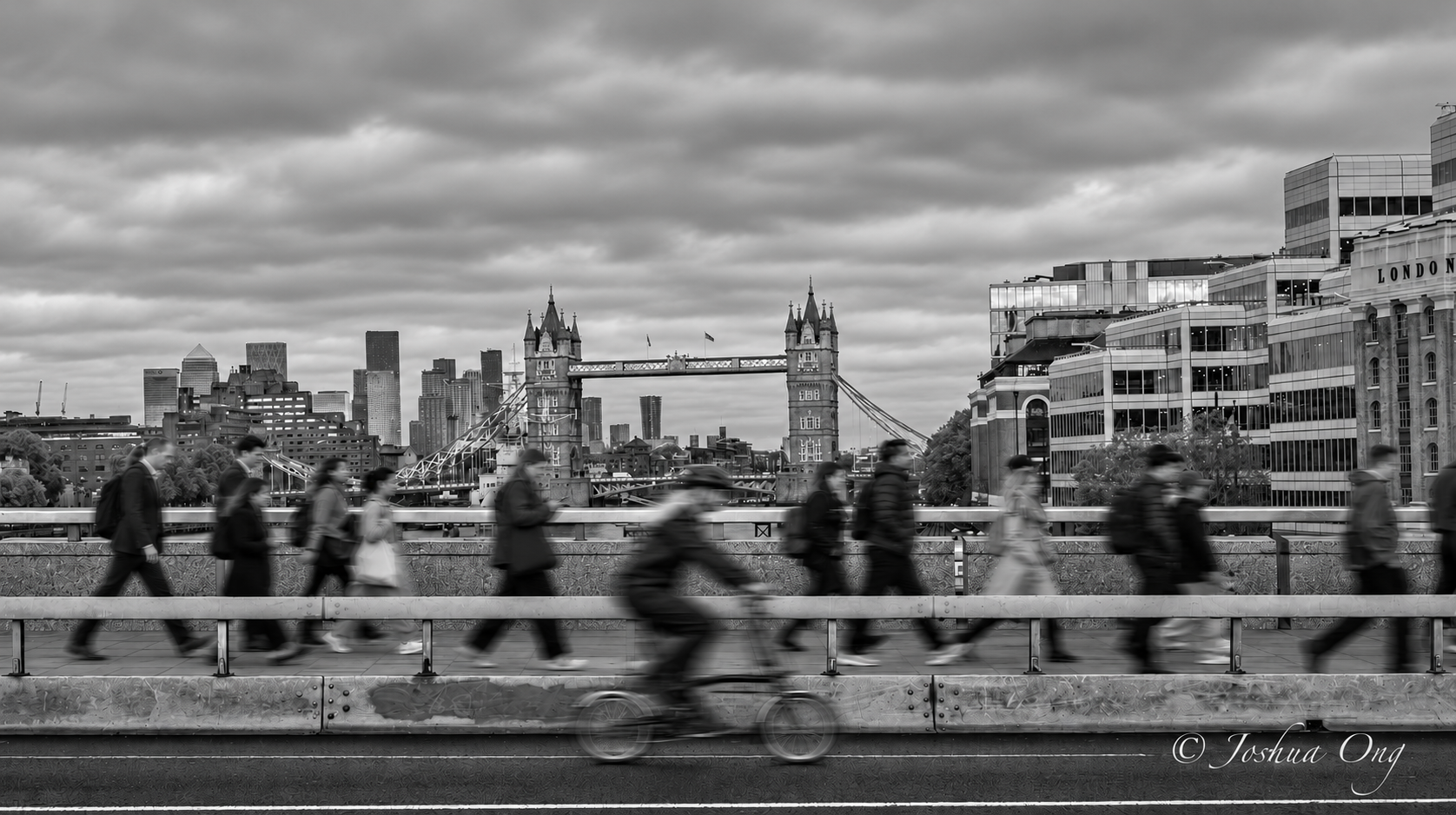
I noticed that there were a lot of pretty fast walking people on the London bridge and in the afternoon the majority of them walked in the same direction. In addition, there were a few cyclists. So, for fun, I steadied myself and used 1/16 sec to capture the movement using the Tower Bridge in the background...
GM 28-70mm on A7r VI - the effective IBIS on the A7r VI helped there...
Originally, I posted only a single image but I added another one that was converted to B&W
GM 28-70mm on A7r VI - the effective IBIS on the A7r VI helped there...
Originally, I posted only a single image but I added another one that was converted to B&W
 |
||
 © AGeoJO 2026 |
||
 |
|
||
 |
||
|
Nov 13, 2026 at 07:52 AM
p.5287 #12Sony FE Images Thread
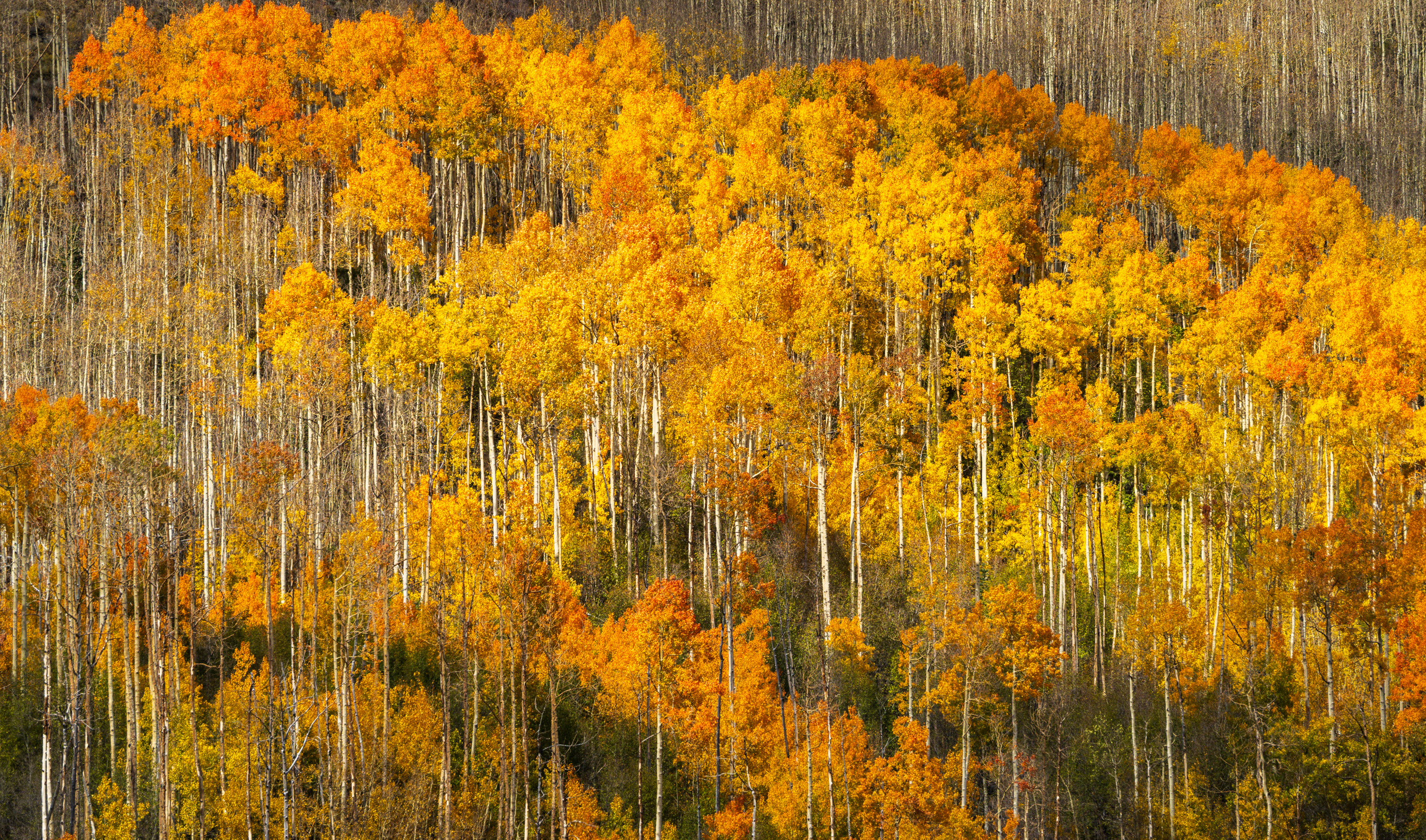
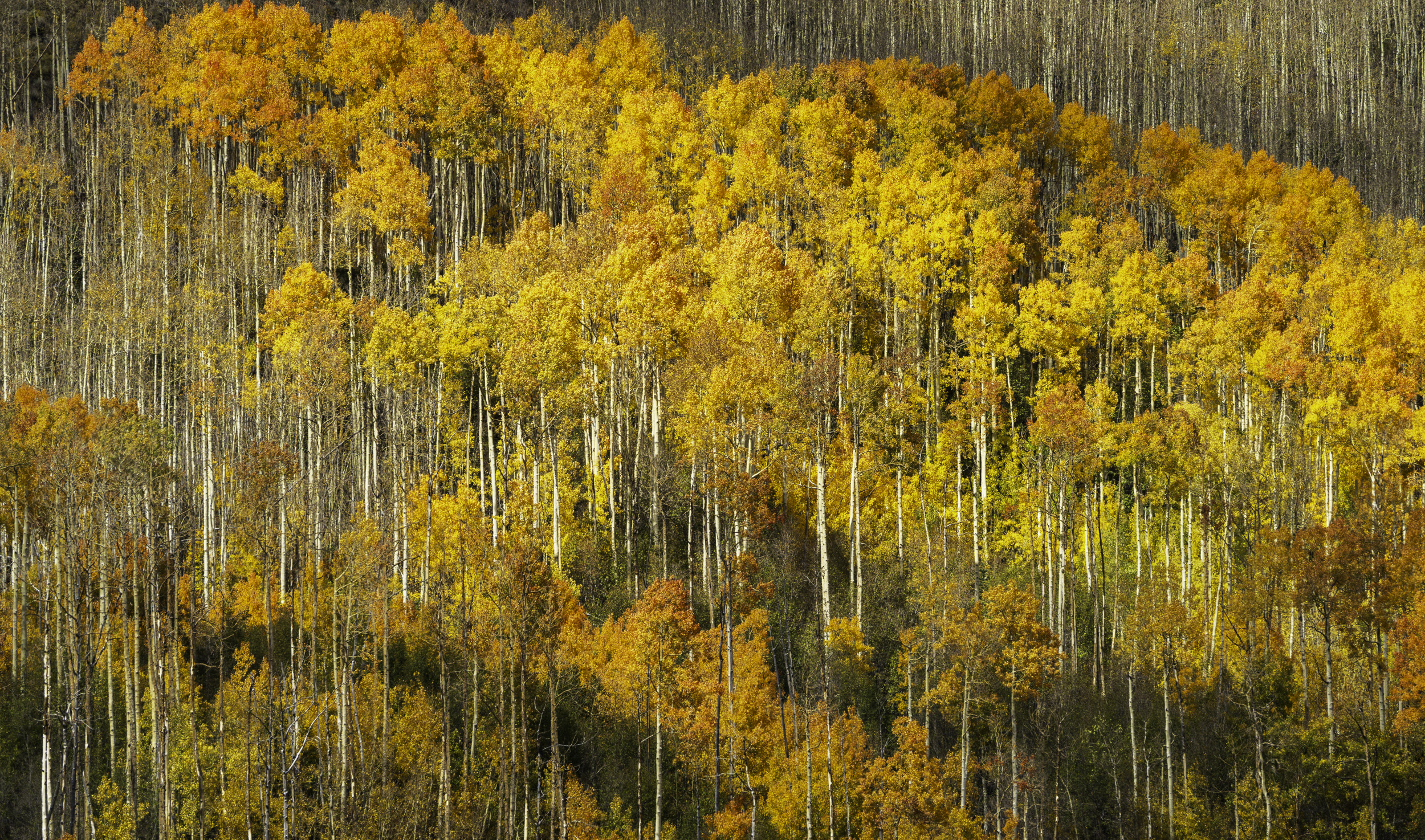
Aspens on a Utah hillside with the Sigma 500mm f/5.6 on A7RV
The discussion on color profiles is always interesting. I almost always export jpegs to sRGB for the best web compatibility, but Lightroom uses the wider gamut ProPhoto RGB during editing and on some images like this one there is a noticeable loss of richness converting to sRGB. I will post two images to see if our browsers can differentiate - the first sRGB and the second ProPhoto RGB:
Note: viewing in Safari on my 16” M1 MacBook, the 2nd (ProPhoto RGB) definitely shows me the richer colors compared to 1st (sRGB).
The discussion on color profiles is always interesting. I almost always export jpegs to sRGB for the best web compatibility, but Lightroom uses the wider gamut ProPhoto RGB during editing and on some images like this one there is a noticeable loss of richness converting to sRGB. I will post two images to see if our browsers can differentiate - the first sRGB and the second ProPhoto RGB:
Note: viewing in Safari on my 16” M1 MacBook, the 2nd (ProPhoto RGB) definitely shows me the richer colors compared to 1st (sRGB).
 |
||
 |
||
|
|
||
 |
||
|
Nov 13, 2026 at 11:06 AM
p.5287 #13Sony FE Images Thread
Ross Martin wrote:
Aspens on a Utah hillside with the Sigma 500mm f/5.6 on A7RV
The discussion on color profiles is always interesting. I almost always export jpegs to sRGB for the best web compatibility, but Lightroom uses the wider gamut ProPhoto RGB during editing and on some images like this one there is a noticeable loss of richness converting to sRGB. I will post two images to see if our browsers can differentiate - the first sRGB and the second ProPhoto RGB:
Note: viewing in Safari on my 16” M1 MacBook, the 2nd (ProPhoto RGB) definitely shows me the richer colors compared to...Show more →
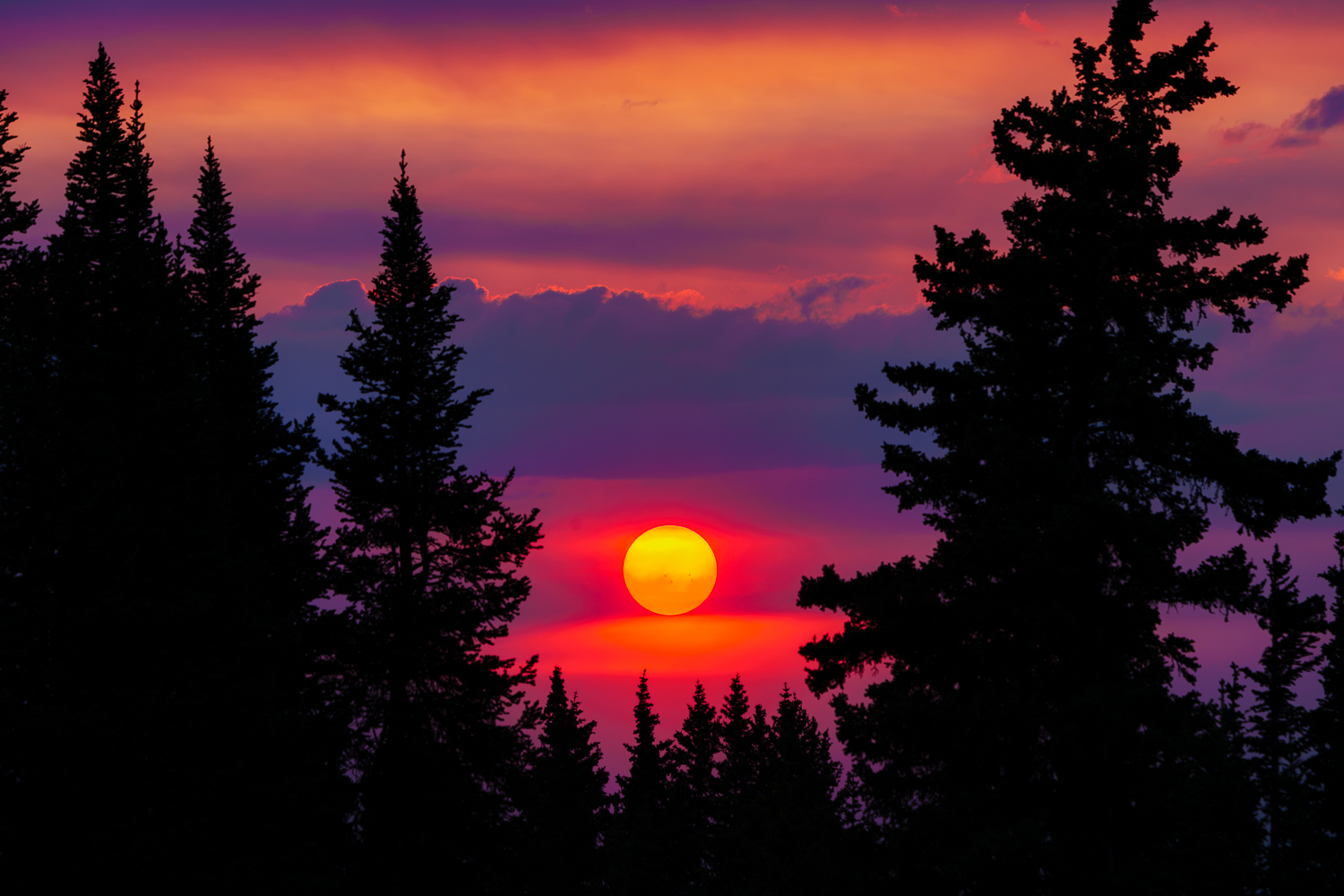
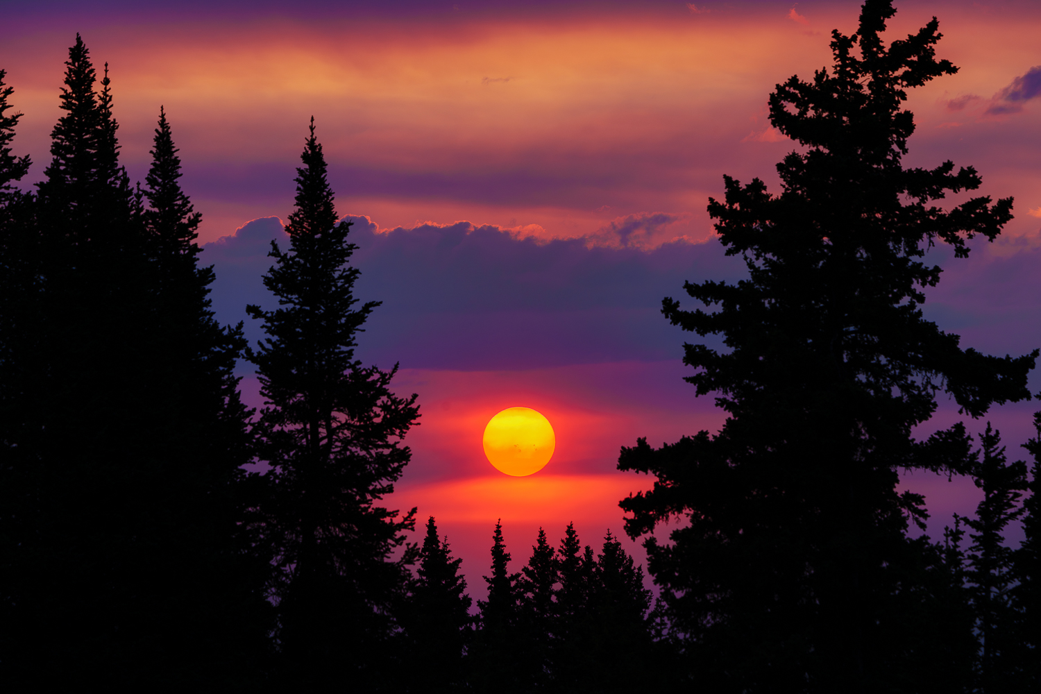
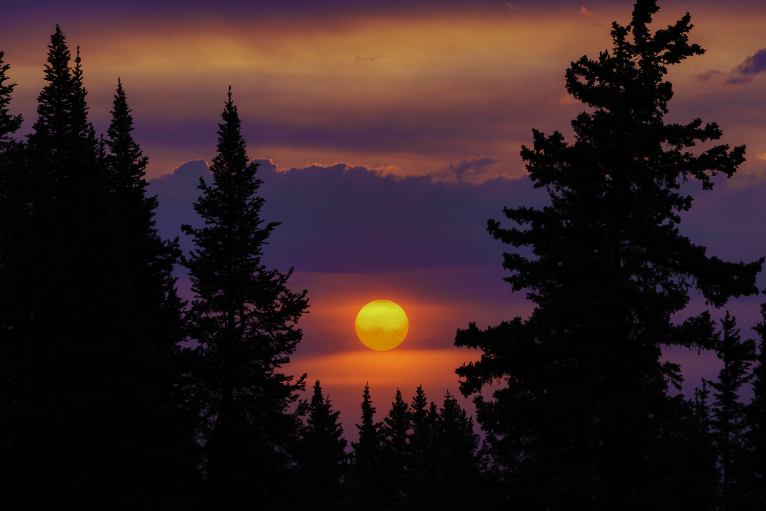
I too see the difference Ross in your photos here, that's viewing on Safari with M2 Max Mac Studio and 32" LG monitor calibrated. Yeah, I'm always disappointed in the way sRGB looks from my original edited files that's why I have been experimenting with P3 for uploads. Here is another test on an image with a lot of reds and oranges. On my computer viewing these three in Preview or Photoshop I can clearly see less saturated colors in the sRGB file, with ProPhoto showing the best color and P3 somewhere in between. Do these 3 look any different viewing the post, I'd be curious to hear. I sure would like to use a higher gamut profile but I also don't want it to look terrible on particular platforms/computers/monitors. Displayed in this order, sRGB, Display P3, and last is ProPhoto RGB.
Aspens on a Utah hillside with the Sigma 500mm f/5.6 on A7RV
The discussion on color profiles is always interesting. I almost always export jpegs to sRGB for the best web compatibility, but Lightroom uses the wider gamut ProPhoto RGB during editing and on some images like this one there is a noticeable loss of richness converting to sRGB. I will post two images to see if our browsers can differentiate - the first sRGB and the second ProPhoto RGB:
Note: viewing in Safari on my 16” M1 MacBook, the 2nd (ProPhoto RGB) definitely shows me the richer colors compared to...Show more →
I too see the difference Ross in your photos here, that's viewing on Safari with M2 Max Mac Studio and 32" LG monitor calibrated. Yeah, I'm always disappointed in the way sRGB looks from my original edited files that's why I have been experimenting with P3 for uploads. Here is another test on an image with a lot of reds and oranges. On my computer viewing these three in Preview or Photoshop I can clearly see less saturated colors in the sRGB file, with ProPhoto showing the best color and P3 somewhere in between. Do these 3 look any different viewing the post, I'd be curious to hear. I sure would like to use a higher gamut profile but I also don't want it to look terrible on particular platforms/computers/monitors. Displayed in this order, sRGB, Display P3, and last is ProPhoto RGB.
ILCE-7RM5 FE 100-400mm F4.5-5.6 GM OSS lens 268mm f/11.0 1/200s 200 ISO 0.0 EV
ILCE-7RM5 FE 100-400mm F4.5-5.6 GM OSS lens 268mm f/11.0 1/200s 200 ISO 0.0 EV
ILCE-7RM5 FE 100-400mm F4.5-5.6 GM OSS lens 268mm f/11.0 1/200s 200 ISO 0.0 EV
Nov 13, 2026 at 12:04 PM
p.5287 #14Sony FE Images Thread
Zeiss Batis 2.8/135; f5.6; iso 160; 1/100 sec.
 DSC09529 by stm geist, auf Flickr
Edited on Nov 13, 2026 at 05:12 PM · View previous versions
DSC09529 by stm geist, auf FlickrEdited on Nov 13, 2026 at 05:12 PM · View previous versions
Nov 13, 2026 at 04:27 PM
p.5287 #15Sony FE Images Thread
Really slow day at the pond yesterday but I got some steps in and a couple of keepers.....📸🚶🏼♂️
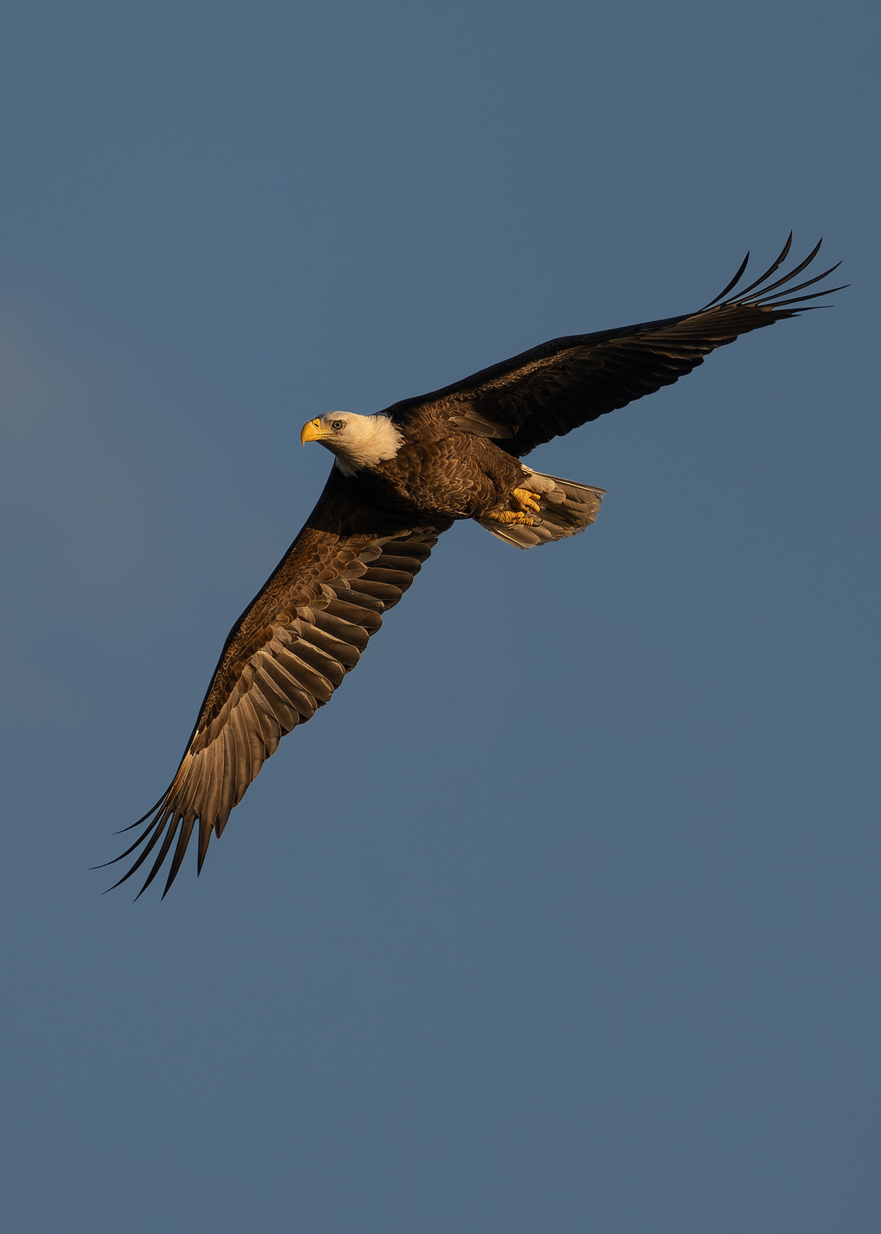
Eagle fly-by on the way to the nest. Getting close to nesting season.
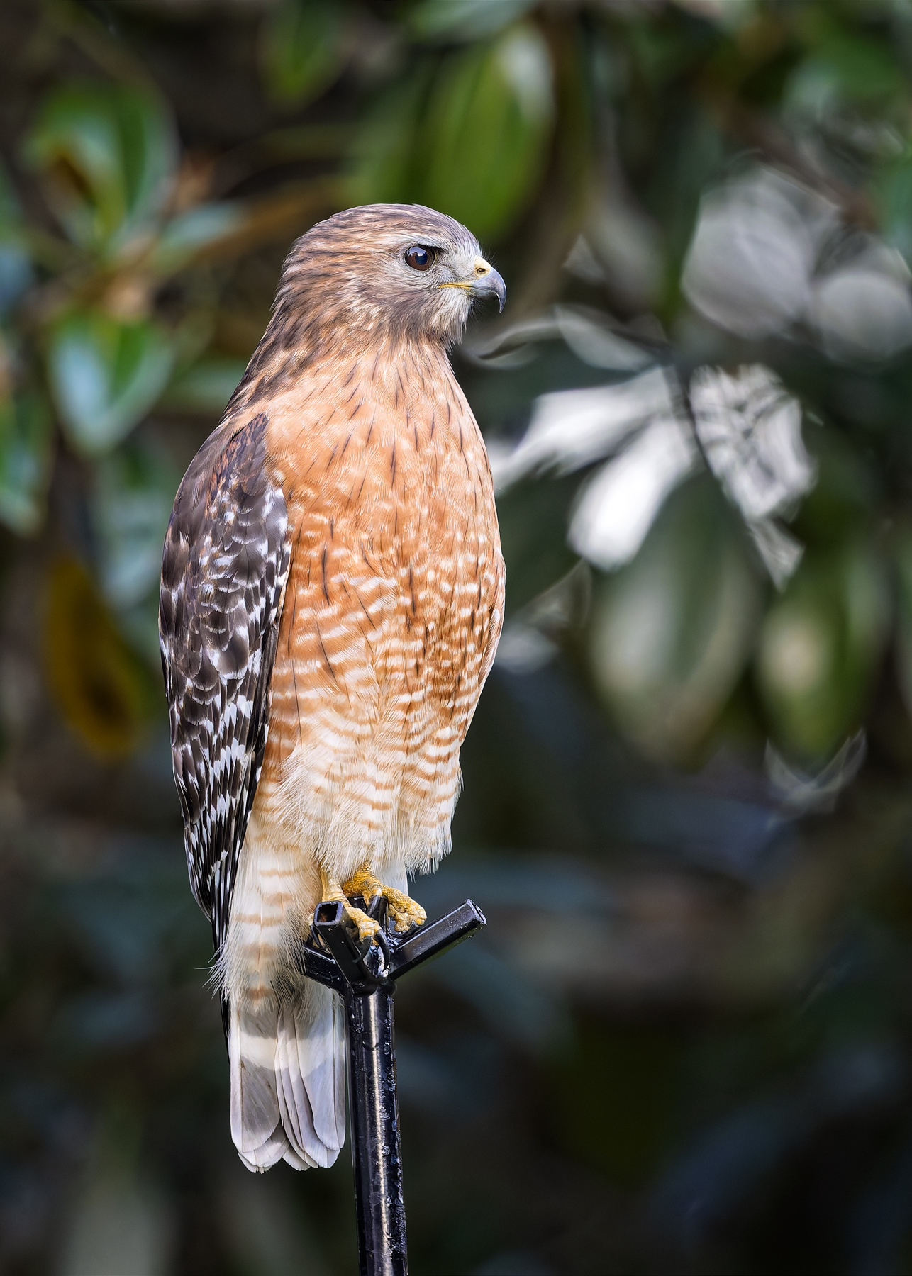
Resident red shouldered hawk....completely unafraid and always ready to pose!
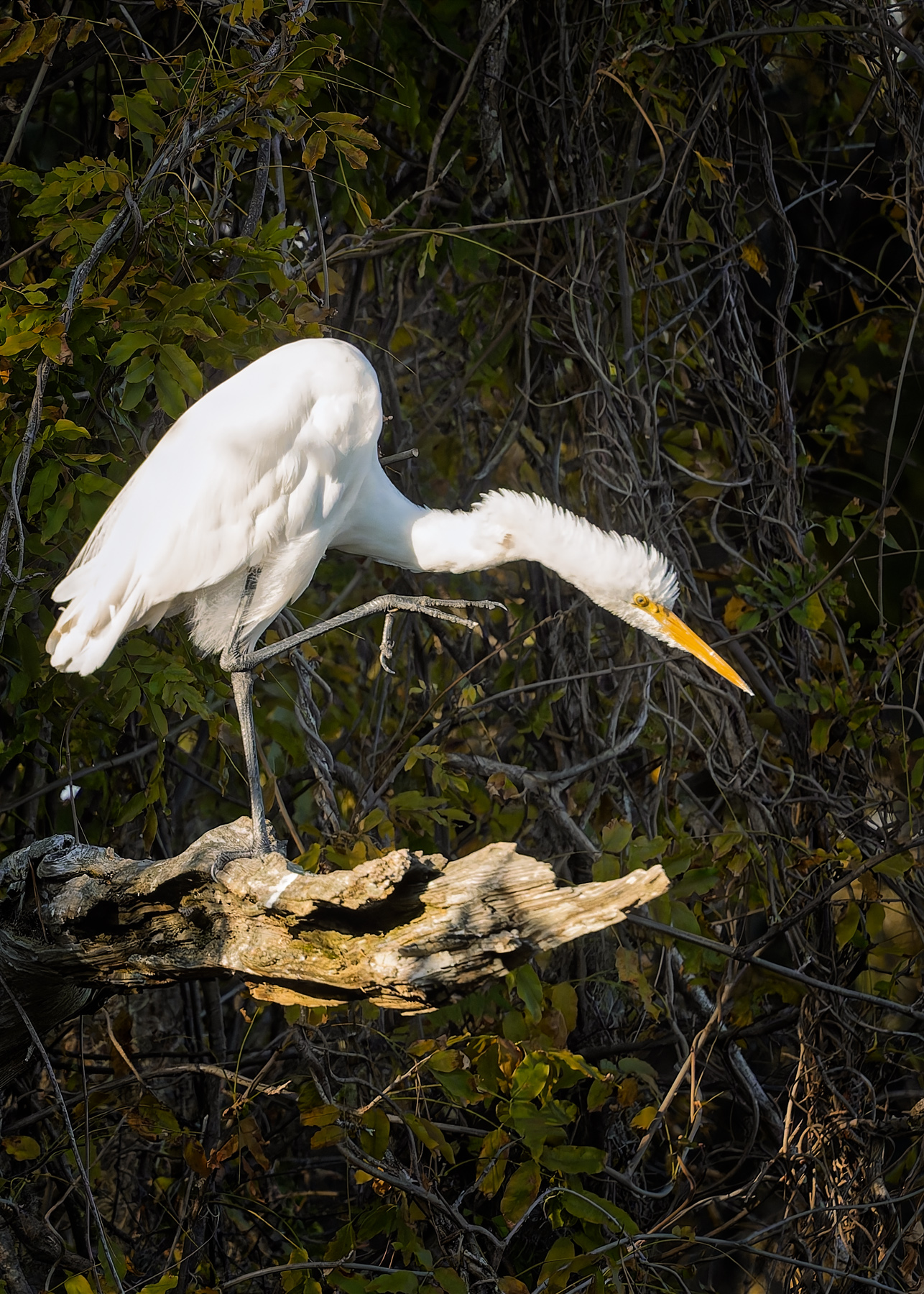
Mr. Miyagi egret...practicing his crane technique....if do right, no can defend! 🥋
Eagle fly-by on the way to the nest. Getting close to nesting season.
ILCE-7RM6 FE 300mm F2.8 GM OSS + 2X Teleconverter lens 600mm f/5.6 1/4000s 640 ISO -0.3 EV
Resident red shouldered hawk....completely unafraid and always ready to pose!
ILCE-7RM6 FE 300mm F2.8 GM OSS + 2X Teleconverter lens 600mm f/5.6 1/400s 10000 ISO 0.0 EV
Mr. Miyagi egret...practicing his crane technique....if do right, no can defend! 🥋
ILCE-7RM6 FE 300mm F2.8 GM OSS + 2X Teleconverter lens 600mm f/5.6 1/4000s 4000 ISO -1.0 EV
Nov 13, 2026 at 04:39 PM
p.5287 #16Sony FE Images Thread
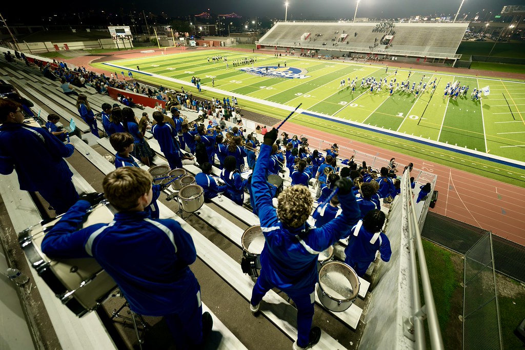 Untitled by Tyrone Barthelemy, on Flickr
Friday night lights
Sony 14mm GM
Nov 13, 2026 at 05:23 PM
p.5287 #17Sony FE Images Thread
adventure_photo wrote:
The discussion on color profiles is always interesting. I almost always export jpegs to sRGB for the best web compatibility, but Lightroom uses the wider gamut ProPhoto RGB during editing and on some images like this one there is a noticeable loss of richness converting to sRGB. I will post two images to see if our browsers can differentiate - the first sRGB and the second ProPhoto RGB:
Note: viewing in Safari on my 16” M1 MacBook, the 2nd (ProPhoto RGB) definitely shows me the richer colors compared to 1st (sRGB).I too see the difference Ross in your photos here, that's viewing on Safari with M2 Max Mac Studio and 32" LG monitor calibrated. Yeah, I'm always disappointed in the way sRGB looks from my original edited files that's why I have been experimenting with P3 for uploads. Here is another test on an image with a lot of reds and oranges. On my computer viewing these three in Preview or Photoshop I can clearly see less saturated colors in the sRGB file, with ProPhoto showing the best color and P3 somewhere in between. Do these 3 look any different...Show more →
That’s a beautiful image, Scott! I think because it is so intensely saturated, my eyes are having a hard time determining any differences between the three, no matter how much I compare them.
Ross Martin wrote
Aspens on a Utah hillside with the Sigma 500mm f/5.6 on A7RVThe discussion on color profiles is always interesting. I almost always export jpegs to sRGB for the best web compatibility, but Lightroom uses the wider gamut ProPhoto RGB during editing and on some images like this one there is a noticeable loss of richness converting to sRGB. I will post two images to see if our browsers can differentiate - the first sRGB and the second ProPhoto RGB:
Note: viewing in Safari on my 16” M1 MacBook, the 2nd (ProPhoto RGB) definitely shows me the richer colors compared to 1st (sRGB).
That’s a beautiful image, Scott! I think because it is so intensely saturated, my eyes are having a hard time determining any differences between the three, no matter how much I compare them.
Nov 13, 2026 at 06:30 PM
p.5287 #18Sony FE Images Thread
I just re-acquired the 50mm f/1.4 GM that I once had and took it for a spin today at a local ranch. It's a great daily fast 50 and this time I'm keeping it.
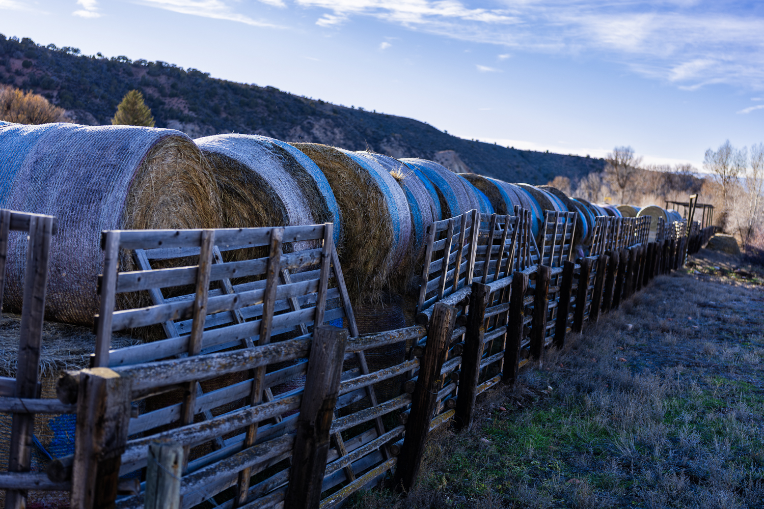
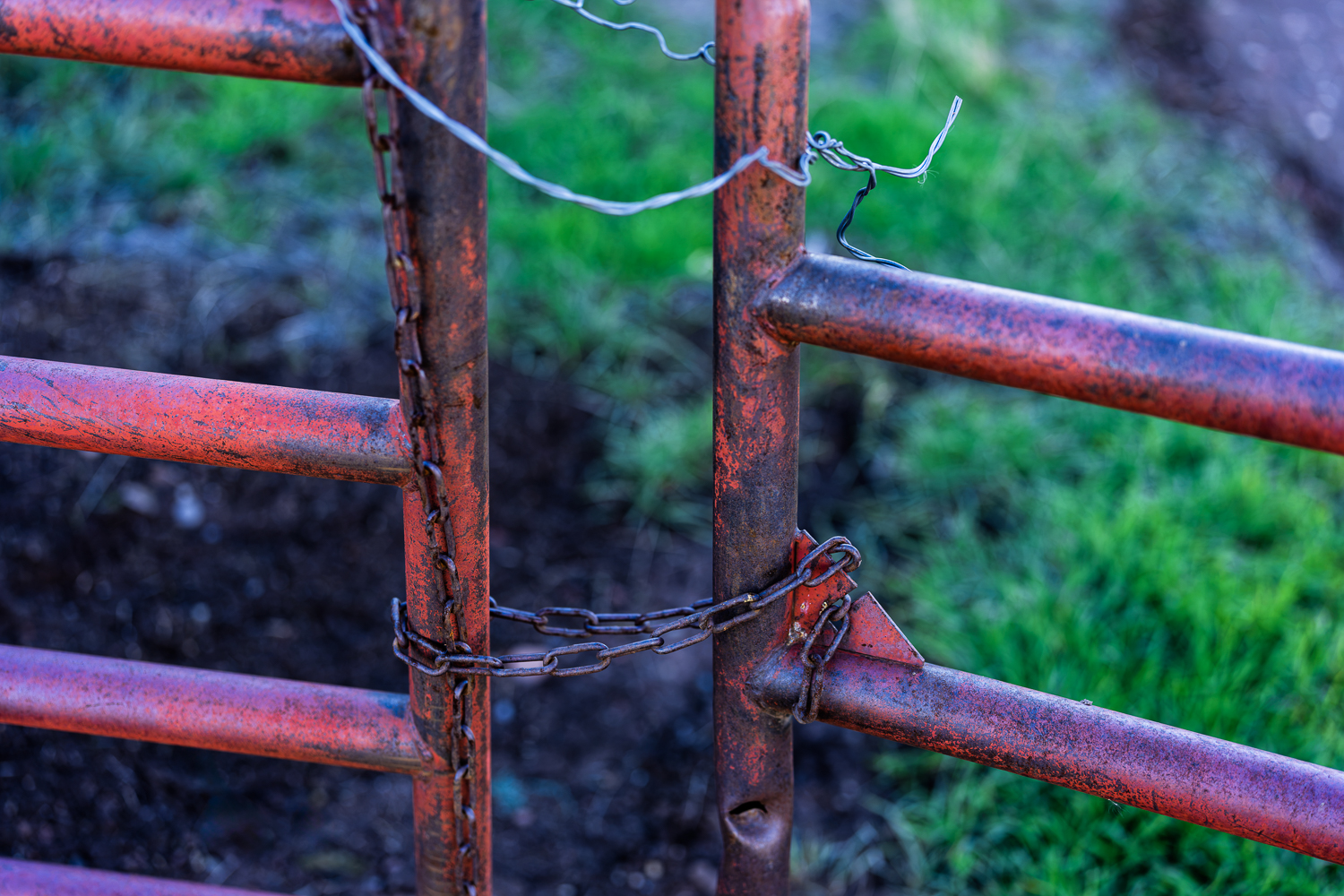
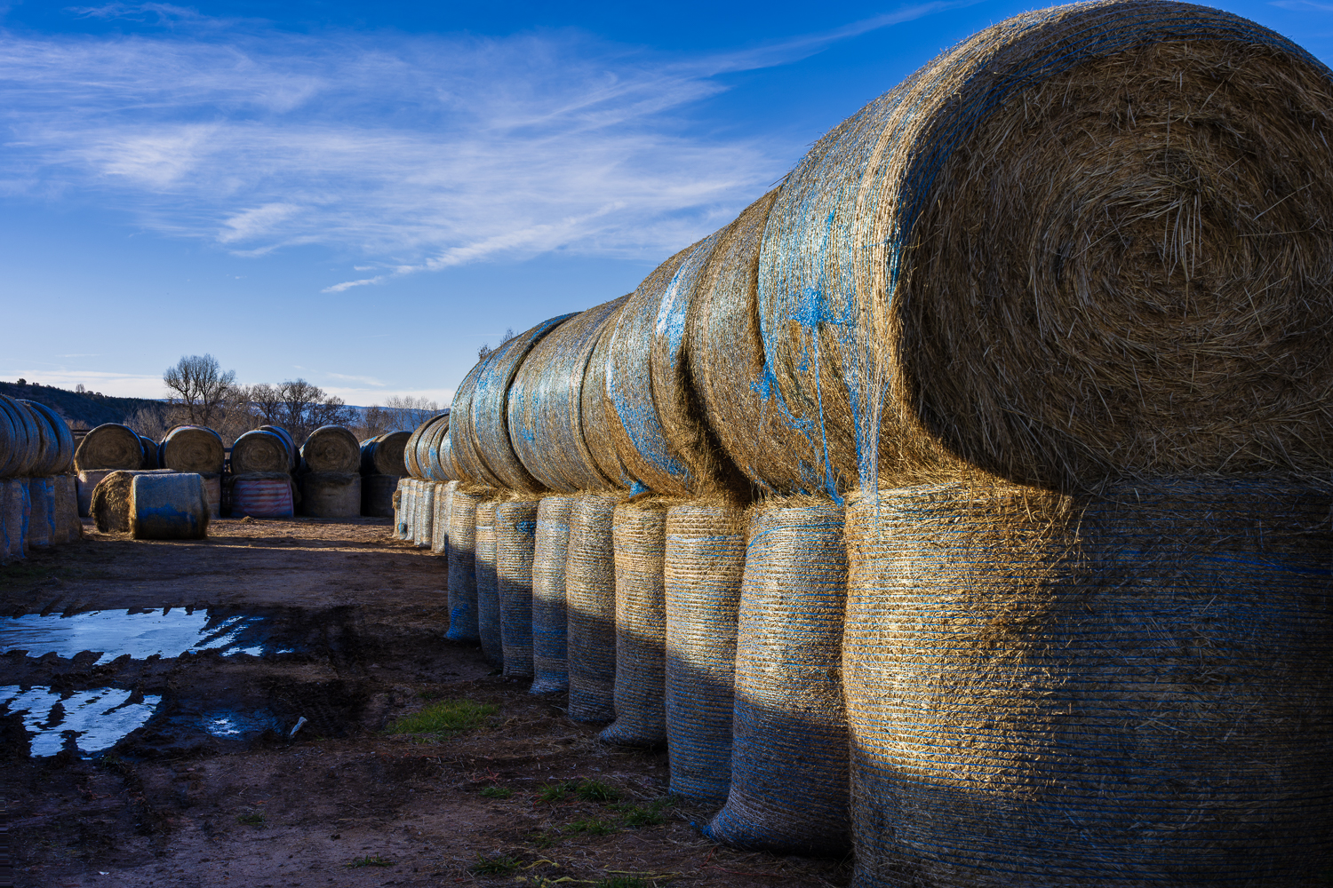
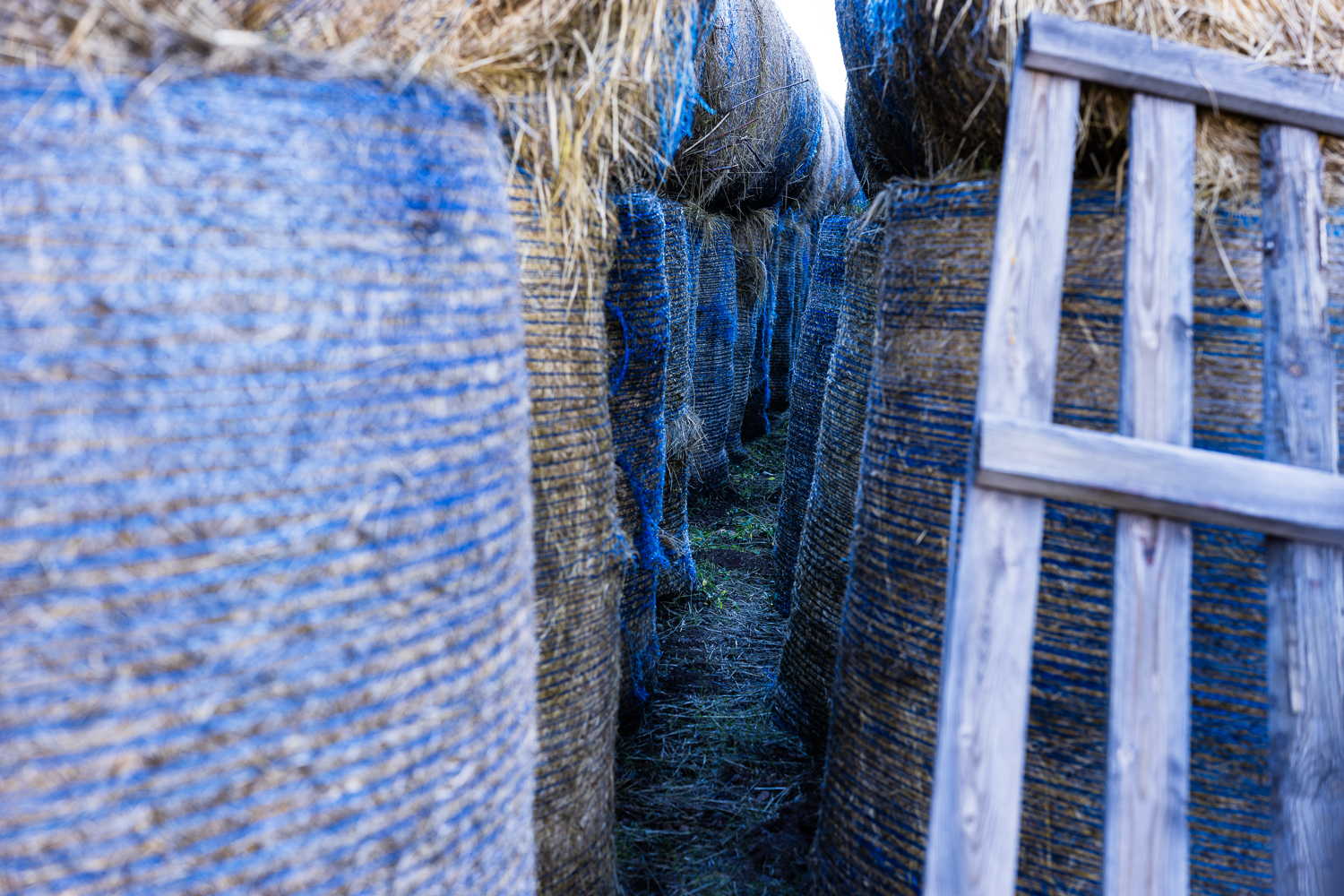
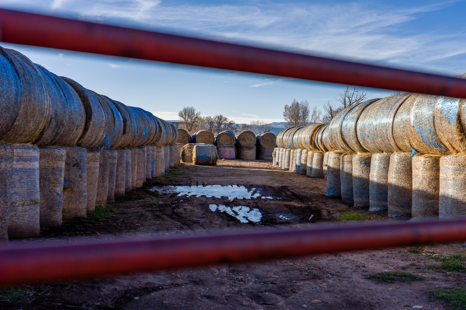
ILCE-7RM6 FE 50mm F1.4 GM lens 50mm f/2.0 1/1250s 100 ISO 0.0 EV
ILCE-7RM6 FE 50mm F1.4 GM lens 50mm f/2.0 1/250s 100 ISO 0.0 EV
ILCE-7RM6 FE 50mm F1.4 GM lens 50mm f/8.0 1/250s 100 ISO 0.0 EV
ILCE-7RM6 FE 50mm F1.4 GM lens 50mm f/3.5 1/30s 100 ISO 0.0 EV
ILCE-7RM6 FE 50mm F1.4 GM lens 50mm f/3.5 1/1600s 100 ISO -1.0 EV
Nov 13, 2026 at 09:12 PM
p.5287 #19Sony FE Images Thread
olalafoto wrote:
20-70/4 G
https://cdn.imgchest.com/files/8a1f01e1efbc.jpg
70-200/4 Gii
https://cdn.imgchest.com/files/f4d4dd20ad94.jpg
Love that reflection in #1!
20-70/4 G
https://cdn.imgchest.com/files/8a1f01e1efbc.jpg
70-200/4 Gii
https://cdn.imgchest.com/files/f4d4dd20ad94.jpg
Love that reflection in #1!
Nov 13, 2026 at 11:13 PM
p.5287 #20Sony FE Images Thread
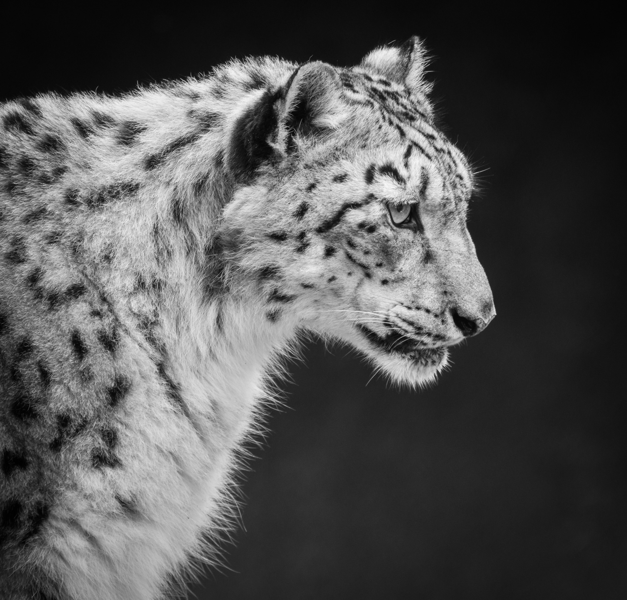
Snow Leopard, Cincinnati Zoo
 |
||
 |
||
|
ILCE-7RM5 FE 100-400mm F4.5-5.6 GM OSS + 1.4X Teleconverter lens 560mm f/8.0 1/80s 500 ISO -1.0 EV
Nov 13, 2026 at 11:15 PM