Sony FE Images Thread

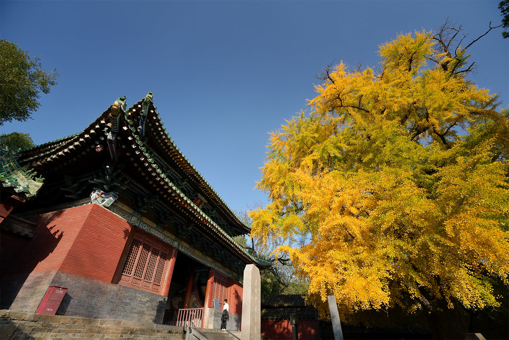
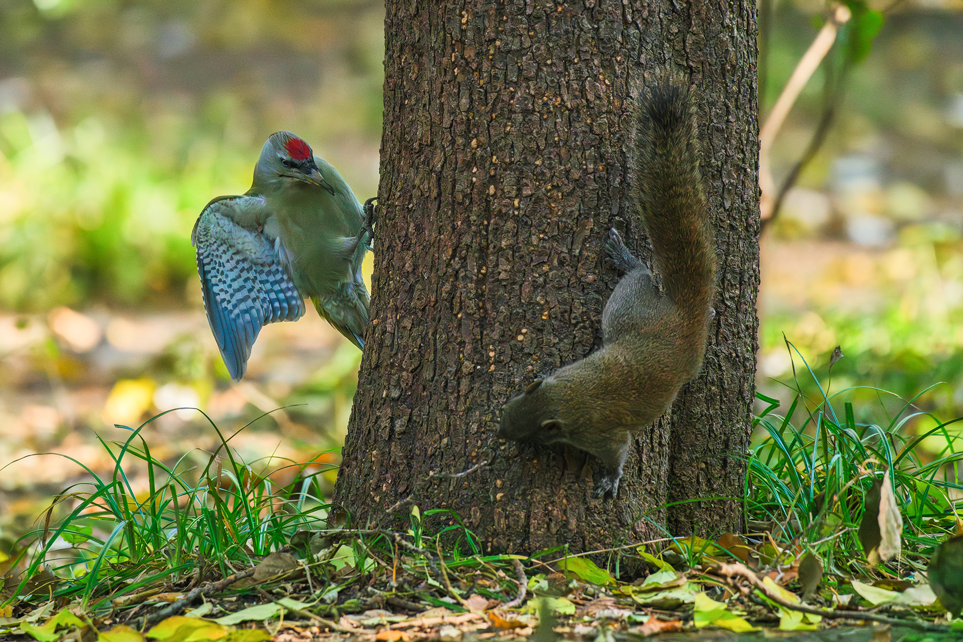
p.5286 #3Sony FE Images Thread
A7R6 + Sigma 500/5.6
Edited on Nov 11, 2026 at 08:11 AM · View previous versions
 |
||
 |
||
|
Edited on Nov 11, 2026 at 08:11 AM · View previous versions
Nov 11, 2026 at 08:10 AM

p.5286 #4Sony FE Images Thread
Ross Martin wrote:
Love these, sort of image where you can look at it 10 times and see different things each timeThank you John and I agree, so fun with these kind of images! I could have spent hours in that one area framing up shots!
This photo is spectacular Joshua, love it! The lighting, colors, model, posing, crisp details - well done, it's a stunning image!
____________________________________________________________________________________________
One from a couple evenings ago along the Colorado River near where I live.Thank you very much, Scott! And your landscape images, especially this one is drop-dead gorgeous - I love it!
______________________________________________________________________________
I did a walking tour in London and ended up walking for over 10 miles that afternoon/evening and it rained/drizzled most of the time. To a certain degree, the images become more suitable in B&W. The wet cobblestone pavement renders nicely, especially after it got dark... Here is one of them using GM 28-70 mm at 60mm and f/2.8 on A7r VI...That is absolutely gorgeous, Joshua!
Thank you very much, Ross! And I am a fan of your images regardless of the genre!
adventure_photo wrote:
Some creative experimentation with burning steel wool and colorful lights brings a graffiti-covered wall in an underground concrete tunnel to life with explosive energy.
I like your experiment, Scott! The results are gorgeous!
__________________________________________________________________________
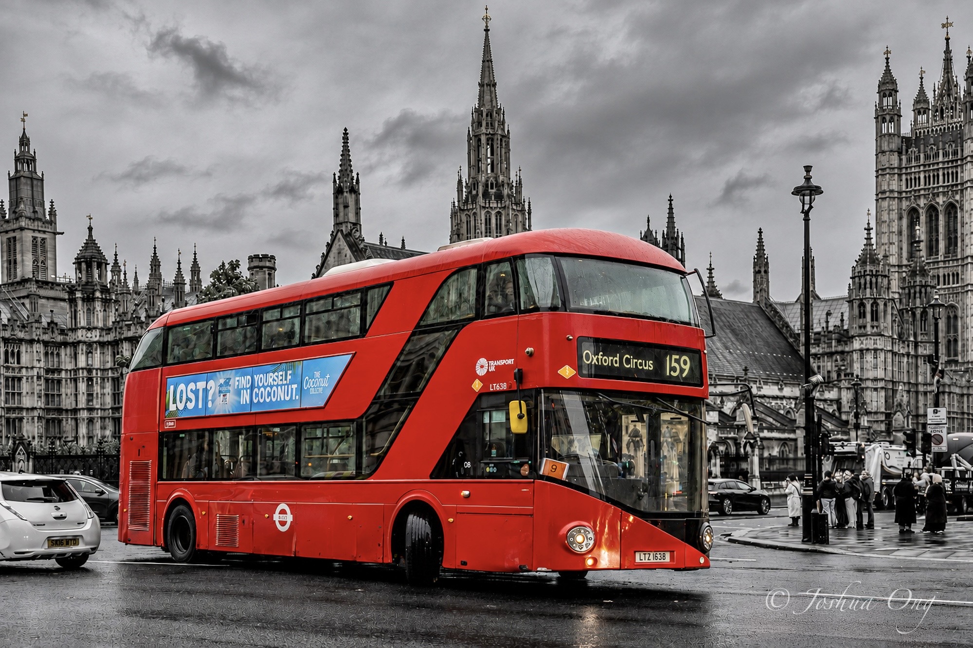
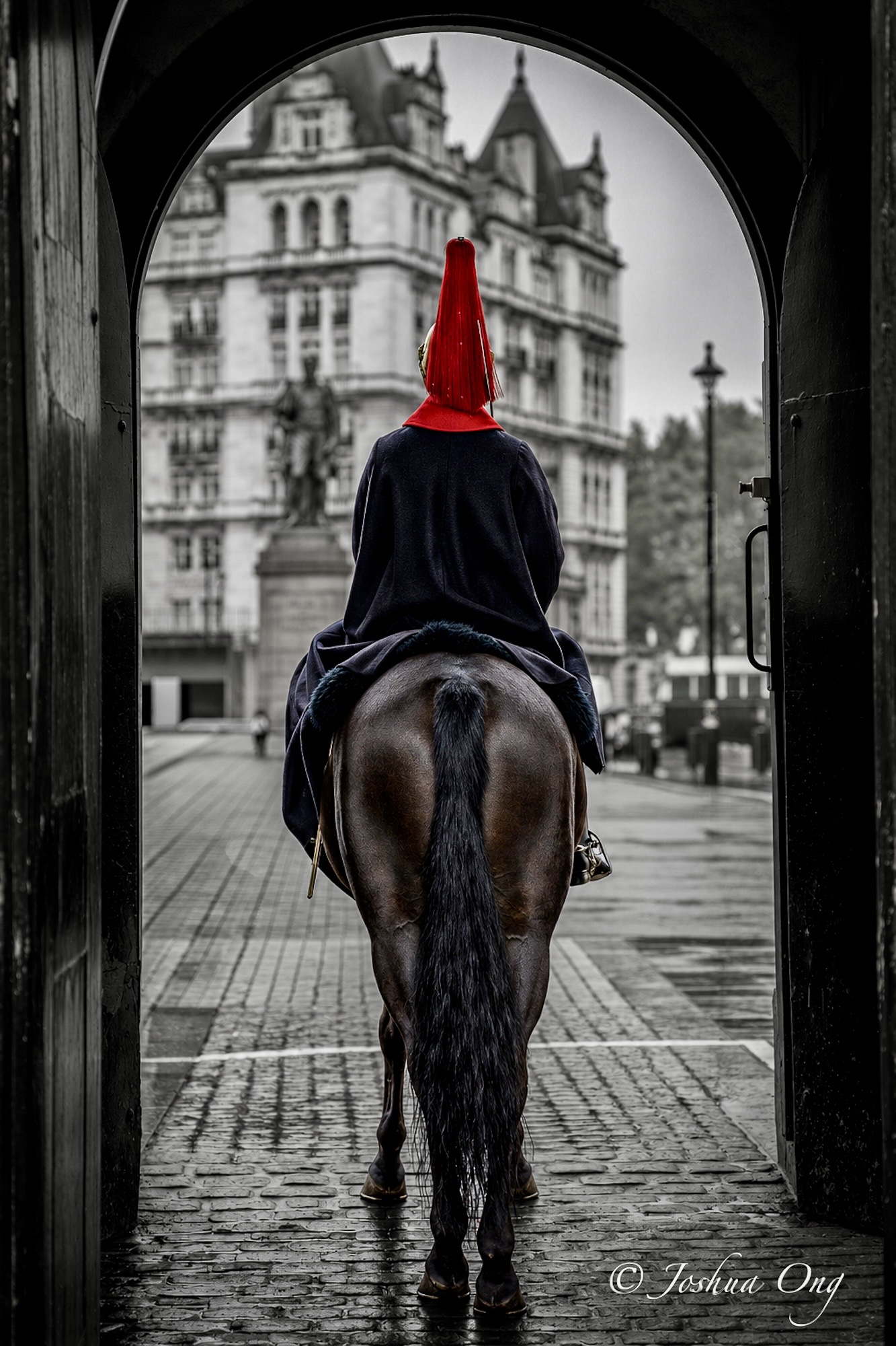
Sometimes, for a change, I like to accentuate the subject by keeping it in color while rendering the surrounding in B&W. I remembered vividly that it took quite a bit of effort to do so in PS. Now, in LR, it can be done in just a few clicks... Here are two characteristic and mostly RED items from London. All captured using GM 28-70mm on A7r VI.
AGeoJO wrote
adventure_photo wrote
johnahill wrote
adventure_photo wrote
An intricate little underwater world of vibrant green algae, delicate bubbles, and a submerged leaf. Amazing how something so ordinary can become so fascinating when you take a closer look.AGeoJO wrote
Batis 85mm at f/5.6 on A1 II....____________________________________________________________________________________________
One from a couple evenings ago along the Colorado River near where I live.
______________________________________________________________________________
I did a walking tour in London and ended up walking for over 10 miles that afternoon/evening and it rained/drizzled most of the time. To a certain degree, the images become more suitable in B&W. The wet cobblestone pavement renders nicely, especially after it got dark... Here is one of them using GM 28-70 mm at 60mm and f/2.8 on A7r VI...
Thank you very much, Ross! And I am a fan of your images regardless of the genre!
adventure_photo wrote:
Some creative experimentation with burning steel wool and colorful lights brings a graffiti-covered wall in an underground concrete tunnel to life with explosive energy.
I like your experiment, Scott! The results are gorgeous!
__________________________________________________________________________
Sometimes, for a change, I like to accentuate the subject by keeping it in color while rendering the surrounding in B&W. I remembered vividly that it took quite a bit of effort to do so in PS. Now, in LR, it can be done in just a few clicks... Here are two characteristic and mostly RED items from London. All captured using GM 28-70mm on A7r VI.
 |
||
 © AGeoJO 2026 |
||
 |
|
||
 © AGeoJO 2026 |
||
|
Nov 11, 2026 at 08:11 AM
p.5286 #5Sony FE Images Thread
Sony A1 + Sony FE 70-200mm F4 Macro G OSS II
 _DSC1548_(2) by Bill Dyke, on Flickr
Sony A1 + Sigma 105mm F1.4 DG HSM | Art
 _DSC1635_(2) by Bill Dyke, on Flickr
_DSC1548_(2) by Bill Dyke, on FlickrSony A1 + Sigma 105mm F1.4 DG HSM | Art
_DSC1635_(2) by Bill Dyke, on FlickrNov 11, 2026 at 11:55 AM
p.5286 #6Sony FE Images Thread
Rice country, found in the central Sacramento Valley, CA.
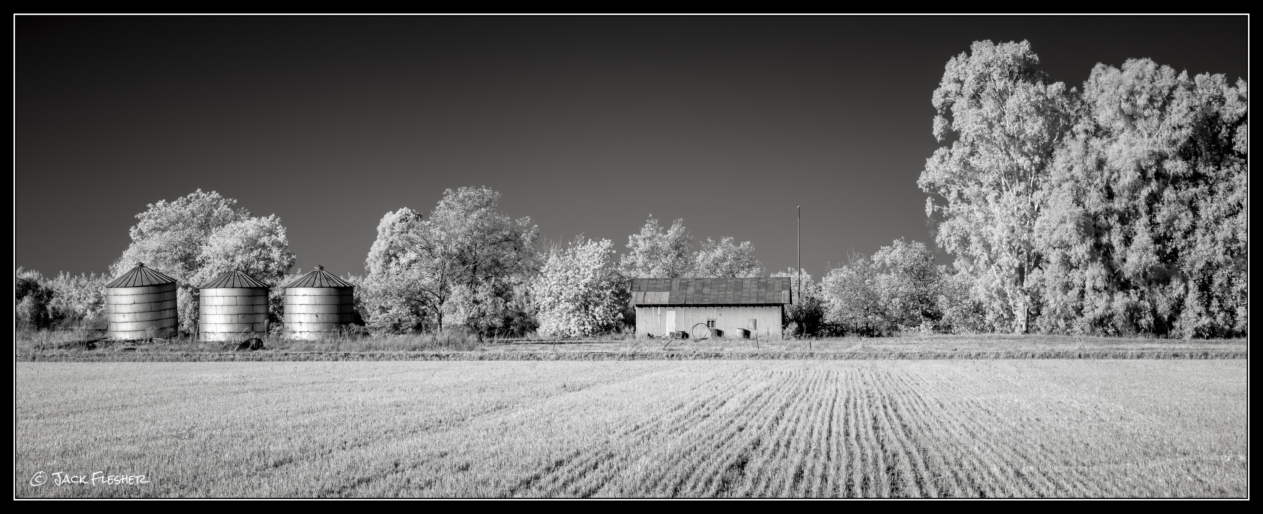
Taken with 720 IR
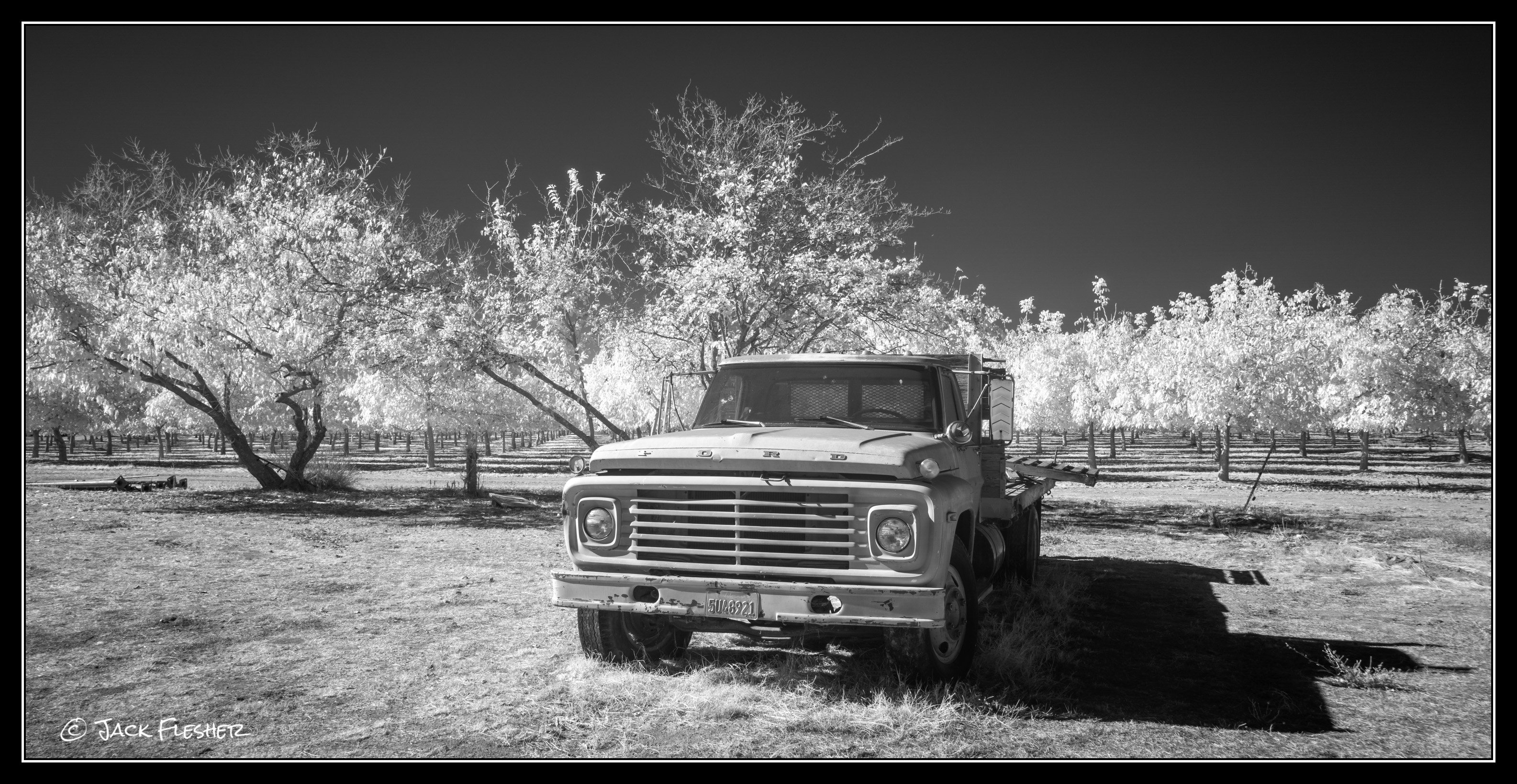
Taken with 850 IR
Taken with 720 IR
ILCE-7RM4 E 28-75mm F2.8-2.8 lens 60mm f/8.0 1/320s 100 ISO 0.0 EV
Taken with 850 IR
ILCE-7RM4 E 28-75mm F2.8-2.8 lens 28mm f/8.0 1/60s 100 ISO 0.0 EV
Nov 11, 2026 at 01:19 PM
p.5286 #7Sony FE Images Thread
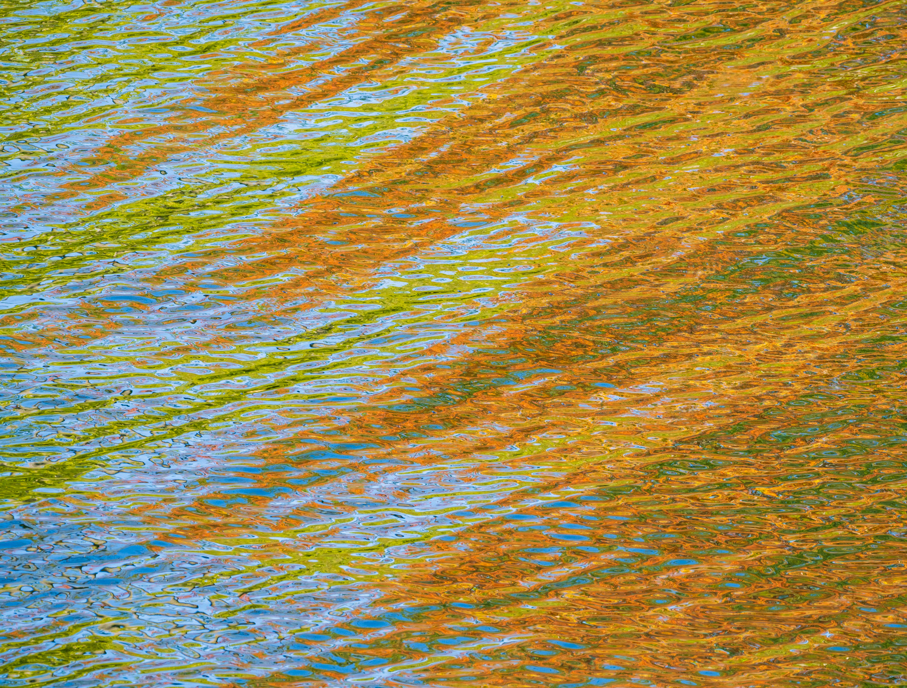
Fall color reflections in lake, A7RV + Sigma 500/5.6
|
||
 |
||
|
Nov 11, 2026 at 09:29 PM

p.5286 #9Sony FE Images Thread
Jack Flesher wrote:
Rice country, found in the central Sacramento Valley, CA.
Love the second one! You are getting good with it.
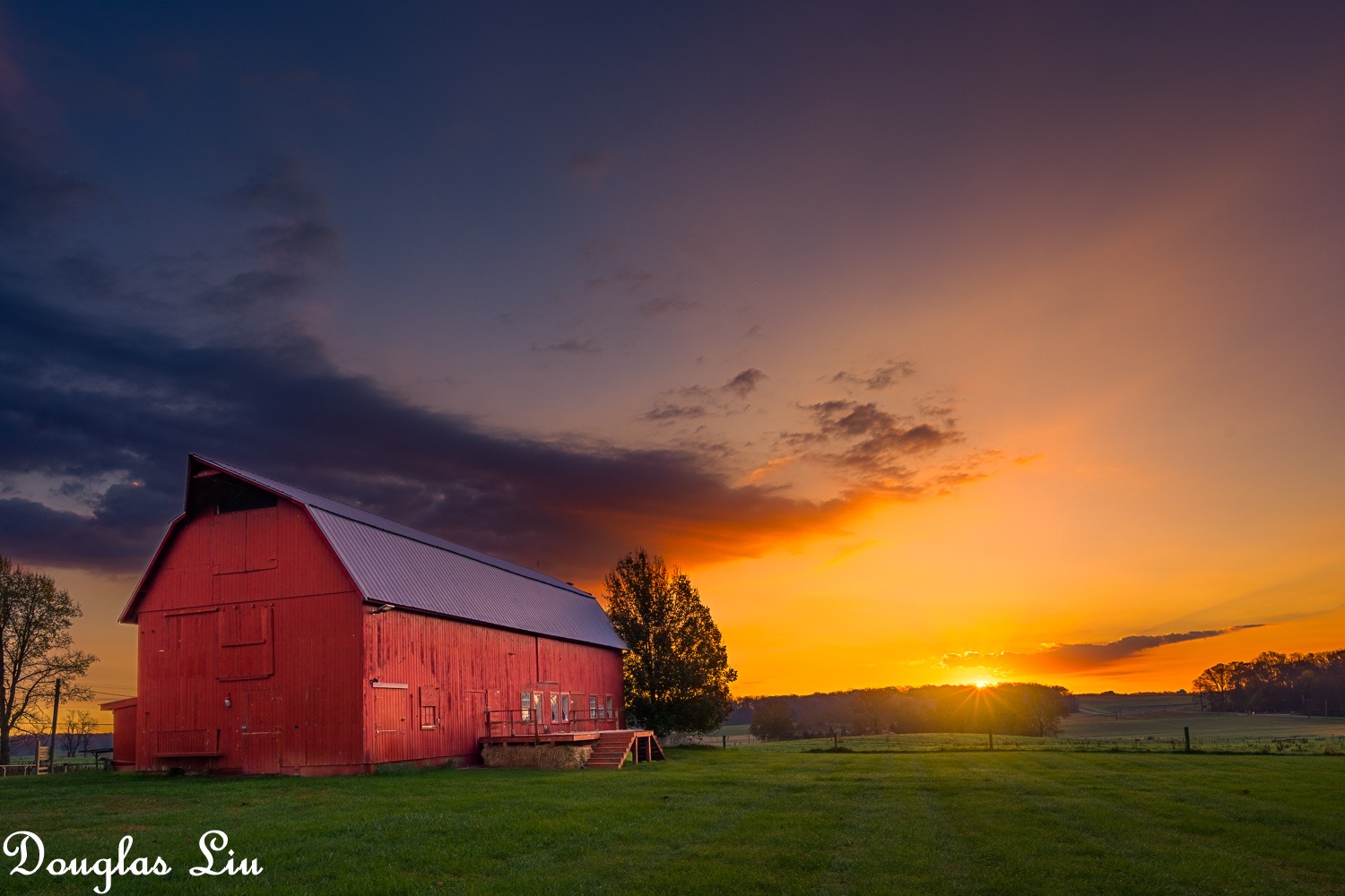
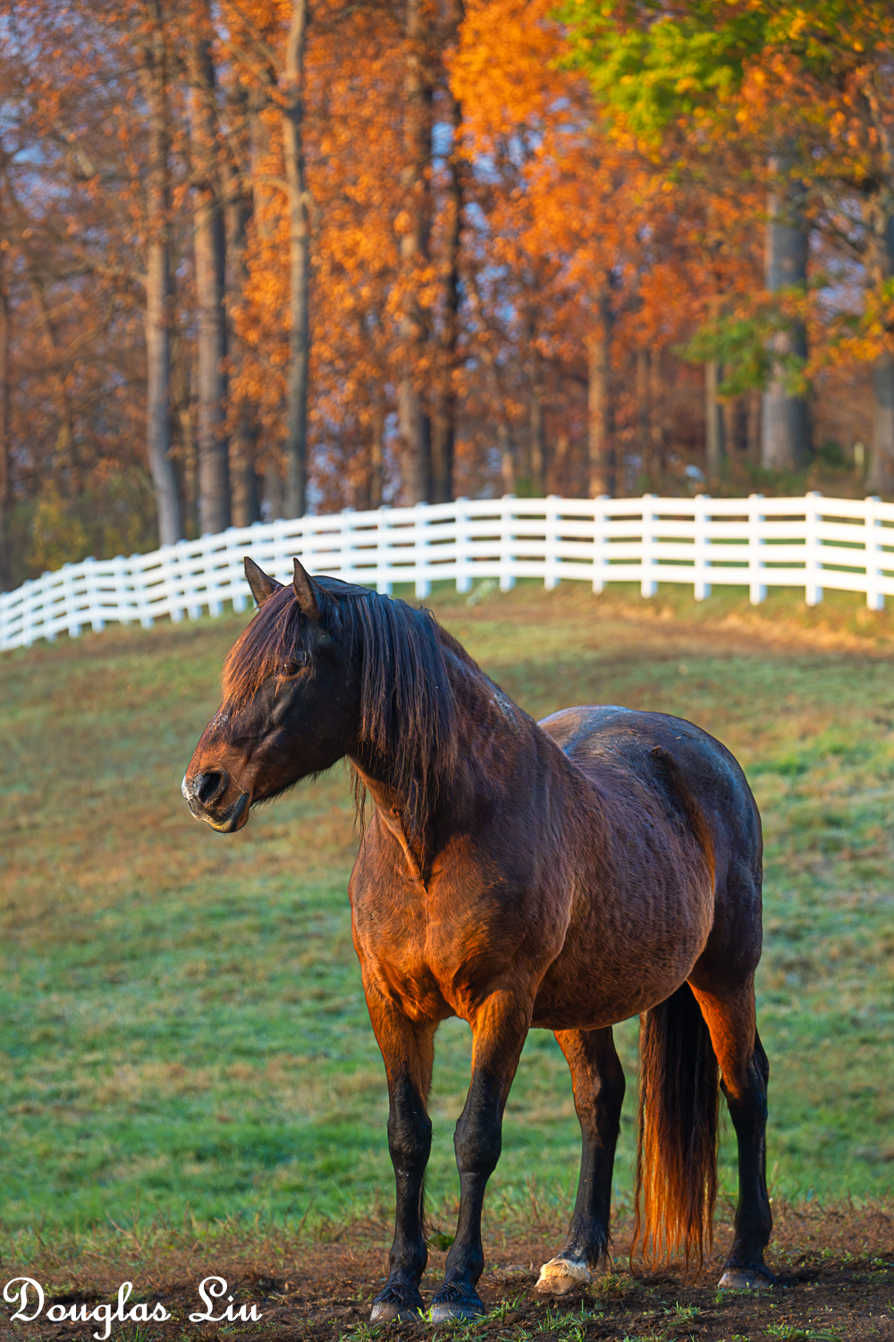
From yesterday.
-2, 0,+2 HDR.
Rice country, found in the central Sacramento Valley, CA.
Love the second one! You are getting good with it.
From yesterday.
 |
||
 |
||
|
-2, 0,+2 HDR.
ILCE-7RM6 Voigtlander NOKTON 21mm F1.4 Aspherical lens 21mm f/10.0 1/400s 100 ISO -2.0 EV
|
||
 |
||
|
ILCE-7RM6 E 50-400mm F4.5-6.3 A067 lens 171mm f/6.3 1/160s 1600 ISO -0.7 EV
Nov 12, 2026 at 03:36 AM
p.5286 #10Sony FE Images Thread
Douglas L wrote:
Love the second one! You are getting good with it.
From yesterday.
Thanks — there’s definitely a learning curve!
Jack Flesher wrote
Rice country, found in the central Sacramento Valley, CA.From yesterday.
Thanks — there’s definitely a learning curve!
Nov 12, 2026 at 09:14 AM
|
p.5286 #11Sony FE Images Thread
Colourful November cherries.
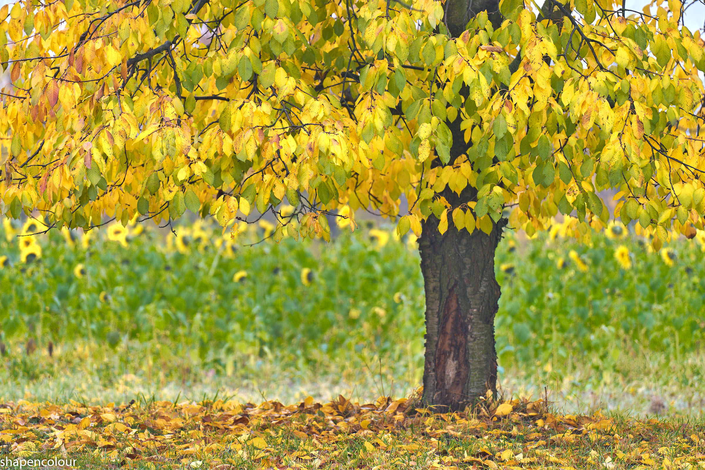
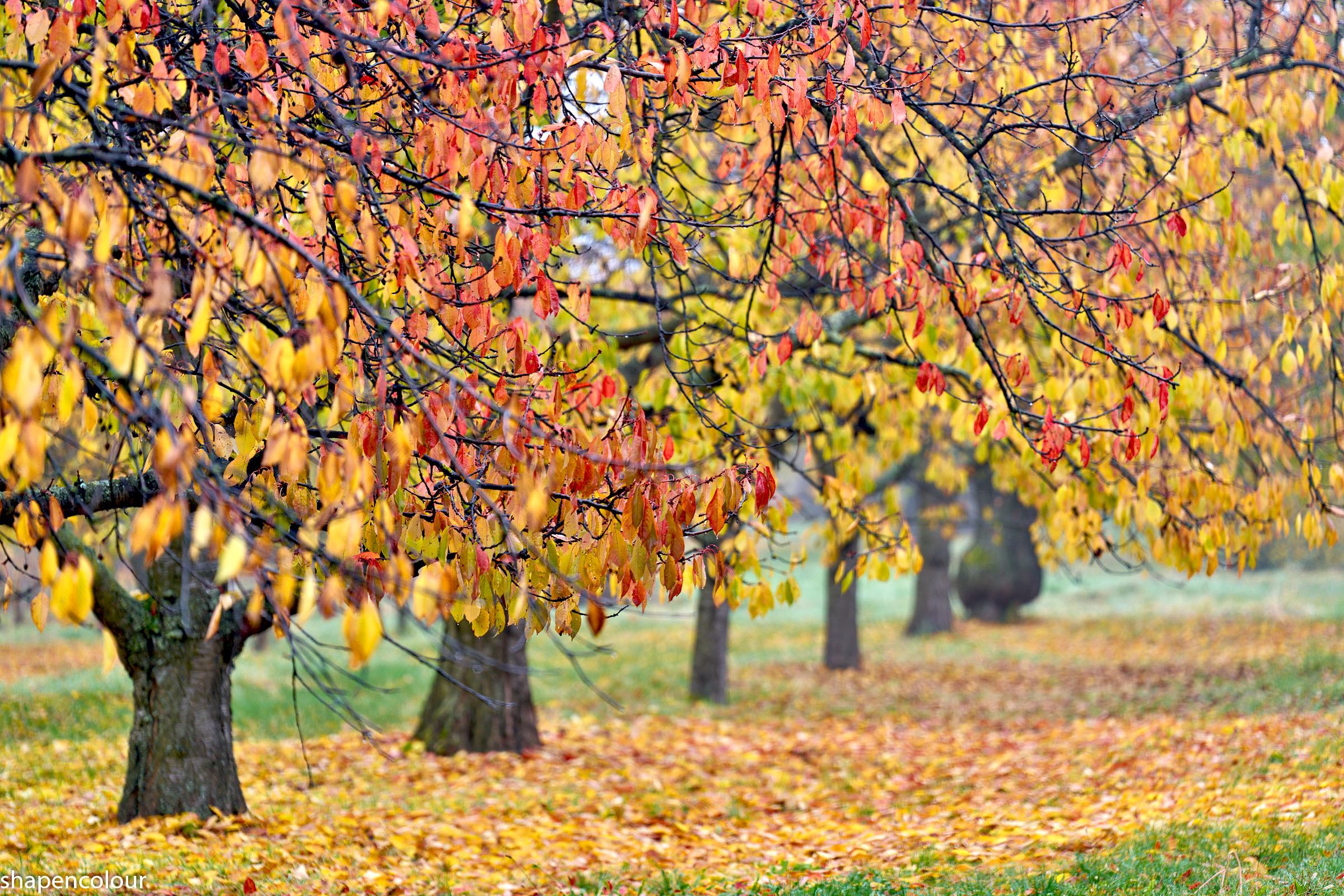
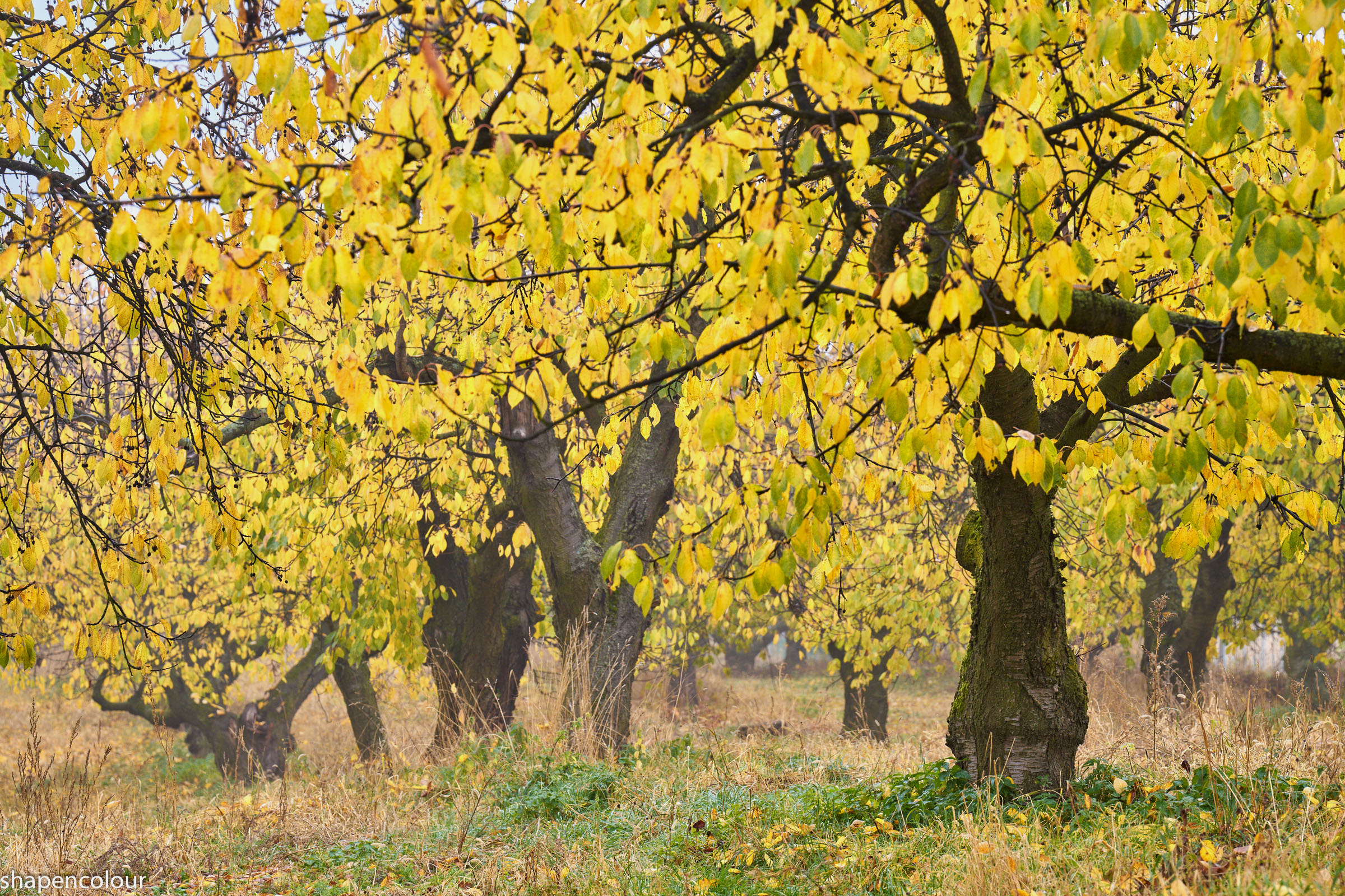
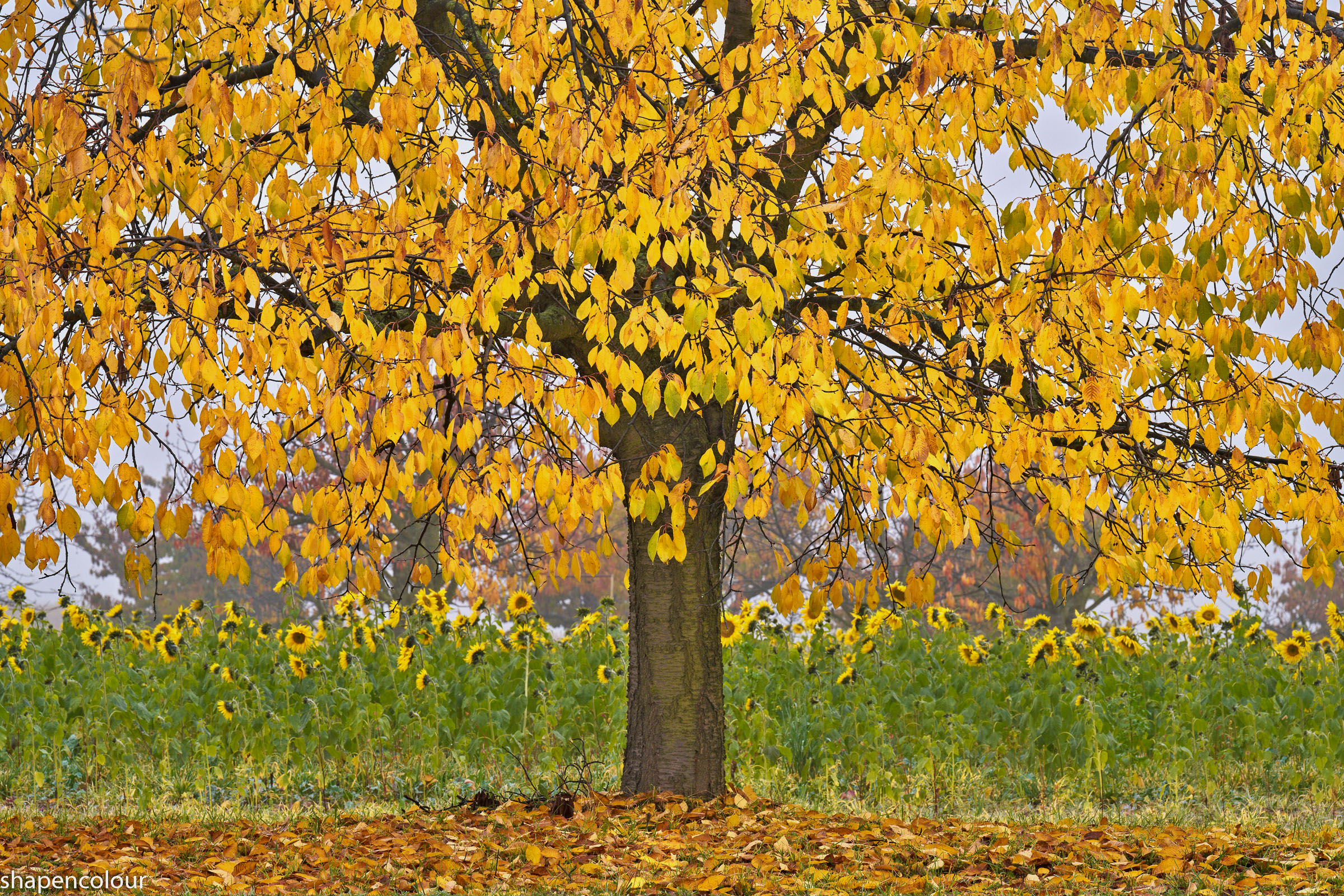
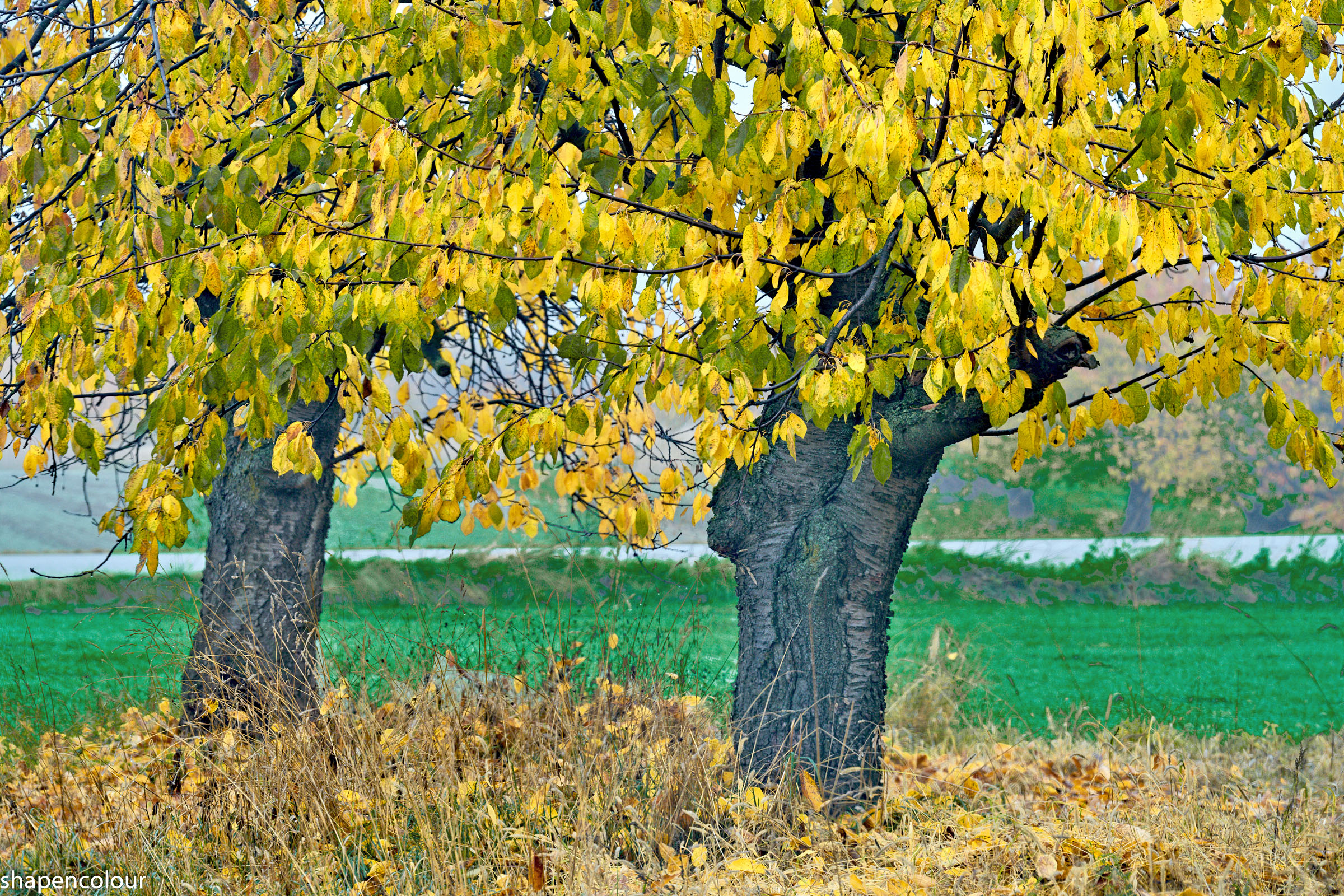
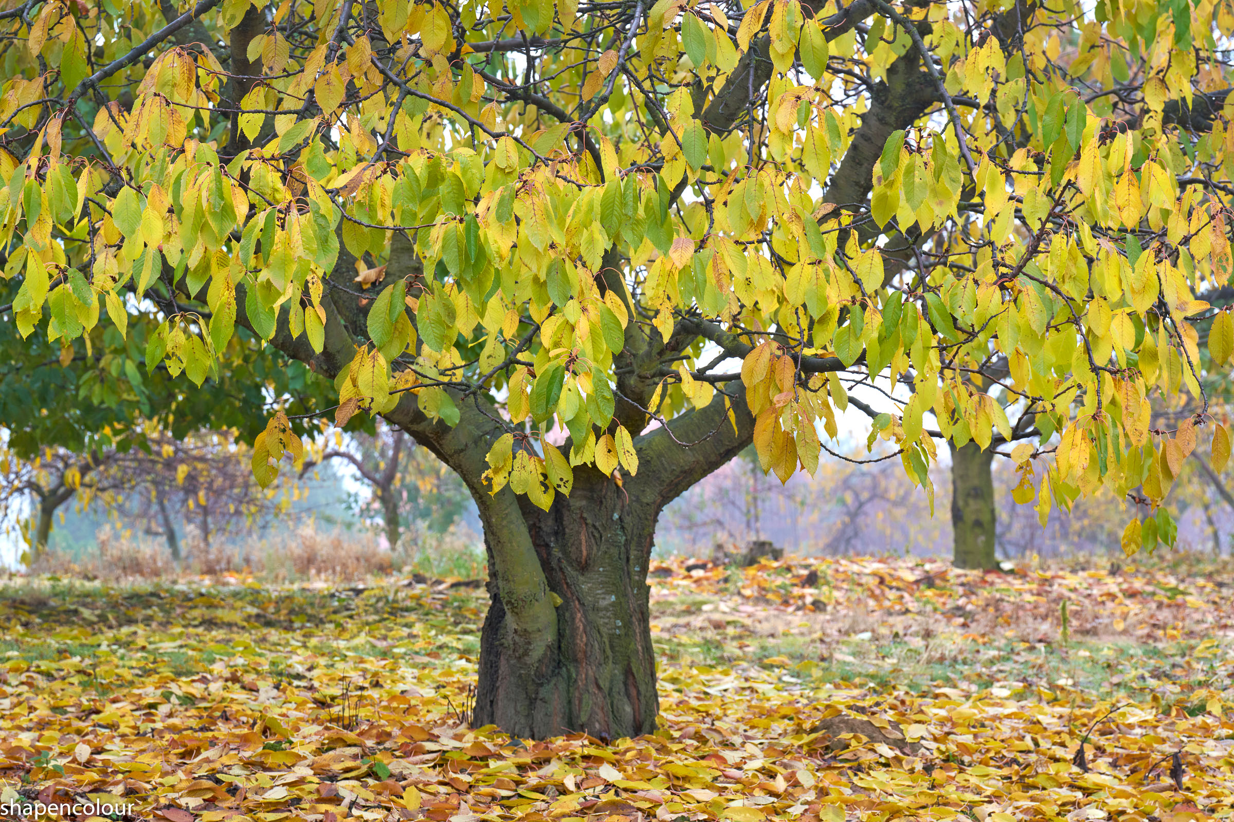
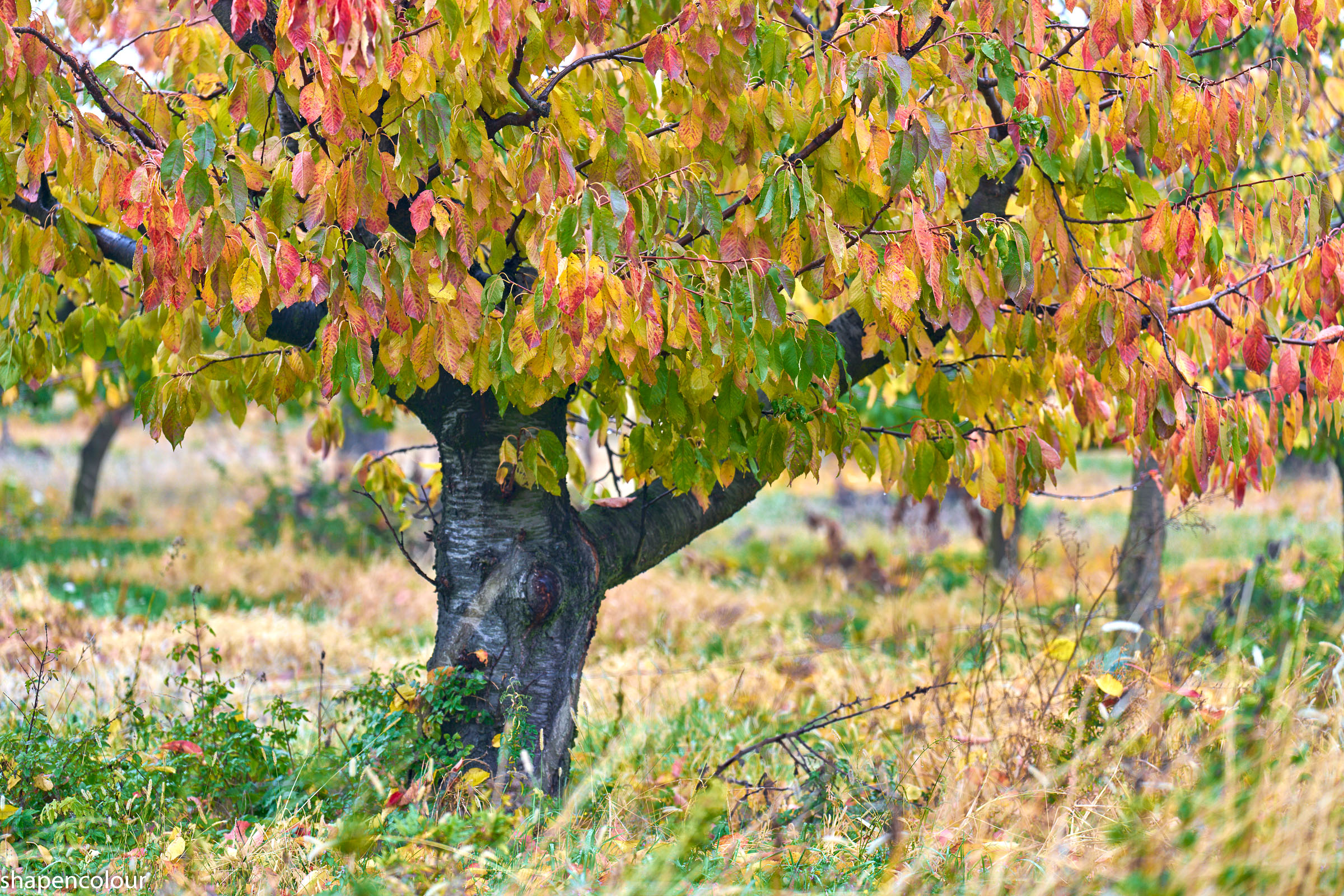
ILCE-7RM5 Sony FE 70-200mm F2.8 GM OSS II (SEL70200GM2) lens 200mm f/2.8 1/250s 100 ISO 0.0 EV
ILCE-7RM5 Sony FE 70-200mm F2.8 GM OSS II (SEL70200GM2) lens 160mm f/2.8 1/160s 100 ISO 0.0 EV
ILCE-7RM5 Sony FE 70-200mm F2.8 GM OSS II (SEL70200GM2) lens 154mm f/8.0 1/60s 400 ISO 0.0 EV
ILCE-7RM5 Sony FE 70-200mm F2.8 GM OSS II (SEL70200GM2) lens 173mm f/11.0 1/60s 250 ISO 0.0 EV
ILCE-7RM5 Sony FE 70-200mm F2.8 GM OSS II (SEL70200GM2) lens 160mm f/8.0 1/60s 320 ISO 0.0 EV
ILCE-7RM5 Sony FE 70-200mm F2.8 GM OSS II (SEL70200GM2) lens 110mm f/8.0 1/60s 400 ISO 0.0 EV
ILCE-7RM5 Sony FE 70-200mm F2.8 GM OSS II (SEL70200GM2) lens 128mm f/2.8 1/100s 100 ISO 0.0 EV
Nov 12, 2026 at 10:50 AM
p.5286 #12Sony FE Images Thread
For whatever reason, a few of the posters images on this forum render on my display as sort of "washed out" for lack of a better term. Most look normal saturation and contrast to me. I am wondering if this is a stylistic choice, like they purposefully use heavier negative clarity and/or negative contrast and saturation, or maybe just lift shadows heavily? Or perhaps it's a profile mismatch they're unaware of, like perhaps they're posting Adobe RGB JPEG images in sRGB colorspace? I am only curious and don't want to name names so as to avoid offending anybody, but wondering if it's intentional or perhaps something is wrong with my monitor or browser?
Nov 12, 2026 at 12:00 PM
p.5286 #13Sony FE Images Thread
.
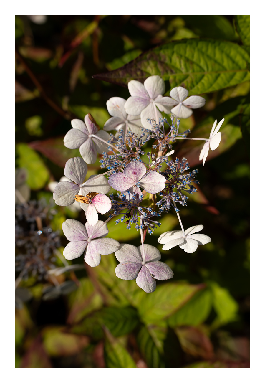
ILCE-7RM5 35mm f/5.6 1/1000s 100 ISO -1.0 EV
Nov 12, 2026 at 01:45 PM
p.5286 #14Sony FE Images Thread
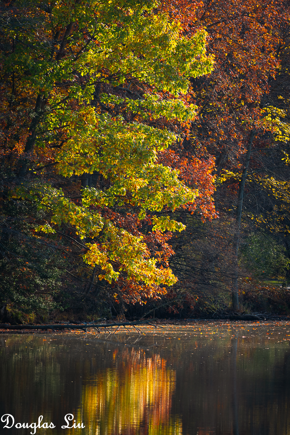
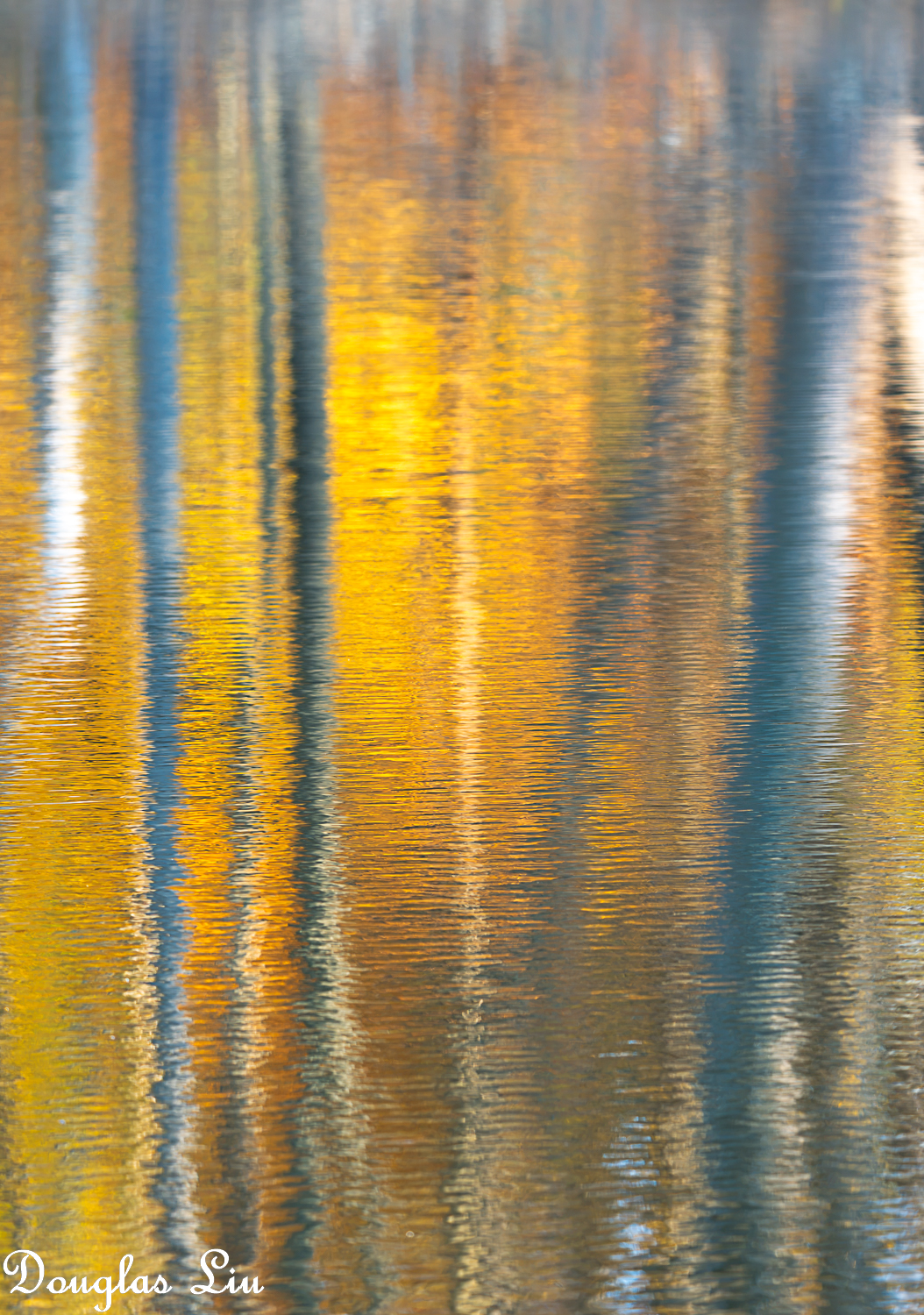
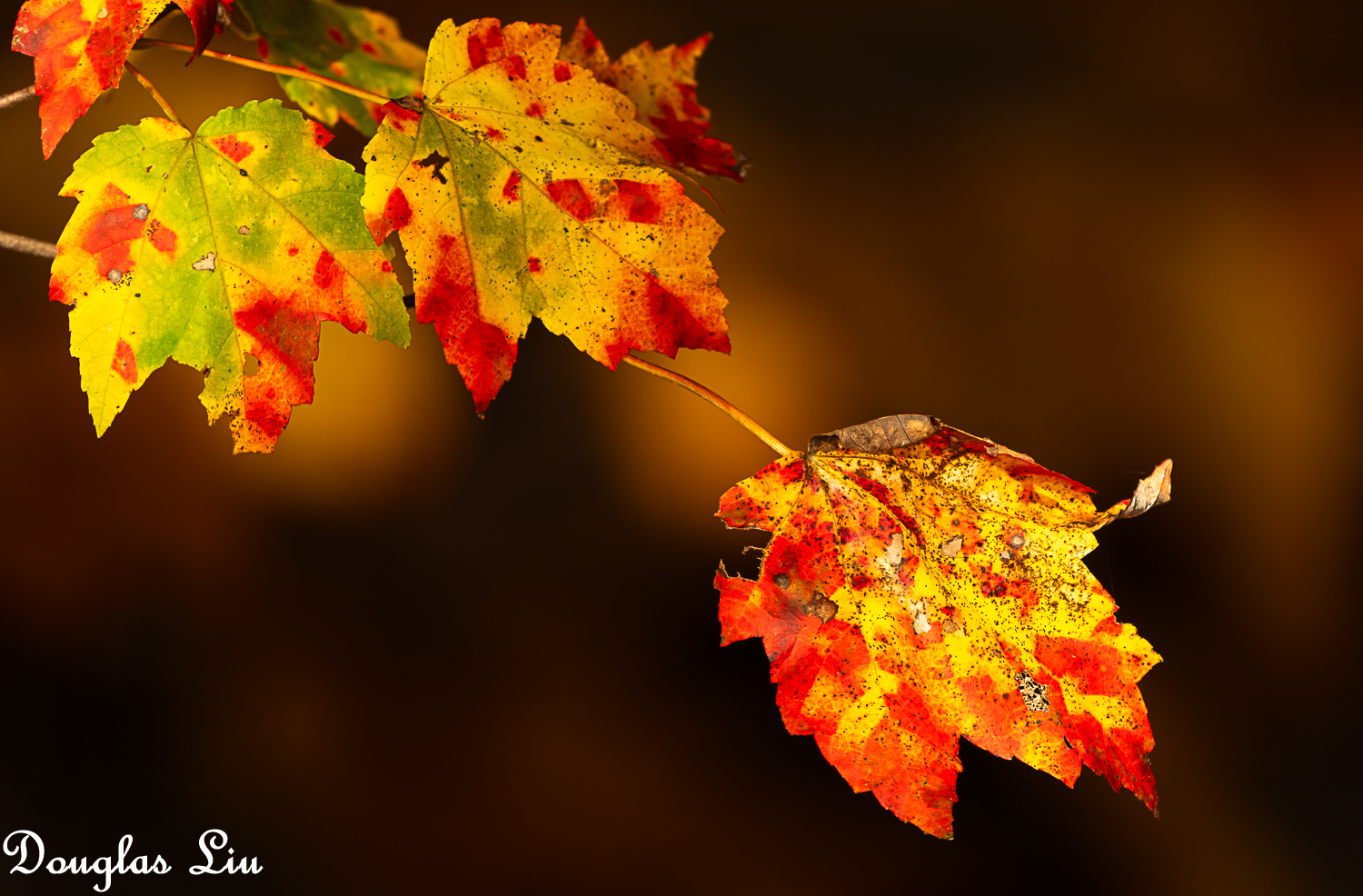
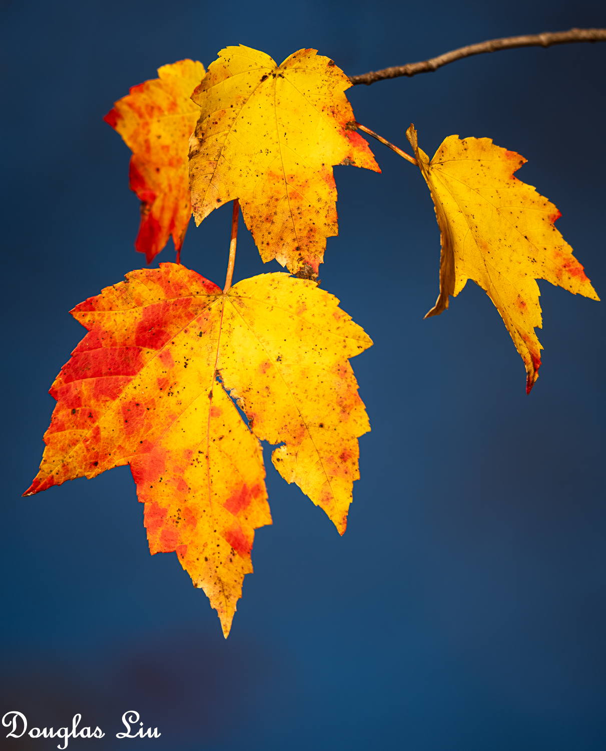
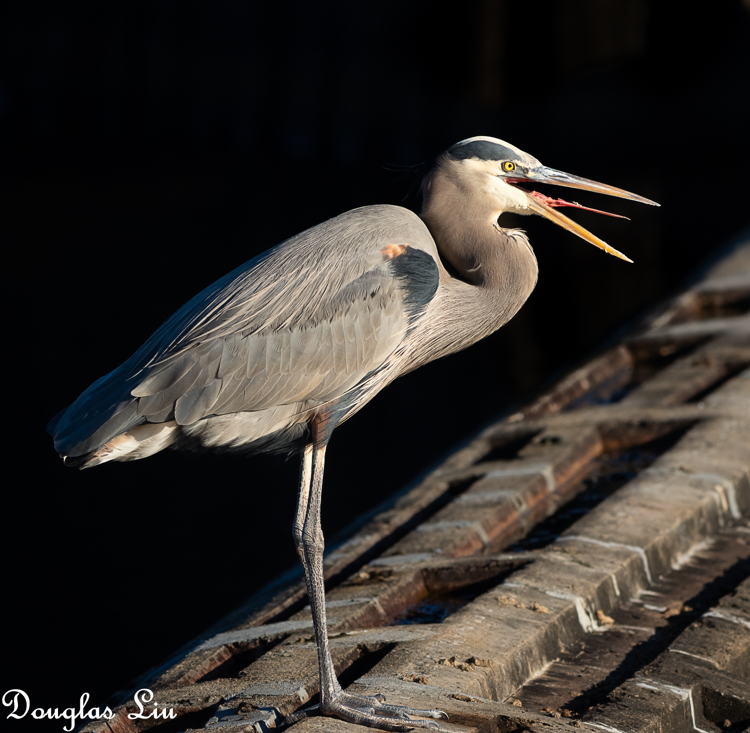
From yesterday... There are still leaves here and there.
 |
||
 |
||
|
ILCE-1M2 FE 400-800mm F6.3-8 G OSS lens 400mm f/8.0 1/125s 100 ISO 0.0 EV
|
||
 |
||
|
ILCE-1M2 FE 400-800mm F6.3-8 G OSS lens 423mm f/8.0 1/80s 100 ISO 0.0 EV
|
||
 |
||
|
ILCE-1M2 FE 400-800mm F6.3-8 G OSS lens 800mm f/8.0 1/320s 200 ISO 0.0 EV
|
||
 |
||
|
ILCE-1M2 FE 400-800mm F6.3-8 G OSS lens 637mm f/8.0 1/320s 100 ISO 0.0 EV
|
||
 |
||
|
ILCE-1M2 FE 400-800mm F6.3-8 G OSS lens 800mm f/8.0 1/1000s 500 ISO -1.3 EV
Nov 12, 2026 at 03:23 PM
p.5286 #15Sony FE Images Thread
We call him Seven.
a1, 70-350 lens.
1/400, f6.3, iso 1600.

a1, 70-350 lens.
1/400, f6.3, iso 1600.
Nov 12, 2026 at 04:00 PM
p.5286 #16Sony FE Images Thread
First Encounter Beach at low tide, Eastham, Cape Cod, MA.
ILCE-1 / 20-70
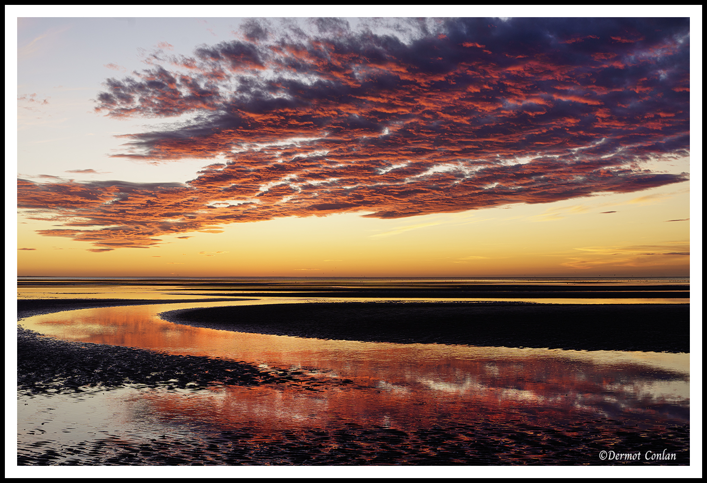
ILCE-1 / 20-70
Nov 12, 2026 at 05:37 PM
p.5286 #17Sony FE Images Thread
When anyone asks: what middle focal length all round lens should I buy for my Sony camera' I suggest the FE 55mm f1.8 ZA, to give it the full name. Well, a major dealer I have good words to say about - BH Photo Video - list this very good lens as 'discontinued' for reasons known only to themselves. It uses the same formula as the RX1 and Leica, of many aspherical surfaces in a low element count lens. It's available new in the UK and Australia, maybe it is a matter of taste. Why do I like it? Here are a few diverse people images:
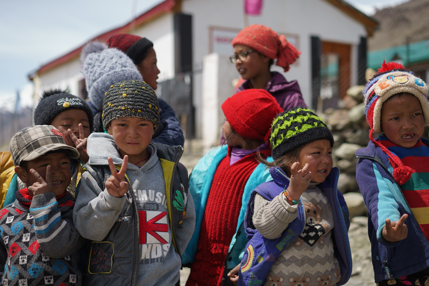
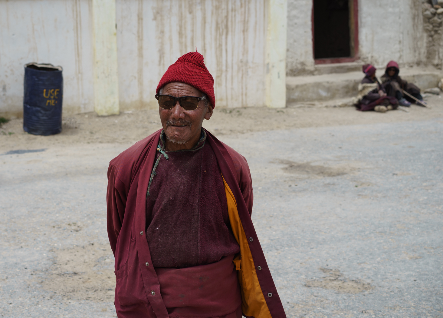

Tibetans show their tongue if they are human beings; demons tongues are black.
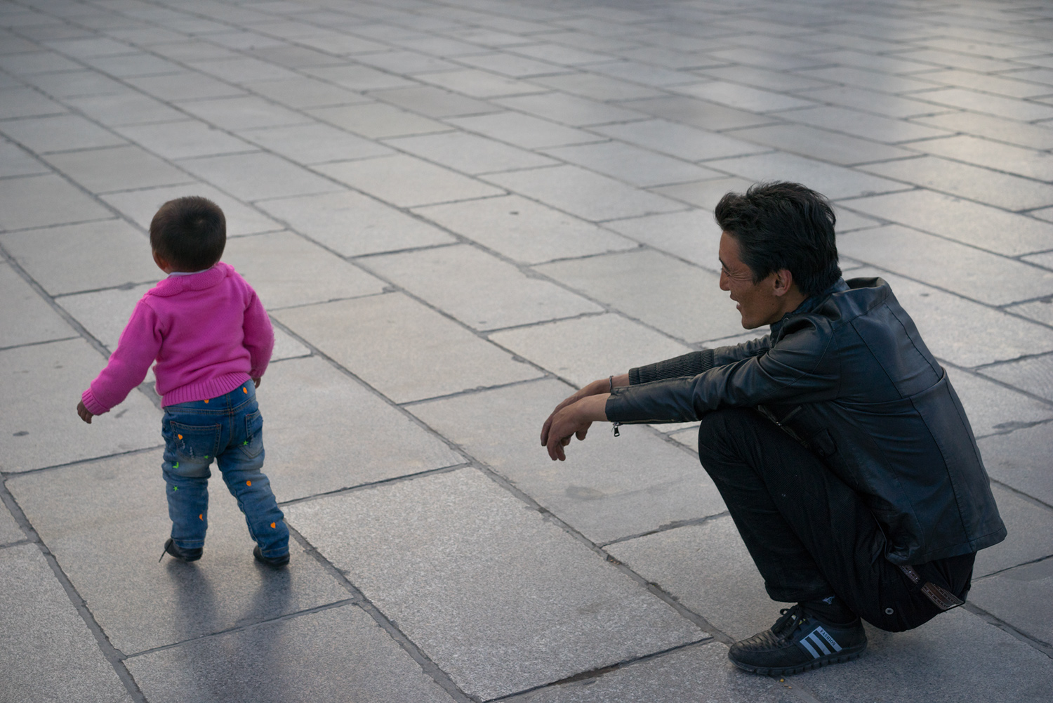
Tibetans show their tongue if they are human beings; demons tongues are black.
Nov 12, 2026 at 07:14 PM
p.5286 #18Sony FE Images Thread
Jack Flesher wrote:
For whatever reason, a few of the posters images on this forum render on my display as sort of "washed out" for lack of a better term. Most look normal saturation and contrast to me. I am wondering if this is a stylistic choice, like they purposefully use heavier negative clarity and/or negative contrast and saturation, or maybe just lift shadows heavily? Or perhaps it's a profile mismatch they're unaware of, like perhaps they're posting Adobe RGB JPEG images in sRGB colorspace? I am only curious and don't want to name names so as to avoid offending anybody, but...Show more →
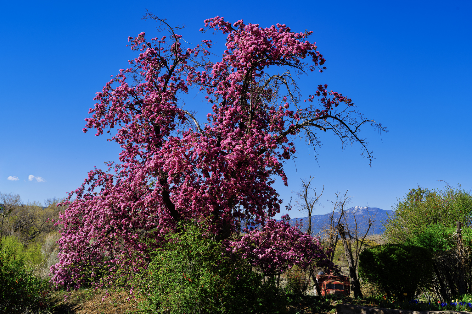
Hey Jack, I have struggled with what profile to use when posting here for best display of my photos. My workflow is RAW ProPhoto RGB from Lightroom Classic > Photoshop and then back to Lightroom Classic saved as a tiff file. From Lightroom Classic I export with color profile embedded. I was always using sRGB but recently started using Display P3 as it has a higher gamut and retains better colors especially for greens, oranges, reds, and yellows. Display P3 seems to be heading toward the new standard for internet sharing and display over the old sRGB standard. As far as I can tell, this site does not strip the profile and I assume most browsers/monitors can display P3 properly. Is it my images you are referring to? Maybe you could mention what posters you see this with and we can all learn here. What is your method of posting on the site? Do you output to sRGB? Do you embed profile? Here are two versions of the same image - the first has sRGB profile embedded and the second Display P3 profile embedded. Let me know if one looks better than the other or if one is grossly washed out or they look the same. And what do you think are the best color profile posting practices, I'd be curious to hear your insights?
Taos, New Mexico in Spring - 1st is sRGB, 2nd is Display P3
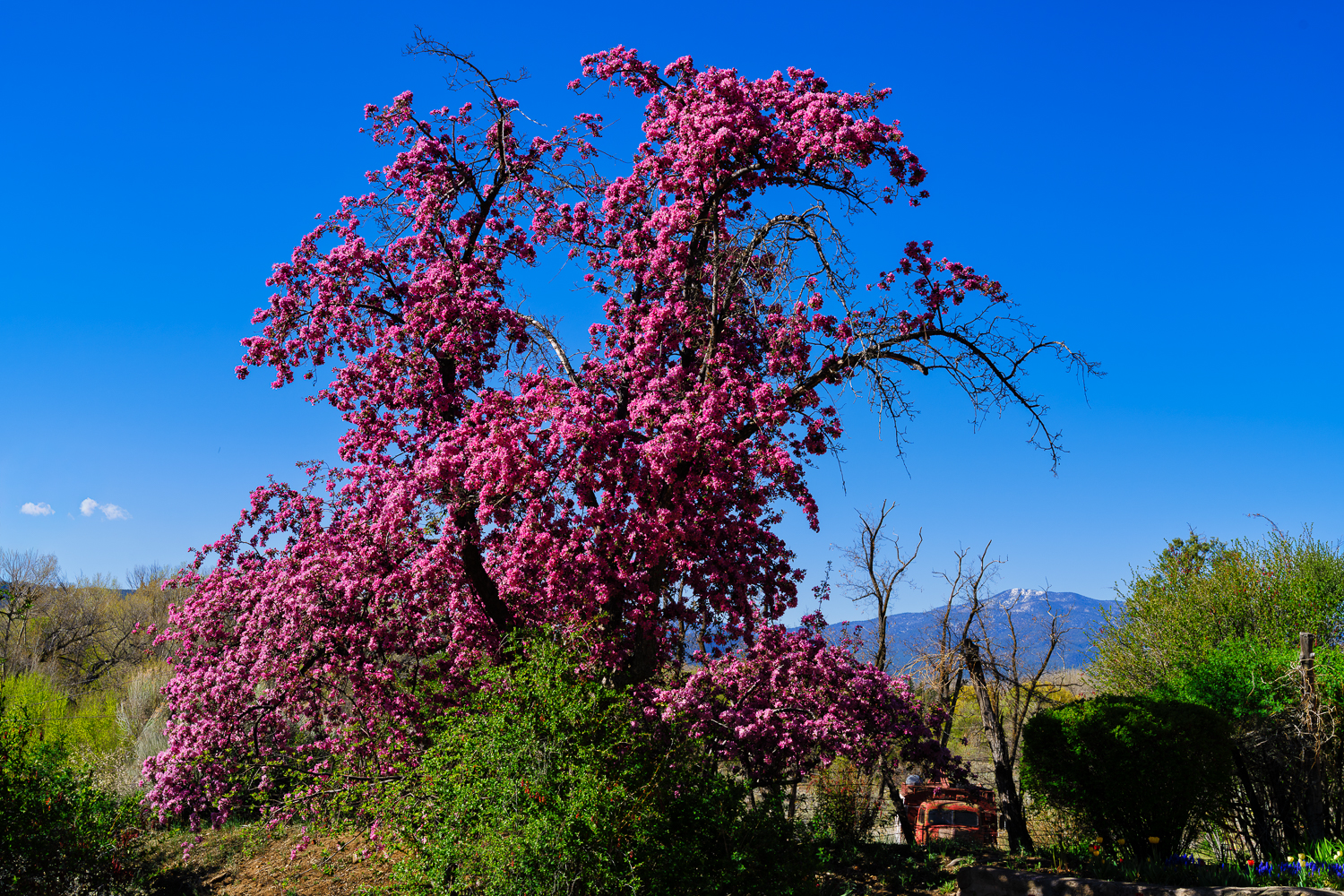
For whatever reason, a few of the posters images on this forum render on my display as sort of "washed out" for lack of a better term. Most look normal saturation and contrast to me. I am wondering if this is a stylistic choice, like they purposefully use heavier negative clarity and/or negative contrast and saturation, or maybe just lift shadows heavily? Or perhaps it's a profile mismatch they're unaware of, like perhaps they're posting Adobe RGB JPEG images in sRGB colorspace? I am only curious and don't want to name names so as to avoid offending anybody, but...Show more →
Hey Jack, I have struggled with what profile to use when posting here for best display of my photos. My workflow is RAW ProPhoto RGB from Lightroom Classic > Photoshop and then back to Lightroom Classic saved as a tiff file. From Lightroom Classic I export with color profile embedded. I was always using sRGB but recently started using Display P3 as it has a higher gamut and retains better colors especially for greens, oranges, reds, and yellows. Display P3 seems to be heading toward the new standard for internet sharing and display over the old sRGB standard. As far as I can tell, this site does not strip the profile and I assume most browsers/monitors can display P3 properly. Is it my images you are referring to? Maybe you could mention what posters you see this with and we can all learn here. What is your method of posting on the site? Do you output to sRGB? Do you embed profile? Here are two versions of the same image - the first has sRGB profile embedded and the second Display P3 profile embedded. Let me know if one looks better than the other or if one is grossly washed out or they look the same. And what do you think are the best color profile posting practices, I'd be curious to hear your insights?
Taos, New Mexico in Spring - 1st is sRGB, 2nd is Display P3
ILCE-7RM5 FE 50mm F1.4 GM lens 50mm f/13.0 1/100s 100 ISO 0.0 EV
ILCE-7RM5 FE 50mm F1.4 GM lens 50mm f/13.0 1/100s 100 ISO 0.0 EV
Nov 12, 2026 at 10:14 PM
p.5286 #19Sony FE Images Thread
Color profile test in regard to my last post responding to Jack - this one shows more of a difference, 1st is sRGB color profile embedded, 2nd has Display P3 profile embedded. On my monitor the P3 looks richer and has better greens. Let me know if you see a difference and what your posting methods/profile used are.
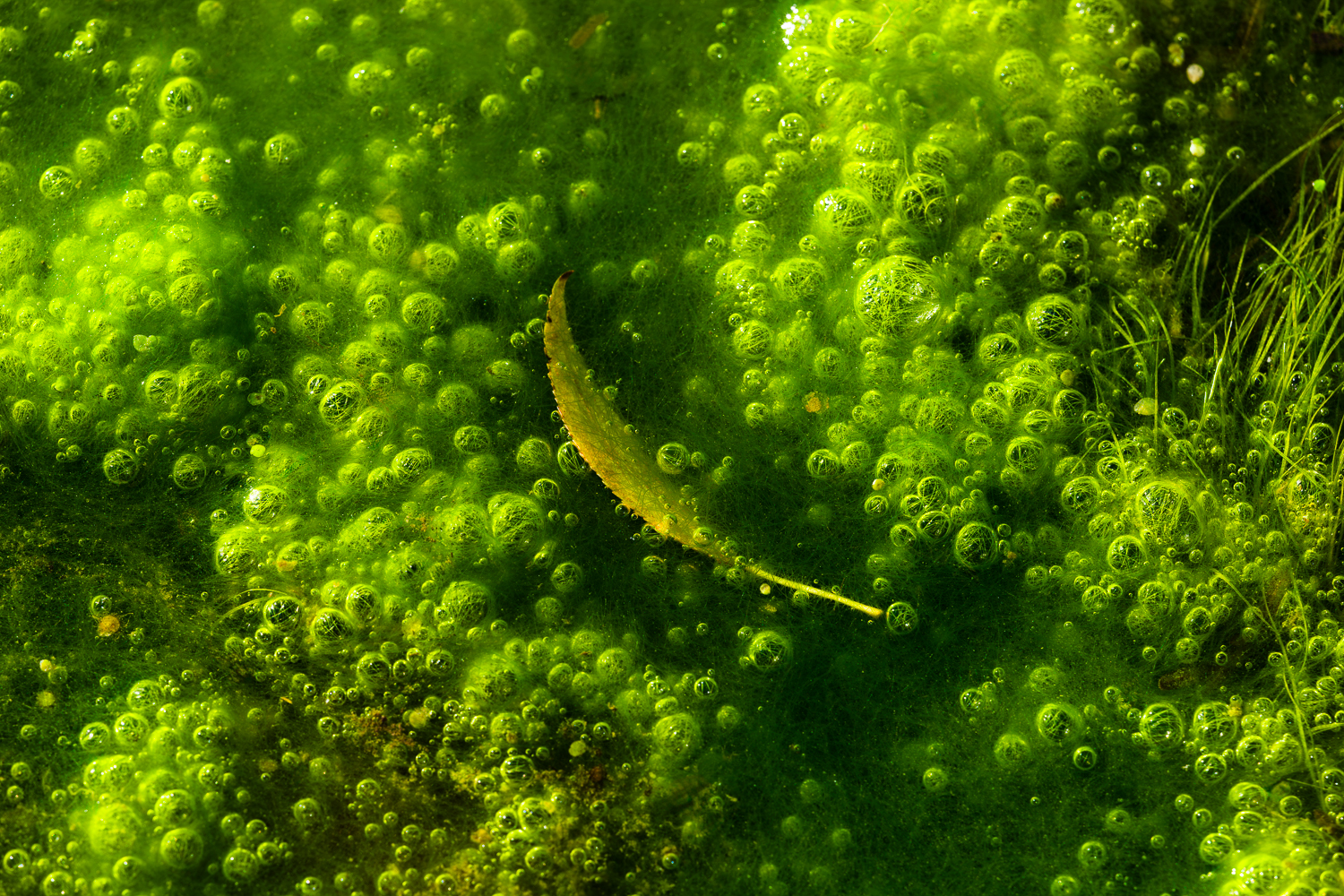
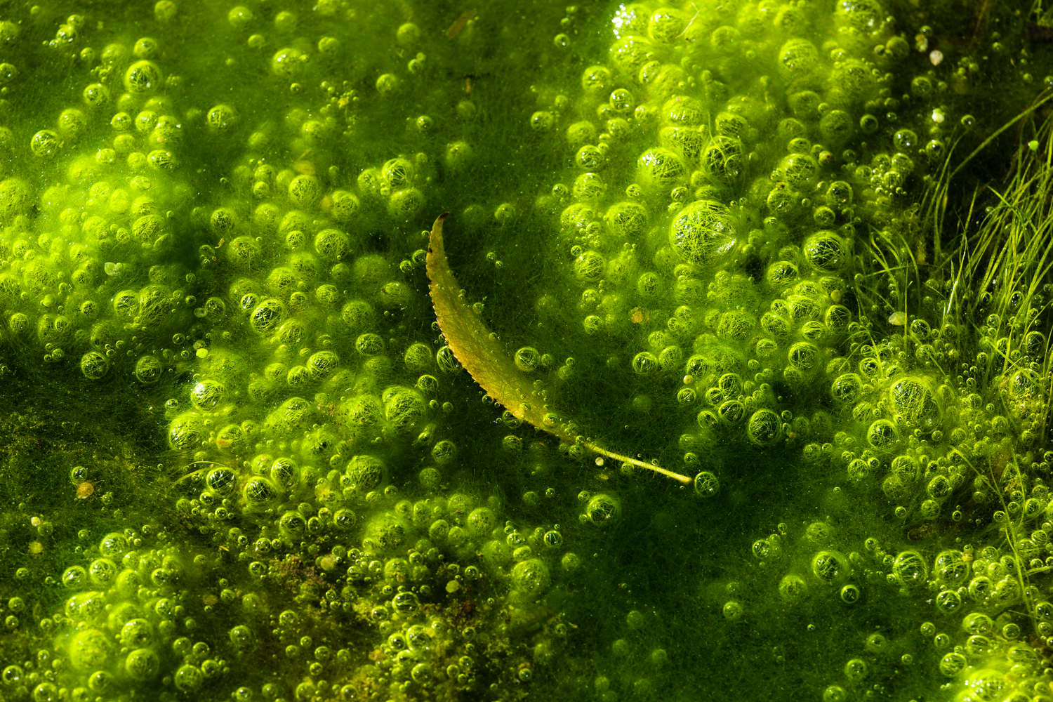
ILCE-7RM6 Voigtlander MACRO APO-LANTHAR 110mm F2.5 lens 110mm f/8.0 1/125s 100 ISO 0.0 EV
ILCE-7RM6 Voigtlander MACRO APO-LANTHAR 110mm F2.5 lens 110mm f/8.0 1/125s 100 ISO 0.0 EV
Nov 12, 2026 at 10:31 PM
p.5286 #20Sony FE Images Thread
adventure_photo wrote:
Hey Jack, I have struggled with what profile to use when posting here for best display of my photos. My workflow is RAW ProPhoto RGB from Lightroom Classic > Photoshop and then back to Lightroom Classic saved as a tiff file. From Lightroom Classic I export with color profile embedded. I was always using sRGB but recently started using Display P3 as it has a higher gamut and retains better colors especially for greens, oranges, reds, and yellows. Display P3 seems to be heading toward the new standard for internet sharing and display over the old sRGB standard. As far...Show more →
Appreciate the reply. No, it is not your images I was referring to, yours look well balanced and properly saturated on all my devices. I'm not going to single anyone out as I meant for this to be a more generic discussion, but there are some on this page. Let me also clarify that the flatter effect is not huge, but still obvious enough I can see it on my iPhone screen.
As for my own process. I shoot and do initial edits in raw and convert that out to a 16-bit PSD in Image P3 for additional editing in PS. I will work the image to taste in PS and save it as a working file which is often layered. I use psd's because they're more efficient than saving layered tiffs. Then if posting to web or social media, I do convert them to 8-bit sRGB JPEG's. My process for that is I flatten the layered Image P3 psd file, size to whatever the destination uses, "convert*" (different than assign!) to sRGB colorspace (via "perceptual" rendering intent) and change to 8-bit depth, and then finally save out as a JPEG. Of course all this is done via dedicated actions, so it's a button push to get the resulting image.
*I suspect some use "assign" which can create some of the flatter effect I was referring to, especially when the original is in a larger color space than the one assigned.
Jack Flesher wrote
For whatever reason, a few of the posters images on this forum render on my display as sort of "washed out" for lack of a better term. Most look normal saturation and contrast to me. I am wondering if this is a stylistic choice, like they purposefully use heavier negative clarity and/or negative contrast and saturation, or maybe just lift shadows heavily? Or perhaps it's a profile mismatch they're unaware of, like perhaps they're posting Adobe RGB JPEG images in sRGB colorspace? I am only curious and don't want to name names so as to avoid offending anybody, but wondering if it's intentional or perhaps something is wrong with my monitor or browser?Appreciate the reply. No, it is not your images I was referring to, yours look well balanced and properly saturated on all my devices. I'm not going to single anyone out as I meant for this to be a more generic discussion, but there are some on this page. Let me also clarify that the flatter effect is not huge, but still obvious enough I can see it on my iPhone screen.
As for my own process. I shoot and do initial edits in raw and convert that out to a 16-bit PSD in Image P3 for additional editing in PS. I will work the image to taste in PS and save it as a working file which is often layered. I use psd's because they're more efficient than saving layered tiffs. Then if posting to web or social media, I do convert them to 8-bit sRGB JPEG's. My process for that is I flatten the layered Image P3 psd file, size to whatever the destination uses, "convert*" (different than assign!) to sRGB colorspace (via "perceptual" rendering intent) and change to 8-bit depth, and then finally save out as a JPEG. Of course all this is done via dedicated actions, so it's a button push to get the resulting image.
*I suspect some use "assign" which can create some of the flatter effect I was referring to, especially when the original is in a larger color space than the one assigned.
Nov 12, 2026 at 10:54 PM