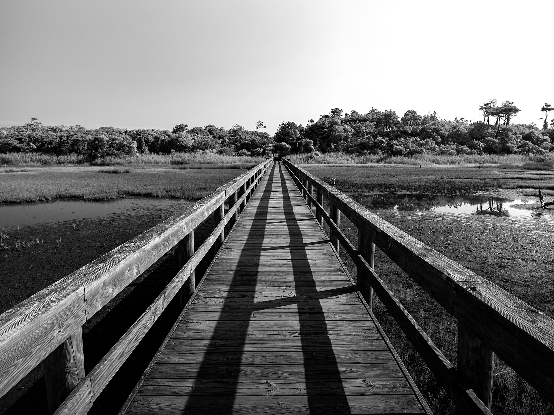
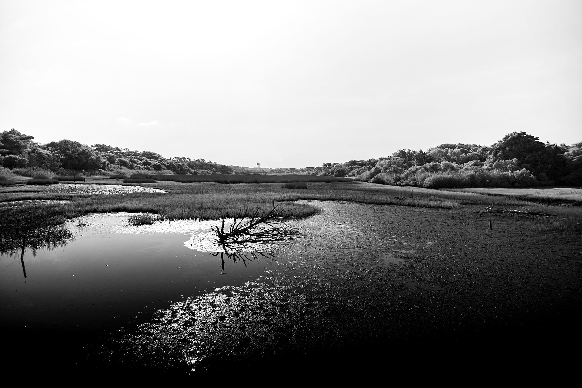
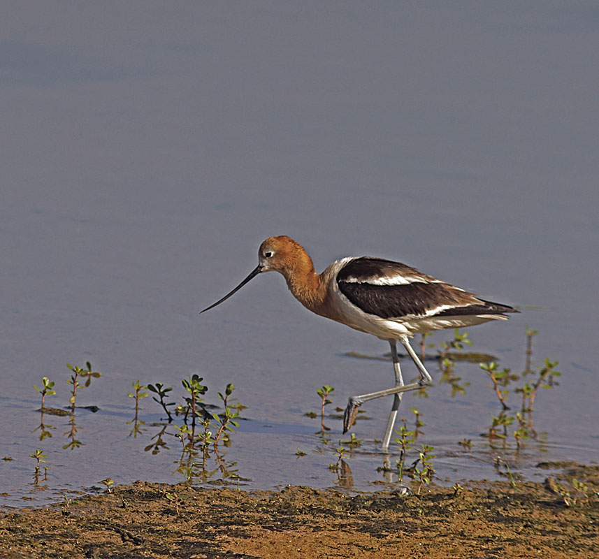
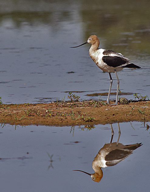
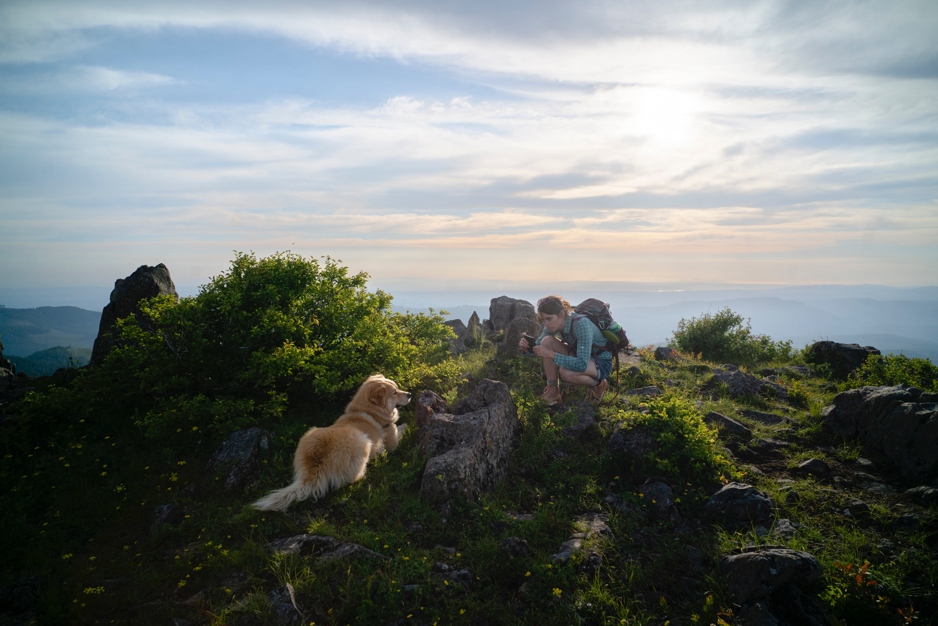
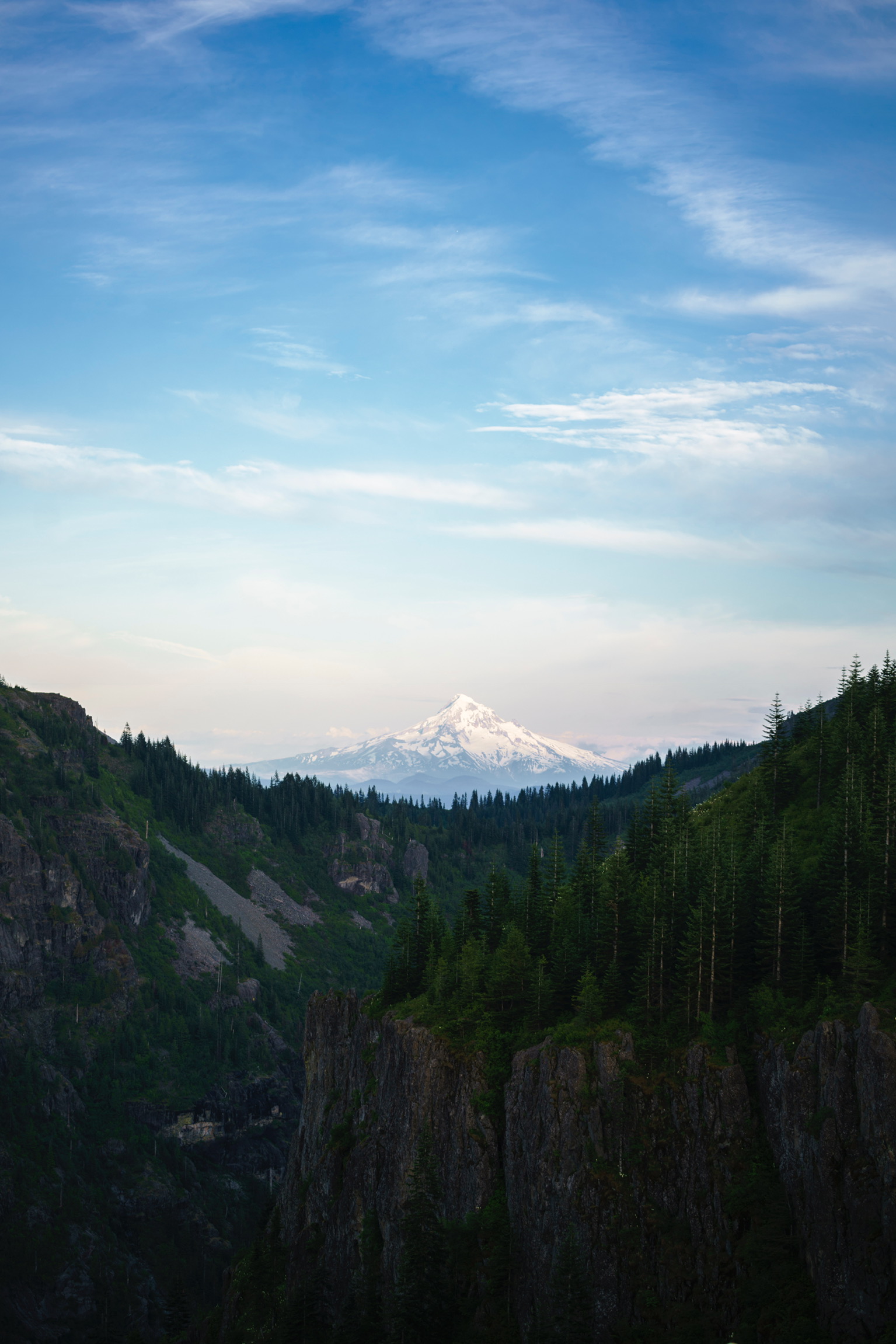
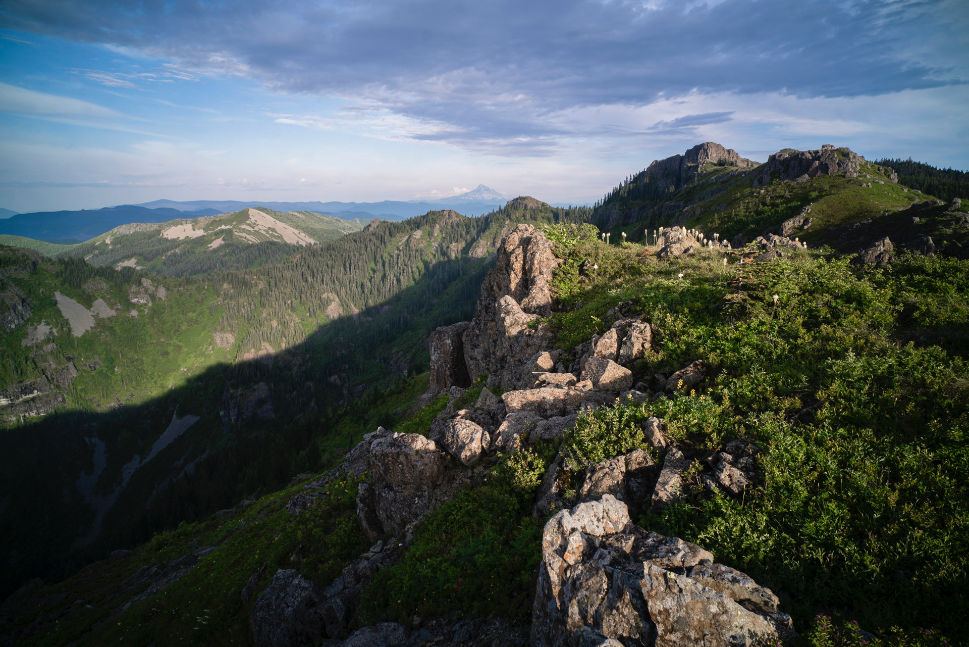
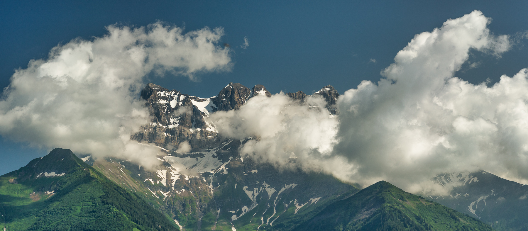
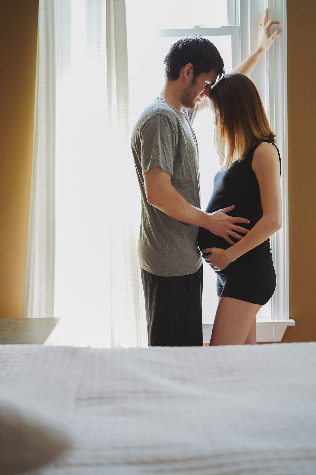
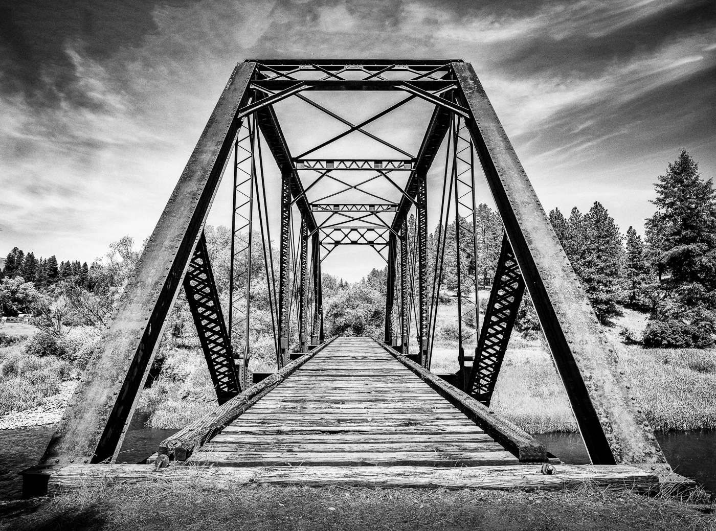
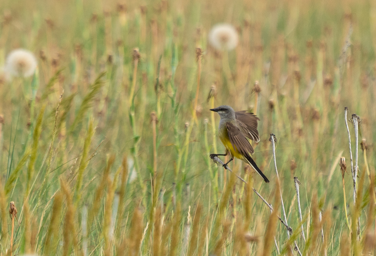
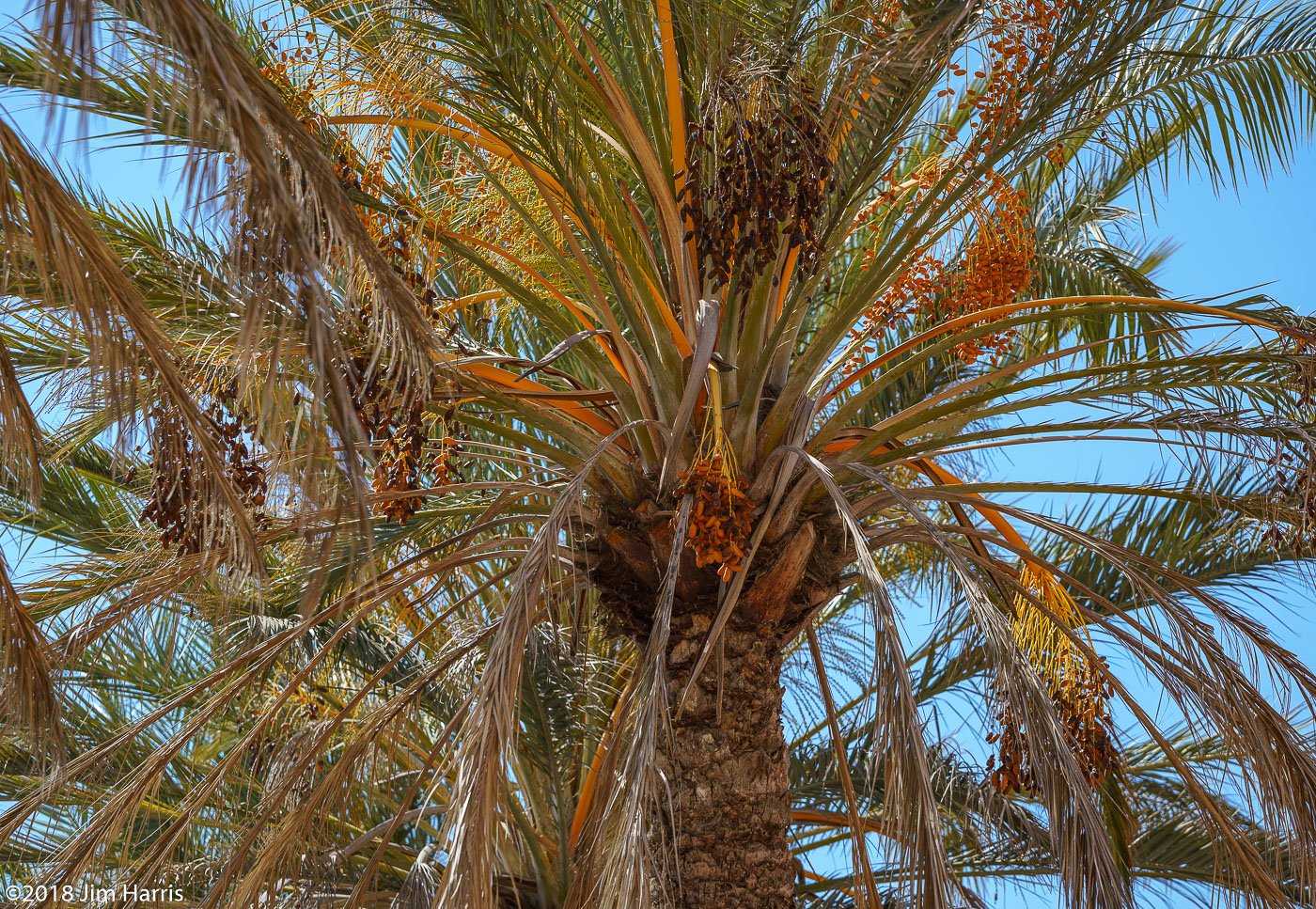
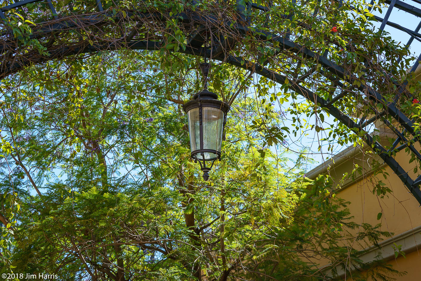
Haven't gotten a lot of shooting in recently, hope to remedy next week. Doing a bit of testing this morning though and got a couple frames I liked well enough. Full Spectrum A7RII, Contax G 21mm.
BokehBeauty wrote:
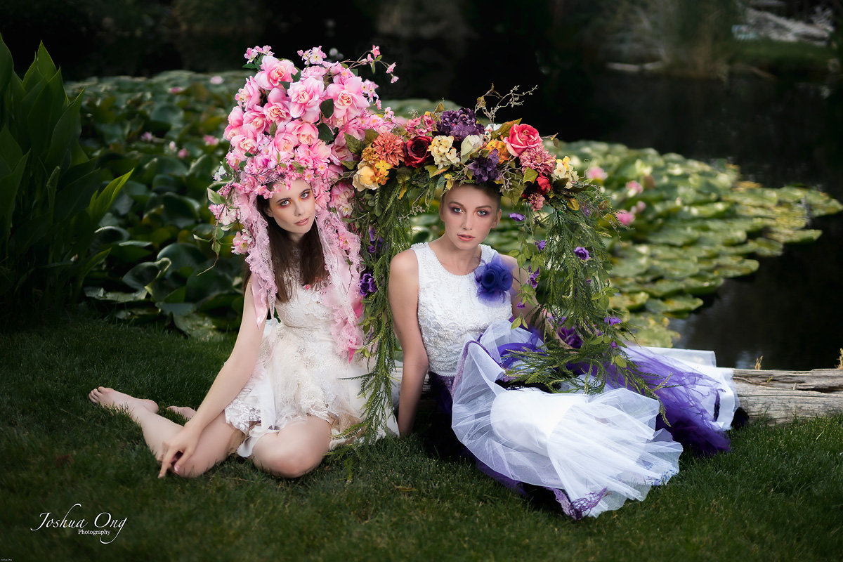
Ronny, the skin color palette of the B&W is so much nicer than the colored one some pages back. Without knowing the girl I can’t align the colored skin tones (and btw, the greens of the foliage) with a girl under north European sun. It frustrates me to see your pictures as one of the absolute top photographers to have the same skin tone anomaly I face with Sony. Please don’t take it as an offense, just an emotional reaction.
Hi and thank you
I find it very difficult to get good skin tones
I know sony don't have the best from the start
but I'm having trouble getting good portrait pictures .. but I'm struggling
On some pictures, I have used one and another filter (nikcollection)
is probably not optimal to get good skin tones.
I try to go on the feeling in the picture
If I like it I use it anyway... same with my flowershot etc
It is really fun to shoot portraits .. very different against my usual motives
I definitely don't take it as a offense...you should be able to discuss and get tips and advice in order to make the pictures better. Get help developing and making progress in their own photography
Also get help with their equipment and learn how to use it in the best way
Ronny //
Edit
Test
is it better or worse
tested Freds settings in the thread you started on skin tones
The picture is directly from camera and just the settings that Fred wrote Skin tones tweak: Full strength
Sony A7R II + Zeiss Loxia 85 mm f/2.4by Ronny Olsson, on Flickr
I find it very difficult to get good skin tones
I know sony don't have the best from the start
but I'm having trouble getting good portrait pictures .. but I'm struggling
On some pictures, I have used one and another filter (nikcollection)
is probably not optimal to get good skin tones.
I try to go on the feeling in the picture
If I like it I use it anyway... same with my flowershot etc
It is really fun to shoot portraits .. very different against my usual motives
I definitely don't take it as a offense...you should be able to discuss and get tips and advice in order to make the pictures better. Get help developing and making progress in their own photography
Also get help with their equipment and learn how to use it in the best way
Ronny //
Edit
Test
is it better or worse
tested Freds settings in the thread you started on skin tones
The picture is directly from camera and just the settings that Fred wrote Skin tones tweak: Full strength
Ronny, I wasn't there; I don't know her and I don't know how tan she is. So, my opinion is strictly from editing point of view and not how the portrait was taken. These are my observations and some suggestions:
1. The face is the most important part of a portrait and it is rendered on the dark side, darker than her right shoulder area. That's why I don't trust the straight out of the camera images . Somehow, if you brighten her face area it would be better, IMHO.
2. Even the other areas are on the dark side and being on the saturated side for my taste. Portrait is a type of photography that a less than perfect lens is sometimes more suitable. A sharp lens is not a lady's best friend regardless of her age. But that less than perfect rendition can be applied in PP. My preset in LR for softer skin is lowering the clarity but increasing the sharpness. Yes, increasing the sharpness level somehow works magic for skin rendition. In your case, I would also increase the exposure level but lower the saturation level. Everything done to taste of course.
I am not an authority in portraits but I have done a few and I hope you don't mind me telling this.
I find it very difficult to get good skin tones
I know sony don't have the best from the start
but I'm having trouble getting good portrait pictures .. but I'm struggling
On some pictures, I have used one and another filter (nikcollection)
is probably not optimal to get good skin tones.
I try to go on the feeling in the picture
If I like it I use it anyway... same with my flowershot etc
It is really fun to shoot portraits .. very different against my usual motives
I definitely don't take it as a offense...you should be able to discuss and get tips and advice in order to make the pictures better. Get help developing and making progress in their own photography
Also get help with their equipment and learn how to use it in the best way
Ronny //
Edit
Test
is it better or worse
tested Freds settings in the thread you started on skin tones
The picture is directly from camera and just the settings that Fred wrote Skin tones tweak: Full strength
Thank you for taking that discussion. Looking at many images, I see multiple aspects with Sony skin tones.
1. To avoid the green tint of earlier Sony color rendering, now the skin tone falls on the saturated brown side, and this is different from natural soft bronzing of Caucasian YOUNG people. It looks to me like old skin bronzed over decades of summers.
2. In the same direction of “old skin”, the black level for only the skin maybe too low.
3. The contrast curve for the skin is either too much S-curve or too flat, but rarely pleasant. Maybe the huge dynamic range of the sensor leads to different interpretation than the human eye.
This is not specific to singular pictures, it is an anomaly of most (all) Sony images if not taken under very bright lighting conditions or heavily pp. Contrary to the claim of Sony I see no substantial improvement from Sony A7R2 to A7R3. It is so surprising as Sony took over the Minolta Konica color design team, maybe the most dedicated “to the truth” of all time.
It is symptomatic that we need help of massive “artistic impression” tools such as Nik or I use currently selected Anita Sadowska presets as a start.
Outside this discussion, also the greens of spring season plants look “old”, means late summer, not young to me. The green-yellow balance doesn’t fit.
Messier77 wrote:
Saw the storm of a lifetime yesterday near Strasburg, Colorado. I've been chasing for 16 years and have never seen anything like it. Beautiful corkscrew tornado that stayed in a field and hit nothing and injured no one. Wind was calm and the birds were chirping.
Back from a week in the field and the FE 24-105 stayed on the body most of the day, great performing lens to work with! From the town of Elberton Washington in the Palouse region...
Like many of you in this thread, Poof and I have traveled the world. For the last year we've traveled in our own campervan we built from scratch (we're both a bit tired of TSA sticking their hands up our arses). Here is a shot of the camper two weeks ago in a campsite in northern Gros Morne Nat. Park, our rolling photography studio-
BokehBeauty wrote:
Outside this discussion, also the greens of spring season plants look “old”, means late summer, not young to me. The green-yellow balance doesn’t fit.
For some reason greens in both big RAW converters are rendered "wrong" for Sony cameras. Problem was (I no longer use, I don't know current situation) much worse in LightRoom, but also present in Capture One. In mk1 model profiles for mentioned software same green exposed differently (aperture or shutter speed) changed the hue of green!!! The brighter exposure of same green had hue shifted towards yellow. Same RAW file processed directly from sensor values without Sony's mapping tables (=using dcraw) did produce same hue for different brightnesses - so it was not too weak CFA(Color Filter Array), what I first suspected that in order to gain high ISOs Sony had made too weak filtering. Profiles for mkII cameras have been better.
I lost my nerves with this in 2013/2014/2015 and for some time developed all my RAWs with dcraw (+utilities I coded on top of that). I even started coding command line utility to do same as shadow & highlight sliders in LightRoom/Capture One, but then come to my senses too much work as I already have day job...
Now I use Capture One and greens are OKish. But sometimes I have to create adjustment layer and change the brighter green hue back to green from the too yellow hue.
--------------------------------
Zeiss Loxia 2.4/25 FE @ f/18.0, 20s, A7r @ ISO 100, Hoya HMC 82mm NDX400
Sony 70-400mm F/4-5.6 G SSM @ f/8.0 & 300mm, 1/320s, A7 mkII @ ISO 200
HelenaN wrote:
Thank you! A bit surprising that you say that though, because I feel that they are exactly my usual style. Typical subjects (old boats, farm animals, light effects, decaying things...) and my favorite B&W preset.
I think it was going back to the country. Seems you'd been in the city for a while, but as you say it all made sense once I saw your name (I frequently review this thread backwards, scrolling up.)
Btw. it's interesting to read your thoughts on the CV 40/1.2 and 50/1.5. The 40mm is tempting, but since I already have the 50mm and 35/1.7 I think I'll skip it for now.
I kicked around the idea of adding the 35/1.7, but I do really like the 40. I keep looking at the second shot I posted from the 50 though and really like its rendering too. Might have to spend more time and look at some more comparisons. Too much to do these days!