Just got a new NEC 2690wuxi2 monitor. I could see so far that it works rather well with the SpectraView II software and my Spider2 calibrator. I'd have just a few questions for other owners of this monitor:
Any firm idea if the Spider2 calibrator is suited fully OK for this (Wider Gamut) monitor?
For users that have used Spectraview on this monitor and are fully happy with results : what target settings have you used?
What target settings matches best prints for you? (unfortunately I can't test this easilly since I don't print at home... but I am interested, since pictures will get printed, but outside...
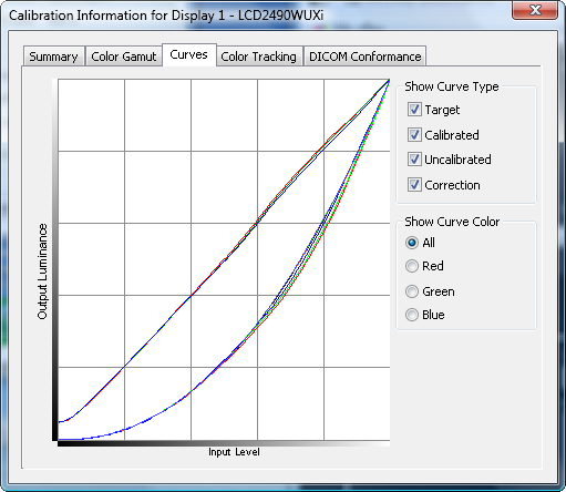
My calibration results seem OK, but I have only one strange behavior on the reds in the curve display... they seem to be the harderst to match prefectly and no matter what I do, there is always a little wobble in the red curve in the middle tone.... This is really anoying, even though it's not something very visible in the test pics. => Did anyone see this yet? Any idea how this can be fixed?
That would be all for a first... at least if all of these get answered, I'll be super happy.
I have a 2490 and use a DTP-94 with SVII software. While I don't have wide gamut I have a couple of comments for you.
- I am over-the-moon satisfied with SVII calibration and all of the professional features of the 90 series. I thought you'd have to pry my GDM-F520 CRT out of my cold dead hands less than 12 months ago but I lucked into a used 2490 for a great price. While I miss the deep blacks, everything else has been fantastic. I literally feel affection for this piece of gear (sappy, I know).
- Make sure that you leave several things set to the factory defaults, confirm with your manual and the OSD: contrast, black level, sharpness, ColorComp/Uniformity=3
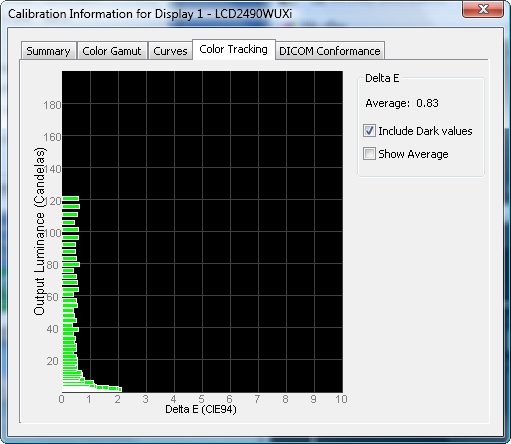
- I don't believe that the Spyder2 is well suited to WG, but I have no personal experience in the manner. The lumps in your red response are atypical. When Colorcomp (same as your uniformity) is on, my correction curves are almost nothing
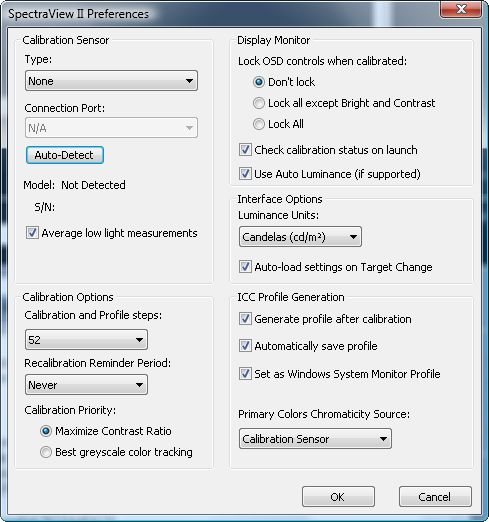
- Make sure that you select a preference to "maximize contrast" and not "precise grey scale tracking" in SVII. The latter will try to get the extreme low grey levels perfectly grey but in doing this it can cut your contrast in half. As a photography, you don't need the levels 0-4 to be perfectly grey and the contrast is more than worth the "sacrifice". Medical imaging and other professional users other than graphics users may require this so the software is capable.
- Don't try to go too dim. The system is capable of using pixel blocking (displaying a "white" as "grey" to reduce the brightness below the minimum levels the backlight is capable of. You will get the best accuracy and calibration/profile by not getting into blocking mode. I believe your brightness indicators turn magenta when this mode is active.
- IMO 80 is too low for best accuracy as you're well into the pixel blocking mode. Your contrast being only 500 illustrates this perfectly. White is getting darker but black is not when pixel blocking is used. When the backlight is varied both white and black vary according to the backlight output.
- I'd suggest using Auto-luminance (don't confuse with autobright) mode 1 and target something like 120-130 cd/m2 and see what you get. Also consider using the SVII photographer default of 140 just to see what the curves do even if this is brighter than your taste.
- brand new blacklights are very bright. This is unfortunate, but universal. After 1000 hours or so it should settle down. I can maintain 120 comfortably without blocking, which works well in my environment.
- don't forget to activate the advanced OSD (it's in the manual, holding INPUT for 1s while turning it on) for best control of the display.
That's what comes to mind top of my head. There was a long thread about a month ago that I participated in with another 2690 owner, Jxxxx (where the numbers elude me). You might give that a read. He had issues with text sharpness connected to a Mac too, but it seemed like that may have been a Mac anti-aliasing thing that can't be turned off.
I don't have the NEC, however in looking at your curves, something is very wrong. The red LUT is non-monotonic which is always bad for a correction LUT. Follow Craig's advice and see if that doesn't improve the red LUT. If that doesn't correct the problem, you may need to purchase a new display calibrator. I have read that the Spyder2 is not suitable for use with wide gamut displays, however I don't have any firsthand experience with either the Spyder2 (I use an EyeOne Pro) nor a wide gamut display (I have a Dell 2209WA).
Craig seems to know a lot more about the NEC monitors than I do but I question one aspect of his advice: Do we really want or need maximum contrast when our goal is to more closely match print performance in reasonable lighting ? I think not.
I can't profile my 2690 properly (using its built-in LUT) because I have the wrong colourimeter (a colormunki) and so I am using the default settings that I am assured are pretty accurate in the spectraview monitors. I use D65, 90 Cd/m2, gamma 2.2. I'll tweak it when I get my Eye One 2. So far I have seen a good match between print and screen but I'm not studying it very closely because A/B comparisons between a monitor and a properly lit print are tricky to do - it's just a perception that I'm getting what I expected. I have profiled my printer with the colormunki.
I read on Luminous Landscape that 80 Cd/m2 is best for photography but most calibrators suggest 90-120 Cd/m2 - without actually justifying the different recommendations. Gamma 2.2 is now pretty much universal. D65 seems to be a compromise that is quite commonly used even though most prints are not observed in 6500K light.
Alan321 wrote:
Craig seems to know a lot more about the NEC monitors than I do but I question one aspect of his advice: Do we really want or need maximum contrast when our goal is to more closely match print performance in reasonable lighting ? I think not.
Maximum contrast (difference between displayed white and displayed black), not maximum brightness. My assertion is to make sure that white isn't artificially suppressed by the blocking functions and the full range of natural tones the display is capable of be displayed. It's a digital device, capable of only a certain resolution of discrete tones - if you begin to limit them there are simply fewer to work with.
One of the largest disadvantages of LCD technology be it in monitors, televisions, or what have you is far less contrast ratio that CRT, plasma, LED and other light-generating (as opposed to light-blocking) technologies.
SOFT PROOFING is used to best match the characteristics of your particular output devices, the inks and paper you've chosen.
I don't know why anyone would volunteer to always look at washed-out grey "blacks" and cut the number of renderable tones from the display in half. In most cases, the gamut of the display is already the smallest gamut in the workflow at the best of times (camera RAW, workspace, printer) - why make it smaller on purpose? You want the display to render the widest possible range of tones it can and running pixel blocking specifically defeats this. I agree that LCDs, in general, are too bright but using pixel blocking makes white darker without changing black and causes the display to map/approximate all tones in between.
I can't profile my 2690 properly (using its built-in LUT) because I have the wrong colourimeter (a colormunki) and so I am using the default settings that I am assured are pretty accurate in the spectraview monitors. I use D65, 90 Cd/m2, gamma 2.2. I'll tweak
Be advised that you'll be using panel blocking. Any display other than a 90 series, Eizo or other high end display could never even go that dim because they don't have panel blocking, yet could be perfectly calibrated and profiled by a colorimeter system.
I've said this in threads before, and others have agreed with me - I don't know why everything thinks that there's a universal "ideal" brightness for a display just because you read it on the Internet. Are your prints always lit by the very same light? Do you ship a special viewing box to your clients/family with your prints? NO. Your prints will be viewed in all kinds of lighting levels unless it's on the wall of a museum or gallery. Your display luminosity should be set relative to the brightness in your working environment for comfort and utility.
One must also keep in mind that many of the people giving this universal "advice" probably got into the profession/hobby in the days of CRTs. CRTs are light producing displays, not light blocking displays. They do not have this problem of loosing tones when they exceed the adjustment limit of the LCD backlight and begin to use pixel blocking so there is no downside to calibrating to very dim whitepoints. There can be a huge disadvantage with LCDs.
I read on Luminous Landscape that 80 Cd/m2 is best for photography but most calibrators suggest 90-120 Cd/m2 - without actually justifying the different recommendations. Gamma 2.2 is now pretty much universal. D65 seems to be a compromise that is quite commonly used even though most prints are not observed in 6500K light.
I appreciate the comprehensive replies you have posted. The NEC manual makes more sense to me after reading your stuff.
I'm now giving 170 Cd/m2 and 50% contrast a try (both are defaults). On my 2690 Spectraview the 170 CD/m2 is the minimum brightness that is controlled by the backlight. Do you think 170 is too high ? It's a toss-up between avoiding the pixel blocking and having it too bright. It is still daylight here at present and so it'll be a little while before I know whether 170 is too bright to look at all night, but I am concerned that my image files will appear too dark on other people's monitors if they only use 90-120 Cd/m2.
I'm using auto luminance mode 3 because it seems to a layman (me) that controlling both colour and luminance instead of just luminance has to be better.
I've set gamma 2.2 and white point D65 as before. The "photography" software preset uses D50 but I don't like that. Again, D65 is more common out there in photography world as far as I can tell.
I can't use the Spectraview profiler software properly because it spits the dummy at my colormunki. I'm just using the built-in menu settings on the basis that the spectraview monitors are already accurately calibrated in the factory. I don't see the curves displayed as you guys do and I'm unsure if that is because the software is different or because I'm missing something by not having the colourimeter to play with. I'm using it on an Apple computer and there is separate disc of Windows software that I have not tried using. My version of Spectraview Profiler is 4.1.16.
I appreciate the comprehensive replies you have posted. The NEC manual makes more sense to me after reading your stuff.
I'm now giving 170 Cd/m2 and 50% contrast a try (both are defaults). On my 2690 Spectraview the 170 CD/m2 is the minimum brightness that is controlled by the backlight. Do you think 170 is too high ? It's a toss-up between avoiding the pixel blocking and having it too bright. It is still daylight here at present and so it'll be a little while before I know whether 170 is too bright to look at all night, but I am concerned that my image files will appear too dark on other people's monitors if they only use 90-120 Cd/m2. ...Show more →
In *my* environment I would find 170 too bright in terms of being uncomfortable, but that doesn't mean you will.
Your images shouldn't look too dark on other people's displays. The average Joe has an LCD these days and, as digitally driven light blocking devices, they have a black point, white point, and 255 shades in between. I'd also say that the average Joe's LCD is in the high hundreds contrast ratio. They will have set their whitepoint to their comfort level (unfortunately for the average Joe, this seems to be something crazy like 300 cd/m2 because they like it bright and vivid).
You can't control the viewing conditions of others, you can just be sure that you've rendered your final output in a colour-managed way according to established standards.
I believe that I am slightly pixel blocking to run around 120-130 cd/m^2 since I have a contrast around 600 right now and I have seen my display measure in the high 700s with different parameters.
Keep in mind that with a 90 series and the Spectraview package you can have multiple calibrated/profiled presets. You can have a "day" and "night" that you load with different levels - one blocking and one not - for instance. This is one of the additional beauties of SVII.
I'm using auto luminance mode 3 because it seems to a layman (me) that controlling both colour and luminance instead of just luminance has to be better.
That wasn't my understanding. If you're running fully calibrated and profiled let the LUT curves do the work. If you aren't, you may be right. I should look into that again further. I know that when I went through it in excrutiating detail about a year ago I settled on mode 1.
I've set gamma 2.2 and white point D65 as before. The "photography" software preset uses D50 but I don't like that. Again, D65 is more common out there in photography world as far as I can tell.
Agreed, D65 and g=2.2 seems to be the emerging standards. Most "Joe Average" folks will be running LCD native whitepoint which could be as high as 9300K though. More and more in the last little while I've seen an increasing amount of "sRGB" displays with D65. The problem is that people think bluer whites are "whiter". If only they realized they weren't doing the laundry...
I can't use the Spectraview profiler software properly because it spits the dummy at my colormunki. I'm just using the built-in menu settings on the basis that the spectraview monitors are already accurately calibrated in the factory. I don't see the curves displayed as you guys do and I'm unsure if that is because the software is different or because I'm missing something by not having the colourimeter to play with. I'm using it on an Apple computer and there is separate disc of Windows software that I have not tried using. My version of Spectraview Profiler is 4.1.16.
- Alan
You really are missing the whole package without the colorimeter. However, several of us hardware enthusiasts (outside of FM) have found that with Colorcomp/Uniformity turned on to the default level of 3 it is VERY close to being calibrated from a colour standpoint. I've run SV profile runs with CC on and off and with it off you see a more typical correction curve with deviations. With CC on there's almost no deviation along the g=2.2 curves for all colours. Interesting, really. Even without SV and a puck you get very close to calibrated results as long as you leave Colorcomp/Uniformity on (which you want to anyways as it makes grey and white backgrounds silky smooth like a piece of paper in front of you instead of a blotchy LCD).
Just wanted to thank everyone for their feedback. It's been putting me on the path of various testing configurations, but in the end I have to say that while results improve with increasing intensity, my reds still have a hard time behaving... they seem to start getting into control at about 130cd/m2.
However, at that levels the intensity seems a bit on the high side; as for the blacks, they are OK even at lower levels (I feel I could afford going lower like 100-90).
What do you think? The only thing I didn't test is a different sonde... Could that be it?
PS: I'll keep on trying 140-150cd.. just to see if trend continues...
Just to share this with everyone - SOLUTION FOUND!.
I found out that the calibration sonde ( Spider) was not accurate enough in the dark areas and couldn't calibrate well my new monitor...
=> Decided to buy a EyeOne => Everything works perfectly and consistently.
calemon wrote:
... Your display luminosity should be set relative to the brightness in your working environment for comfort and utility. ...
In my dim environment that's 80 cd/m� on my 2090uxi. Any higher and my prints come out too dark (in reasonable print-viewing light, not in my working light). I started out at 95 and worked down.
...and:
...consider using the SVII photographer default of 140...
But SVII's "Print Standard" default (at least in my v1.0.42) is also 80 cd/m�. Thoughts on that?
I thought that the original sonde coming with the SpectraView was also an I1?
Do you have the original full SpectraView package? (and what sonde it came with?).
In any case, the I1 & my 2690 wuxi is proving to be a great combination.
PS: btw, 80cd/m2 is looking good with this new calibration sonde. Previously, I couldn't get too low, below 120-130 without serious artefacts. Now, I can and the calibration is doing it's job right.
Glad you found a solution as the Spyder 2 isn't capable of accurately calibrating a wide gamut monitor. I use a p221w, a different panel technology than yours, with the Spyder 3 and it works quite well.
calemon wrote:
I believe that I am slightly pixel blocking to run around 120-130 cd/m^2 since I have a contrast around 600 right now and I have seen my display measure in the high 700s with different parameters.
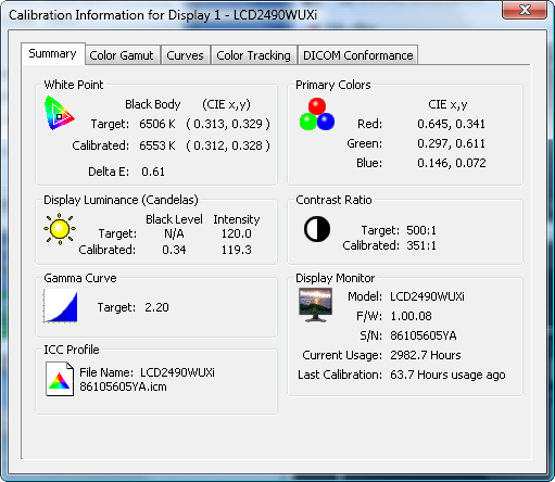
calemon, how are you getting such a high contrast? My 2690 targeted to 120 cd/m2 and default contrast (maximum) gives a contrast ratio of around 275:1 (~ .40 cd/m2). Does the 2490 just have a lower black point?
1/ make sure that you have "maximize contrast" set in the target configuration and not "preserve greyscale". The latter, although sounding like what a photog would want, is mostly active near black and totally destroys your blacks. I went through this too, and had black around 0.4 until I figured this out. You'll be able to see that the correction curve is pretty heavy down around black if this is your problem. I remember reading a report online at one point in the last year where someone's got stuck doing the grey tracking mode even when they selected contrast. I can't remember any specifics.
2/ don't try to go too dim. Panel blocking is used to achieve brightnesses lower than 0% backlight can provide. This means that black doesn't get any darker while white gets greyer so your contrast ratio (and potentially colour accuracy and visible tones) goes out the window. Manually set your panel to 0% backlight through the OSD while not entering blocking (on newer models I think you need to make sure the brightness numbers don't go magenta, or flashing or something - mine is different) and then take some measurements with your puck to see what your native minimum brightness without pixel blocking actually is.
With a CR as bad as 275 and the elevated black level you show, I don't think #2 is your problem, but it's worth mentioning.
My last profiling/calibration run with colorcomp (uniformity on newer displays) set for 3 and target luminosity of 125 has a black of 0.21 and a CR of ~600. Not as good as it has been, but I think I might be tickling pixel blocking with only 125. Of course my display has 7500 hours on it, which will reduce CCFL backlight intensity.
David: you do indeed have it set correctly, but your black is still way too hot. It may still be a case of the setting getting "stuck". Sorry I have nothing with more satisfactory detail
I would recommend a couple of things:
1/ On the curves add at least "correction" to that view. Right now you're just viewing target and results. You want to look for heavy corrections applied at low brightness. This will be elevating your black to a "grey" trying to make it perfectly grey instead of ever so slightly tinted. This is more for MRIs and the like than photography, honestly. I think it got stuck on me once too when I was first figuring this out.
2/ Go ahead and enable extended luminance stabilization. It will take longer but is more accurate. 120 isn't "very low", but it is "low" compared to the standard CCFL luminosity range.
3/ you could also try a round at 140 just to see if it's behaviour changes. You should be getting blacks around 0.2 at least. Once you crack that nut I think everything will fall into place.
4/ You could do a full factory reset on the panel, set it for sRGB or native gammas, color temps, and just use SVII and your colorimeter to MEASURE black without running a profile. If a full reset and running non-calibrated gets you darker blacks, you know it's something in your calibration that's throwing things off.
5/ your panel MIGHT be defective, but I think you'd notice huge blotches of backlight bleed and that sort of thing. I'm going to assume this isn't what's going on.
Somewhere I have captures I used in a thread I participated in on a non-photo computer hardware forum sorting this out. It was a much older version of SVII, but I'll see if I can dig it out to show you what I was seeing at the time which was elevating my blacks.
EDIT: Found it
Settings:
My black was in the 0.3s and my CR was in the 300s:
Here you can see the high level of corrections being applied at very low intensities:
As you can see, despite having it set correctly it was still heavily correcting the very dark shades. I honestly can't remember how I got it unstuck, and whether a panel settings reset was required.
Alan321 wrote:
I can't profile my 2690 properly (using its built-in LUT) because I have the wrong colourimeter (a colormunki) and so I am using the default settings that I am assured are pretty accurate in the spectraview monitors. I use D65, 90 Cd/m2, gamma 2.2. I'll tweak it when I get my Eye One 2. So far I have seen a good match between print and screen but I'm not studying it very closely because A/B comparisons between a monitor and a properly lit print are tricky to do - it's just a perception that I'm getting what I expected. I have profiled my printer with the colormunki.
What's wrong with the Colormunki? I use mine with my 2690 WUXI (version 1) and get excellent results. The prints from my HP B9180 mirror what I see onscreen.