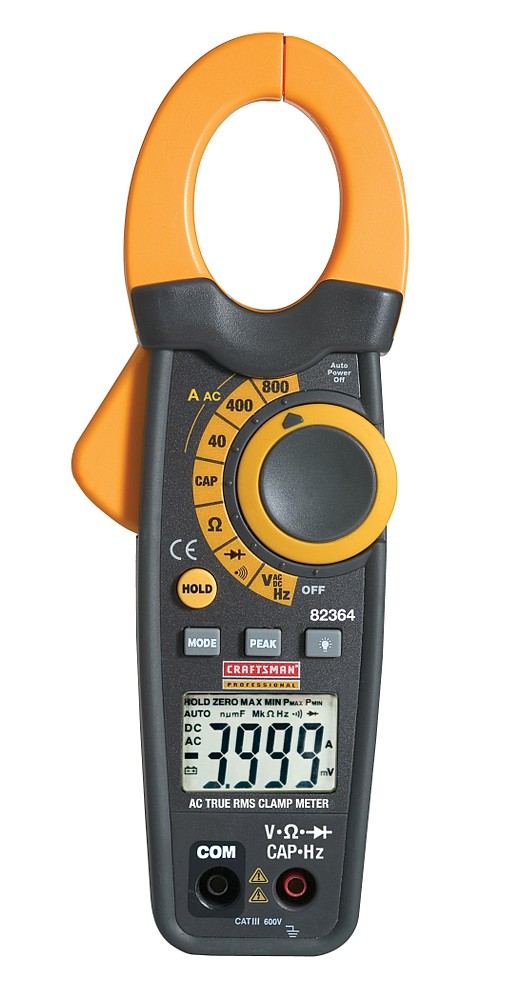
The overhead and back lighting seems to work okay, but I think you really need to orient it in the proper direction. It is almost impossible to read what the buttons say without straining my head. The logo is not very apparent because of the angle. You really need to prop it up, so everything reads proper, then have a display of some sort on the screen. The goal of a product shot is to make the item seem bigger than life, and enticing. I understand that it was convenient to lay it down at that angle, but it does not make an ideal placement for the product.
I don't really see a problem with the positioning of the product, but it needs to have the readout on the display.
Lighting is ok, if a little dated looking being a soft light source floated above the item, decent gradation of the background. a little fill or accent 'kicker' light on the right side may improve it...
I can totally understand about propping it up so that you can see all of the stuff. However, when it goes in the catalogue it'll probably have a little bio next to it with the craftsman logo next to it.
.....but still, I agree with Ben.
But also, do you know what context it will be going into? The reason I ask is because they may want to make an extraction from the background. I dont know who you are shooting for, but are they going to have an easy time extracting it from a gradiated background?
I also agree about making it read something on the LED. Just dont forget to bill them for batteries. 8)
This shot is not for anybody except myself, I am trying to build a decent 12-20 shot product portfolio with this being my first serious attempt.
I suppose I could have gone with a white sweep but I was trying to make it a little more interesting - I am not trying to discount your advice, btw. I was trying to make it look sexy versus informative. Something tactile. A glossy magazine type ad - though I do not know of any magazines with glossy sexy photos of tools.
I should have put something on the screen.
BTW, getting it to set at that angle was a pain, it wanted to fall to its back. I had to prop it to that position.
The outlined shot from the website is very informative, and would be right for the inside of a catalog.
The shot of the product on the black bg is prettier and could be a shot for the cover of a catalog.
make sure its easier to read for the viewer, whether it be on screen or print. lighting etc works just as long as its consistent with the rest of the products.
always shoot wide then zoom in. shooting wide allows the designers to use the space around the product for copy placement.