This is a new image I'm changing to, the picture I had is in a link below.
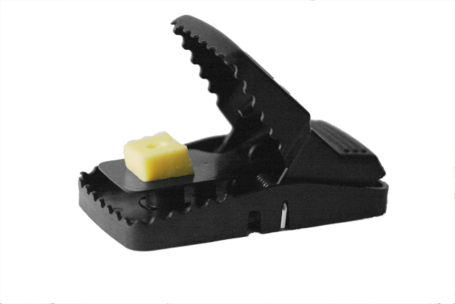
I changed the subject from "Fatal Attraction" to the "2nd Mouse gets the Cheese also... C&C's please...
I think this would be improved by a cast shadow at the bottom. Right now it looks like it's floating.
Also, seems to be a bit out of focus.
Good idea for the WA!
~ Carrol
I agree with Carrol.
I think it's a good idea, original and clever take on the assignment however execution could be improved.
Shadows, sharpness... Also blacks look washed out to me.
Not bad as it is but could be better IMO.
Funny idea and good shot ! Technically better IMO than the first one.
However watch out for the dimensions (640 pixel for the largest) !
I see some "pixel mess" in the middle top and some spots at bottom right.
Maybe a different crop (closer, more squared) could improve too.


