which lens has the most 3D POP?
p.23 #1which lens has the most 3D POP?
Ummm, several posts here that don't tell what lens was used. What's the point then? 
Jul 13, 2019 at 02:33 AM
Guest
Offline
Guest
Details
p.23 #2which lens has the most 3D POP?
Here's my contribution. I could produce pop-3D effect only with primes mostly wide open and with specific composition with much fore- and/or background involved. Not every WO shot with the very best prime lens gives pop-3D. For true 3D effect I'm ispired by Olaf's works in brenizer technique (copy&paste required to make the link workable).
https://www.flickr.com/search/?sort=date-taken-desc&safe_search=1&tags=bokehpanorama&user_id=62289058%40N03&view_all=1
Zeiss lenses produce 3D effect easier than Sigma 35 Art that needs more support from the right composition and lighting. Some 3D shots are exceptionally sharp and have no bokeh areas, other have a lot of blurred fore- and background areas. IMHO lens imperfections in bokeh areas can improve 3D effect and Zeiss knows it designing lenses with specific blurring effect that retains OOF edges better recognizable.
BTW cat's eye effect and native lens vignetting helps in producing 3D effect for centered composition with an isolated subject alongside with thin DOF effect.
#1 - Sigma 35 Art at f/1.4

_MG_5430 - Autumn birch garland by Alex DROP, on Flickr
#2 - Sigma 35 Art at f/1.4

_MG_1917_web - A Statue by Alex DROP, on Flickr
#3 - CZ 50P ZE at at f/2.2

See larger (1024)... IMG_4922_2 by Alex DROP, on Flickr
#4 - CZ 50P ZE at f/2.2

See larger (1024)... IMG_4943_2 by Alex DROP, on Flickr
#5 - CZ 100MP ZE at f/2.2

_MG_5252 - Pattern of backlit linden leaves by Alex DROP, on Flickr
#6 - CZ 100MP ZE at f/2.2

_MG_1639_web - Sunset by Alex DROP, on Flickr
#7 - CZ 100MP ZE at f/3.5

_MG_2566_web - Covered with rain drops by Alex DROP, on Flickr
#8 - CZ 100MP ZE at f/2.8
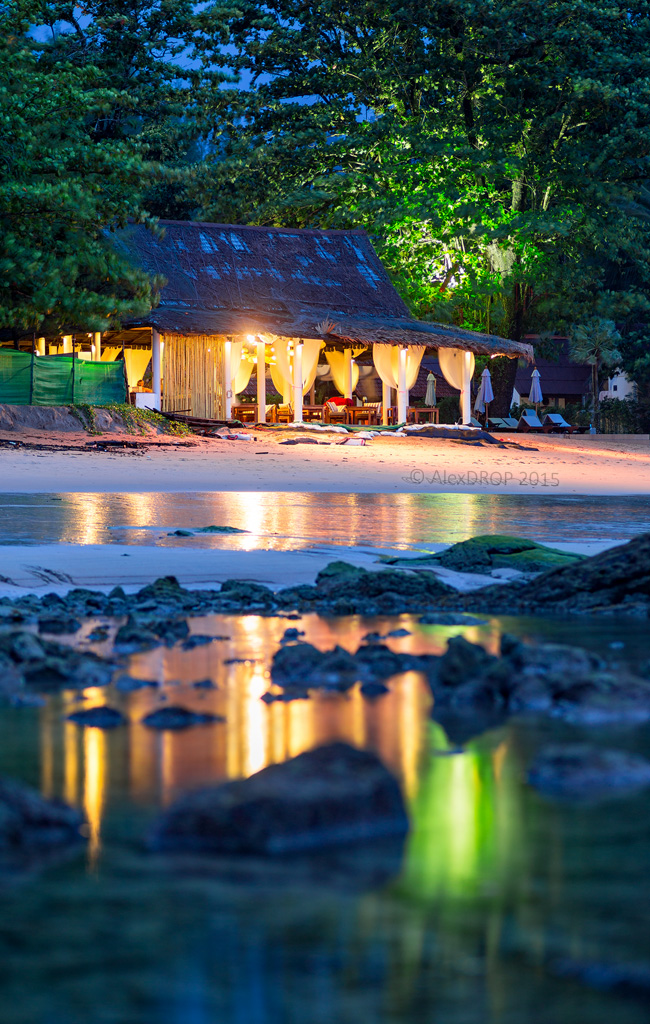
_MG_6362_web - A seashore restaurant at blue hour by Alex DROP, on Flickr
#9 - CZ 100MP ZE at f/2.0

_MG_6378_web - Rocks by the sea in tungsten light by Alex DROP, on Flickr
https://www.flickr.com/search/?sort=date-taken-desc&safe_search=1&tags=bokehpanorama&user_id=62289058%40N03&view_all=1
Zeiss lenses produce 3D effect easier than Sigma 35 Art that needs more support from the right composition and lighting. Some 3D shots are exceptionally sharp and have no bokeh areas, other have a lot of blurred fore- and background areas. IMHO lens imperfections in bokeh areas can improve 3D effect and Zeiss knows it designing lenses with specific blurring effect that retains OOF edges better recognizable.
BTW cat's eye effect and native lens vignetting helps in producing 3D effect for centered composition with an isolated subject alongside with thin DOF effect.
_MG_5430 - Autumn birch garland by Alex DROP, on Flickr
_MG_1917_web - A Statue by Alex DROP, on Flickr
See larger (1024)... IMG_4922_2 by Alex DROP, on Flickr
See larger (1024)... IMG_4943_2 by Alex DROP, on Flickr
_MG_5252 - Pattern of backlit linden leaves by Alex DROP, on Flickr
_MG_1639_web - Sunset by Alex DROP, on Flickr
_MG_2566_web - Covered with rain drops by Alex DROP, on Flickr
_MG_6362_web - A seashore restaurant at blue hour by Alex DROP, on Flickr
_MG_6378_web - Rocks by the sea in tungsten light by Alex DROP, on Flickr
Jul 14, 2019 at 05:49 AM
p.23 #3which lens has the most 3D POP?
Trying to get the look with the Tammy

Ye old truck by micke vmix, on Flickr
D800E + Tamron 35/1.8VC at F1.8
Ye old truck by micke vmix, on Flickr
D800E + Tamron 35/1.8VC at F1.8
Jul 14, 2019 at 08:07 AM
p.23 #4which lens has the most 3D POP?
Great result, it has the look, quite definitely!
I wonder how the Zeiss ZF 35mm f2 would look in this very situation.
But the Tammy is no slouch at all, and the AF and VR are very,useful, as is the low MFD!
I wonder how the Zeiss ZF 35mm f2 would look in this very situation.
But the Tammy is no slouch at all, and the AF and VR are very,useful, as is the low MFD!
Jul 15, 2019 at 02:28 AM
p.23 #5which lens has the most 3D POP?
Ultraluminal wrote:
This thread reminds me of similar discussions in large format blogs about contact prints vs digital prints, discussions that were launched in 1985 when the Iris printer came out and then of course later when Epson's high-resolution inkjet printers became available. The thing about contact prints is that they have a look, a depth, that you have to see to understand. You can't just take a picture of a contact print and post it online. And as awesome as digital prints are, I've never seen one that can capture that look. And this look is not so dependent on the...Show more →
Earlier quote
But honestly, format size in my experience has a lot more to do with it. The reason is that gradual transitions of color and tone are recorded in such tremendous detail and with such subtlety, that the picture really comes to life. Medium and especially large format exhibit this effect almost as a routine.Earlier quote
A lot of people are showing this 3D look using photos that have shallow DOF, but I think it's actually even more evident in well-chosen shots with infinite DOF. I can tell you that the 8x10 contact print I made yesterday, with infinite focus, absolutely has that 3D effect.Earlier quote
It's a bit of a fad for people to go for completely obliterative bokeh, but I think it's compositionally sloppy a lot of the time. It takes the subject completely out of context, fails to create interplay between foreground and background, wipes away suggestions of depth, and rather than looking lifelike it just looks imprecise and isolated.I do concur with others that transitions in and out of focus help the 3D effect, but that doesn't answer Grant's and my point that you can see that 3D look even if the entire image is in perfect focus. Obviously DOF has nothing to do with it in that case.
The more I look at images described as 3D, the more I think that having real luminosity (with texture) is key.
Earlier quote
Yes, I think part of it is a matter of the sheer abundance of detail in larger formats. Irrespective of subject size, a larger format will give you an image that is captured much closer to life size, so a print will have more of the textural details we expect to see. Every transition, including gradations of tone, color, focus, and texture, is projected over a much larger recording surface, so the subtlest real life details seem to make it into print.I do think that luminosity has a lot to do with the 3D effect, which means having textured highlights. Placing important details on Ansel's zones 6 and 7 is a very good strategy, especially in the context of a long transition from deep shadows through midtones.
I started off in photography using formats large enough to make useful contact prints (other than simply proof sheets of a whole 35mm film) and spent many a happy hour fiddling with tissue paper to do shading on contact prints! The good tonal gradations are a characteristic of Silver Chloride emulsion, good for contact prints but rather slow for projection printing,where bromide or chloro-bromide are more generally useful.
Gerry
Jul 15, 2019 at 07:10 AM
p.23 #6which lens has the most 3D POP?
Ultraluminal wrote:
Thank you for those wonderful examples. And since this is a thread on lenses that can give that 3D look, I'd like to give a shout out as well to the 75mm Color Heliar f/2.5. For one thing, perhaps partly because it doesn't get a lot of love from lens reviewers, it's cheap! For those who are interested in reading more about this lens, here are a couple of links from the many that I've collected over the years, reviews that may touch a bit on what Philip was talking about above:
In the link below the reviewer writes
Earlier quote
This lens has a very smooth transition between in and out of focus and the colors just blend together. I find it very pleasing in general . . . . The in focus areas are very well defined followed by just smooth out of focus backgrounds . . . . Yes, the Leica Summarit is similar, the Leica summicrons are amazing as well. They are not $300 however. What lens can you go buy today for $300 that will be so amazing? . . . . The Color Heliar is amazing from wide-open . . . . This is one of the few lenses I have ever used that I cannot really find fault with, especially when compared to any alternatives. Voigtlander might not have the reputation of Leica when it comes to lenses but this lens is honestly fantastic. A true gem amongst lenses. I couldn’t pinpoint what was so different at first, but I know now. I absolutely am in love with the rendering. I especially love the rendering in low contrast lighting. So much so that I began a project that completely relies on the look that only this lens has given me. I will have an e-book available soon that showcases this lenses artistic rendering. Every time I look at my files from this lens I am constantly surprised at how details come out, or how smooth areas are, etc… This lens gives great compliment to any lens kit. It is so small and light, that I never notice I have a 75mm lens with me!And in...Show more →
Earlier quote
I’ve had ample opportunities, here at B&H, to try many of Sony’s own offerings, as well as other native E-mount lenses, and am typically impressed by how good and consistent pretty much every lens is nowadays. And maybe that’s the problem. I enjoy using lenses for their character—a somewhat indescribable quality that cannot really be evaluated or shown in tests. I’m interested in rendering, not necessarily perfection.I've had one of these for quite a while, bought it originally to give me a modern medium tele to use on a Leica III, and like it on my Fuji too. Interestingly along with other Voigtlander lenses I like there are often comments that its 'flat and uninteresting'!
Gerry
Jul 15, 2019 at 07:17 AM
p.23 #7which lens has the most 3D POP?
The 'flat' is often simply a potential beautiful color palette lurking in the image, awaiting some decent post-processing. How hard can it be? You really need solid foundation colour palette for RAWs, just as many use neutral or similar camera profiles.
Lens designers know a large number of their customers: (i) shoot camera-baked jpegs; (ii) are new to the game; (iii) really, really dislike doing anything much to their images through either/both lack of time/lack of interest; (iv) want bright colours OOC; or (vi) are pros who churn through 1000s of images per session and cannot possibly deal with each image, and so adopt an average outcome.
And that is why many modern lenses are so sickly sweet and quick to over-saturate in colour delivery. If the industry moves this way as a whole entity, soon very few remember what it was like to see classy, stylish images that did not beat you over the head. That is how you change the expectations of a new generation; it's happening with the normalisation of 1000g lenses, like the new 1090g Sigma 35/1.2, especially made to 'suit' FE Sonys. They are all doing it..except the friends at CV.
Lens designers know a large number of their customers: (i) shoot camera-baked jpegs; (ii) are new to the game; (iii) really, really dislike doing anything much to their images through either/both lack of time/lack of interest; (iv) want bright colours OOC; or (vi) are pros who churn through 1000s of images per session and cannot possibly deal with each image, and so adopt an average outcome.
And that is why many modern lenses are so sickly sweet and quick to over-saturate in colour delivery. If the industry moves this way as a whole entity, soon very few remember what it was like to see classy, stylish images that did not beat you over the head. That is how you change the expectations of a new generation; it's happening with the normalisation of 1000g lenses, like the new 1090g Sigma 35/1.2, especially made to 'suit' FE Sonys. They are all doing it..except the friends at CV.
Jul 15, 2019 at 06:36 PM
p.23 #8which lens has the most 3D POP?
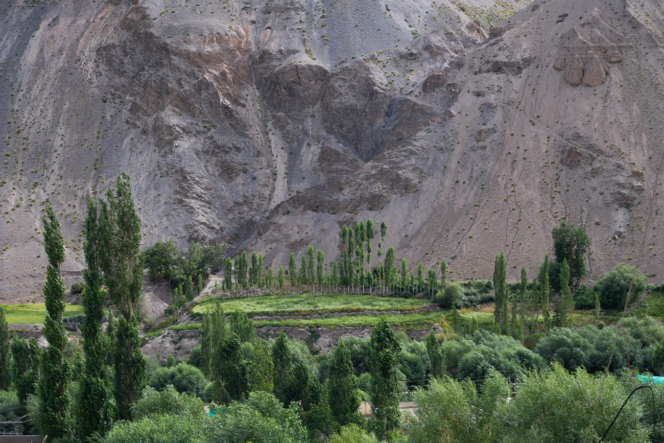
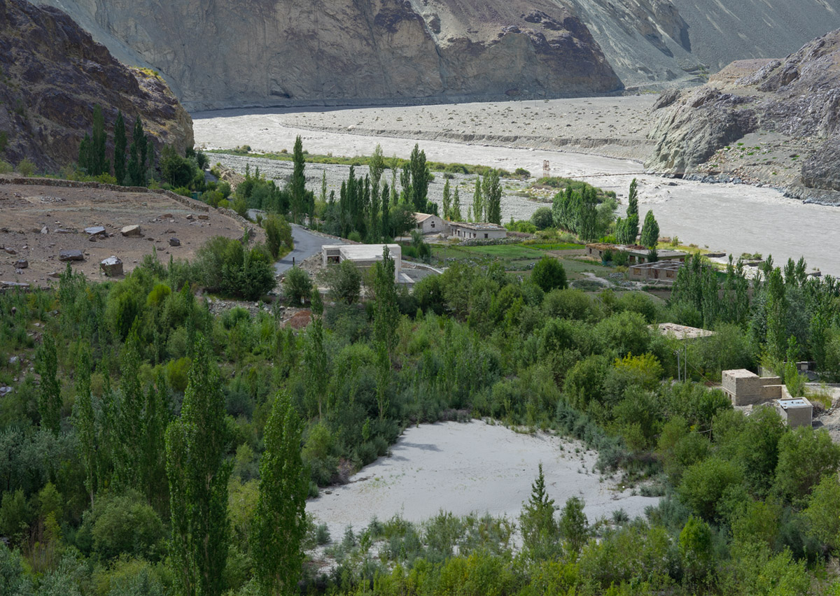
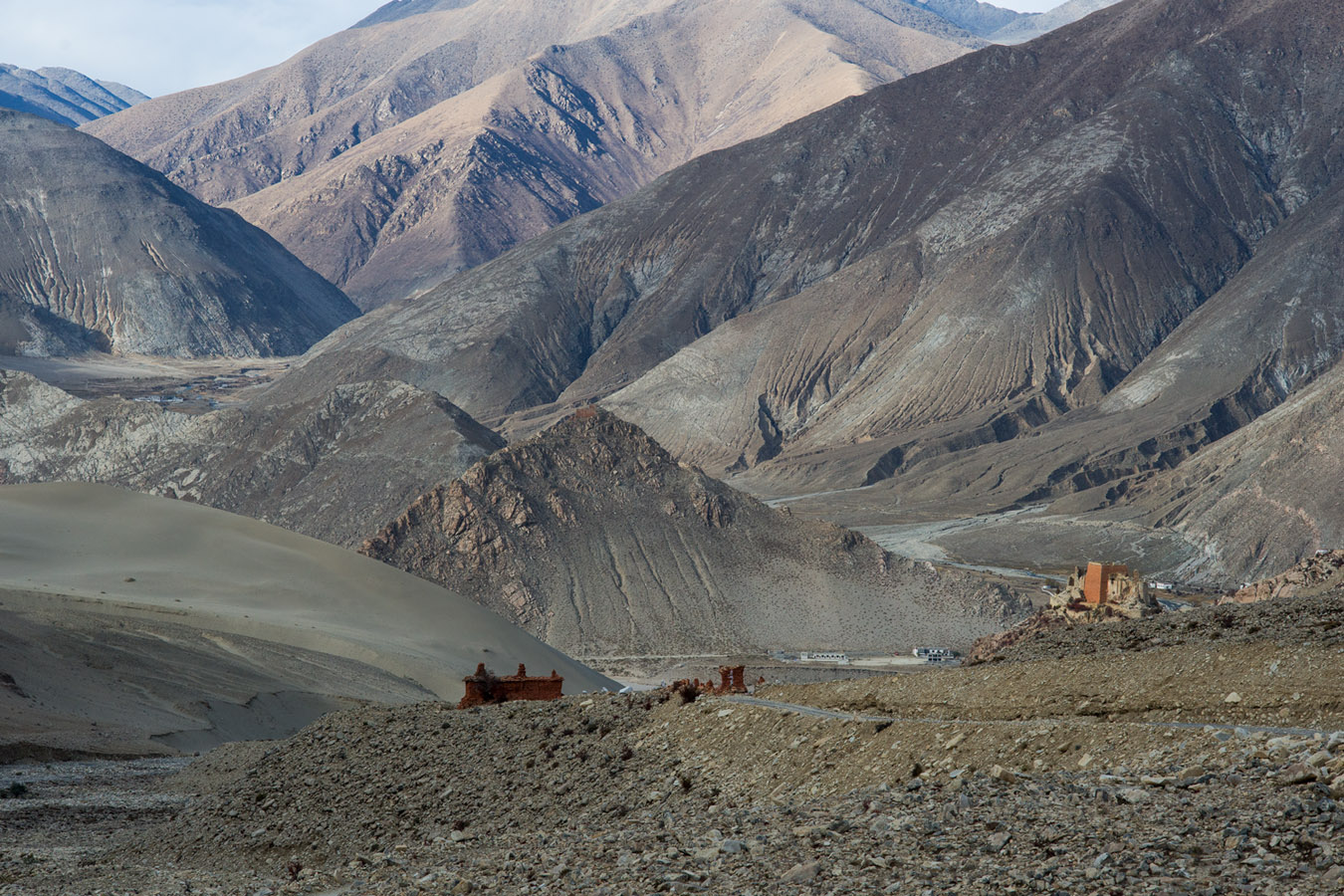
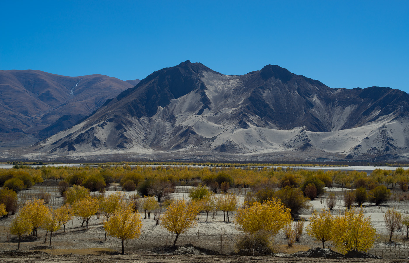
To hopefully show the dramatic effect color handling can have on 3D, here are two images, one from a lens 30 years old and the other from a lens 30 months old. Both images lack leading lines and both are over 50mm in focal length, shot in similar light/time of day. One image lacks colour tone variation (hue gradation) and thus suffers a lack of 3D; the other has well-drawn colour gradients which assist the viewer in understanding the photo dynamic, front to back. I could provide details but if you see it, you'll know.
Jul 15, 2019 at 06:49 PM
p.23 #9which lens has the most 3D POP?
The top picture really looks 3D to me. Hope I’m not losing my mind!
Jul 15, 2019 at 07:12 PM
p.23 #10which lens has the most 3D POP?
philip_pj wrote:
To hopefully show the dramatic effect color handling can have on 3D, here are two images, one from a lens 30 years old and the other from a lens 30 months old. Both images lack leading lines and both are over 50mm in focal length, shot in similar light/time of day. One image lacks colour tone variation (hue gradation) and thus suffers a lack of 3D; the other has well-drawn colour gradients which assist the viewer in understanding the photo dynamic, front to back. I could provide details but if you see it, you'll know.
The first image is beautiful and does indeed have a 3D look and a rich color palette.
The second image is a tougher subject. The range of light to dark is greater in this image, primarily because of the lighter sand, river, and mountain colors. So overall there is a larger color tonal gradient in image two. But it is the layout of that gradient fails to give that 3D pop. There are concentrated areas of relative monotones in the river, the sand field in the forefront, and the large sandbar to the right of the river in the upper center of the image. The image has a patchy quilt-like spread of colors, not the smooth gradients seen in the first image. The image is also a bit overexposed, to my eye. Overall a very flat and, IMO, much less appealing image than the first.
A great example of how the layout of hue gradients contribute to “3D pop.”
To hopefully show the dramatic effect color handling can have on 3D, here are two images, one from a lens 30 years old and the other from a lens 30 months old. Both images lack leading lines and both are over 50mm in focal length, shot in similar light/time of day. One image lacks colour tone variation (hue gradation) and thus suffers a lack of 3D; the other has well-drawn colour gradients which assist the viewer in understanding the photo dynamic, front to back. I could provide details but if you see it, you'll know.
The first image is beautiful and does indeed have a 3D look and a rich color palette.
The second image is a tougher subject. The range of light to dark is greater in this image, primarily because of the lighter sand, river, and mountain colors. So overall there is a larger color tonal gradient in image two. But it is the layout of that gradient fails to give that 3D pop. There are concentrated areas of relative monotones in the river, the sand field in the forefront, and the large sandbar to the right of the river in the upper center of the image. The image has a patchy quilt-like spread of colors, not the smooth gradients seen in the first image. The image is also a bit overexposed, to my eye. Overall a very flat and, IMO, much less appealing image than the first.
A great example of how the layout of hue gradients contribute to “3D pop.”
Jul 15, 2019 at 07:29 PM
|
p.23 #11which lens has the most 3D POP?
Agree image one has the 3D pop image two not so much.
Jul 15, 2019 at 07:33 PM
p.23 #12which lens has the most 3D POP?
C/Y 2.8 28mm MMJ
 _DSC7715 by Karl Ludwig, auf Flickr
Jul 28, 2019 at 06:33 AM
p.23 #13which lens has the most 3D POP?
C/Y 4 80-200mm @200mm
 _DSC7622 by Karl Ludwig, auf Flickr
Jul 28, 2019 at 06:39 AM
Guest
Offline
Guest
Details
p.23 #14which lens has the most 3D POP?
chris9 wrote:
C/Y 4 80-200mm @200mm
https://live.staticflickr.com/65535/48395055967_a0197e8969_o.jpg_DSC7622 by Karl Ludwig, auf Flickr
Despite it is blurred it retains some good amount of 3D. Nice rendering.
C/Y 4 80-200mm @200mm
https://live.staticflickr.com/65535/48395055967_a0197e8969_o.jpg_DSC7622 by Karl Ludwig, auf Flickr
Despite it is blurred it retains some good amount of 3D. Nice rendering.
Jul 28, 2019 at 08:55 AM
p.23 #15which lens has the most 3D POP?
Most shots here (not all) are at wider apertures. I do think you can coax a little out even stopped down (for example at f/11), if you have the right lighting and angles.

Harpers Ferry by Tim Devine, on Flickr
Not as strong as others that have been posted, but think I see a little glimmer of 3D'ness.
-Tim
Edited on Aug 06, 2019 at 08:40 PM · View previous versions
Harpers Ferry by Tim Devine, on Flickr
Not as strong as others that have been posted, but think I see a little glimmer of 3D'ness.
-Tim
Edited on Aug 06, 2019 at 08:40 PM · View previous versions
Jul 28, 2019 at 11:11 AM
p.23 #16which lens has the most 3D POP?
Contax (Zeiss) Vario-Sonnar 35-70 f/3.4
 Ducati NCR award winner by David Mc, on Flickr
 Long View Farm mailbox by David Mc, on Flickr
 A stylish park-bench by David Mc, on Flickr
Ducati NCR award winner by David Mc, on FlickrLong View Farm mailbox by David Mc, on FlickrA stylish park-bench by David Mc, on FlickrJul 28, 2019 at 04:51 PM
p.23 #17which lens has the most 3D POP?
I like the separation I get from my CY 35 1.4 MMJ

Edited on Jul 28, 2019 at 08:16 PM · View previous versions
Edited on Jul 28, 2019 at 08:16 PM · View previous versions
Jul 28, 2019 at 05:34 PM
p.23 #18which lens has the most 3D POP?
AlexDROP wrote:
https://live.staticflickr.com/65535/48395055967_a0197e8969_o.jpg_DSC7622 by Karl Ludwig, auf FlickrDespite it is blurred it retains some good amount of 3D. Nice rendering.
Yes, sorry for that - 200mm 1/80 of a second, manual lens, A7I, no IS, moving action. the blur is definitely not the fault of the lens. but I thought I upload it as there is definitely some 3d rendering.
chris9 wrote
C/Y 4 80-200mm @200mmhttps://live.staticflickr.com/65535/48395055967_a0197e8969_o.jpg_DSC7622 by Karl Ludwig, auf Flickr
Yes, sorry for that - 200mm 1/80 of a second, manual lens, A7I, no IS, moving action. the blur is definitely not the fault of the lens. but I thought I upload it as there is definitely some 3d rendering.
Jul 28, 2019 at 06:41 PM
p.23 #19which lens has the most 3D POP?
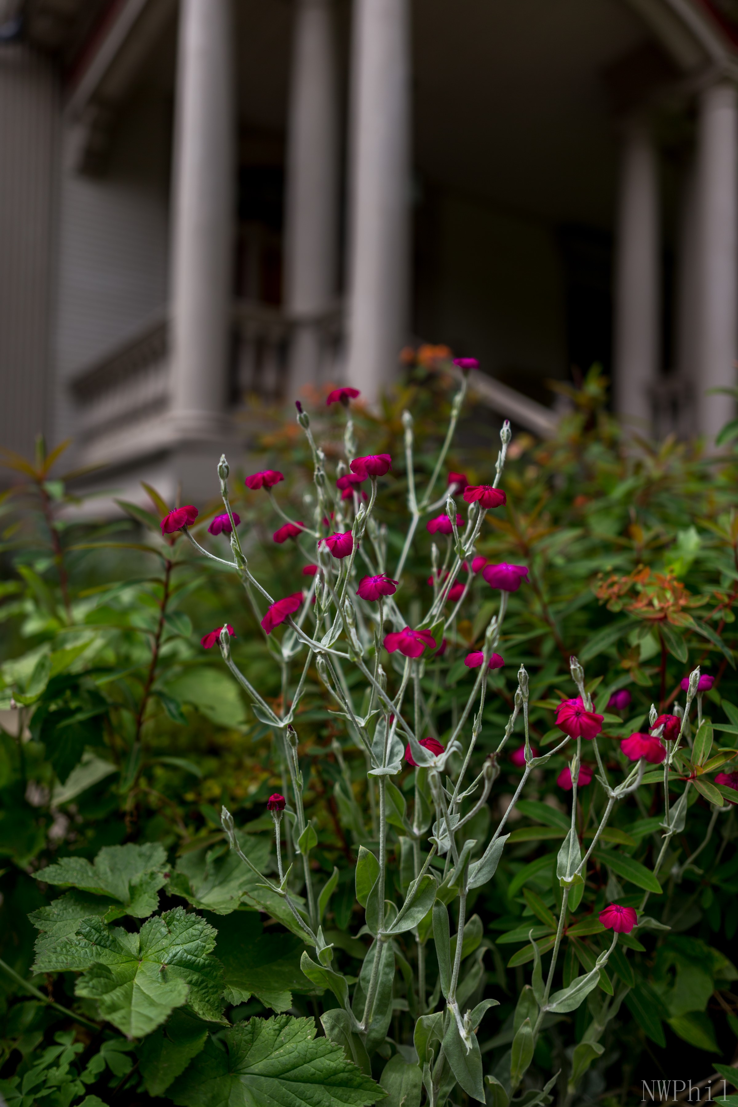
sometimes wide-angles can do the trick too...
edit:
Zeiss Otus 28mm @ f/1.4 on a canon 1Dx
Edited on Jul 29, 2019 at 12:46 AM · View previous versions
edit:
Zeiss Otus 28mm @ f/1.4 on a canon 1Dx
Edited on Jul 29, 2019 at 12:46 AM · View previous versions
Jul 28, 2019 at 07:02 PM
p.23 #20which lens has the most 3D POP?
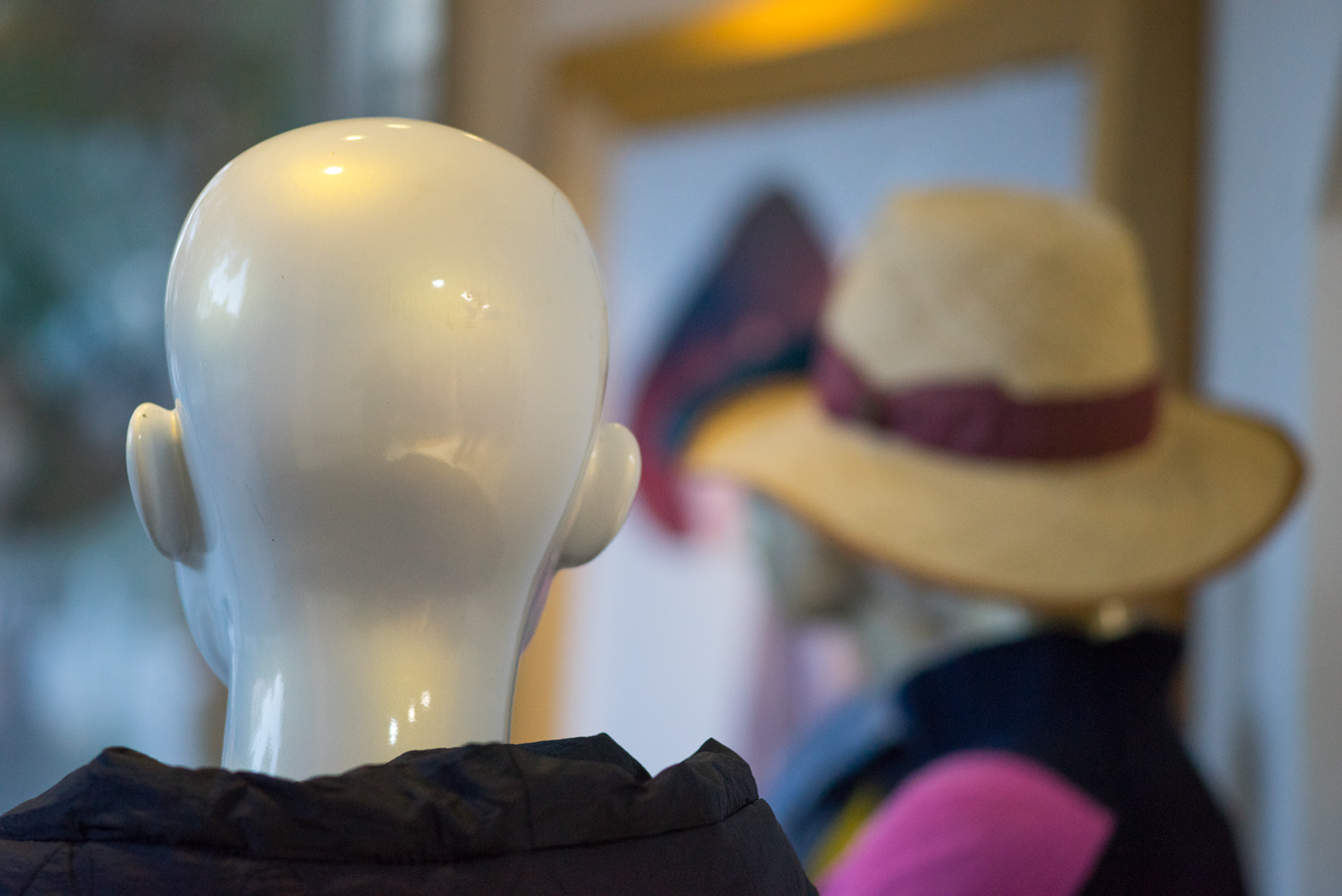
A close run among my MF lenses (all chosen for 3D qualities) comes from the CY 100/3.5. It obviously gets plenty of wide open use - being my favourite portrait lens - but here are a couple of full DOF landscapes with no leading lines to speak of - a tough test. Plus two shot at f3.5 to illustrate the OOF favoured by CZ designers from this very trad 5/4 Sonnar design.

Jul 28, 2019 at 07:27 PM