sum1sgrampa wrote:
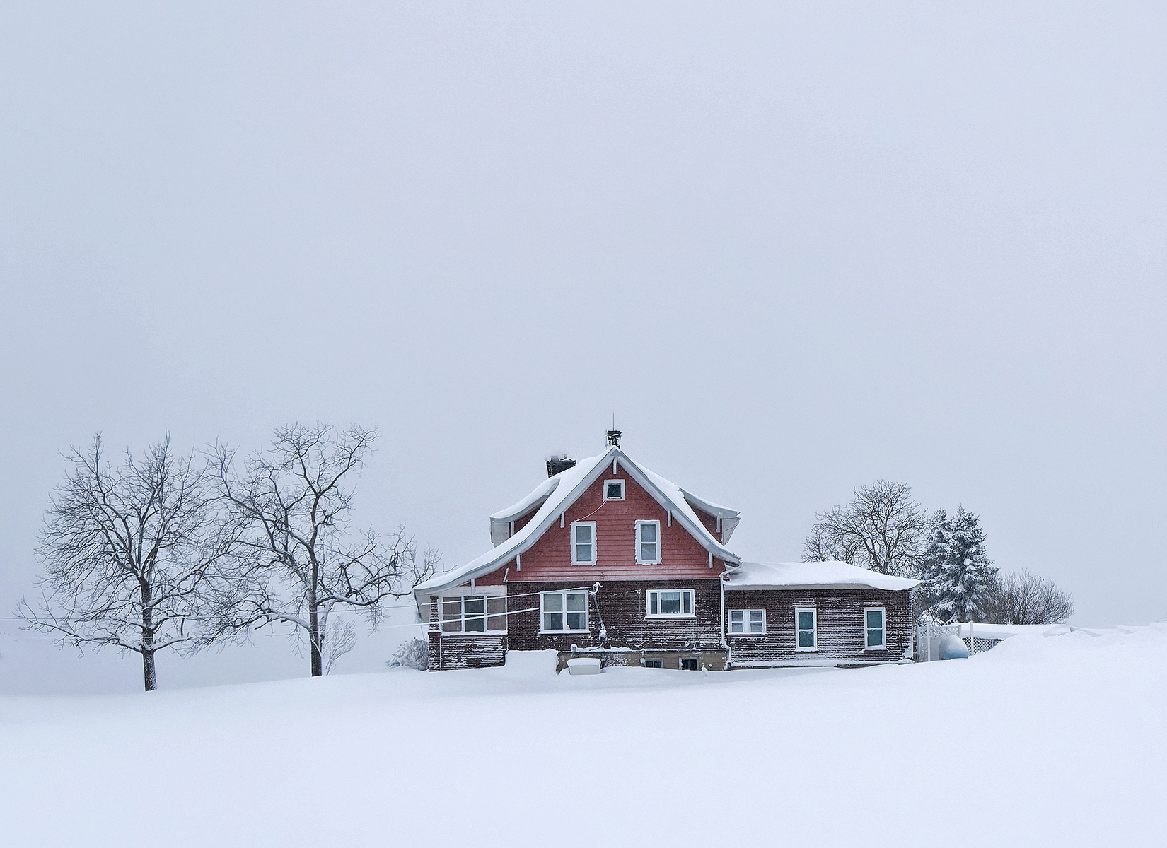
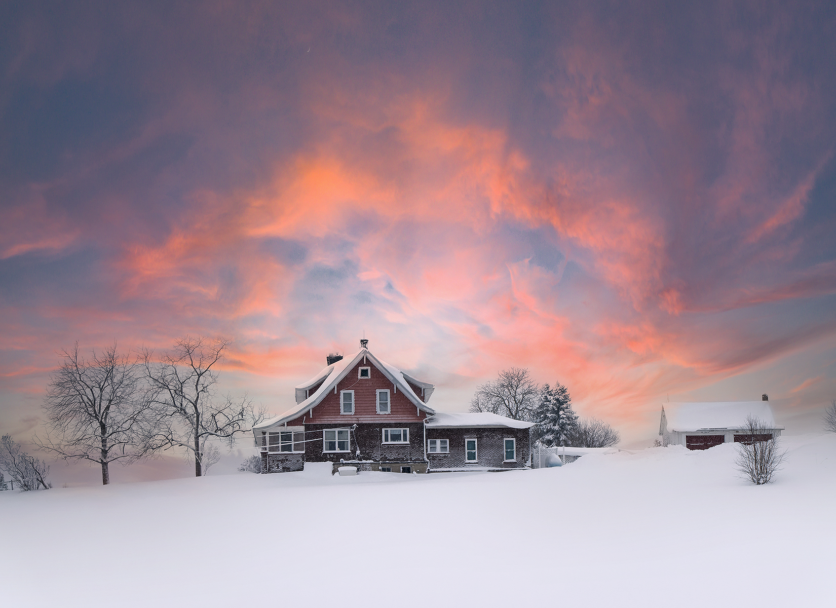
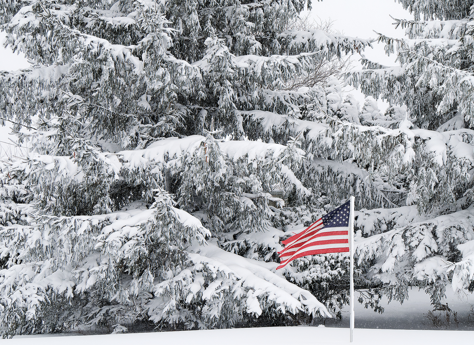
I looked at it that way also. Didn't like the composition, thought it looked too "boxy".
Anything else I can do for you
I like this one! As a suggestion, I think the composition may benefit from changing the format from 4 x 3 to 3 x 2 (cropping from the top)🙂