- Abram, your "garage" has potential for great 3D. The Flickr raped version is pretty awful, but the one original you loaded to Flickr with some added sharpening has great potential. Using f/3.2-4 would make the garage to pop-up nicely, but still maintaining important parts in focus. I'm jealous to you, since I don't have this kind of paint peeled off garages to shoot here
- rwcs, really shallow DOF for Distagon 35, nice.
- Juan, you too have very shallow DOF with Distagon 35 and very smooth bokeh, either my memory doens't work (very probable ) or I have "different" 35mm Distagon, have to go out and see...
akul wrote:
Samuli - You are absolutely right about the polarizer. I have never used them on zeiss up to this point. I think it is about time to expand a little. I see the benefit of their use clearly from your shots, and I like shooting trees and leaves. Beauty and clarity I see in your shots are truly inspirational. Thanks again for your tip.
This year's photos I could not use polarizer due to not being able to carry much stuff (e.g. tripod) due to knee and back issues. All the past years I have shoot mostly from tripod, with polarizer when beneficial while at same time covering the filter and lens from sun with hand/cap/whatever available. I don't think I can use polarizer AND do the shooting handheld, I could try but I'm pretty sure it will end to frustration and flare issues (or I have to upgrade my Hoya filters to some decent ones...). The ZE/ZF/ZS lens hoods are not effective, if filter is used and also with most Z* hoods it's really hard to use polarizer when hood is installed.
If you use polarizer be careful to not get "too blue" skyes, which is big problem for me when I shoot with polarizer. Also sometimes greens can get much more greener than it's possible to represent in web or even with most of the current LCD displays.
akul wrote:
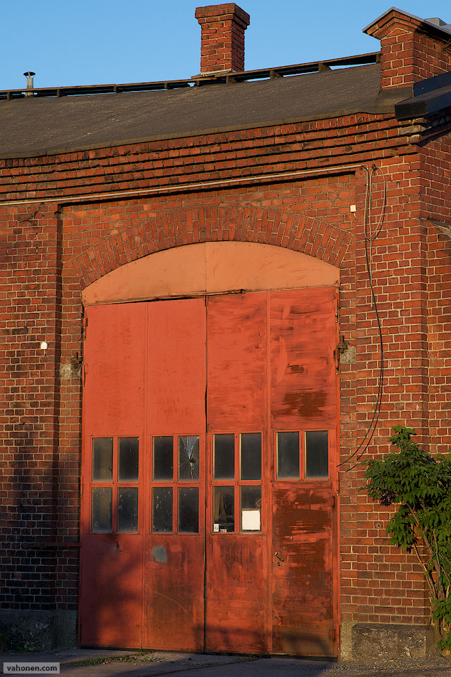
Beautiful capture of light on the most recent shot with 85. It looks very crisp and gives me an impression of large DOF. Where was your focus point ? I sort of assume the first doorway on the left?
Thanks - I can't remember where the focus was but when I look at the original picture I'm 95% sure it's on the wall behind the doorway. What the hell I was thinking - or did I think at all, maybe trying to optimize DOF for whole building...thanks for bringing this up, I'm in "rust" after not shooting for 9 months - I should remember by now "do not optimize overall DOF, always focus to main element in picture", but seems I make rookie mistakes again. Due to this the doorway doesn't pop-up as it should, instead too much attention is drawn to the wall with texture - hmm, I definitely have to reshoot this one, more emphasis is needed to the "light path" towards the doorway and doorway itself.
Samuli Vahonen wrote:
- Abram, your "garage" has potential for great 3D. The Flickr raped version is pretty awful, but the one original you loaded to Flickr with some added sharpening has great potential. Using f/3.2-4 would make the garage to pop-up nicely, but still maintaining important parts in focus. I'm jealous to you, since I don't have this kind of paint peeled off garages to shoot here
I agree, flickr does tend to ruin photos... I wonder if Smugmug is any better? I have unlimited hosting with them as well.
I shot that at f/5.6, but it's not TOO far from home so I can always go back and re-shoot (May even do that today, been wanting to go back there with a tripod) I appreciate the compliment but also the constructive feedback, it's very helpful.
AbramG wrote:
I agree, flickr does tend to ruin photos... I wonder if Smugmug is any better? I have unlimited hosting with them as well.
I have seen good embedded photos from Flickr, I think the "trick" is that you share the same "original", not some resized size. I don't know how to do it since I have had my own website 10+ years and have never wanted to host my pictures in other websites.
AbramG wrote:
I shot that at f/5.6, but it's not TOO far from home so I can always go back and re-shoot (May even do that today, been wanting to go back there with a tripod) I appreciate the compliment but also the constructive feedback, it's very helpful.
Giving constructive feedback via internet is very difficult, anything negative in internet turns very fast to something ugly. Well it's not so easy in "face to face"-situations either, but a little easier and less risk to understand words incorrectly.
--------------------
I rarely shoot at f/1.4, but below are two with 85ZE, these were taken after sunset, just having yellow glow in the sky.
Regarding Flickr you just have to upload the image in the correct size and then choose "original" in the drop-down-menu when copy the link. That's the way I post most of my pictures.
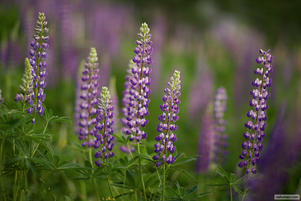
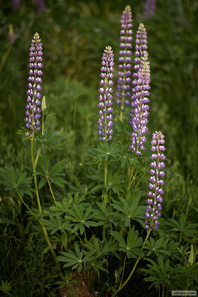
Samuli, your two urgan shots are amazing!
Juan, great shot! It looks more like Norway than Spain, though...:-)
Prosep: awesome! Where is that? It really gives you the urge to go there NOW!
Bobn melbmanu: lovely compositions!
I am running out of time and words to congratulate everyone appropriately...:-(
Samuli - love the soft, warm light in both building shots. Some subtle telephoto compression in the first to highlight the repetitive patterns in the buildings.
AbramG: enjoy! The first test shot is particularly nice -especially the front door!
rwcs: yellow & blue color combo really adds to the shot. Love to see more.
prosep: interesting shot of the falls in Yellowstone. Taken from Artist Point? When did you go? Nice to see some lingering snow as well. My very personal opinion would be to bring down the contrast levels slightly w.r.t the brown tones in the corners
BTW, was your workflow there something like this? !
<swat flies> <take shot> <put bug spray> <throw it away> <swat some more> <repeat>.
juan: Yeah, as Samuli said, quite shallow bokeh, even after accounting for 35mm FL and background distance [estimated]
Bob: that 5 shot pano, is very, very good. Crisp and vibrant! Regarding your second
set, #3 and #4 are already at a very good baseline IMHO and a few simple moves and some careful sharpening should do the job. On images like #1, if the histogram is narrow as I suspect it is, it would be useful to open up the highlights a little bit [unless it was a dark grey] and work on some local contrast in the upper half of the tone curve. the lower half will need only some gentle contrast treatment before it gets crunchy IMO. Or else, try B&W and a higher contrast/separation treatment.
This is also a good candidate for an a,b curve steepening move in LAB.
I have a hard time keeping up with the pace. So many wonderful pictures!
abhijeeth: wonderful pictures!
Bob, send the RAWs, I give it a try. it is hard with downsized JPGs.
Cyra: The third one in the 1st set [would like to see more within the frame] and the 1st one in the 2nd set would be my picks. I can't explain the 2nd choice, despite the tree in the middle, I still like it.
MJWong:#2 is just fantastic. #1 is also good but #2 is the king!