great shots everyone. thanks denoir and carstenw. im still a little confused about what 3D means, but for the most part im convinced there is a real difference between canon L and zeiss lenses.
Bob - Your Cinque Terre series is awesome. I'd love to visit there one day.
OIAf - Nice shots. I like the Bonsai shot with 50MP very much.
Jochenb - Great shot from a cemetery
Carsten, Denoir - Great discussion. To make the matters more complicated is the lighting. Lighting gives or take away the impression of 3D ness too. And I don't mean hard shadow, specular light, etc. Front lit tends to be flat, side, or back lit with bounce has more. etc. I love the tube shot by the way.
Lars - Love the buddha with cape. Quite a color. Amazing macro shots. Color of those are just amazing. Wow!
JulianDeLarosa - Beautiful shot with 21.
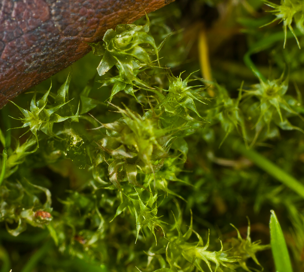
prosep - Love the 100MP shot. Delicate small plant with nice background.
alkanphel - Great macro. What an interesting plant ! I remember seeing a similar plant in high altitude of Mouna Kea. Great bokeh.
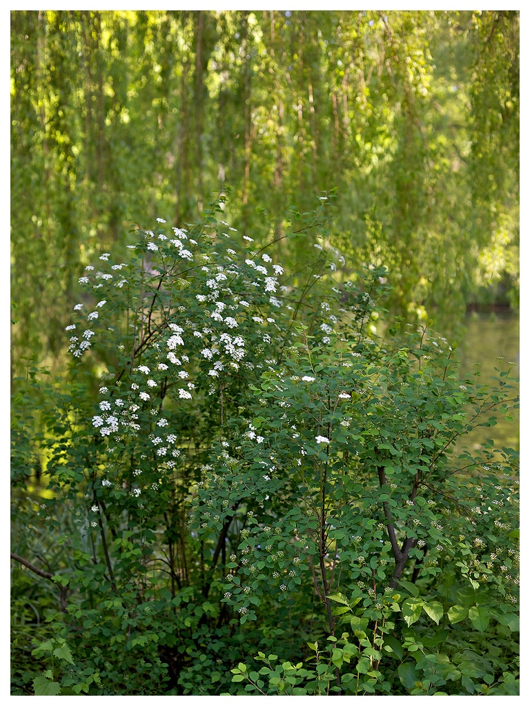
A 50MP shot from Volkspark Friedrichshain today. I need to figure out how to increase contrast in similar tones without modifying the image in general, such as increasing the contrast in the foliage in this shot.
By the way, I don't think I have ever used the clone tool so much on an image before Nothing major, just cleaning up dirty little details and corners where you don't notice them at first, but they bring the image down slightly. I am not sure if this is a good thing...
Another one I had slight trouble with, this time because the subject is dark and the background light. This is hard for me to pull off, but it ought to be possible.
Thanks Akul! I was leaning way over a fence to get the shot, and another guy with a camera walked by, and was trying to figure out what I was shooting. He walked back and forth and couldn't figure it out
Silver Efex Pro 2 is probably what you want. Very nice tool, which can automate much of the B&W conversion process. You seem to be quite good already though?
carstenw wrote:
A 50MP shot from Volkspark Friedrichshain today. I need to figure out how to increase contrast in similar tones without modifying the image in general, such as increasing the contrast in the foliage in this shot.
By the way, I don't think I have ever used the clone tool so much on an image before Nothing major, just cleaning up dirty little details and corners where you don't notice them at first, but they bring the image down slightly. I am not sure if this is a good thing...
Carsten: If you have lightroom or Photoshop, you could play with the slider Pr�senz. Additionally try to make the gradiation curve steep at the brightness levels of the leafs. Helpful is also to enhance the saturation of green while decreasing the luminosity of green.
I like the first one, although the central placement of the leaves, and the way the secondary group on the right has been sliced through, weaken the composition, IMO. Your processing seems to be very good on the sharpness front, but less strong in the colours. If I had to recommend something, I would say to focus on having a strong composition of an interesting subject, and working on the colours in PP.
H.Lux wrote:
Carsten: If you have lightroom or Photoshop, you could play with the slider Pr�senz. Additionally try to make the gradiation curve steep at the brightness levels of the leafs. Helpful is also to enhance the saturation of green while decreasing the luminosity of green.
When you say Pr�senz, I presume you mean the Clarity slider, not the Vibrance and Saturation sliders? I use Aperture, so perhaps Definition is the closest. Clarity appears to boost the contrast in the midtones (and I recall a warning from Luka that it destroys micro-contrast when over-used), whereas Definition is like a gentle USM with a large radius, and thus affects the whole image. Anyway, this sounds like the right thing, so I will try that.
Aperture's curve tool is not as powerful as CS4's, so maybe I will have to pop into CS4 to tweak the high end of the curve there.
carstenw wrote:
When you say Pr�senz, I presume you mean the Clarity slider, not the Vibrance and Saturation sliders?
Yes your right. I meant clarity (Klarheit) in the Pr�senz (presence?) panel.
You may also double the layer and multiply them. Then adjust the opacity slider. Dark areas may become too dark.
As you mentioned everything has to be done with care.


 Nothing major, just cleaning up dirty little details and corners where you don't notice them at first, but they bring the image down slightly. I am not sure if this is a good thing...