FM is looking "slick"
p.2 #1FM is looking "slick"
What happened" this morning, grabbed my phone, tried to follow a thread that got my attention and it's now rather cluttered ? 8 spaced lines of stuff before/after the "post." Desk top version has three with poster details to side. I can read the posts without working through all that stuff. Notwithstanding ads and two sets of reply boxes. ot sure, at least the phone version, is working well for me?
Nov 11, 2026 at 10:09 AM
p.2 #2FM is looking "slick"
The mobile interface is quite busy and seems to require more clicks. I’m sure I’ll get used to it over time.
Nov 11, 2026 at 05:44 PM
p.2 #3FM is looking "slick"
dclark wrote:
The change in "Activity" from showing total posts and likes is a bit misleading and may change some behaviors.
For example, I have 5 dots in my activity, which may lead you to believe I post a lot. Not true. That reflects 6886 posts (6887 with this one) over the past 23 years and 8 months. There are many FM'ers that post that many in a period of just a few months! They should be rewarded with many more dots than I get. Maybe activity dots should be based on posts per day, or maybe posts over the past week or...Show more →
It appears you now have to hit the ‘Detail’ tab under a user’s name in order to see their likes, to see where they’re from, and to see if they have thread or assignment wins, otherwise all that info that used to be visible it is now hidden. I really hope @Fred Miranda can change it back to leave it as before where by default we can see the likes and the other info, and make the button ‘Hide’ if for some reason a person does not want to see that (or eliminate the button altogether). I personally really enjoy seeing all that info for members, and it is cumbersome to have to hit ‘Detail’ for each and every member, only to have it default to hidden the next time I get on.
The change in "Activity" from showing total posts and likes is a bit misleading and may change some behaviors.
For example, I have 5 dots in my activity, which may lead you to believe I post a lot. Not true. That reflects 6886 posts (6887 with this one) over the past 23 years and 8 months. There are many FM'ers that post that many in a period of just a few months! They should be rewarded with many more dots than I get. Maybe activity dots should be based on posts per day, or maybe posts over the past week or...Show more →
It appears you now have to hit the ‘Detail’ tab under a user’s name in order to see their likes, to see where they’re from, and to see if they have thread or assignment wins, otherwise all that info that used to be visible it is now hidden. I really hope @Fred Miranda can change it back to leave it as before where by default we can see the likes and the other info, and make the button ‘Hide’ if for some reason a person does not want to see that (or eliminate the button altogether). I personally really enjoy seeing all that info for members, and it is cumbersome to have to hit ‘Detail’ for each and every member, only to have it default to hidden the next time I get on.
Nov 11, 2026 at 08:20 PM
p.2 #4FM is looking "slick"
We're still actively working on the mobile layout, and I just pushed a bunch of updates tonight. Sorry for the delay in catching this thread...I'm reading through the feedback here as well! https://www.fredmiranda.com/forum/topic/1961307/
Nov 11, 2026 at 09:10 PM
|
p.2 #5FM is looking "slick"
Ross Martin wrote:
For example, I have 5 dots in my activity, which may lead you to believe I post a lot. Not true. That reflects 6886 posts (6887 with this one) over the past 23 years and 8 months. There are many FM'ers that post that many in a period of just a few months! They should be rewarded with many more dots than I get. Maybe activity dots should be based on posts per day, or maybe posts over the past week or month. Then FM'ers who post multiple times a day would get the recognition they deserve. And a string of dots are pretty dull. Why not a string of emoticons? It could start with a 😡 and then add a 😏, and by the time you have 7 emoticons you get a 🤣 or maybe a 😇. I see lots of room for improvement over dots.
Likes are no longer displayed! This is going to slaughter the urge to post photos in equipment forums where they will get Likes rather than in the presentation forums where all you get are a few nice comments. Some of the most active threads in the Sony forum may collapse. You may still get likes, but if they don't show, who cares?It appears you now have to hit the ‘Detail’ tab under a user’s name in order to see their likes, to see where they’re from, and to see if they have thread or assignment wins, otherwise all that info that used to be visible it is now hidden. I really hope @Fred Miranda can change it back to leave it as before where by default we can see the likes and the other info, and make the button ‘Hide’ if for some reason a person does not want to see that (or eliminate the button altogether). I personally really...Show more →
I want to clarify that my comment about Likes not showing was meant to be sarcasm. I think it's not good that threads are started in equipment forums to post Nature and Wildlife photos to get likes, rather than post them in the N&W Forum where they should be.
dclark wrote
The change in "Activity" from showing total posts and likes is a bit misleading and may change some behaviors.For example, I have 5 dots in my activity, which may lead you to believe I post a lot. Not true. That reflects 6886 posts (6887 with this one) over the past 23 years and 8 months. There are many FM'ers that post that many in a period of just a few months! They should be rewarded with many more dots than I get. Maybe activity dots should be based on posts per day, or maybe posts over the past week or month. Then FM'ers who post multiple times a day would get the recognition they deserve. And a string of dots are pretty dull. Why not a string of emoticons? It could start with a 😡 and then add a 😏, and by the time you have 7 emoticons you get a 🤣 or maybe a 😇. I see lots of room for improvement over dots.
Likes are no longer displayed! This is going to slaughter the urge to post photos in equipment forums where they will get Likes rather than in the presentation forums where all you get are a few nice comments. Some of the most active threads in the Sony forum may collapse. You may still get likes, but if they don't show, who cares?
I want to clarify that my comment about Likes not showing was meant to be sarcasm. I think it's not good that threads are started in equipment forums to post Nature and Wildlife photos to get likes, rather than post them in the N&W Forum where they should be.
Nov 11, 2026 at 09:29 PM
p.2 #6FM is looking "slick"
The image frame feature has changed, to my mind for the worst. It's a busy and fussy multi-stage effort now, so none of my images will get a frame at all from now on. This below is what appears. It's non-intuitive (white is a standard here) and over-featured, and therefore much harder to process than choosing an item from the drop down list we had before. It's hard to predict what will happen.
There are no fewer than 17 selectable buttons here. I hope others like it, nevertheless, it will suit some of them who want a set and forget scheme. I know it is a bit of a challenge. It's all outweighed by the WYSIWYG post preview - a lovely job. cheers.
PS it's good usability practice to order and display options in frequency of use order or failing that, in order used elsewhere (as a standard), or failing that, alphanumeric order. I'm not sure Show as link would be more frequently used than following options, for example.
PPS the greys and blacks bleed into each other.
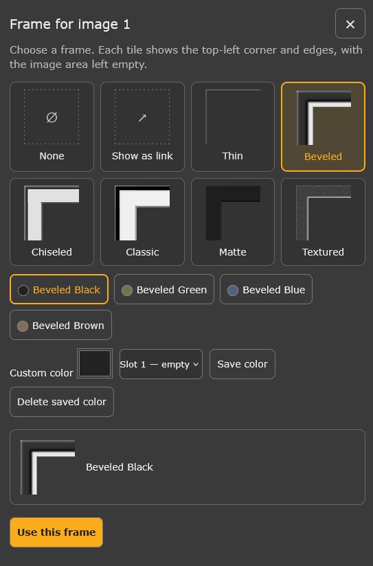
There are no fewer than 17 selectable buttons here. I hope others like it, nevertheless, it will suit some of them who want a set and forget scheme. I know it is a bit of a challenge. It's all outweighed by the WYSIWYG post preview - a lovely job. cheers.
PS it's good usability practice to order and display options in frequency of use order or failing that, in order used elsewhere (as a standard), or failing that, alphanumeric order. I'm not sure Show as link would be more frequently used than following options, for example.
PPS the greys and blacks bleed into each other.
Nov 12, 2026 at 07:27 PM
p.2 #7FM is looking "slick"
I seem to have to look more carefully to determine if it's something I already read as in the for sale section, one of the two should be brighter and the lower price marker is not as pronounced as before.
Nov 14, 2026 at 08:07 AM
p.2 #8FM is looking "slick"
On the mobile version, is there a way to get to the first unread post in each thread? Maybe I'm missing it - right now, I can only get to the start of the thread or the last post of the thread.
Nov 14, 2026 at 07:23 PM