morris wrote:
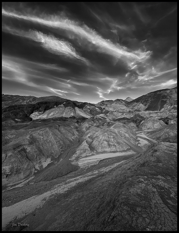
It's so strange to see this colorful place in monochrome. Well done.
Morris
I actually like the idea of seeing it in monochrome.
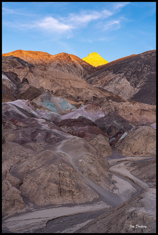
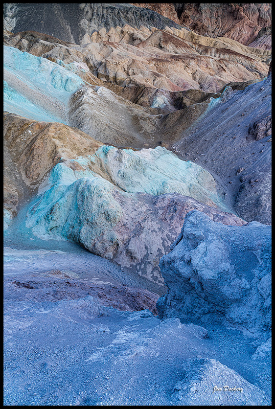
I’m probably an exception, but as a regular Death Valley photographer I have just never been that thrilled by the actual colors of that feature. (Hint for those who haven’t been there — they are not as vibrant as you see in a lot of photographs.)
I like the way the cloud shapes pick up the curing shapes of the wash, too.
Thanks for all the comments, esp. about the halo. When I have time I'll go back and look at the RAW (it is an old shot stored away on another drive).
Dan, I agree on the color of this area. First visit we timed for sunset and were disappointed - until we started hiking up into the hills after the sun was down, which is when the color really came out. I was happily surprised to have the whole place to myself!
Jim Dockery wrote:
Dan, I agree on the color of this area. First visit we timed for sunset and were disappointed - until we started hiking up into the hills after the sun was down, which is when the color really came out. I was happily surprised to have the whole place to myself!
As you might know, I photograph a lot in DEVA. (In fact, at one time a DEVA lodging had my — old, and less than my best* — photographs in the guest rooms. They may still. I know they have one in a lobby area.) I've gone to Artist Palette many times... morning, midday, late afternoon, evening... and while I'm impressed by the geological implications of those colors, as a photographic subject they just have never quite done it for me. I know I'm in the minority, since I see photos of the feature all the time.
There are some "challenges" with the location, as you probably know. The colors would probably be most intense either in very early sunrise or very late sunset light... but the light is blocked by the mountains above it in the morning and by the Panamint Range in the late afternoon. (Maybe under reflected light from brilliantly lit clouds?) And, of course, midday light washes out what are rather subtle colors.
The other challenge is that we see so many photos of the feature than have the colors amped up way beyond anything like reality. I'm not at all against "optimizing" color but for those of us who like to stick a bit closer to something believable, well, you know... ;-)
While I haven't spent a lot of time on Artist Palette itself, I have photographed quite a bit on that driving loop. There are some really great features there, from the face of the Black Mountains, to the winding washes, and out across the Valley.
:-)
- - -
*The story behind the DEVA lodging prints is kind of interesting, but too long to tell here. Suffice it to say that the client selected photographs from my portfolio that I would not have chosen, and there was no (gentle) way to talk them out of their choices. In the end, the client is (almost) always "right." :-)
I think that's one of, if not the best shots of Artists Palette. I've never been impressed with it when I've driven through .... maybe I'll have to revisit in B&W! The contours & textures really stand out. Hope you can minimize the halo.
I like this very much.
My only very humble suggestion would be to consider adding a bit of contrast if possible to the lower/mountain part of the image. The sky is much contrastier (which is eye-catching), but then I think the overall balance would be a tad better if the lower part had comparable contrast.