fredmiranda.com
Login

Moderated by: Fred Miranda
  

FM Forums | Photo Critique | Join Upload & Sell


Critique - Banff Travel Photos


ws_photo
Offline
•
Upload & Sell: On
p.1 #1 · Critique - Banff Travel Photos


Hi all,

This seems like a good place to start in this forum. Its amazing to see a community forum like this still so active today. Anyway, I recently to Banff National Park with way too many cameras and had a very enjoyable time making some photos and memories with friends.

Would love some feedback on these images, especially any color editing suggestions. I always have a tough time creating a consistent color style through my images since I often switch between brands, film stocks and formats. Is it even worth actively trying to achieve a consistent color "look" through your body of work?

Thanks!


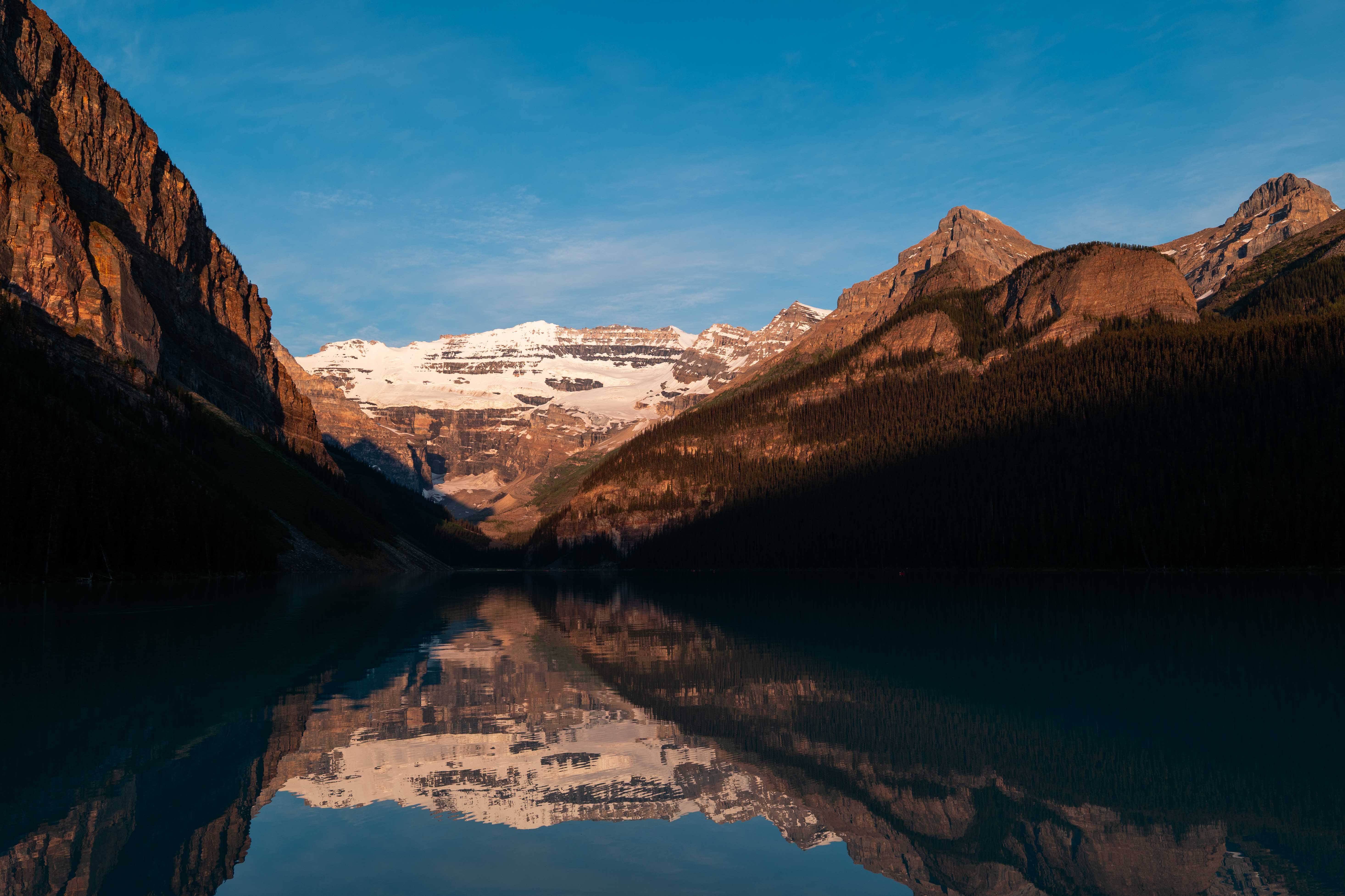
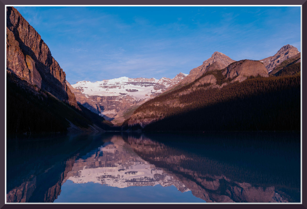
Sunrise Over Lake Louise


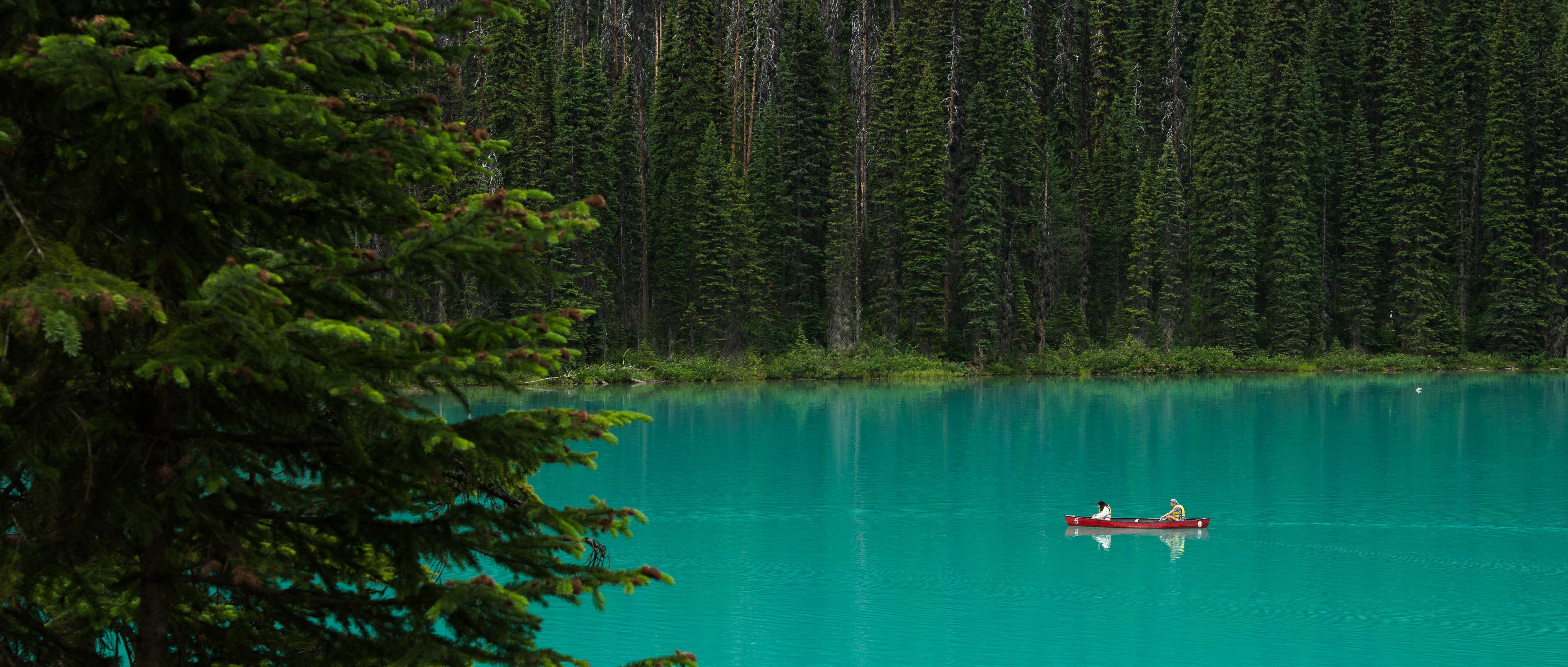
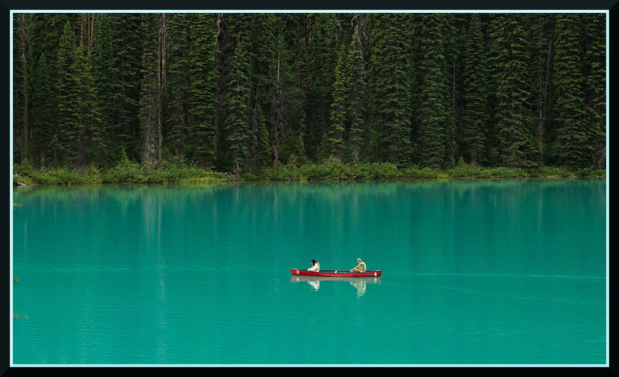
Banff Blues


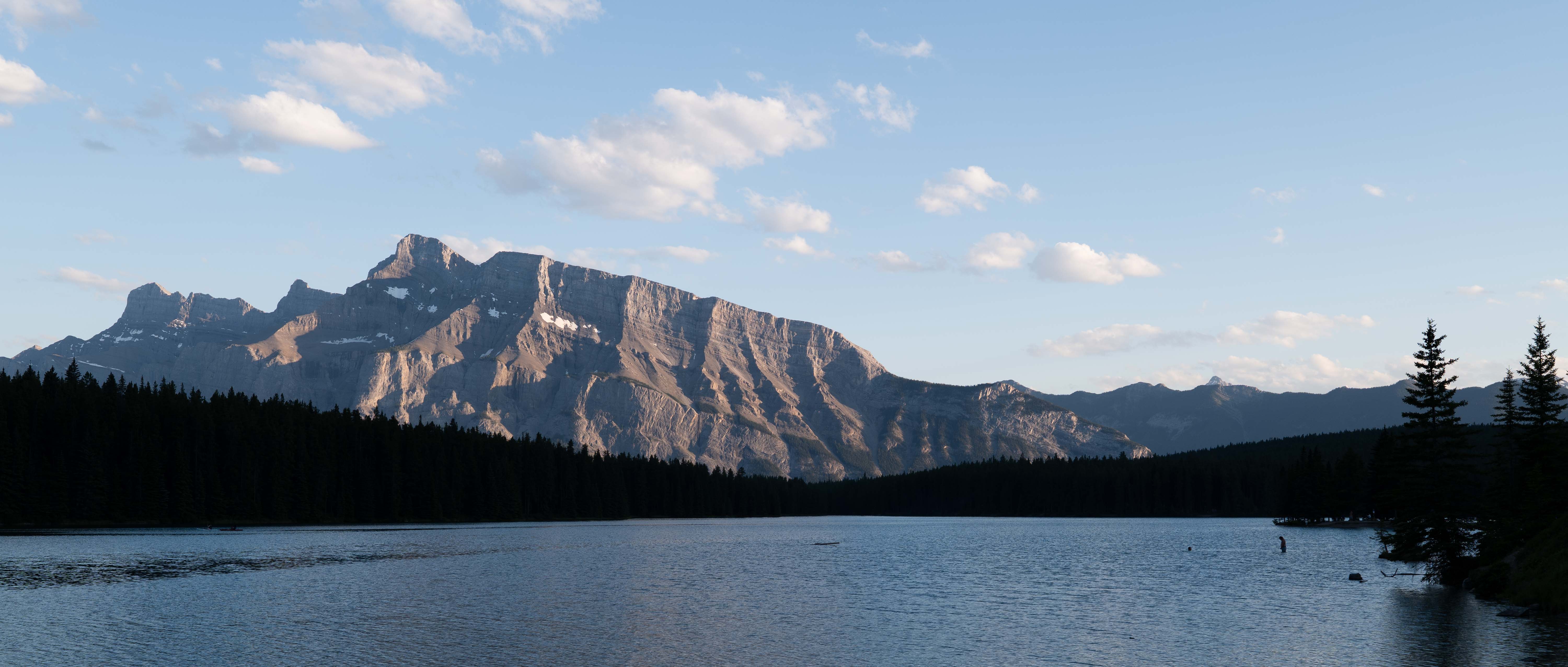
Cold Water


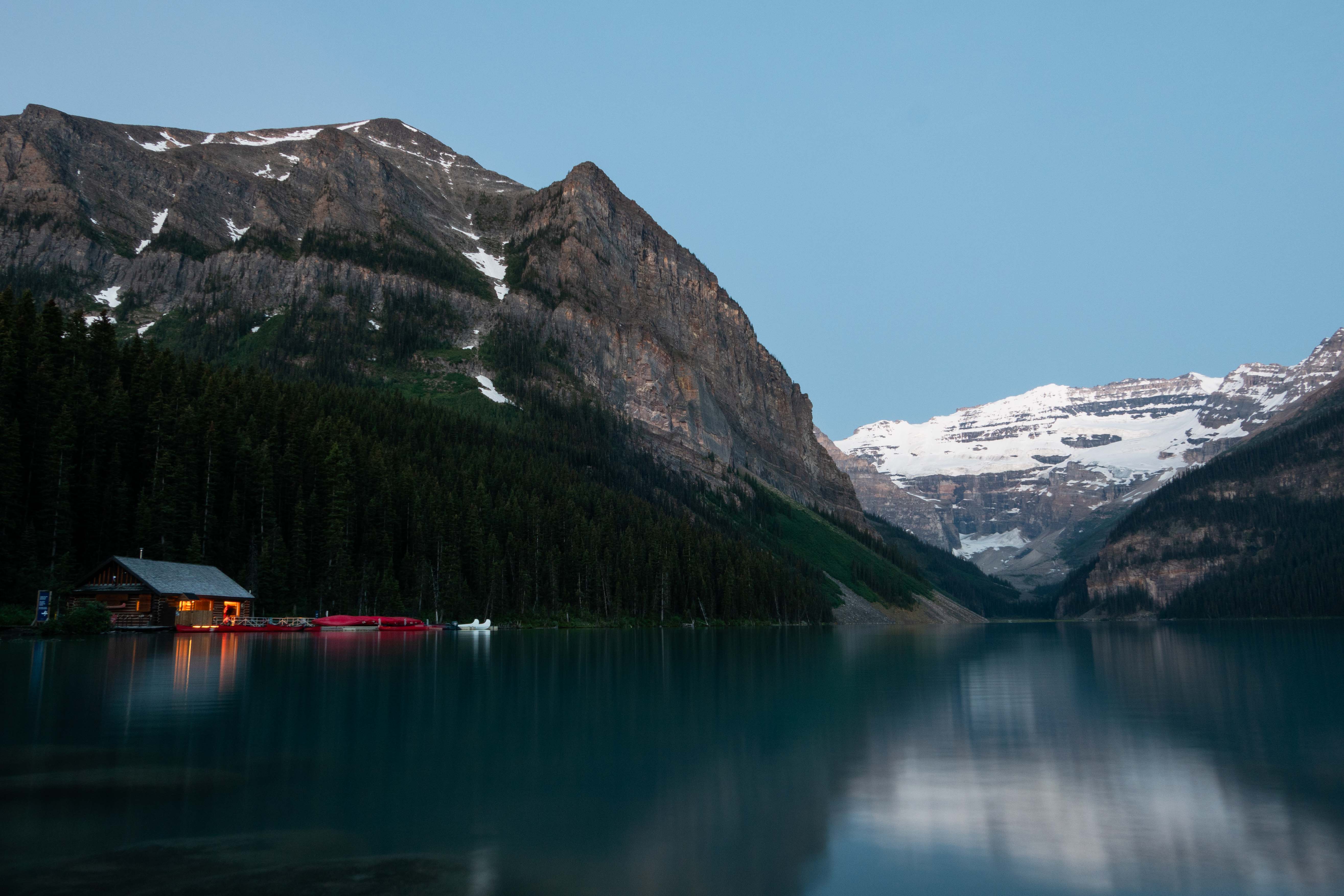
Waiting For Sunrise


Sep 16, 2026 at 03:14 AM
Shasoc
Offline
• • • • • • •
Upload & Sell: On
p.1 #2 · Critique - Banff Travel Photos


Welcome to the Critique Forum.

Is it even worth actively trying to achieve a consistent color "look" through your body of work? My answer would be more "No" than "Yes".
Color opens up so many creative possibilities. The beauty of editing colors is that you can take the image to many different directions. Of course, it’s a matter of deciding how close you want to stay to reality or embracing all the creative possibilities. That is only your decision.
If you use PS/LR my recommendation would be to master The Point Color Tool in the Color Mixer Panel. It is one of the best adjustments you can use, not only to correct colors, but offers many creative possibilities. And you can use it with masks.

Usually, we limit the critique to 1 or 2 images. However these are all on the same "theme" and I will limit my suggestions to the essential (colors) w/o going too deep.

First image. The scene evokes a sense of peace and tranquility, with the warm light on the mountains contrasting beautifully with the cool blue sky.

I feel like the intense brightness and (in less intensity) saturation of the scene is overpowering the natural beauty of the landscape. To bring back the viewer's attention to the subject and to the subtle beauty of the light at sunrise, I would suggest reducing the overall saturation and luminance. Focus on taming those electric blues and warm oranges so the natural tones can carry the scene.

Second image. The striking color of the lake and the scale of the forest create a really captivating environment, with the canoe serving as a focal point that enhances the sense of calm and adventure of the image. I like the intensity of the colors and the deep greens of the forest creating a color palette that feels inviting.

Suggestion: the dense pine branches in the foreground, while serving as a frame, are a bit dominant and visually heavy. Reducing their visual weight by slightly darkening them or softening their contrast (or cloning some out), will allow the viewer's eye to move more freely into the scene, w/o competing with the lake and canoe.

Third image. The dominant blues and cool tones effectively convey some sense of cold water (a more "cool" blue would work even better). The warmth on the peaks is a nice touch, adding some contrast with the coolness of the scene.

Suggestion: The dark foreground foliage lacks detail and feels like a solid block. If possible, I would try to get some detail out of that area or look for a frame where light hits the tops of the trees or the water's edge, which would create a more engaging transition into the scene and enhance the feeling of "cold water."

Fourth image. The image conveys a sense of peaceful isolation. The cabin's warm light provides a strong visual anchor, drawing the eye into the grand landscape.
The cool blues and greens work together with the warm orange glow of the cabin, creating an inviting atmosphere and a feeling of quiet and natural beauty. What I miss is some warmth in the sky that would suggest a sunrise mood. It feels more like a serene twilight scene. Just how I feel about it.

Suggestion:The warm and inviting cabin feels slightly lost against the dense dark trees. Consider giving it more presence by lifting the shadows and making it a stronger anchor for the viewer's eye. This would reinforce its role as the element of human connection with nature.

You did a very good job on these! They are all beautiful images that inspire a sense of peace, tranquillity and adventure.
Think of colors as a way to express how you see the world around you. There is space for every kind of vision. Of course it’s a matter of deciding how close you want to stay to reality or use colors to express your creativity. What matters is making your photos with purpose.

Socrate


Sep 16, 2026 at 11:08 AM
grandmas
Offline
• • • •
Upload & Sell: On
p.1 #3 · Critique - Banff Travel Photos


Welcome to the forum!

On the first one I like the visual balance. The sky seems a bit green for my taste.

Two I find the tree on the left distracting and might consider a crop and slight sharpening.

Three has nice balance and colors, I like it as is.

Four, I like the idea you are going for, but it is so heavy on the left that I find it uncomfortable to view. I can’t find a crop to improve it.

Keep up the good work and remember whatever works for you is is right.


Sep 16, 2026 at 12:56 PM
ws_photo
Offline
•
Upload & Sell: On
p.1 #4 · Critique - Banff Travel Photos


Socrate,

Thank you for your very thoughtful response! I like your take on color. I will certainly put the feedback to use and I’ll make sure to keep posts in the future to 1 or 2 photos.

I especially like the idea of trying to bring out the detail in the foreground on the third image, it is quite dark. On the first image I did a few different edit versions, this one was the one I was most happy with. I definitely agree about lowering the saturation though.


Sep 16, 2026 at 04:12 PM
ws_photo
Offline
•
Upload & Sell: On
p.1 #5 · Critique - Banff Travel Photos


I enjoy the re-edits you did on these the first and second images quite a bit. Seeing your version of the first shot, it definitely is a bit green. Cropping out the tree entirely for the second image does clean up the image in a very satisfying way.

Thank you for the feedback!


grandmas wrote:
Welcome to the forum!

On the first one I like the visual balance. The sky seems a bit green for my taste.

Two I find the tree on the left distracting and might consider a crop and slight sharpening.

Three has nice balance and colors, I like it as is.

Four, I like the idea you are going for, but it is so heavy on the left that I find it uncomfortable to view. I can’t find a crop to improve it.

Keep up the good work and remember whatever works for you is is right.


Sep 16, 2026 at 04:13 PM


Search in Used Dept. 

RustyBug
Offline
• • • • • • •
Upload & Sell: On
p.1 #6 · Critique - Banff Travel Photos


Welcome to the Forum.

Nice presentation ... it gives us a vibe of being there somewhat, collectivley.

As to the issue of matching colors, etc. Unless you are working in a sect of the industry that DEMANDS it (and you wouldn't be asking, if you did), then it isn't going to be uber critical for perfect color matching, etc.

As an ambient shooter, we KNOW that the color of the LIGHT for a given time of day, as well as orientation of NESW, and a few other aspects are constantly in play.

To that degree ... you have "some" decisions to make. Primarily, are you trying to use the scene to SHOWCASE the color of the light ... OR, are you trying to use the light to SHOWCASE the scene (subject).

From that, you are also making decisions if your intent is to present the matter as a "recording device", or an "artistic rendering".

If we look to the history of Ektachrome / Kodachrome, Fujichrome (Velvia), we had distinctly different profiles in those film stocks. Generally speaking a photographer would adopt ONE of those as their "go to" film ... depending on which attributes they preferred.

Rarely did someone go "jumping around" from one film to another WITHIN a given shoot. Could, but mostly, didn't. Personally, I shot landscapes and general work with Fujichrome ... and portraits / weddings with Kodak VPS 160.

Going back to the 3 chromes ... while their color profiles did not match one another, there were TRAITS about them. One notable trait was the amount of saturation the profile(s) had. Kodachrome kinda rocked the world with its processing that allowed for more saturation than Ektachrome. Fujihrome had inherently strong saturation in the cool hues.

Insert color science of digital cameras, and we're off to the races between natural, low saturation and knock your socks off uber-saturation.

Hang with me ... almost there.

As a generalist ... we can certainly go with "whatever you like" and in today's realm, the world is your oyster.

However, if you want to build a certain degree of consistency across your work ... I'd suggest you make (sometime down the road is fine) some consideration to what levels of saturation you want to present in.

Imo, if you operate in a reasonable band of saturation range, your images will retain a certain cohesiveness to them ... and THAT is (I assume) the crux of your question ... how do I keep my work cohesive, so I'm not all over the map.

That's not to say, that everything, every time must be matchy-matchy ... and when shifting genre's etc. your apporach may indeed vary. But, to Socrate's point, unless you are repro-art, studio controlled, etc. ... perfect color calibration matching files is not for most folks. But, they can aid themselves by harnessing a degree of consistency in overall things like saturation, contrast vibes, etc. .. even if colors aren't perfect matches.

That said, take a lap back at nice images above ... consider the saturation levels applied in each, for your review.


HTH

Again, welcome to the Forum.


Sep 16, 2026 at 04:16 PM
ws_photo
Offline
•
Upload & Sell: On
p.1 #7 · Critique - Banff Travel Photos


RustyBug, I appreciate the extremly well thought out feedback. I love your comparisons of color today back to film stocks and I think you are absolutly correct when it comes to taking a look at saturation. Thanks!


Sep 17, 2026 at 10:26 PM
Malka_1
Offline
• •
Upload & Sell: On
p.1 #8 · Critique - Banff Travel Photos


For what it's worth, I think your #2 is perfect as is. Color of lakes in Canadian Rockies is not to be believed and you captured it well.


Sep 17, 2026 at 10:52 PM
ws_photo
Offline
•
Upload & Sell: On
p.1 #9 · Critique - Banff Travel Photos


Thank you! Glad you like it

That water is surreal.


Sep 18, 2026 at 01:35 PM
Jakelbee
Offline
•
Upload & Sell: Off
p.1 #10 · Critique - Banff Travel Photos


I love the first one. The coloring and reflecting are beautiful. The texture from the rock is unreal.


Sep 23, 2026 at 12:56 PM


FM Forums | Photo Critique | Join Upload & Sell


Welcome back
Log in to your account