p.1 #1 · Does anyone know how Harry Gruyaert produces his color images?
Does anyone know how Harry Gruyaert produces his color images?
He gets unique effects in his images, that fall into several categories. I know he has been shooting digitally for years and that he works very hard to produce his color images in a way that is just so.
But I have been unsuccessful in finding out more about his techniques, especially in his post-processing.
p.1 #2 · Does anyone know how Harry Gruyaert produces his color images?
I looked at his work on Magnum Photos. The photographs that I see there are mostly from the 1970s - 1980s. They are emotional, visually beautiful, and look more like modernist art paintings (some like Salvador Dali). I believe these are not digital. If these had been digital, one might have (unjustly) accused them of being over-processed.
Since you refer to his digital photography, would you be able to point to any relevant examples or collections on the Internet?
p.1 #3 · Does anyone know how Harry Gruyaert produces his color images?
ruthenium wrote:
I looked at his work on Magnum Photos. The photographs that I see there are mostly from the 1970s - 1980s. They are emotional, visually beautiful, and look more like modernist art paintings (some like Salvador Dali). I believe these are not digital. If these had been digital, one might have (unjustly) accused them of being over-processed.
Since you refer to his digital photography, would you be able to point to any relevant examples or collections on the Internet?
He has shot digital since Kodachrome was discontinued in 2010, and he may have digitized film slides for processing before that or since then. He does not sort his images by digital or film.
He likes digital now and said somewhere that it gives access to a kind of light that is not available on film. He works his images for a long time in post-processing and is extremely sensitive to nuances and differences in color renderings.
He shoots a lot in the three primary colors in bright light, but also in complementary colors and also in more monochromatic hues that are often referred to an "analogous."
Here is a link to a nice video displaying many of his images, some digital, some film, but none are marked as either:
p.1 #4 · Does anyone know how Harry Gruyaert produces his color images?
I believe that most work in the video isn't digital. I am not sure.
His (many) selected works on https://www.magnumphotos.com/photographer/harry-gruyaert have dates (have a look), and I like the characteristically grainy images from the 1970s - 1980s - to early 1990s. It is this grain that makes the photos look like art created using the neo-impressionist painting technique - pointillism.
The series "Harry Gruyaert�s Last Call" is a mix of film and digital, and to my eye, there is a difference. The grain is gone, and the more recent works from 2012-13 look less "interesting" to me.
p.1 #5 · Does anyone know how Harry Gruyaert produces his color images?
From 2015 "Herm�s Launches its Spring/Summer Advertising Campaign" series - there are several (3-5) that I like.
This one, for example. Maybe this is because it doesn't look digital.
downloaded from https://www.magnumphotos.com/arts-culture/fashion/harry-gruyaert-hermes-springsummer-advertising-campaign
p.1 #6 · Does anyone know how Harry Gruyaert produces his color images?
chiron wrote:
Does anyone know how Harry Gruyaert produces his color images?
He gets unique effects in his images, that fall into several categories. I know he has been shooting digitally for years and that he works very hard to produce his color images in a way that is just so.
But I have been unsuccessful in finding out more about his techniques, especially in his post-processing.
Anyone know anything?
Can't say that I personally like most of his images. Lots of his images were certainly shot on film, and you can easily see where he has done hand-coloring on many. I find his subject content more interesting than his post-processing. Anyone capable of post-processing today can easily replicate those 'looks'. IMO
p.1 #7 · Does anyone know how Harry Gruyaert produces his color images?
I am not primarily interested in whether the images are film or digital-I'm not sure how that became a focus of the thread. Anything shot after 2010 is almost certainly digital. I have three of his books with dates given. As far as his post-processing goes, he likes digital and may have digitized his slides. He says that digital gets an additional quality of light that is not possible with film and that digital made it possible for him to take more chances. But there is not a lot that he has said about his specific techniques.
His selection of colors and the intensity + subtlety he derives from them is very special. It is not just a question of hitting the saturation slider.
He is often compared to Saul Leiter, whose work I also love. But Leiter was working in a pre-digital era and so his processing was less intense--most of his color work was accomplished by his eye and in the camera.
p.1 #8 · Does anyone know how Harry Gruyaert produces his color images?
I see the distorted colors and color "grain" noise in the older images. The 20th century tech plus the scanning and PP creates inaccurate profiles that are artistic but not good.
There are so many ways to process images now it isn't even funny. Starting from digital RAW files, you should develop your own profiles to get the look you want if accuracy is not desired.
p.1 #9 · Does anyone know how Harry Gruyaert produces his color images?
Thank you for bringing this photographer to my attention. I�ve probably seen his work but was not really aware of it per se. (That video link was invaluable.)
Some things I notice about his style:ware
- he seems very aware of the effects of color. Color �realism� isn�t really a goal, and intense, saturated colors are often a visual key, along with an awareness of color relationships and the emotional effects of color. (I feel that he shifts/emphasizes colors and the overall balance for emotional effect.)
- although people appear in the photographs a lot, we rarely (hardly ever) see a focus on the what I might term the individual personality of the figures. In a sense they seem more important as graphic elements and points of focus than as personalities.
- he has a very strong graphic sense and most of hte iamges (with some exceptions) have very strong graphic components � shapes, angles, lines, etc.
- He does not shy away from blocking shadows and letting dark tones go all the way to black. There are a lot of dark/black spaces in many of the images.
- He balances that with high contrast levels (and that high saturation of colors)
- While the contrast levels are high, he is achieving them in ways that don�t necessarily over-emphasize details in the way that, say, just raising a contrast slider would. I�m not sure what is going on, but it is possible that he is using something like the classic unshared mask to increase contrasts over a wider radius. (There are some other techniques that could create this effect, too.)
p.1 #10 · Does anyone know how Harry Gruyaert produces his color images?
chiron wrote:
As far as his post-processing goes, he likes digital and may have digitized his slides. He says that digital gets an additional quality of light that is not possible with film and that digital made it possible for him to take more chances. But there is not a lot that he has said about his specific techniques.
Digital post-processing gives all photographers thousands of ways to alter original images and they can do it easier and faster than one could do making prints in a darkroom. Why should he say anything about his specific techniques?
His selection of colors and the intensity + subtlety he derives from them is very special. It is not just a question of hitting the saturation slider.
And some may find many of his images are trash. Just like many find images by Picasso, Warhol, Pollock look like garbage, while other find them to be great works of art. Once again, photographers proficient in post-processing can replicate the same looks on their own images.
But Leiter was working in a pre-digital era and so his processing was less intense--most of his color work was accomplished by his eye and in the camera.
He and everyone else could not attain the many manipulations of images in a darkroom that one can today on a computer.
p.1 #11 · Does anyone know how Harry Gruyaert produces his color images?
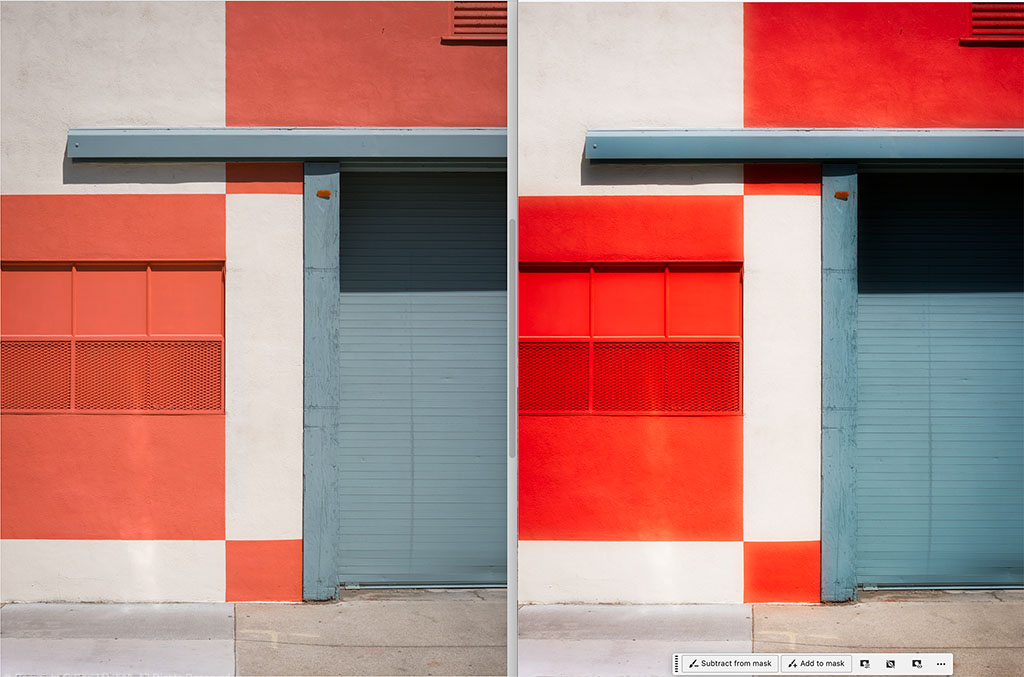
To add to something I wrote above, I think that techniques like that illustrated in this example show up in a good deal of his work ��not precisely the same thing, but along the same lines. The image on the left is what came into Photoshop, and even it was "amplified" a bit from the original. The image on the right does some processing along the lines of some of what we see. (Some might think this illustration is a bit over the top, but I did it that way to make the point.)
Also, I think this photographer doesn't shy away from photographing in harsh light ��and this photograph was also made in full, direct sun.
p.1 #12 · Does anyone know how Harry Gruyaert produces his color images?
gdanmitchell wrote:
Thank you for bringing this photographer to my attention. I�ve probably seen his work but was not really aware of it per se. (That video link was invaluable.)
Some things I notice about his style:ware
- he seems very aware of the effects of color. Color �realism� isn�t really a goal, and intense, saturated colors are often a visual key, along with an awareness of color relationships and the emotional effects of color. (I feel that he shifts/emphasizes colors and the overall balance for emotional effect.)
- although people appear in the photographs a lot, we rarely (hardly ever) see a focus on the what I might term the individual personality of the figures. In a sense they seem more important as graphic elements and points of focus than as personalities.
- he has a very strong graphic sense and most of hte iamges (with some exceptions) have very strong graphic components � shapes, angles, lines, etc.
- He does not shy away from blocking shadows and letting dark tones go all the way to black. There are a lot of dark/black spaces in many of the images.
- He balances that with high contrast levels (and that high saturation of colors)
- While the contrast levels are high, he is achieving them in ways that don�t necessarily over-emphasize details in the way that, say, just raising a contrast slider would. I�m not sure what is going on, but it is possible that he is using something like the classic unshared mask to increase contrasts over a wider radius. (There are some other techniques that could create this effect, too.)
gdanmitchell wrote:
To add to something I wrote above, I think that techniques like that illustrated in this example show up in a good deal of his work ��not precisely the same thing, but along the same lines. The image on the left is what came into Photoshop, and even it was "amplified" a bit from the original. The image on the right does some processing along the lines of some of what we see. (Some might think this illustration is a bit over the top, but I did it that way to make the point.)
Also, I think this photographer doesn't shy away from photographing in harsh light ��and this photograph was also made in full, direct sun.
I think that is an excellent reading of Gruyaert's way of constructing an image, and I have seen most of his published images over a period of years. I agree with you on all points and you have articulated it beautifully--the use of black, the pursuit of the emotional effect of colors (I believe that somewhere he has said that his favorite painter is Pierre Bonnard, and if you look at Bonnard's painting I think you will see many similarities), the deemphasis of individual portraiture--his people are human but they are almost categories of people and colors rather than individuals, a strong graphic sense, the use of both high contrast and high saturation in many images, his tendency to often shoot in bright daylight.
i think he may fine tune his colors to strengthen the way they play to each other, whether they play as contrasting primary colors or as more monochromatic colors as in his serene "analagous" images and seascapes. By fine tuning, I mean he may change the shade of a color--a blue with more or less gree, a red with more or less yellow--to work better with other colors.
I'm not sure what an "unshared mask" is--say more.
I liked your illustration--it does get at some of what he does. What did you do to the second image, if you don't mind saying?
p.1 #13 · Does anyone know how Harry Gruyaert produces his color images?
chiron wrote:
I'm not sure what an "unshared mask" is--say more.
I liked your illustration--it does get at some of what he does. What did you do to the second image, if you don't mind saying?
I enjoyed your take on his work.
�Unshared mask� is�
� a typo! I meant UNSHARP mask. (I suspect that autocorrect may have changed it.)
Unsharp mask is an old technique that was used a lot in the film darkroom. Basically you would create an �unsharp� version of your negative ��a blurred version � and layer it with the normal, sharp negative. This creates some extra contrast around boundaries between different luminosity levels. If you think of a line between gray and almost-white areas, around that boundary it would make the white whiter and the gray darker, even black. It is sort of like a large radius, high amount sharpening setting.
I actually used a version of that in my second image. That�s not all I did, but it probably has the biggest effect. It also increases the saturation of colors and expands the overall dynamic range a bit. I also steepened a luminosity curve so that the image goes rom pure black to near pure white and I added a slight s-curve to that curve. I also increased the saturation i level using a couple of techniques.
this is a game I try sometimes when I want to understand how a photographer creates a �look� � I try to use my post-processing tools to see how it is done by creating my own version of it. It isn�t my goal to try to imitate these other photographers, and the fact is that simply by using their techniques I would not capture the other, more important aspects of how they �see� the world, but it does help me expand my �bag of tricks� that I can apply to my own work.
p.1 #14 · Does anyone know how Harry Gruyaert produces his color images?
It is a unique style that underscores geometry and color in an interesting fashion. Thank you for sharing the links! I was unaware of him before this thread.
To me it appears his general look is high contrast, high saturation, with heavy black tail and longer white neck. Chrome films reproduced to print differently than digital does today. If properly exposed in high-contrast light, you would have a broad zone of black and then they had a longer neck up before being blown white as his images show -- this was primarily a property of how the color layers worked with the silver in a native positive. Kodachrome specifically had higher contrast and saturation with a red color weighting, while Ektachrome was a little lower contrast and saturation along with a different hue weighting toward the blue and green layers. In viewing his legacy images, it appears to me he used both emulsions, the Ektachrome being the images that appear a tad more muted, almost like they were made from color reversal emulsions.
The unknown is what was done in the lab between processing the chrome then printing it as a positive since we aren't directly viewing his originals. It's entirely possible he had some special recipe to increase both contrast and saturation further at the print or separation stage, and it appears he did something along that line, at least to my eyes. Regardless, very interesting and unique images
And lowering the blacks and popping the primaries would be easier post-2010 when he was working in digital.
There are other things he also does, for example in the more serene images, like the seascapes and the more monochromatic color images. I think one of the is that he fine tuned the colors.
p.1 #17 · Does anyone know how Harry Gruyaert produces his color images?
Jack Flesher wrote:
It is a unique style that underscores geometry and color in an interesting fashion. Thank you for sharing the links! I was unaware of him before this thread.
To me it appears his general look is high contrast, high saturation, with heavy black tail and longer white neck. Chrome films reproduced to print differently than digital does today. If properly exposed in high-contrast light, you would have a broad zone of black and then they had a longer neck up before being blown white as his images show -- this was primarily a property of how the color layers worked with the silver in a native positive. Kodachrome specifically had higher contrast and saturation with a red color weighting, while Ektachrome was a little lower contrast and saturation along with a different hue weighting toward the blue and green layers. In viewing his legacy images, it appears to me he used both emulsions, the Ektachrome being the images that appear a tad more muted, almost like they were made from color reversal emulsions.
The unknown is what was done in the lab between processing the chrome then printing it as a positive since we aren't directly viewing his originals. It's entirely possible he had some special recipe to increase both contrast and saturation further at the print or separation stage, and it appears he did something along that line, at least to my eyes. Regardless, very interesting and unique images
Excellent analysis, I think. He also worked in digital and came to be quite happy with it, and that would have given him access to a wide range of recipes to elicit what he wanted. Therefore, doing the aesthetic analysis of the final result, as you and Dan, and Scott are doing, may be the best way to understand how he worked, better than knowing exactly what his processing was and is--he is still working.
We are lucky today to have the processing and camera tools we now do. Achieving his controlled effects with slide films and processing is almost impossibly virtuosic.
p.1 #18 · Does anyone know how Harry Gruyaert produces his color images?
A unique presentation of color.
To my eye, I catch relatively low contrast but high color saturation. There is also a warm, slight 'wonky' color imbalance, that hints at outdated and/or thermally damaged film.
p.1 #19 · Does anyone know how Harry Gruyaert produces his color images?
Jack Flesher wrote:
Kodachrome specifically had higher contrast and saturation with a red color weighting, while Ektachrome was a little lower contrast and saturation along with a different hue weighting toward the blue and green layers.
Maybe this was true in the 70 and 80s but in my peak film years of the 90s, Kodachrome was far from being the highest color saturation transparency film. By that point I would in hindsight consider it to be somewhat muted emulsion, in comparison. But indeed his images from the series 'Made in Belgium' many do have that Kodachrome color look. And as mentioned, the inherent lower dynamic range of transparency film results in that typical crushed shadow range. We can do that now too with digital but often the inherently high stock digital profile color vibrancy isn't modified. When you reduce dynamic range in post, by increasing contrast, saturation increases. So to emulate the look, you'd crush shadows and play around with color saturation reduction.
His series 'Last Call' is IMO more technically eclectic, perhaps because it spans into digital. But to my eyes it looks like some of the film images have been reprocessed at some point in a more 'digital' approach, in some cases to pull details out of the shadows (you can see uneven grain intensity in these images). Some images have the look of having had low amount, high radius USM applied, which I wouldn't expect from a film image unless it was reprocessed. Or as Dan mentioned, maybe it was done during printing, way back when, sandwiched with a USM mask.
I don't really see unique color processing at play here. I feel it's generally how the film images looked and they frankly remind me of the (technical) results I had when I shot a wide range of film types. His post 2010 images look cleaner, as one would expect from digital. Some of the 'Last Call' images could just be from how they were scanned.
Taperwing wrote:
A unique presentation of color.
There is also a warm, slight 'wonky' color imbalance, that hints at outdated and/or thermally damaged film.
Maybe from too many trips through the airport x-ray machines on his many journeys. But in seriousness, this was the reality of shooting film. Emulsions were never static and unchanging like digital sensors. Things could and would change from emulation batch to batch. Plus the massive variables that processing potentially added to the mix (Kodak et al put huge effort into minimizing these variables, but it still came down to operator competency). A slip-up by a lab tech could significantly affect the processed image.
Back then, those were all things that photographers often tried very hard to overcome in the pursuit of never attainable technical perfection. But now it's desirable because it has nostalgic character that SOOC digital does not offer.
p.1 #20 · Does anyone know how Harry Gruyaert produces his color images?
The thing about shooting Kodachrome 25 as one's main color imaging method, is that the Kodachrome---as all reversal films--- was "stuck" at one level of contrast, one level of saturation, one daylight color [white] balance, one sensitivity(ISO). If the scene was contrasty and had saturated colors, that's what it looked like on the developed film, which, being a reversal film, was also the final image.
Gruyeart worked within these limitations. His main input was the choice of scene, and more importantly, the choice of light (color, direction, hard/soft, etc.). See also Ernst Haas (1921-1986) for the work of another master of Kodachrome.