This topic is in the 2015 archive. You can read it and like its posts here. It is read only.
Archive 2015Zeiss Unveils the Loxia 21mm f/2.8
p.28 #1Zeiss Unveils the Loxia 21mm f/2.8
My Loxia 21 also went just a fraction beyond infinity.
Jan 16, 2016 at 02:17 AM
p.28 #2Zeiss Unveils the Loxia 21mm f/2.8
trogdon wrote:
Agree Fred.I'm getting mine tomorrow. Fingers crossed. My Loxia 50/2 is perfectly centered.The Batis 18mm would be a great complement to your 25/2.
I like to space my prime lenses every 20 degrees (diagonal angle of view)
For me, I find myself shooting at about 20mm FL a lot with my 16-35/4 and therefore the Loxia 21/2.8 is my preferred focal length. Following the 20-degree spacing, I would go 10 (Heliar), 15 (Heliar or 16-35@16), 21 (Loxia), 32 (RX1RII), 50 (Loxia) and 85/1.8 (Batis or FE 70-200/4)If you want to sell your 16-35 let me know  seems like you've got the golden copy of it!
I am not planning on selling my 16-35/4 as I will still be using its wider range (16-18mm) to complement my set-up.
My go to lens is now the Loxia 21 but if I need wider AOV, I will grab the zoom. When released in Spring, I may try the two new Heliar wides depending on their performance. (10mm and 15mm for E-mount)
Fred Miranda wrote
GMPhotography wrote
I just rebought the Loxia 50. Really like this lens. I may wait for the Batis 18 still undecided between it and the Loxia 21 so looking forward to your testing on itFred Miranda wrote
GMPhotography wrote
Fred Miranda wrote
Unless you really want to shoot the stars at f/2.8. In this case, you would want a better centered copy.I like to space my prime lenses every 20 degrees (diagonal angle of view)
For me, I find myself shooting at about 20mm FL a lot with my 16-35/4 and therefore the Loxia 21/2.8 is my preferred focal length. Following the 20-degree spacing, I would go 10 (Heliar), 15 (Heliar or 16-35@16), 21 (Loxia), 32 (RX1RII), 50 (Loxia) and 85/1.8 (Batis or FE 70-200/4)
seems like you've got the golden copy of it!I am not planning on selling my 16-35/4 as I will still be using its wider range (16-18mm) to complement my set-up.
My go to lens is now the Loxia 21 but if I need wider AOV, I will grab the zoom. When released in Spring, I may try the two new Heliar wides depending on their performance. (10mm and 15mm for E-mount)
Jan 16, 2016 at 10:06 AM
p.28 #3Zeiss Unveils the Loxia 21mm f/2.8
I wanted to test for coma but it's very cloudy here is San Clemente. I will try tonight.
Jan 16, 2016 at 10:07 AM
p.28 #4Zeiss Unveils the Loxia 21mm f/2.8
Thank Fred. I also noticed the corners on the 16-35 never entirely sharpened up.
Very interesting the Loxia has a warm feel too.
Very interesting the Loxia has a warm feel too.
Jan 16, 2016 at 10:08 AM
p.28 #5Zeiss Unveils the Loxia 21mm f/2.8
nehemiahphoto wrote:
Thank Fred. I also noticed the corners on the 16-35 never entirely sharpened up.
Very interesting the Loxia has a warm feel too.
If I increase Temperature +200, Tint +6 and Vibrance to +5 for the the 16-35/4, It pretty much mimics the Loxia 21mm overall 'colors' look.
Thank Fred. I also noticed the corners on the 16-35 never entirely sharpened up.
Very interesting the Loxia has a warm feel too.
If I increase Temperature +200, Tint +6 and Vibrance to +5 for the the 16-35/4, It pretty much mimics the Loxia 21mm overall 'colors' look.
Jan 16, 2016 at 10:36 AM
p.28 #6Zeiss Unveils the Loxia 21mm f/2.8
The 16-35 often looks a little flat I find, though it's a good lens ( I hear-- had two copies which were decentered).
The ZA 16-35 made images pop in a way that doesn't show up in reviews and the ZF 21 seems to as well, but I didn't find that so with FE 16-35.
The ZA 16-35 made images pop in a way that doesn't show up in reviews and the ZF 21 seems to as well, but I didn't find that so with FE 16-35.
Jan 16, 2016 at 10:56 AM
p.28 #7Zeiss Unveils the Loxia 21mm f/2.8
Fred Miranda wrote:
Very interesting the Loxia has a warm feel too.If I increase Temperature +200, Tint +6 and Vibrance to +5 for the the 16-35/4, It pretty much mimics the Loxia 21mm overall 'colors' look.
Hmmm thats a pretty large bump on those settings to match. Interesting, the Loxia sounds nice and warm which i do like
nehemiahphoto wrote
Thank Fred. I also noticed the corners on the 16-35 never entirely sharpened up.Very interesting the Loxia has a warm feel too.
Hmmm thats a pretty large bump on those settings to match. Interesting, the Loxia sounds nice and warm which i do like
Jan 16, 2016 at 11:27 AM
p.28 #8Zeiss Unveils the Loxia 21mm f/2.8
Fred Miranda wrote:
Very interesting the Loxia has a warm feel too.If I increase Temperature +200, Tint +6 and Vibrance to +5 for the the 16-35/4, It pretty much mimics the Loxia 21mm overall 'colors' look.
Could recent Zeiss coatings be contributing to the warmer character of the Loxia 21mm? Asking since I am wondering if the Milvus will be warmer than the ZF Classic? Could be interesting on the ZF 35/2 giving a warmer 3D pop. Or a Milvus 35/1.4.
nehemiahphoto wrote
Thank Fred. I also noticed the corners on the 16-35 never entirely sharpened up.Very interesting the Loxia has a warm feel too.
Could recent Zeiss coatings be contributing to the warmer character of the Loxia 21mm? Asking since I am wondering if the Milvus will be warmer than the ZF Classic? Could be interesting on the ZF 35/2 giving a warmer 3D pop. Or a Milvus 35/1.4.
Jan 16, 2016 at 01:21 PM
p.28 #9Zeiss Unveils the Loxia 21mm f/2.8
The coatings can definitely contribute to the warmth, though I don't think as much as the glass types used.
I'm going to take a semi-educated guess that they're using new types of glass in the Otus-and-beyond lines (so Otus, Loxia, Milvus) which leads to slightly different colours. Maybe RoHS2 required additional changes?
I'm going to take a semi-educated guess that they're using new types of glass in the Otus-and-beyond lines (so Otus, Loxia, Milvus) which leads to slightly different colours. Maybe RoHS2 required additional changes?
Jan 16, 2016 at 03:12 PM
p.28 #10Zeiss Unveils the Loxia 21mm f/2.8
Are the loxias 35 and 50, warmer than the FE 55 and 35 1.4 & 2.8?
It might just be 21 loxia specific?
Also, Fred, any chance you compare the Loxia 21 to the ZF 21?
It might just be 21 loxia specific?
Also, Fred, any chance you compare the Loxia 21 to the ZF 21?
Jan 16, 2016 at 04:18 PM
p.28 #11Zeiss Unveils the Loxia 21mm f/2.8
Fred Miranda wrote:
Here are some crops demonstrating the best scenario for both lenses which is at f/5.6. Stopping down to f/8 does not make the center or edges any better.
As I wrote, the 16-35/4 still shows astigmatism towards the edges and extreme corners never get razor sharp. Center micro-contrast and resolution are comparable between the lenses but the Loxia has the edge. I can post some crops later showing the exceptional performance of the Loxia at f/2.8 and f/4.
The Loxia 21/2.8 matches the performance I get from my RX1RII 35/2 and Loxia 50/2. That will be my new 21-35-50 Holy Trinity....Show more →
looks fantastic! is infinity focus at the infinity mark of the lens or a little before?
Here are some crops demonstrating the best scenario for both lenses which is at f/5.6. Stopping down to f/8 does not make the center or edges any better.
As I wrote, the 16-35/4 still shows astigmatism towards the edges and extreme corners never get razor sharp. Center micro-contrast and resolution are comparable between the lenses but the Loxia has the edge. I can post some crops later showing the exceptional performance of the Loxia at f/2.8 and f/4.
The Loxia 21/2.8 matches the performance I get from my RX1RII 35/2 and Loxia 50/2. That will be my new 21-35-50 Holy Trinity....Show more →
looks fantastic! is infinity focus at the infinity mark of the lens or a little before?
Jan 16, 2016 at 04:25 PM
p.28 #12Zeiss Unveils the Loxia 21mm f/2.8
nehemiahphoto wrote:
Thank Fred. I also noticed the corners on the 16-35 never entirely sharpened up.
Very interesting the Loxia has a warm feel too.
It's the same with the Loxia 35/2. The extreme edges never get crispy due to astigmatism. The meridonial lines are much weaker than the sagittal.
Thank Fred. I also noticed the corners on the 16-35 never entirely sharpened up.
Very interesting the Loxia has a warm feel too.
It's the same with the Loxia 35/2. The extreme edges never get crispy due to astigmatism. The meridonial lines are much weaker than the sagittal.
Jan 16, 2016 at 04:55 PM
p.28 #13Zeiss Unveils the Loxia 21mm f/2.8
nehemiahphoto wrote:
Are the loxias 35 and 50, warmer than the FE 55 and 35 1.4 & 2.8?
It might just be 21 loxia specific?
Also, Fred, any chance you compare the Loxia 21 to the ZF 21?
I have not tested the ZE or ZF 21/2.8 against the Loxias but have used the ZE when shooting Canon. I don't recall seen sharp edges like this though.
As far as the other Loxias and the warm character. I would say yes. The Loxia 50/2 is warmer than the FE 55/1.8 and the Loxia 35/2 is warmer than the FE 35/2.8.
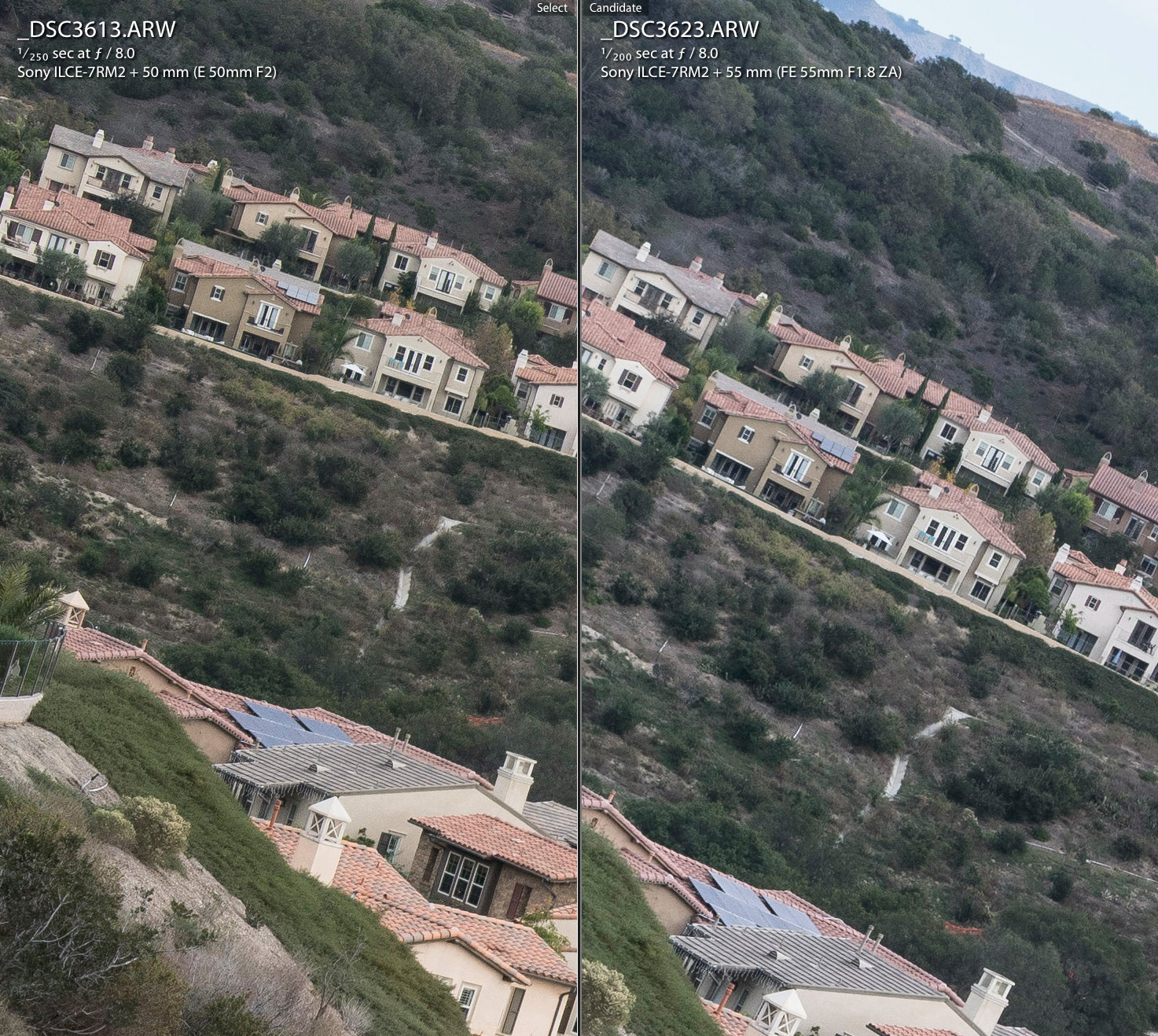
Here is a sample crop (1:1) showing the Loxia 50/2 vs the FE 55/1.8 (Extreme corner section) - Infinity focus
Compare the warmth and overall rendering. I own both lenses but prefer the rendering and colors of the Loxia for landscapes.
Are the loxias 35 and 50, warmer than the FE 55 and 35 1.4 & 2.8?
It might just be 21 loxia specific?
Also, Fred, any chance you compare the Loxia 21 to the ZF 21?
I have not tested the ZE or ZF 21/2.8 against the Loxias but have used the ZE when shooting Canon. I don't recall seen sharp edges like this though.
As far as the other Loxias and the warm character. I would say yes. The Loxia 50/2 is warmer than the FE 55/1.8 and the Loxia 35/2 is warmer than the FE 35/2.8.
Here is a sample crop (1:1) showing the Loxia 50/2 vs the FE 55/1.8 (Extreme corner section) - Infinity focus
Compare the warmth and overall rendering. I own both lenses but prefer the rendering and colors of the Loxia for landscapes.
 |
||
 |
||
|
Jan 16, 2016 at 05:11 PM
p.28 #14Zeiss Unveils the Loxia 21mm f/2.8
Very helpful and it's good to know what to expect from the Loxia line. I prefer the Loxias color more as well.
I like how all the zeiss lines have different looks. I love the Contax N and Contax looks the best. The FE look the least. But it's subjective and style/situation dependent.
I like how all the zeiss lines have different looks. I love the Contax N and Contax looks the best. The FE look the least. But it's subjective and style/situation dependent.
Jan 16, 2016 at 05:19 PM
p.28 #15Zeiss Unveils the Loxia 21mm f/2.8
Infinity focus is a tiny bit before the hard stop. Similar to the other Loxias.
sebboh wrote:
As I wrote, the 16-35/4 still shows astigmatism towards the edges and extreme corners never get razor sharp. Center micro-contrast and resolution are comparable between the lenses but the Loxia has the edge. I can post some crops later showing the exceptional performance of the Loxia at f/2.8 and f/4.
The Loxia 21/2.8 matches the performance I get from my RX1RII 35/2 and Loxia 50/2. That will be my new 21-35-50 Holy Trinity. looks fantastic! is infinity focus at the infinity mark of the lens or a little before?
sebboh wrote:
Fred Miranda wrote
Here are some crops demonstrating the best scenario for both lenses which is at f/5.6. Stopping down to f/8 does not make the center or edges any better.As I wrote, the 16-35/4 still shows astigmatism towards the edges and extreme corners never get razor sharp. Center micro-contrast and resolution are comparable between the lenses but the Loxia has the edge. I can post some crops later showing the exceptional performance of the Loxia at f/2.8 and f/4.
The Loxia 21/2.8 matches the performance I get from my RX1RII 35/2 and Loxia 50/2. That will be my new 21-35-50 Holy Trinity.
Jan 16, 2016 at 06:33 PM
p.28 #16Zeiss Unveils the Loxia 21mm f/2.8
Fred Miranda wrote:
Here is a sample crop (1:1) showing the Loxia 50/2 vs the FE 55/1.8 (Extreme corner section) - Infinity focus
Compare the warmth and overall rendering. I own both lenses but prefer the rendering and colors of the Loxia for landscapes.
As you mentioned earlier the color is well within the margin of a minor ACR tweak, though it's nice not to have to drag up the vibrance on every shot. As for the resolution it could be a difference in focus point but it looks to me like the 55 has a little more.
Also, is that Laguna Beach?
Here is a sample crop (1:1) showing the Loxia 50/2 vs the FE 55/1.8 (Extreme corner section) - Infinity focus
Compare the warmth and overall rendering. I own both lenses but prefer the rendering and colors of the Loxia for landscapes.
As you mentioned earlier the color is well within the margin of a minor ACR tweak, though it's nice not to have to drag up the vibrance on every shot. As for the resolution it could be a difference in focus point but it looks to me like the 55 has a little more.
Also, is that Laguna Beach?
Jan 17, 2016 at 02:18 PM
p.28 #17Zeiss Unveils the Loxia 21mm f/2.8
Yes, the color is an issue for the FE55 for nature and landscape work, for me at least beyond slider tweaking to match my 'real' near-normal landscape lens, the CY 35-70. What the zoom gives up it keeps in microcolor (h/t Mike Johnston) and flat field. The 55 is a low lateral CA monster so it works for high detail scenes too at f4-f5.6 if you have enough DoF.
The FE55 can be used to very good effect in some settings - snow, etc. and it renders strongly/evenly at all apertures, more than the L50 which suffers CoF in midfield (usually well disguised) - see chart below, it might flatten a little by f8, a common Zeiss ploy. The detail line pair at f5.6 reunite right at the corner - 21mm in the chart, so corners are very sharp (above 60%).
The color signatures of the older designs are very good, you see this too with the new L21 against the older Distagons. It starts to look like a trade-off, maybe the coatings got too good or something, we need a new interview with Dr Nasse. Most don't mind, they want the sheer resolution.
Here is Mike's full quote and link:
'They might not be the "sharpest" lenses in the world in terms of absolute ultimate resolution (although they ain't chopped liver in that department either), but the "Zeiss Look" has an overall integrity I really appreciate. The best Zeisses all share a common house characteristic that I can best describe with the words "microcolor" and "microcontrast."
They discriminate very well between very close shades of color on a minute level, and they have very good large-structure (5 lp/mm or 10 lp/mm) contrast. They tend to even their sharpness out across the image height (i.e. the whole frame) and tend to be balanced for consistency up and down the aperture range. Add very good flare and veiling glare resistance and a warm bias, and you get an image morphology that goes far beyond simpleminded notions of sharpness.'
http://theonlinephotographer.typepad.com/the_online_photographer/2013/03/day-1-sony-and-zeiss-up-in-a-tree.html
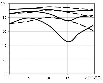
The FE55 can be used to very good effect in some settings - snow, etc. and it renders strongly/evenly at all apertures, more than the L50 which suffers CoF in midfield (usually well disguised) - see chart below, it might flatten a little by f8, a common Zeiss ploy. The detail line pair at f5.6 reunite right at the corner - 21mm in the chart, so corners are very sharp (above 60%).
The color signatures of the older designs are very good, you see this too with the new L21 against the older Distagons. It starts to look like a trade-off, maybe the coatings got too good or something, we need a new interview with Dr Nasse. Most don't mind, they want the sheer resolution.
Here is Mike's full quote and link:
'They might not be the "sharpest" lenses in the world in terms of absolute ultimate resolution (although they ain't chopped liver in that department either), but the "Zeiss Look" has an overall integrity I really appreciate. The best Zeisses all share a common house characteristic that I can best describe with the words "microcolor" and "microcontrast."
They discriminate very well between very close shades of color on a minute level, and they have very good large-structure (5 lp/mm or 10 lp/mm) contrast. They tend to even their sharpness out across the image height (i.e. the whole frame) and tend to be balanced for consistency up and down the aperture range. Add very good flare and veiling glare resistance and a warm bias, and you get an image morphology that goes far beyond simpleminded notions of sharpness.'
http://theonlinephotographer.typepad.com/the_online_photographer/2013/03/day-1-sony-and-zeiss-up-in-a-tree.html
Jan 17, 2016 at 03:28 PM
p.28 #18Zeiss Unveils the Loxia 21mm f/2.8
Great info as always Philip.
To me, it's more than just color. The Loxia 50/2 is a better manual focus lens, has better built, weather seal and prettier sunstar. Everything I want when shooting landscapes. Starting at f/6.3, they are pretty much equal in contrast and resolution to the very corners. (At least my copies which are well centered)
I tend to grab the FE 55/1.8 when shooting without a tripod, wide-open or in situations where AF or eyeAF is needed.
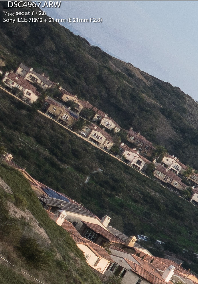
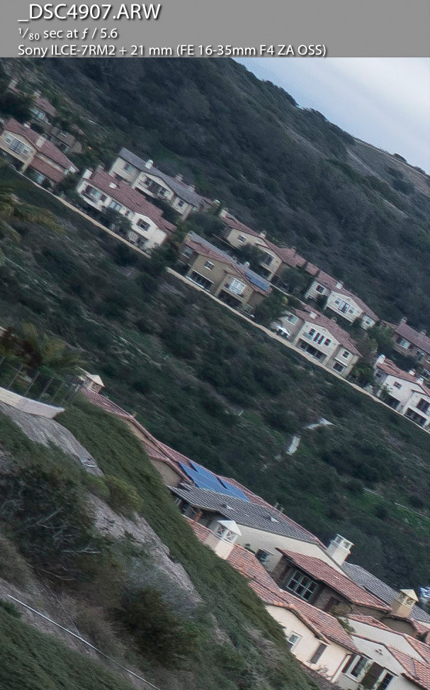
Going back to the Loxia 21/2.8. Here is a 1:1 crop showing the extreme edge wide-open focused at infinity. I think it's a great performance. Especially when compared to the best case scenario for the 16-35/4 which is f/5.6.
Lighting is difference from the crops as they are from different days. But we can still judge resolution/contrast and color (Both set to daylight WB)
Top image: Loxia 21mm @ f/2.8
Bottom image: FE 16-35mm @f/5.6
To me, it's more than just color. The Loxia 50/2 is a better manual focus lens, has better built, weather seal and prettier sunstar. Everything I want when shooting landscapes. Starting at f/6.3, they are pretty much equal in contrast and resolution to the very corners. (At least my copies which are well centered)
I tend to grab the FE 55/1.8 when shooting without a tripod, wide-open or in situations where AF or eyeAF is needed.
Going back to the Loxia 21/2.8. Here is a 1:1 crop showing the extreme edge wide-open focused at infinity. I think it's a great performance. Especially when compared to the best case scenario for the 16-35/4 which is f/5.6.
Lighting is difference from the crops as they are from different days. But we can still judge resolution/contrast and color (Both set to daylight WB)
Top image: Loxia 21mm @ f/2.8
Bottom image: FE 16-35mm @f/5.6
|
||
 |
||
|
|
||
 |
||
|
Jan 17, 2016 at 06:18 PM
p.28 #19Zeiss Unveils the Loxia 21mm f/2.8
I've been reading this thread with great interest and glad to see people are starting to get their pre-orders. Well I just got my Loxia 21 to go with my 35 and 50. I'm fortunate to be in a position to compare it to my Zeis Batis 25mm, Zeiss ZE 21mm, the Sony FE 16-35 f/4 OSS, and even the Canon 16-35mm f/4L IS. For me I really like this focal length but it is a lot closer to the Batis 25mm than I thought. The Batis FOV appears closer to 23mm but I can't prove that.
I haven't tested my lens yet for decentering but I guess I need to since so many lenses appear to have issues these days.
In the end I plan to sell the ZE 21 if thinks work out. I would also give up the 16-35mm FE lens if a good 15mm became available. I still have a CV 15mm II version I got awhile back but since its a version II its been hard to sell no that the version III is available and because it didn't perform very well on the A7 family of cameras.
I used to own a ZE 18 sold that when I added a TS-E 17mm. If a Batis 18 came out I don't think I would add it even though I'm super impressed by the two Batis lenses. They are two of the reason I enjoy my A7RII so much.
I haven't tested my lens yet for decentering but I guess I need to since so many lenses appear to have issues these days.
In the end I plan to sell the ZE 21 if thinks work out. I would also give up the 16-35mm FE lens if a good 15mm became available. I still have a CV 15mm II version I got awhile back but since its a version II its been hard to sell no that the version III is available and because it didn't perform very well on the A7 family of cameras.
I used to own a ZE 18 sold that when I added a TS-E 17mm. If a Batis 18 came out I don't think I would add it even though I'm super impressed by the two Batis lenses. They are two of the reason I enjoy my A7RII so much.
Jan 17, 2016 at 08:03 PM
p.28 #20Zeiss Unveils the Loxia 21mm f/2.8
philip_pj wrote:
Yes, the color is an issue for the FE55 for nature and landscape work, for me at least beyond slider tweaking to match my 'real' near-normal landscape lens, the CY 35-70. What the zoom gives up it keeps in microcolor (h/t Mike Johnston) and flat field. The 55 is a low lateral CA monster so it works for high detail scenes too at f4-f5.6 if you have enough DoF.
The FE55 can be used to very good effect in some settings - snow, etc. and it renders strongly/evenly at all apertures, more than the L50 which suffers CoF in midfield...Show more →
Sorry, but can you break this down a little for me--you're saying that the older lenses have better color because of less advanced coatings? Or why?
Yes, the color is an issue for the FE55 for nature and landscape work, for me at least beyond slider tweaking to match my 'real' near-normal landscape lens, the CY 35-70. What the zoom gives up it keeps in microcolor (h/t Mike Johnston) and flat field. The 55 is a low lateral CA monster so it works for high detail scenes too at f4-f5.6 if you have enough DoF.
The FE55 can be used to very good effect in some settings - snow, etc. and it renders strongly/evenly at all apertures, more than the L50 which suffers CoF in midfield...Show more →
Sorry, but can you break this down a little for me--you're saying that the older lenses have better color because of less advanced coatings? Or why?
Jan 17, 2016 at 08:17 PM