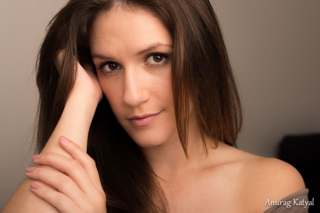
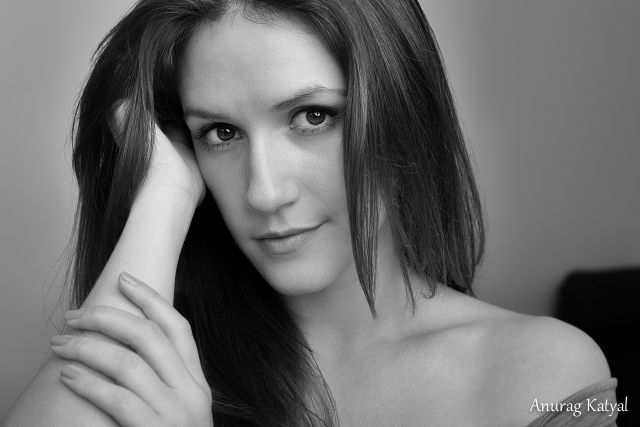
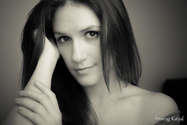
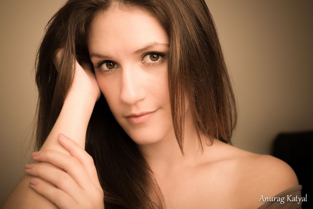
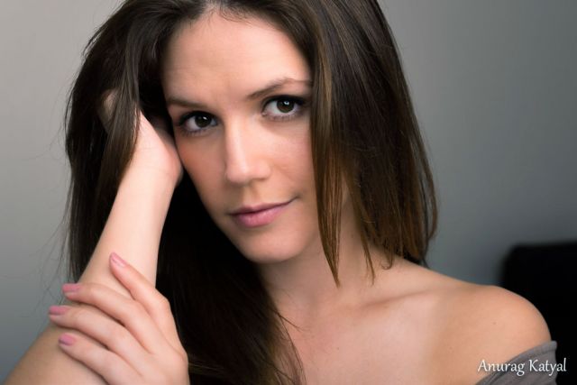
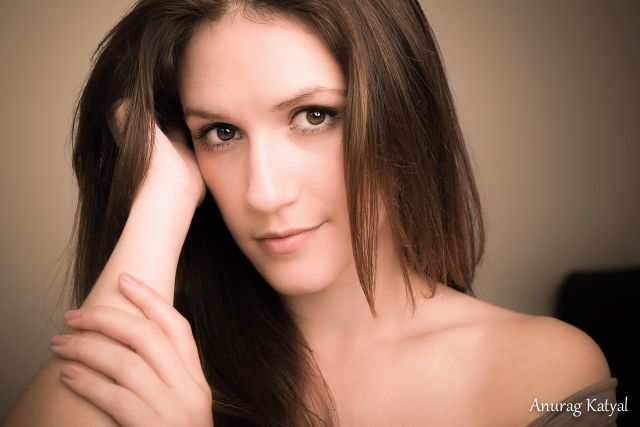
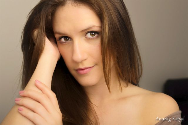
In some ways the composition goes against "conventional" ideas, however ...
I think the combinations of those departures are offset and / or conjoined by how the pieces of the puzzle are orchestrated.
First glance, it seemed a bit odd. Spending more time with it, I like it in a way that's hard to describe ... the last rendering my pref with a mixture of detail and non-detail areas.
I've never been a big fan of the 50mm lens for portraiture, but this is a rather nice example of such.
Mental note to self: 50mm landscape vertical = XXmm portrait vertical.
The problem with shooting a portrait close with a 50mm lens (on full frame) is you have to get too close. Getting that close is slimming to a face, but the perspective distortion of the close position exaggerates the size of the nose, if it is turned towards the lens. This subject has a thin face and doesn't need the slimming of a close perspective. A close perspective can also exaggerate other aspects such as ears and chin, depending upon the pose. In this case, it exaggerates the size of her size and shape of her nose - not ideal. Her nose would be better balanced if photographed from further - at least two meters or six feet. More would be better. My usual lens preference for a typical portrait is 85-105mm because it pits the subject at a good distance. If I were making a portrait for this model, I'd consider shooting with a 135mm lens because it let me get a little farther away for a more flattering perspective. If your subject has a small nose and a round face, getting close can be a plus, providing better facial balance.
The lady seems to have a slim face and a strong nose. The fingers are rather short which leads to think that she is not a tall person in which case you have accentuated her forehead jaw line and place the nose in an unflaterring pose.
You camera position and/or her face position should be looking up at you. A lifting of the head would have produced a more flatering portrait.
The palm of the hand in the hair looks amputated. Please avoid hands until mastering portrait posing....or feeling lucky.
The crop at the hair line is somehow forced. I cannot comment as we cannot see her full head. The bare circle needs to be addressed somehow.
2- Light
You have used broad lighting which is her face to the light to the camera. More feathering would have helped and Butterfly lighting would have been a safer shot.
Am I looking a two light sources and a reflector? Why the B/G has an uneven lighting. When you do a lights set up, it is advisable to light the B/G first followed by key light and then main light.
3- Post Processing
I noted that you are using LR which is not really what should be used for such PP.
You have complicated your PP by not having a correct posing and lighting....unless you messed with ACR on this original image you have posted.
The problem with LR is the complexity of CC'ing images. And in case someone is proficient in LR to do such CC'ing, then PS would be faster and simpler for him/her to use.
RustyBug wrote:
In some ways the composition goes against "conventional" ideas,
Detail @ what Almass said ^ way better than I could have.
I certainly recognize the bevy of technical issues that are very well noted, yet I still prefer the the OP's last rendering on some kind of a visceral level. Maybe it is simply the brightness level in the eyes and hair compared to the darker reworks ... and (may sound odd from me) the cast doesn't really bother me on this one. I'm mostly taking it as intentional artistic liberty (different from good correction) from the OP, even though it does appear somewhat rooted in technical/professional deficiency.
The lady seems to have a slim face and a strong nose. The fingers are rather short which leads to think that she is not a tall person in which case you have accentuated her forehead jaw line and place the nose in an unflaterring pose.
You camera position and/or her face position should be looking up at you. A lifting of the head would have produced a more flatering portrait.
***You are correct. She is not very tall. I shall try to be mindful of this in the future.
The palm of the hand in the hair looks amputated. Please avoid hands until mastering portrait posing....or feeling lucky.
***I was actually trying to recreate an image I saw while looking up poses for head shots but after reading your comment above, I went back and the model is indeed waaaaay taller. I find it difficult to post models so usually try to find some poses that I would like to try out so I am better prepared when they arrive. I shall try to keep the model in mind when trying to find images in the future.
The crop at the hair line is somehow forced. I cannot comment as we cannot see her full head. The bare circle needs to be addressed somehow.
***Tried to stick to the rule of thirds. 'Forced' me into the crop at the hair line. Here is the image SOOC.
2- Light
You have used broad lighting which is her face to the light to the camera. More feathering would have helped and Butterfly lighting would have been a safer shot.
***Duly noted.
Am I looking a two light sources and a reflector? Why the B/G has an uneven lighting. When you do a lights set up, it is advisable to light the B/G first followed by key light and then main light.
***Lizz was sitting at 45 degrees next to a large screen door (camera left) and there was a strobe on camera right. The walls of the apartment are white. I was planning on using a white backdrop I had set up in the living room but panicked a little when she mentioned she only had half as much time to spend. My mistake for not taking my time with the images and rushing at that stage. I was planning on compositing the image with a different background so I didn't pay as much attention to the lighting in the back but I am assuming the extremely grey clouds outside and the strobe didn't play well together causing the funkiness in the background.
3- Post Processing
I noted that you are using LR which is not really what should be used for such PP.
You have complicated your PP by not having a correct posing and lighting....unless you messed with ACR on this original image you have posted.
***I usually start with LR for lens corrections, cropping and basic changes in highlights, whites, blacks, and shadows. Then go to PS for skin retouching. And then back to LR for color correction but I must confess to using some presets I found online for this last step. I don't know how to get the colors to pop - just moving the sliders for vibrance/saturation don't yield good results. On more than one occasion, people have remarked in the strange colors so I guess I will stay away from the presets. The magenta and cyan issue and any others related to color are a result of using the preset.
The problem with LR is the complexity of CC'ing images. And in case someone is proficient in LR to do such CC'ing, then PS would be faster and simpler for him/her to use.
***Any suggestions on where I can learn about color correction in photoshop. Paradoxically, I thought PS would be the much harder tool for this purpose. Color correction has typically scared me in the past and continues to be something I fight with. As such, I usually stick with B/W conversions that Silver Efex gives me as they are usually better than stuff I can come up with on my own in LR.
You are over in magenta and your C is 0
***See above about (incorrect) preset use.
I corrected as follows:
In this version, you were able to fix the brightness in her wrist arm right by her wrist. Was this being caused due to the magenta/cyan issue or is there something else at play here? I wasn't able to sort it out on my own so help would be appreciated.
Thank you for the critique. I will certainly try to be mindful of the suggestions in the future.
AuntiPode wrote:
The problem with shooting a portrait close with a 50mm lens (on full frame) is you have to get too close. Getting that close is slimming to a face, but the perspective distortion of the close position exaggerates the size of the nose, if it is turned towards the lens. This subject has a thin face and doesn't need the slimming of a close perspective. A close perspective can also exaggerate other aspects such as ears and chin, depending upon the pose. In this case, it exaggerates the size of her size and shape of her nose - not ideal. Her nose would be better balanced if photographed from further - at least two meters or six feet. More would be better. My usual lens preference for a typical portrait is 85-105mm because it pits the subject at a good distance. If I were making a portrait for this model, I'd consider shooting with a 135mm lens because it let me get a little farther away for a more flattering perspective. If your subject has a small nose and a round face, getting close can be a plus, providing better facial balance.
I was using my 85/1.8G for the most part but didn't like those images as much, mostly due to my faults with guiding the model to pose but I do agree that the 85mm was a better focal length for close up shots. I see now that the nose is not as prominent in those images.
Took a stab @ some CC only on the OP's last rendering. Reading from pupil and catchlight for neutral balance clues ... still preferring the OP's warmer (softer) toned version @ artistic rendering (even if it contains attributes of making lemonade)
Without reading other comments, I like to give a first impression. If there is a difference between 1 and 4, I am missing it. I would need to lay one atop the other in photoshop and click them on and off. I liked it straight off.
The two monochromes are noticeably different in tone and I prefer the first.
Just scrolling to the bottom, I see lots of comments and changes to the color, and all of these contributors are far more expert than I am, so I probably won't have anything more to add other than this first impression.
I think if you look at the tonal value brightness diff in her eyes, I think you'll see how #1 vs. #4 are distinguishable, even if the color variance, etc. may not be quite as readily discernible for you.
Here's an effort working from the sooc. Curious @ the lights being used as there seems to be a slight color variance between diff areas. That can sometimes occur if one light is dialed back on power and there is a slight color shift as a result (or a few other reasons). Skin tones are NOT my forte ...
I think if you look at the tonal value brightness diff in her eyes, I think you'll see how #1 vs. #4 are distinguishable, even if the color variance, etc. may not be quite as readily discernible for you.
Here's an effort working from the sooc. Curious @ the lights being used as there seems to be a slight color variance between diff areas. That can sometimes occur if one light is dialed back on power and there is a slight color shift as a result (or a few other reasons). Skin tones are NOT my forte ...
Kent, the problem was that they were not side by side. I opened another window so I could have then side by side and can see the difference which is for me mostly a difference in exposure. My visual memory was unable to carry the memory of 1 to the memory of 4 in the time it took to scroll. Neither were overexposed to my eyes.
Anurag wrote:
Kent, I was using the strobe (a borrowed Alien Bee 1600) at the lowest power setting.
Lizz was sitting at 45 degrees next to a large screen door (camera left) and there was a strobe on camera right.
The low setting on AB's do tend to incur a warmer color shift from full power. I'm guessing about 300K-500K, or so warmer. The (im)balance of color mixing with the outdoor light color would likely account for what I was seeing.
Anurag wrote:
I was using my 85/1.8G for the most part but didn't like those images as much, mostly due to my faults with guiding the model to pose but I do agree that the 85mm was a better focal length for close up shots. I see now that the nose is not as prominent in those images.
Just be sure to remember, focal length is only indirectly related. The issue is how close the camera lens is to the subject. You can get the good perspective with a shorter lens by shooting farther away and getting more of the subject. If you have resolution to spare, you can still crop to a head shot. A telephoto lens just lets you get a head shot from farther away without cropping in PP.
Comparing images: If it's worth the effort, I pull both of them into Photoshop and put them side-by-side. Or, more often, I put them in one image as separate layers and toggle the top layer on and off or drop the opacity, depending upon what characteristics I want to compare.
Almass wrote:
Color is the single most important factor in post production.
+1 ... and it takes more time and effort to better understand than many (general population) are willing to give to it.
Consistent color in the production/capture lighting is a key factor to being able to produce consistent color in post production most readily. Temperature matched, controlled studio lighting is on one end of the spectrum for consistency ... mixed lighting sources of varying color (some beyond our control) on the other hand tends to make things a bit more challenging.
Color correction efforts (technical or artistic/aesthetic) can be well served by first knowing whether the lighting was of a consistent vs. inconsistent color throughout. If/when we know we were in mixed lighting, we can adjust our corrections accordingly (masks, gradients, etc) based on our assessment/knowledge of the lighting color(s) illuminating our subject/scene and our desired output to be revealed.
Almass wrote:
”There is no quality without quantity.”
(Daido Moriyama)
Can you expand on your thoughts of what Daido is trying to suggest here.
I'm not certain that I align with that ... except that it seems to suggest that quality is a comparative and (gross paraphrase) without more junk to compare, the good stuff won't be noticed as good. I don't expect that to be the intent, but I'm not a big fan of Daido, despite his large following that he carved. Cook enough noodles and keep throwing enough spaghetti at the wall and sooner or later you'll find something good will stick ... that seems to be the suggestion that quality is dependent upon quantity (not something I really agree with). Blind dogs do find bones too, but for me quality is about understanding and control to produce a quality product (of any kind).
The other thought that comes to mind ... is that the quantity of experience is required to further develop a valuation of quality. To this end, the master/apprentice relationship comes to mind, which I much better align to ... having seen the quality advance in virtually all disciplines as people gain more experience.
Two very different perspectives regarding the quality / quantity relationship (and others could be presented / derived also) ... some education / clarification regarding Daido's quote would be welcome.
With product photography, getting the color technically precise is often critical. (I once heard a designer complain, at length, when the color in a catalog came back from the printer with the product color slightly off. The difference was to my eyes, very small, but to her's it was criminal.
Color is a special challenge when it comes to portraits. Being technically accurate color doesn't mean a client will like the color. If the subject doesn't like the result, being "correct" doesn't matter. Back in the day I could shoot a gray card and prove the color was "correct", but the customer wanted it look "right", to *her*. I could speculate many reasons, but the bottom line was they wanted the color to look good, not "accurate". Consider it part of making the image "fit to purpose".
AuntiPode wrote:
With product photography, getting the color technically precise is often critical. (I once heard a designer complain, at length, when the color in a catalog came back from the printer with the product color slightly off. The difference was to my eyes, very small, but to her's it was criminal.
Color is a special challenge when it comes to portraits. Being technically accurate color doesn't mean a client will like the color. If the subject doesn't like the result, being "correct" doesn't matter. Back in the day I could shoot a gray card and prove the color was "correct", but the customer wanted it look "right", to *her*. I could speculate many reasons, but the bottom line was they wanted the color to look good, not "accurate". Consider it part of making the image "fit to purpose"....Show more →
The color does indeed need to look "right" and not necessary "accurate".
That is what we always work for and ask for and being asked for......(imposed).
- With the proviso of technical images such as catalogues or any visuals to be used as a reference.
- With another proviso that skin color tone has a tendency to change with the requirements of clients on their Ad agencies as inspired by either or the CD or Photographer or Hig End Retoucher or simply the Colorist in the edit suites.....Today bluish tones are the fashion for fashion/editorials/Ads. Deep copper brown burned sugar for Fine Art which was the fashion before for Advtg.
You probably know the saying in the Design and Imaging industry which is:
If it looks good to your eye, then it is good to go.