The first composite image I posted on Sports Corner a few or more years ago and the 2nd composite is a redo of the sequence within the last week. There is much I like about both composites. Jmcaverly inspired me to rework the composite.
Russ and Tom pushed me further. I reworked it today. I'm done.
1. What I like, the black and white bg and the airy feeling.
1. What I don't like,The plant foot is wrong in the first image and the image could be more dynamically correct.
2. What I like, A closer representation in regards to the pitching motion.
2. What I don't like is the tightness of the image. I could pull the follow through back even further.
3. What I like, it's tight and right.
3. What I don't like.............
Ted: I definitely like the second one better with the middle image on top of the far-left image so the plant foot is more or less facing the mound. Makes sense. But my brain is having problems with the landing foot being in two different places in the middle and far-right image. Have you tried overlapping them completely? Probably would look odd, but my brain keeps telling me that's the way it's 'supposed' to be.
Russ Isabella wrote:
Ted: I definitely like the second one better with the middle image on top of the far-left image so the plant foot is more or less facing the mound. Makes sense. But my brain is having problems with the landing foot being in two different places in the middle and far-right image. Have you tried overlapping them completely? Probably would look real, but my brain keeps telling me that's the way it's 'supposed' to be.
I agree with you Russ. A third redo will be in the works and not 4-years later
I like the first one due to the fact that the last frame on the right is spaced a bit farther to the right. I like the foot plant on both of the photos. Either one works for me.
Ted, I tend to agree that it works either way, but I get what Russ said about the front foot. How about moving the right-side image back to the left until that foot lines up, then completely remove the front leg of the middle image, then cheat the right-side image back to the right a really small amount? Your eye might get tricked into it looking acceptable.
Tom D wrote:
Ted, I tend to agree that it works either way, but I get what Russ said about the front foot. How about moving the right-side image back to the left until that foot lines up, then completely remove the front leg of the middle image, then cheat the right-side image back to the right a really small amount? Your eye might get tricked into it looking acceptable.
Russ Isabella wrote:
I like it, Ted. What if you followed Tom's advice and removed that small slice of the front leg that's showing in the middle image?
Bingo, Russ. And that little cheat to the right of the right-side image, mostly to uncover the front arm in the middle image. You might leave in the small amount of bg you cropped off the right side so Jordan has some space to throw into.
3 and 4 both are excellent, Ted, and now that I see them both, I'm thinking 3 just barely edges out 4 because, while I thought it made sense to eliminate all evidence of the front leg in the middle image, doing so (as in #4) is playing tricks with my brain, and when I go back to #3, I'm somehow thinking it makes perfect sense to have that sliver of leg showing. Of course no one but us nuts is going to scrutinize these images the way we are scrutinizing them! so you've got multiple options here. But I'm liking 3 best. Thanks for the variations on your theme!
I think I might be with Russ on this as well, Ted. Eliminating the sliver of leg cleans it up, but is just a little weird. Like, as weird as it is for us to still be scrutinizing it so microscopically, haha. I will say, though- I still think the amount of room you have between the ball and image frame in #1 is about perfect. Not too tight.
Well done, Ted.
Btw, my son was just at the Blue Claws stadium this past Thursday... it's a small world in baseball.
Appreciate you thinking and working out loud with us. Helpful for us to watch but kind of like working naked, I guess
I actually rather liked the first one except for the plant foot. Looked painful. #4 is much tighter and the eye doesn't find ambiguity, which is good. On the other hand that wonderful airy feeling of #1 is gone. How about trying #4 with the BW background? I think that's a real nice touch.
Just another thought and certainly not a criticism.
OntheRez wrote:
Appreciate you thinking and working out loud with us. Helpful for us to watch but kind of like working naked, I guess
I actually rather liked the first one except for the plant foot. Looked painful. #4 is much tighter and the eye doesn't find ambiguity, which is good. On the other hand that wonderful airy feeling of #1 is gone. How about trying #4 with the BW background? I think that's a real nice touch.
Just another thought and certainly not a criticism.


 I reworked it today. I'm done.


 But I'm liking 3 best. Thanks for the variations on your theme!
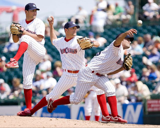