Samuli - Those are just beautiful! You're getting me excited to purchase this lens again! I didn't own it for very long the last time I had it so I never really got to fully appreciate its abilities. I'm very much looking forward to having one again!
AbramG wrote:
Samuli - Those are just beautiful! You're getting me excited to purchase this lens again! I didn't own it for very long the last time I had it so I never really got to fully appreciate its abilities. I'm very much looking forward to having one again!
Thanks - same as with Planar 50 this lens is not easy to photograph if you want best possible results. Since I want my focus always to be exactly in the subject I use Live View in movie mode (focusing happens with actual aperture = no focus shift), this is OK up to f/4 or so but when I shoot with f/5.6 or f/8 then I quickly switch to Av-mode while I'm in 10x magnification mode, and I have f/2.5 selected in Av-mode, then focus in Av and switch back to M-mode and take the shot with final aperture. Sounds complicated but after some practice I'm able to do it without much thinking, almost automatically.
In many ways Contax version is better (manual aperture ring, I even like wide open drawing style slightly better etc.) but the aperture is so much rounder in Z* versions that I'll take the pain and use the above mentioned process for focusing.
Bobu wrote:
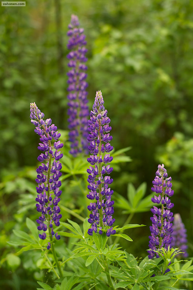
Samuli, the first image is great. I just wish that there would be no visible sky (like in your second image). But this is often just not possible.
Thanks, that could be solved very often by carrying ladder with you all the time Last summer when I carried Gitzo 3541XLS (goes over 2 meter) many times I shoot so that I was standing in some rock or stump of a tree when I made the composition, and it really helped many cases to exclude sky completely. Even those white patches are small, they can be very distracting compositionally and if you happen to combine there some bad bokeh, it draws way too much attention and as a whole the image stops working.
Samuli Vahonen wrote:
Thanks, that could be solved very often by carrying ladder with you all the time Last summer when I carried Gitzo 3541XLS (goes over 2 meter) many times I shoot so that I was standing in some rock or stump of a tree when I made the composition, and it really helped many cases to exclude sky completely. Even those white patches are small, they can be very distracting compositionally and if you happen to combine there some bad bokeh, it draws way too much attention and as a whole the image stops working.
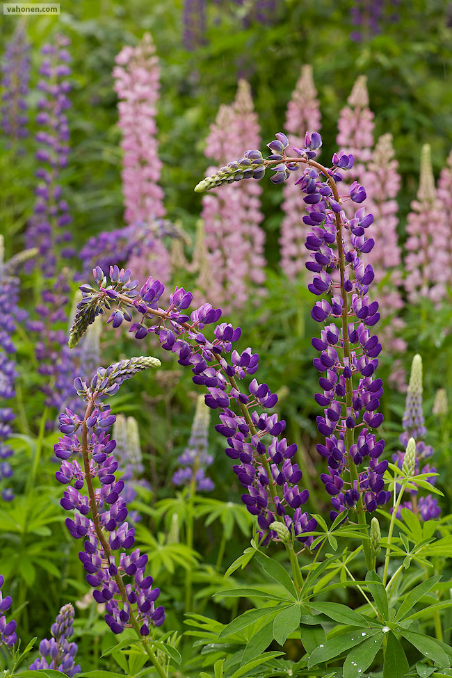
Yes, that's for example the case with your third image, at least for me. A really great image with a slightly nervous/swirly but nevertheless interesting bokeh, but the white patches are just too distracting in my opinion.
cyra wrote:
Carsten: Here is your assignment: take the 50 MP for your detail work and find out what you can do with it better then with the 100 MP
Haha, okay, I'll see what I can do. I might have to postpone it a little though. I am hot on the trail of a 180 Cron, and if I get that, I need to spend the next few weeks comparing it to my Nikkor 200/2 VR to see which I want to keep.
Uzay, the optical illusion in your staircase shot is captivating. I prefer the BW shot of the second one.
Samuli: better wait for the new version of the 25, god knows when it will come...
I posted a couple more ZF 25 shots in this thread
thanks for your suggestion about avoiding sky in the forest. You are right. Also looking at your images at your website and also those you posted makes me aware, that I really, really need to look into sharpening. Especially the much praized "Samuli-focusing-routine" your images just look soooo much better. Plus your way of carefully focusing with live view also is much better then the sloppy eye focusing on the fly I usually do.
Paul: your film shots really come out intense. I do like them a lot.
Bob: looking good. Your struggle there made me try a layer composite out of 3 bracket shots 2/3 of a stop apart in Photoshop. The foreground is the brightest shot, everything above the horizon is 1.3 stops darker, and the middle shot is only coming through at small portions where the overlap is difficult.
No pp done otherwise.
what do you guys think? I feel like it looks a bit artificial due to the intense colours. Not sure I like the result. comments welcome
rji2goleez wrote:
Now, these are far from perfect but improved. Here are some before and afters using NIK's HDR Efex Pro on a single image. I'm by no means an expert on using it and have lots to learn but I'm encouraged . . .
It is pretty impressive to see how much latitude there is in a single digital image.
jae: like your shots on page 339. Was smiling at your shooting conditions. Just out of curiosity, which city is this? I went on to your Flickr page and then on to your watch review website which I found very, very cool!
Also from your second set, the first image [before the edit ] and the last image are nice.
prosep: ! Hope there was not too much of a Memorial Day weekend rush. The sheer volume of water is amazing to watch. Hope you've got some good ops from the other spots also
cyra: first image "before the storm" is nice and some small, subtle changes in LR can help too. I like the 3rd and 5th also.
with your HDR shot, the colors look ok but the trees at the end of the pathway look unnatural - so those transitions need to be worked on.
akul: beautiful flowers
Bob: First and last ones are my favs. A think a gentler tone-mapping and a lower contrast treatment may help you more on your earlier set (?)
uzay: The first one is my fav. Your urban shots are forming a nice collection. you should make this into a nice set.
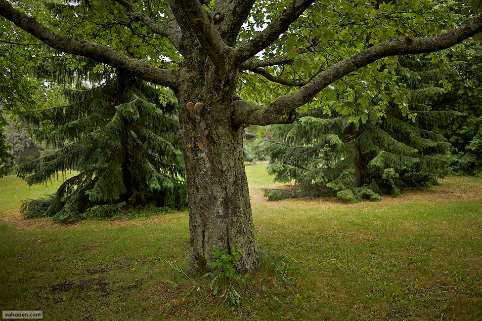
AbramG: Another vote for the tree shot! Darn, even your flickr lens test shots are vey well composed! These ones are difficult to pull of well and you've done a great vertical on this.
Samuli: Beautiful forest pictures as usual!
Thanks, I did spend a lot of time initially picking the pixel width, format and color of frames. I had gone the opposite extreme for a while, especially for nature photos, but some very good print displays and beautifully presented online work gradually pulled me back.
Agree with you about presenting vertical photos electronicallyl. I am the opposite - I see very strongly, sometimes too strongly in 1:2 horizontal. Very difficult for me with WA [<35mm] & verticals in the dSLR 3:2 aspect ratio. I feel it is too skinny/tall. I like 4:5 to 6:7 verticals better.
Regarding your point about horizontal composition, I typed up some of own experiments & ramblings but will post it later on- I think the topic deserves a thread of its own
rji2goleez wrote:
Now, these are far from perfect but improved. Here are some before and afters using NIK's HDR Efex Pro on a single image. I'm by no means an expert on using it and have lots to learn but I'm encouraged . . .
Bob, you get better results if you "develop" 3 versions from your single RAW image, and then combine in HDR. First worked quite well, but 2nd turned somehow weird.
cyra wrote:
better wait for the new version of the 25, god knows when it will come...
I posted a couple more ZF 25 shots in this thread
Great photos - I'm waiting for new version, and actually I'm quite happy to Contax versions, afterall it can produce this kind of results and technically better results when not focusing so close. I actually decided to take Contax 25 to my holiday lens set since the gap between 21 and 35 is little too much - I'm not very experienced shooting wide-angle and I find it very difficult outdoors to find any suitable scenes for 21mm.
Also 25mm (actually 25mm Distagon is closer to 26mm, 25.8mm if I remember correctly) fits between 21 & 35:
cyra wrote:
what do you guys think? I feel like it looks a bit artificial due to the intense colours. Not sure I like the result. comments welcome
Colours are OK to my eye, but I have always been allergic to ND grads and manual layer composites. It's OK otherwise but the dark tops of trees and bushes make it look weird to me. Love the way how light paints the road at distance.
FlyPenFly: Seems that Sony very different colours than Canon - I kind of like them, but it also seems that when you use WB for shadows it turns the parts of photo in sunlight to pretty weird, specially greens almost "neon" like. The ones, in which you managed to have correct WB the greens look great. I specially likes the photos of some bridge with Distagon 28, the ones where WB and exposure was correct for the sky e.g. this. Do you use auto white balance? Asking this since many of your photos did seem to have "wrong" white balance, or do you use "wrong" WB for artistical purposes?
akul: Can't wait for your experiments & ramblings about vertical compositions
To be honest, I've been playing around with WB a lot lately. Its going to be very inconsistent until I figure out what I prefer... Although lately they've been more consistent.
I find using Auto in camera or in LR leads to yucky results. Still developing an eye for it.
Thanks for taking the time to look through those photos!
abhijeeth: I'm in New York. And yes, I have far too many expensive hobbies...
Uzay, great first photo and the second one looks better in b&W
Samuli, nice set. The last one is my favourite here.
Paul, the first one is really nice.
Bob, from the first HDR example #1 looks good (natural) but not #2 in the second set the last one is the best although there is something about that is not quite right. A green cast perhaps? HDR is really hard in my opinion for landscape photography, I prefer blending of two photos instead because then I understand what I'm doing and why both when shooting and in PP
cyra, that is a very well composed and dramatic photo but it doesn't look really natural. More like the image used on a movie poster (The perfect storm II ), the colours look right but a little to saturated.
rji2goleez: I like the last HDR the best. The tricky thing about HDR seems that its super easy to get cartoonish about it but your samples look restrained and realistic to what the eye sees. The first one looks like a photo, the third one looks like a memory.
Paul Yi: I think the elbow in that guys face is a little distracting I do like the 3dness of the last flower shot.
Samuli, I was referring to your previous tree set in my post but this one with the 35/2 is also very nice, specially the second one.
Bob, very nice photo.
Joakim, penflypen - I agree with your assessments on the HDR attempts. It's all too easy to get that cartoonish effect and I really want something more natural. I also agree that it just doesn't look right. It may not be possible with the exposures I have. Samuli has graciously volunteered to play with the raw image and see what he can come up with.


 Last summer when I carried Gitzo 3541XLS (goes over 2 meter) many times I shoot so that I was standing in some rock or stump of a tree when I made the composition, and it really helped many cases to exclude sky completely. Even those white patches are small, they can be very distracting compositionally and if you happen to combine there some bad bokeh, it draws way too much attention and as a whole the image stops working.


 ! Hope there was not too much of a Memorial Day weekend rush. The sheer volume of water is amazing to watch. Hope you've got some good ops from the other spots also