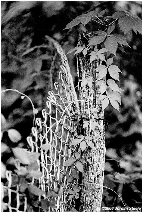
Minolta X-370, Rokkor 135mm f/2.8 @ f/2.8, Ilford HP5 (the extra grittiness here is mostly due to my scanner and not the film, which actually looks pretty fine grained in the print I scanned...I don't have a film scanner).
XP-2 Super is more grainy than BW400CN, but seems sharper. From my tests, XP-2 Super does much better at ISO 250-320 than at 400 whereas BW400CN does about perfect at 400. I use BW400CN now, especially after Ilford jacked up their prices to match Kodak... I guess in general I prefer Kodak b&w anyway, so now that Kodak is a little cheaper I just use them... good results can be had from either though...
Matt Cope wrote:
It is grainy (which is odd because a lot of people used to claim the chromogenic films were too fine grained to look right..) but noticably less so if you nail the exposure. A lot of my scans (like those posted) look grainier than they are because the scanning service I use tends to block up the grain a bit.. It's still worth it for me though because I can get it developed and scanned onto CD very easily and cheaply, and anything great I can replrint from the negative or get scanned properly..
Lotusm50 wrote:
mawz- How are you scanning these? They all seem to have a decidedly purple cast -- and I don't think that is due to the Fuji film.
Scanned on a Epson 4870 and then corrected for a purple cast in post (the 4870 tends towards a purple cast by default).
I'm not seeing any purple cast in the posted images however, at least not in the first or third (there's a hint of it in the second that I couldn't erase entirely), across multiple systems (Either on my profiled editing system at home or my unprofiled work system which I'm using right now). Does your browser obey colour profiles? Those are sRGB images and I'm checking in Firefox 3 with profiles enabled.
My monitor is fully profiled and I use Firefox 3 which is color managed. I'm not seeing the purple cast on anyone else's images, just the ones you posted above.
Lotusm50 wrote:
My monitor is fully profiled and I use Firefox 3 which is color managed. I'm not seeing the purple cast on anyone else's images, just the ones you posted above.
Note FF3 is not colour-managed by default, you do need to enable it.
I've also tested in IE6 on my work machine and see no colour cast (that's a completely unprofiled system).
The only thing I can think of is that your system is somehow misunderstanding the profile attached to those images (should be bog-standard sRGB assigned by PS CS2).
This is odd, because, as I said, I don't see the purple cast in any other images. I even downloaded the file and pulled it into CS3 and the cast is still there -- so it's not just the browser. Maybe it how we are defining "cast". It's not really evident in the first image of the sky and skyscraper, but in the 2nd and 3rd it is. The second also appears over contrasty and over saturated (the oranges and reds of the streetlight and car light, and green patina of the church steeple are very, very strong. In the last image, contrast is fine, but the silver car is slightly purplish, as is the concrete, gray building stone and gutter spout on the left, and the man's blue shirt and gray trousers. To look more objectively at the colors, in PS, sampling a section of the color car's paint (a little under the "Cooper" nameplate) gives the numbers 78, 78, 104. That's not a Mini Cooper color (should be pure silver). I don't think it is me or my monitor (a Dell 2408WFP profiled with Color Eyes Display Pro and a Gretag/Macbeth Eye One device). Maybe I'm just overly sensitive to it. I always felt that my Nikon scanner produced a blue cast. And is have the color management in Firefox 3 enabled -- that's the first thing I did when I installed it. In PS, the profile is read as sRGB.
Lotusm50 wrote:
This is odd, because, as I said, I don't see the purple cast in any other images. I even downloaded the file and pulled it into CS3 and the cast is still there -- so it's not just the browser. Maybe it how we are defining "cast". It's not really evident in the first image of the sky and skyscraper, but in the 2nd and 3rd it is. The second also appears over contrasty and over saturated (the oranges and reds of the streetlight and car light, and green patina of the church steeple are very, very strong. In the last image, contrast is fine, but the silver car is slightly purplish, as is the concrete, gray building stone and gutter spout on the left, and the man's blue shirt and gray trousers. To look more objectively at the colors, in PS, sampling a section of the color car's paint (a little under the "Cooper" nameplate) gives the numbers 78, 78, 104. That's not a Mini Cooper color (should be pure silver). I don't think it is me or my monitor (a Dell 2408WFP profiled with Color Eyes Display Pro and a Gretag/Macbeth Eye One device). Maybe I'm just overly sensitive to it. I always felt that my Nikon scanner produced a blue cast. And is have the color management in Firefox 3 enabled -- that's the first thing I did when I installed it. In PS, the profile is read as sRGB.
Saturation in the second image is boosted over the scan (I worked the image over in PS and CaptureNX). The boost does bring out the cast to a visible amount in the clouds.
I see what you're getting at on the third image, there is possibly still a hint of colour cast in the third image (Although that's not the scanner, Provia 400F has a very slight bias that way). I wouldn't call it visible though, unless you're extremely sensitive to it which it seems you are.
The 4870 definitely does have a cast to its scans, I have to correct each one for it, but it's a far more visible cast than anything shown in these images.