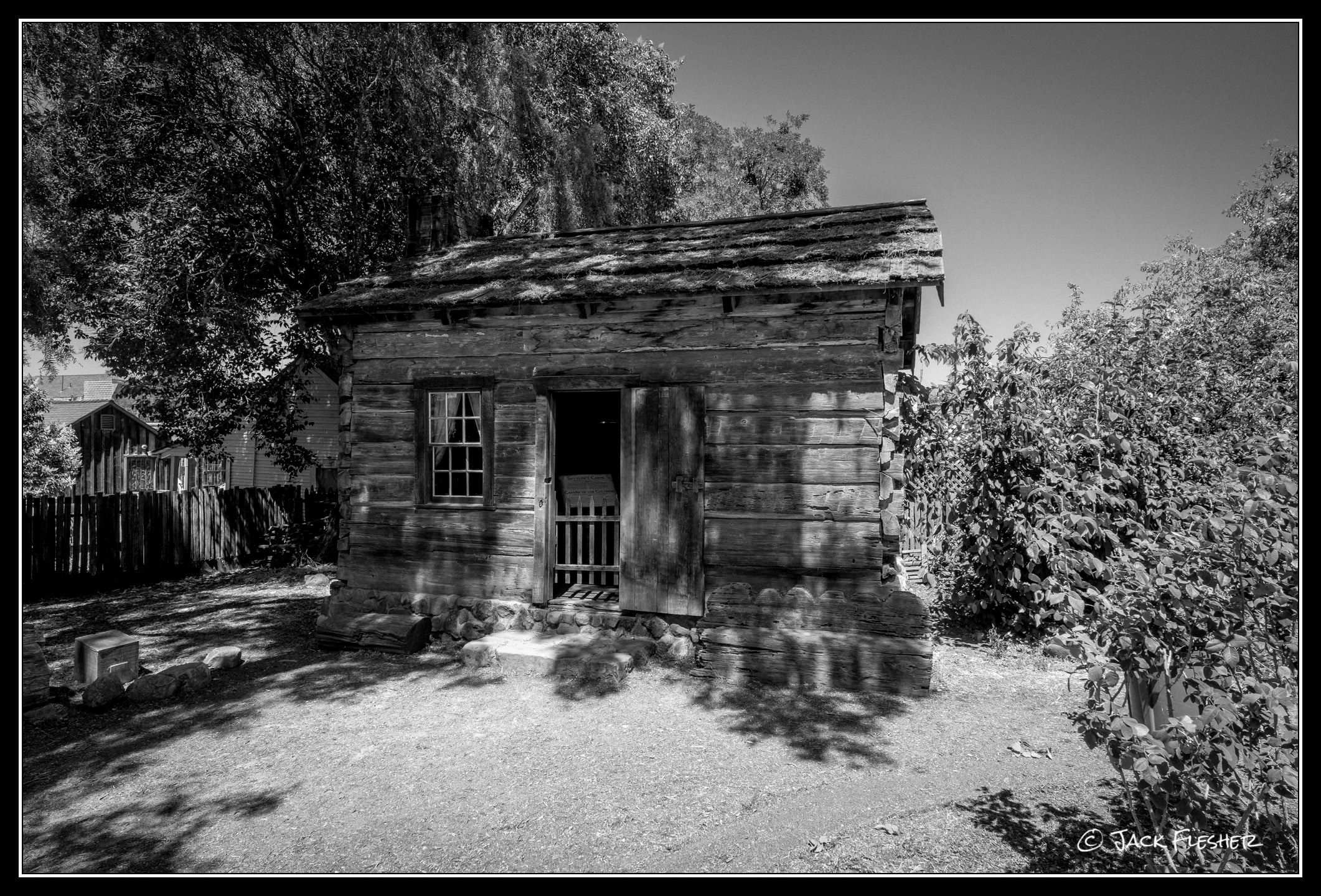
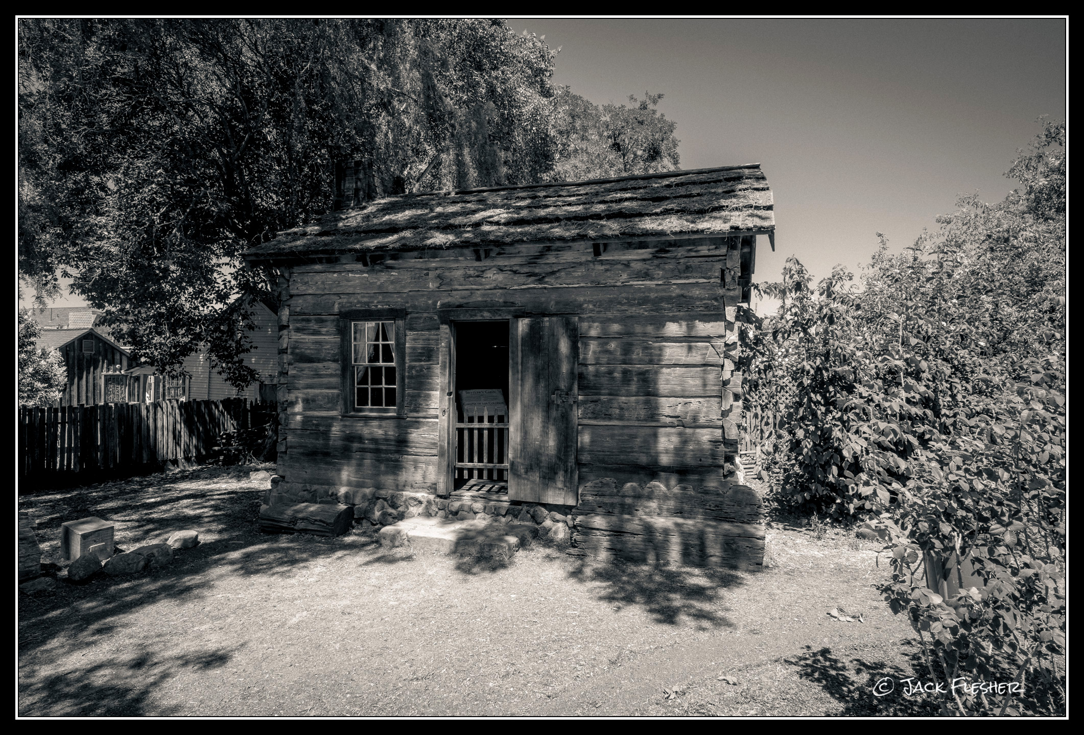
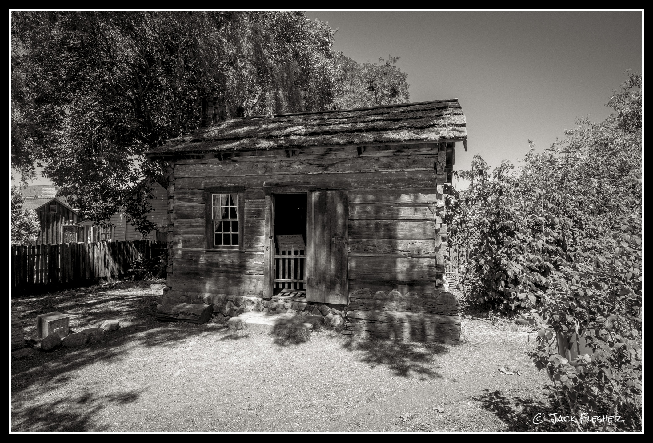
I'm in the process of learning ACR B&W conversion. I think I'm getting there, and want to start saving some basic styles for faster editing. Here are three different sets so far and I'd appreciate honest feedback: what you like, what you don't like and what you'd change, eliminate or add. TIA!
PS: I chose this image because of the range of tones, textures and original colors.
Straight B&W conversion
Split-tone, w/ Sepia Highlights, warm Sepia Mids and Selenium Shadows
I like #3 best as the Sepia creates a light touch of warmth and mood which I find comforting. I've never tried split tones such as in #2 so don't have a strong opinion about it.
Right now I'm finishing my work flow in LR - B&W presets w/exposure, contrast adjustments, and moving the image to NIK Silver Efex Pro and completing the flow with #13-Coffee (a lighter shade of Sepia).
#1 for me - not fond of sepia, makes me think of faded old shots, that I guess works well for images you are aiming to convey that feel (like this old building) but not my cup of tea as a norm.
I'm pretty sure it's an optical illusion but #'s 2 & 3 give me the impression of a slight degree of distortion while #1, my fav of the the set, less so. For me, n-tone images are a rarity and my color perception is faulty anyway, so I cannot judge other than to say getting an n-tone images is a walk in the weeds workflow, at least for me. So, to me it is useful to have lens profiles to apply rather than rely on ACR's default - particularly for adapted glass.
I've been playing at length with ChatGPT constructing basic settings for DxO PL10 for specific camera sensors — M10r, M246, Z8, Z6iii, and most recently D200. The underlying tone curve is specific to each sensor as are global adjustments. From the baseline, the workflow can fork to a specific FilmPack B&W film ( ACROS Neopan 100, Delta3200, FP4 125, or HP5 400 in my case) or SilverEfexPro9 adjustments.
I'm sure you can do the same with ACR and PS; I did need to 'train' CGPT for the DxO PL10 tone curve parameters - it wanted to use older metrics.
Perhaps an exercise in futility but I have learned about sensor specifics and preferred slider use along the way. I also use CGPT to compare lenses - saves lots of digging through reviews etc.
Al Trujillo wrote:
I like #3 best as the Sepia creates a light touch of warmth and mood which I find comforting. I've never tried split tones such as in #2 so don't have a strong opinion about it.
Right now I'm finishing my work flow in LR - B&W presets w/exposure, contrast adjustments, and moving the image to NIK Silver Efex Pro and completing the flow with #13-Coffee (a lighter shade of Sepia).
Thanks for asking.
Appreciate this feedback. One feature of ACR presets is they can include a slider that reduces or increases the global effect of the adjustments. I left all of these in the middle, but I do agree with you that I tend to prefer subtler tones in general too.
Jim Dockery wrote:
#1 for me - not fond of sepia, makes me think of faded old shots, that I guess works well for images you are aiming to convey that feel (like this old building) but not my cup of tea as a norm.
Thanks Jim. That’s my initial favorite as well, and I always seem to come back to it as my goto. I think I appreciate the cleaner, neutral blacks. 🤷🏼
Bob Jarman wrote:
I'm pretty sure it's an optical illusion but #'s 2 & 3 give me the impression of a slight degree of distortion while #1, my fav of the the set, less so. For me, n-tone images are a rarity and my color perception is faulty anyway, so I cannot judge other than to say getting an n-tone images is a walk in the weeds workflow, at least for me. So, to me it is useful to have lens profiles to apply rather than rely on ACR's default - particularly for adapted glass.
I've been playing at length with ChatGPT constructing basic settings for DxO PL10 for specific camera sensors — M10r, M246, Z8, Z6iii, and most recently D200. The underlying tone curve is specific to each sensor as are global adjustments. From the baseline, the workflow can fork to a specific FilmPack B&W film ( ACROS Neopan 100, Delta3200, FP4 125, or HP5 400 in my case) or SilverEfexPro9 adjustments.
I'm sure you can do the same with ACR and PS; I did need to 'train' CGPT for the DxO PL10 tone curve parameters - it wanted to use older metrics.
Perhaps an exercise in futility but I have learned about sensor specifics and preferred slider use along the way. I also use CGPT to compare lenses - saves lots of digging through reviews etc.
Thanks for the inputs Bob! As re any distortion, the base images are all identical, so any perceived distortion is a result of the tonal shifts. In ACR the initial tones are adjustable for balance and overlap, so there are a few variables that could affect this perception.
As re using AI, I’m still attacking my image editing old school, moving sliders and tweaking by eye. I may have to give AI a try at some point.