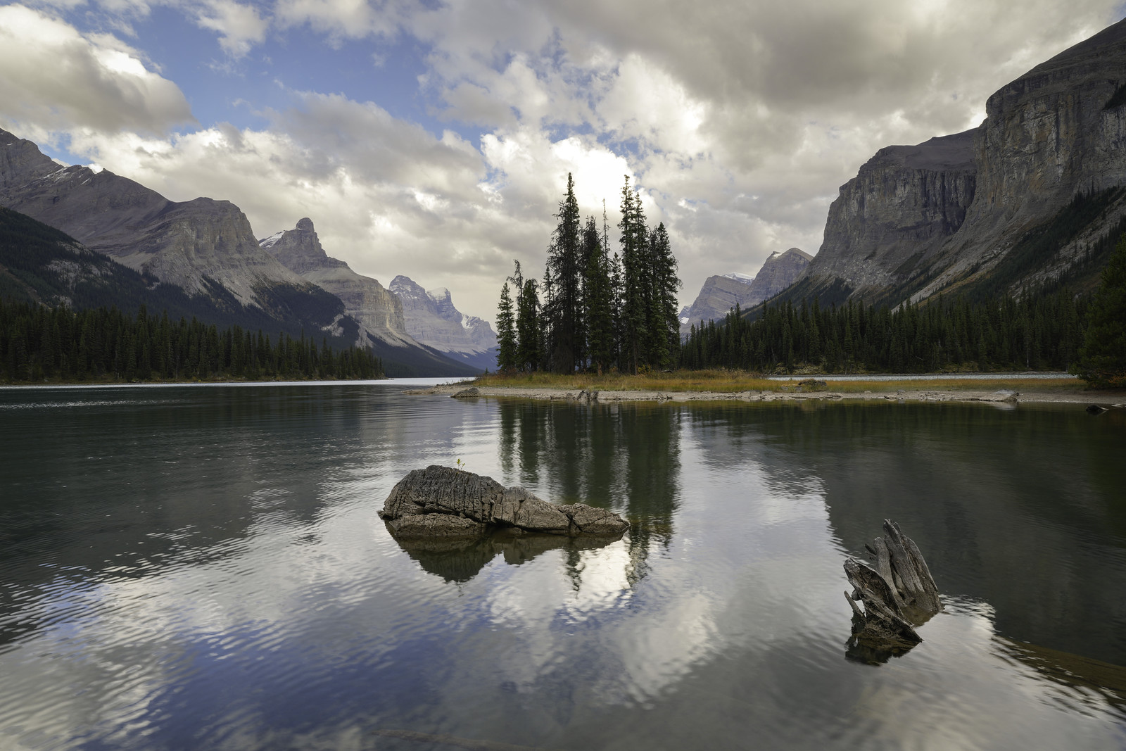
I noticed in my color image of this scene the hotspot in the clouds between the tops of the largest trees. I've worked on it in the B&W (masking the part) but I'm still not completely pleased with the outcome...to my eyes it appears muddy. Any suggestions on this?
I think I can see exactly where you lowered it. I'd say let it be bright between the trees (though not actually blown out at 256). Let it be at a similar level to the bright area in the clouds just to the upper right of those trees. You might be up around 250-252 for the level. If you're going for a print, it will look fine on paper, even if it looks a bit blown out on a screen.
There's another reason to do it. The reflection in the water between the two tree tops is very bright; your actual sky needs to match the intensity pattern of its reflection!! Once you see it, you can't unsee it
Beautiful capture and processing, Al. I see the spot you’re referring to. It seems to lack the detail or texture that gives it that muddy appearance.
One thing you could try in PS is duplicating the layer and using the Clone Stamp tool at around 40–50% opacity. Choose an area of the clouds that has a good mix of shadows and darker spots, and clone some of that texture onto the muddy area.
The lower opacity will give you more control over how much detail you add, allowing you to gradually build up the texture and blend it naturally with the surrounding area.
Yes, can see where you masked and darkened it and it doesn't look right as you've lost all detail in the cloud.
Do you know how to use the Dodge and Burn tools in PS? If so, that's a FAR better way to manage this. You make a layer, select the Burn (darkens) tool, and select highlights, and set flow low, like 15% choose a feathered brush, adjust to size and go. The longer you hover with the brush active (left mouse button pushed), or the higher the "flow" rate, the stronger the effect. Now toggle that layer visibility on and off to see the total effect. If it's a bit too heavy, you can dial back layer opacity to get right where want. Repeat for Dodge (brightens) on it's own layer so you can adjust opacity after the fact with it too For each of these tools you want to select your target tones, Highlights, Midtones or Shadows. This and the flow rate are up in the top bar menu when the tool is active.
You've got some very good suggestions for perfecting this image so I won't muddy the water by adding my own. I do agree that it doesn't look quite right as it is, but I have to say that overall this is a stunning image. The scene is spectacular and you've composed it perfectly.
Brent
photonoclast wrote:
I think I can see exactly where you lowered it. I'd say let it be bright between the trees (though not actually blown out at 256). Let it be at a similar level to the bright area in the clouds just to the upper right of those trees. You might be up around 250-252 for the level. If you're going for a print, it will look fine on paper, even if it looks a bit blown out on a screen.
There's another reason to do it. The reflection in the water between the two tree tops is very bright; your actual sky needs to match the intensity pattern of its reflection!! Once you see it, you can't unsee it...Show more →
Thanks for this - a question though, are you talking about this is in LR or PS? Which level are you referring to?
---------------------------------------------
Lightsearcher wrote:
Beautiful capture and processing, Al. I see the spot you’re referring to. It seems to lack the detail or texture that gives it that muddy appearance.
One thing you could try in PS is duplicating the layer and using the Clone Stamp tool at around 40–50% opacity. Choose an area of the clouds that has a good mix of shadows and darker spots, and clone some of that texture onto the muddy area.
The lower opacity will give you more control over how much detail you add, allowing you to gradually build up the texture and blend it naturally with the surrounding area.
I guess I'd better take the step into PS - I have LR and PS but the latter remains virgin territory. Thanks, Marcel.
---------------------------------------------
Jack Flesher wrote:
Yes, can see where you masked and darkened it and it doesn't look right as you've lost all detail in the cloud.
Do you know how to use the Dodge and Burn tools in PS? If so, that's a FAR better way to manage this. You make a layer, select the Burn (darkens) tool, and select highlights, and set flow low, like 15% choose a feathered brush, adjust to size and go. The longer you hover with the brush active (left mouse button pushed), or the higher the "flow" rate, the stronger the effect. Now toggle that layer visibility on and off to see the total effect. If it's a bit too heavy, you can dial back layer opacity to get right where want. Repeat for Dodge (brightens) on it's own layer so you can adjust opacity after the fact with it too For each of these tools you want to select your target tones, Highlights, Midtones or Shadows. This and the flow rate are up in the top bar menu when the tool is active. ...Show more →
I've used D&B in my other programs so I'll give it a try in PS. Appreciate your suggestion! I'll get on it tomorrow.
---------------------------------------------
bnfotografie wrote:
You've got some very good suggestions for perfecting this image so I won't muddy the water by adding my own. I do agree that it doesn't look quite right as it is, but I have to say that overall this is a stunning image. The scene is spectacular and you've composed it perfectly.
Brent
Thanks for the kind comment Brent. Once seen though it's hard not to be drawn to that part of the image. I hope I can repair it this week.
Good work on the overall image - I prefer it to the color version - but agree with photonoclast to let it go brighter. Sometimes the sun shines through
Al Trujillo wrote:
Thanks for this - a question though, are you talking about this is in LR or PS? Which level are you referring to?
---------------------------------------------
I guess I'd better take the step into PS - I have LR and PS but the latter remains virgin territory. Thanks, Marcel.
---------------------------------------------
I've used D&B in my other programs so I'll give it a try in PS. Appreciate your suggestion! I'll get on it tomorrow.
---------------------------------------------
Thanks for the kind comment Brent. Once seen though it's hard not to be drawn to that part of the image. I hope I can repair it this week.
Al
When you redo it, post a before and after, meaning full bright hot spot. The image is excellent and worthy of some multiple versions. My hunch is you could drag the right tip of your curves slider down (not left!) to a 251 max white output and be done 🤷🏼
Jack Flesher wrote:
When you redo it, post a before and after, meaning full bright hot spot. The image is excellent and worthy of some multiple versions. My hunch is you could drag the right tip of your curves slider down (not left!) to a 251 max white output and be done 🤷🏼
Jack Flesher wrote:
When you redo it, post a before and after, meaning full bright hot spot. The image is excellent and worthy of some multiple versions. My hunch is you could drag the right tip of your curves slider down (not left!) to a 251 max white output and be done 🤷🏼
Hello, Jack, Brent, Marcelo...
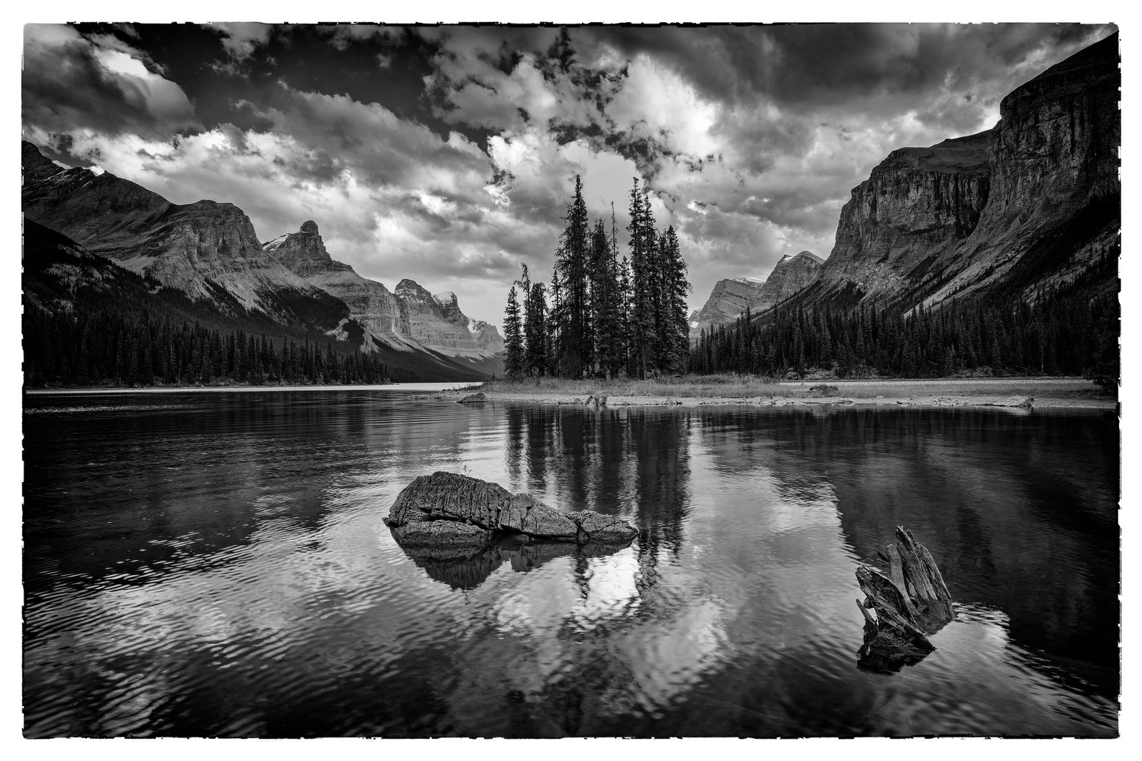
I used the Burn feature to come up with a much better image - thanks again for your help. I'm posting three pictures - the original in color with the blown out cloud, the B&W version with the muddy cloud mask and the final B&W version that was developed using the burn feature. I also used the burn tool to tone down the cloud's bright reflection down near the boulder.



 For each of these tools you want to select your target tones, Highlights, Midtones or Shadows. This and the flow rate are up in the top bar menu when the tool is active.